
 Lessons: 15Length: 1.5 hours
- Overview
- Transcript
4.2 Convert Grayscale to Color
With the lighting all set, let's convert this grayscale painting to color. Learn the tips and techniques for adding color to this base using blend modes and adjustment layers.
1.Introduction
1.1Introduction01:36
2.Set Up
2.1Document Setup and References08:38
2.2Tools and Brushes07:28
3.Concept Development
3.1Concept Development for Surreal Art06:44
3.2Sketch10:00
3.3Thumbnails for Light and Shadow07:32
3.4Adding Color to Your Thumbnails06:17
4.Paint a Surreal Digital Painting
4.1Painting a Grayscale Base06:39
4.2Convert Grayscale to Color05:48
4.3Highlights and Shading05:32
4.4Painting Realistically: Using Texture Brushes04:49
4.5Painting Realistically: Woman, Fish, and Water04:59
4.6Refine Your Painting04:59
4.7Final Touches04:18
5.Conclusion
5.1Conclusion01:54
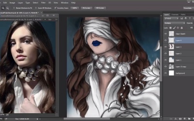
4.2 Convert Grayscale to Color
Hello and welcome back to Surreal Digital Paintings. My name is Melody Nieves and this is lesson 4.2. As long as you are familiar with the software, painting in Photoshop is not as hard as it seems. You can use simple tricks and techniques to get the desired effect that you want. In this lesson we'll add color to the grayscale base we created in the previous lesson by setting a couple of different layers to the multiply blend mode. Some artists always know what colors they want for their painting. And I'm definitely not one of them. Although I have the references to fall back on, those earlier thumbnails were really crucial in allowing me to see what colors worked best before I start painting. I can't tell you how many times I just haven't finished one simply because I couldn't work the colors out. So let's add color to our surrealistic painting. First merge all the layers for the grey scale beast together. This will help to prevent software lag and save on file space. Create a new layer and set it to the multiply blend mode. Pick a bright blue color from the color picker and begin painting the background blue. As you can see, I have the window from my colored thumbnail reference close by to remind me of the colors I need. Once the background is filled, go to Image, Adjustments, Hue and Saturation. First, decrease the lightness of the blue color, then desaturate it. Continue adjusting until you find the better color. Now let's color the rest of the painting using the same technique. For each section you have to create a new layer and set it to multiply. By keeping all the colors separate, you don't have to worry about changing any of the colors you've set into place by mistake. And because all the layers will be the same blend mode we'll be able to merge these layers together eventually. Fill in the skin with the same blue color and use hue and saturation to make the proper skin tone. It might be tempting but it's not necessary to change that blue foreground color. Even though it seems completely unnatural for nearly every detail, the color won't stay that way. So don't feel like you have to try to at least get a color close to the original reference. The beauty of this is that I painted the background, skin and hair with the same blue color. But the hue and saturation adjustments allow me to change them individually to get the colors I need. Since I was in a bit of a rush I definitely forgot a couple of details to color during the thumbnail process. One of those is the woman's lips. This is the classic case where it's good to have the reference handy but you should also pay attention to your gut. For instance, the original blindfold is actually black. But if I made the blindfold in my painting black, it would put too much dark tone on her face. Instead, what I did was coordinate the color of the blindfold fabric to the color of her shirt so that it appears mostly off-white. Moving on to the fishbowl necklace, I wanted to tackle the water first. Since the water spills out to the foreground areas, I decided to keep the color all on the same layer. Referring back to my thumbnail, I remember thinking that a darker blue would work. But there's something about this bright baby blue color that suits the painting even more. Last but not least, let's add color to the lotus flower and the little fishies. You may have noticed that my color choices aren't exactly that bright. In the case of the lotus flower, I already know that I'll need a pink that's a darker shade simply because I'll add more light, and warmth to it later. So a part of painting is almost like having super powers, and trying to tell the future. Because how you set up the colors, greatly influences your end result. I also paint all five fish as well as the necklace string with darker shades than you would expect for the same reason. Now because the fish bowls are colored blue you'll see that the fish in the bowls are darker than the one that's in the foreground. So to change this make sure you go back into your layers and find the fishbowl layer. Use the eraser tool to erase some of the color away, but you can keep some of the effect there so that they actually look like they're sitting in the water. Looking back on the thumbnails, I don't want to forget one more step. Merge all your color layers together and set the layer back to multiply. Let's add a little warmth to this painting by setting a new layer to overlay. Go to the color picker, and select a bright yellow color, and begin painting one light at the light source. Paint some of that warm light so that it's just barely kissing those other details but keep this effect very minimal. Once you're finished, set the layer blend mode of the sketch to overlay. Instead of having to work with harsh, black lines, this blend mode blends a sketch directly into the color scheme and that's it for your transition to color. Knowing how to use Photoshop and it's various tools and resources really allows you to have incredible freedom when painting. Let's continue by adding some highlights. Join me in Lesson 4.3 where I'll show you how to paint the first round of highlights fast and easy.


