
 Lessons: 8Length: 35 minutes
- Overview
- Transcript
2.2 Refining Your Vector Icons
In this lesson we’ll continue to work on our set of icons in Illustrator, refining details to make our icons look extra professional.
1.Introduction
1.1Welcome01:27
1.2Picking a Style for Your Logo Kit03:02
2.Building Block #1: Icons
2.1Sketching and Vectorizing Icons05:08
2.2Refining Your Vector Icons04:15
3.Building Block #2: Frames
3.1Creating Framing Elements06:11
4.Building Block #3: Typography
4.1Choosing Great Typefaces05:01
4.2Formatting and “Mapping” Typography06:31
5.Conclusion
5.1Your Finished Logo Kit03:10
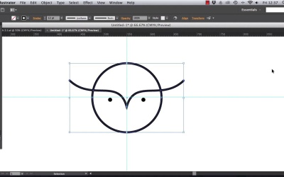
2.2 Refining Your Vector Icons
Okay, so you might have drawn up a few of your sketches on Illustrator, and they're probably looking really nice. But there are a few things that you can do to make your vectors look particularly professional. The panel that's going to be super handy for this is the Stroke panel, and this is docked over on the right side of your work space, over here. Or you can find it up in the Window menu. So the first thing you're gonna want to play around with is the weight of the stroke. So for line art designs, this is particularly important. And often you'll need to apply a slightly heavier stroke weight, to make sure that your icon's going to stand out and be visible at a small size. I'm gonna increase the weight of the circle and arcs that make up my owl icon. So you can adjust the sort of thickness that works for your own logo. You want the design to look nice and bold when viewed from afar, so a higher stroke weight usually looks a bit better. If you create a series of icons within the same style, you should note that you'll have to make the weight consistent across all the designs, as well. The next thing to tweak is the cap of your lines. Cap defines how the ends of your lines will appear. Switching to a round cap, I think, just has this really nice smoothing effect, which just helps the icon to look a bit more professional. This is the central option. By all means, stick with a straight ended cap if it looks better for your style. Because I want to give my logos a more friendly, contemporary look, a round end is just gonna edge it into that sort of territory. Okay, that's looking good, so just these little tweaks can make a really big difference to how professional your logos look. Right, now let's look at the color of this owl. Now, one thing you have to allow for when you're designing logos, is that in certain circumstances, you might find that your logo can only be rendered as a black and white silhouette, or a gray-scale image. This can happen when people want to produce print items, like letterheads, very quickly in house. So as long as your logo design can work in black and white, as well as color, then you've got a really versatile logo design on your hands. Having said that, most logos look a bit better with a little bit of color. And even if you're wanting all or part of the design to stay quite neutral in color, adjusting it from a harsh black is gonna look a lot better. First thing to do is to expand the Color panel, and click on the panel's menu, at the top right, and just check that you're working in CMYK mode. RGB is fine if you're just creating the logo design for online. Then expand the Swatches panel, which you can also find docked over here to the right of the workspace. And head into the panel's menu and choose New Swatch. I'm gonna show you this really flattering gray watch, which just softens logos which you might otherwise set in black. So you want process color for the type, CMYK for the color mode, and let's adjust the levels to cyan, 53.5%, magenta 44.5%, yellow 42%, and key, which is black, to 8.5%. We can name this Logo Grey. And click OK, and now you can see it's been added to the Swatches panel. So let's apply it. Okay, nice. The last thing you need to do to make your icons ready to be used as part of a logo design, is to make this image into a vector whole. To do this, drag your mouse across all the elements making up your icon, and right-click and choose Group. Then head straight up to Objects > Path > Outline Stroke. And, finally, go to Window > Pathfinder, and in the window that opens, choose the first option on the left, which is called Unite. So now you'll be able to scale your design up and down without losing the proportions of the stroke. Okay, fantastic. For now head up and File > Save your work as an Illustrator file, and name it something like ICONS. I'm going to come back to this in the next lesson, so keep it open if you're heading straight over to the next video. I'll see you in just a moment.


