
 Lessons: 7Length: 36 minutes
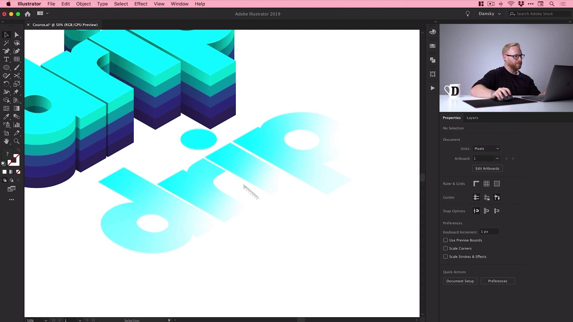
- Overview
- Transcript
2.6 Illustrator Freeform Gradients
Illustrator freeform gradients are a great way to add the finishing touches to a 3D text effect. So in this final lesson, we’ll wrap things up by learning how to add highlights to our text using freeform gradients in Illustrator.
1.Introduction
1.1Welcome to the Course00:45
2.Designing the Isometric Text Effect
2.1Setting Up Our Project02:19
2.2How to Make an Isometric Grid in Illustrator04:31
2.3How to Make Isometric Text02:41
2.4Adding Layers and Colour08:36
2.5How to Add Shadow to Text in Illustrator09:53
2.6Illustrator Freeform Gradients07:01
2.6 Illustrator Freeform Gradients
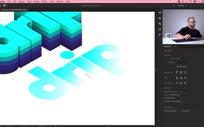
Hey there, welcome back to the course. We've arrived at the final lesson. We've created our text. We've made it isometric. We've added layers to it. We've added color, shadows to give it depth. Now, what we're going to do is we're gonna add a few highlights in places just to finish everything off. And we're gonna be doing this using the freeform gradient tool, so we'll jump into it now and get started. Okay, so this is where we left off. We've added the shadows to give it some depth. Now, we need to add some light or some highlights. So what we're gonna do is select our drip, this is our surface layer here. We go Edit > Copy > Edit > Paste in Place and we'll use the old Shift and [LAUGH] nudge technique to just nudge that out of place. [MUSIC] And then what we can do is go over here, grab the gradient tool. Now, you can use the linear gradient tool or the radial gradient tool. But I like this tool because it just gives you a bit more control over your gradient, and you can preview those changes in real time. So first of all, what I'm gonna do is I'm going to ungroup all of these letters just so everything is separate. There we go, fantastic. And what I'm gonna do is grab the gradient tool with one layer selected, go over here, and from the gradient panel, just click Freeform Gradient. And by default, it will add these random points. You can see, you can move them around, very powerful feature. We only need two in this case, so I'm just going to select these, hit Delete or Backspace on the keyboard. So the light is going to be coming from over here on the right. So with this selected, I can double-click and pick one of my swatches. And then I can double-click on this one and pick that same color as my surface. So it's this kind of turquoisey teal color and I can move this around to really fine tune that highlight if I wanted it coming more from down here or a bit over here. [MUSIC] And then what I'm gonna do is do the same for this one here. [MUSIC] So I'm gonna select this. Click freeform gradient, just remove all those excess points. [MUSIC] And then just add that color like so. So we'll just do it for these remaining letters here. So Freeform Gradient, [MUSIC] And we'll just double-click on those points. Brings up the swatches panel and then you can go and add in the swatch that you'd like. So I could actually have this coming from maybe the right a little bit more. [MUSIC] Just move these around. And then we'll do the day as well. Freeform Gradient, remove all of these, and then we'll just add in our own ones. [MUSIC] Now, what you can do with linear gradients and radial gradients is you could select all of these letters and then go to Object > Compound Path and select Make. In fact, if I just show you, we'll just add a default black to white gradient. It applies the gradient to every single letter because they're not touching each other. But if I make them a compound path, the gradient runs through the entire thing. So you can typically do that with freeform gradients. But in this instance, it didn't seem to work in the way I wanted it to. So that's why we've done it individually. But there is another way to do it all in one go with compound paths. There we go, we've got it done. Now what I'm gonna do is select everything, just go and regroup all those letters and use the old Shift and nudge technique, [MUSIC] There we go. [MUSIC] And this is why I do it, just so it's exactly where I left it, exactly the same position. Now, these highlights are a little bit bright. I could go in and edit the color, but what's easier is I can just select this and adjust the opacity, and just bring that down. So you can see here, this is where we were. We have that flat surface at the top, and I can just bring this up to 70%, and it just adds a little bit of light coming from this direction. And I could double-click to go inside the group. Select this, grab the gradient tool and go and fine tune this, move this around a bit if I wanted, and then just come out of isolation mode. So by double-clicking a group, you go inside it into isolation mode. You can edit changes and make changes to things without actually having to ungroup the object. But then you can just come back out and then everything's still grouped. So that's really, really cool. And because we have the light coming from the right, and it's casting shadows on the left side and it's just a few things I've noticed that don't quite add up. So I've added a shadow here. So we'll remove that one. There's one right here on the side, which isn't going to be there because of course, the light is hitting it from this angle. And this one here, I'm just gonna flip the gradients of the shadow, is in the correct place. So the more you understand about lighting and decide where your light source is gonna be and where the shadows are gonna be cast, it just makes this entire process a little bit easier. And maybe even this one. [MUSIC] Let's just swap the gradient around so it's coming from that side. And then I can zoom back out, and I can still fully edit everything. I can adjust the highlights, I can adjust the shadows and all the colors that we've applied, all these effects on top of this text. And this is where Global Swatches really do reveal their value, because you just open up that swatch and you can start messing around with color. So I could make this one here a bit more blue, preview that change, yep, that's good to me, click OK. And I could go and change the color of all of them if I wanted. And I don't have to kind of dig into all the layers and go underneath the shadows or anything, it's just really, really easy. So now I've done all that, I'm gonna go to View > Show Artboards, and bring my artboard back, then we'll finish this off with a background color. So I'm gonna grab the Rectangle Tool, just draw a rectangle that is the same width and height as my artboard. Object > Arrange > Send to Back, and we'll just double-click the Color Picker, or you can go and create a swatch. [MUSIC] I'm gonna go for something like this, maybe a little bit darker. [MUSIC] A little bit darker still, we'll keep going, but if you go lighter, it's entirely up to you. So there we go, that wraps up the course. We've created our isometric text effect all in Adobe Illustrator. So if you would like to download the project files, what I'll do is I'll package those up with the course. But now you can take this technique and you can apply that to your own font, your own word, and create some isometric text. So I really hope you enjoyed this course. Take care and I'll see you soon.


