
 Lessons: 7Length: 25 minutes
- Overview
- Transcript
2.2 Movie Poster Colors
In this lesson, you'll learn all about movie poster color theory. We'll look at why you may see the same painting of colors over and over again, how color can evoke feeling, and why certain genres use certain colors. We will also learn how to create and add a color grade to some posters!
2.2 Movie Poster Colors
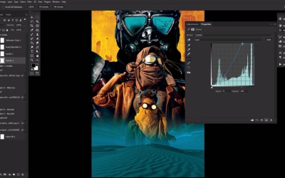
Welcome back to Movie Poster Design in Adobe Photoshop. Next up, we'll be learning all about movie poster color theory. So first, you want to think about color pairing and your genre, bringing up the classic dynamic duo of orange and blue again. Not only are blue and orange a powerful combination, because again, unlike other color pairings, they don't conjure cultural associations. But they also sit on opposite sides of the color wheel, invoking hot and cold, and explosive action. And Hollywood noticed it, and never stopped. If you are designing an action flick, like our mockup here, then blue and orange may be the way to go. We also have white and red for comedies, which creates almost a blank canvas effect, and allows you to feature a subject, coming off very light, and easy to digest, perfect for a comedy. Then the blues and greens for thrillers and dramas, giving a tone of seriousness and [LAUGH] of course, drama. Next, we have a bright, bold, vivid yellows, reds, and blues, your primary colors for offbeat indies. They often go big and bold to stand out from the typical Hollywood movie poster, as they have to compete for attention among big actor names, and even bigger budgets. And then we have muted grays, and blues, and deep greens with hints of red for horror. Often with heavy use of shadow, contrast, and darkness to really convey horror and fear, making things almost claustrophobic. And a fair bit of red, of course, or maybe all red sometimes to invoke some good blood and violence. Now, there are always exceptions, of course. But these are general trends, and give you a good jumping off point. Try and choose a concise and consistent color scheme right away, building it into the design. Then from there, you can enhance using adjustment layers. Here in our action poster, we have a color grade consisting of just for adjustment layers. These enhance and adjust the current orange and blue of the poster. A curves layer with the cyan curve pulled up into the shadows, which you do by clicking this point, and dragging inwards. Now, the magenta is just slightly pulled into the shadows, and slightly removed from the highlights, which are down on the opposite end here. And then an S curve created in the yellows, done by clicking to place an anchor, and then pulling, forming an S-like shape. Next, a levels adjustment layer to slightly increase the contrast by adjusting the toggles, pulling the highlights inward. Next, I use a hue saturation layer to slightly shift the color hues into a bit warmer orange, and a more teal blue. And finally, a selective color layer, focusing on the blacks. Adding in some cyan and magenta, and removing just a touch of yellow, which will make the shadows a nice cold blue, and not as green. In the horror movie poster mockup, we have an even simpler color grade. Bringing in a dark shadowy green, starting with levels, just slightly. Here, we have a selective color adjustment layer, adjusting the cyans, Blues, Whites, Neutrals, and blacks. Finishing up by giving everything a wash of green with a color fill layer. Set to multiply at 22% opacity. This color grade does a particularly good job not only bringing in this green tone, but also deepening the shadows under the bed here. To recap, think of the emotions you want your film poster to invoke, fear, mystery, optimism. And then choose a color scheme that fits, keep your colors consistent and impactful. More is less, most often. And then finally, use a color grade to further enhance and adjust your color scheme, really tying things together. With that, we can finally move on to fonts and typography next time in Movie Poster Design in Adobe Photoshop.


