
Introduction
Hi, we’re Ian and Jess—and today, we're ranking every Wes Anderson movie poster.
Jess has no idea what order these are coming in, and we’re including some poster variants too. Will we still be friends by the end? Let’s find out.
Bottle Rocket
Wes Anderson’s first film, Bottle Rocket, comes with a very indie-looking poster. Low budget, no big agency, and probably designed in-house.
Despite the simplicity, it still shows early signs of Wes’s flair for color. The bold red and yellow pop, and the type is weird... in a good way. It looks like a secret code with abstract downstrokes and partial letters.
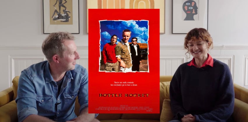


Ranking: #10
A fresh-feeling Wes Anderson movie poster that’s oddly timeless.
Rushmore
Still very '90s. The design echoes Russian Constructivism, complete with radiating lines and Max Fischer’s revolutionary vibes.
But the typography? Not a fan. The quirky slab serif clashes with the otherwise bold style.


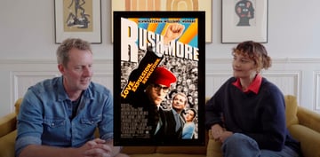
Ranking: #12
Too many elements. Not enough cohesion.
The Royal Tenenbaums
This one’s still an in-house studio job, but now we’re seeing visual cues that scream “Wes Anderson”: pastel tones, symmetry, and the first appearance of that beloved Futura font.
It features the full cast, which makes sense given the plot of the movie. It also uses color to hint at the film’s era and themes—those vermillion red tracksuits are hard to miss.

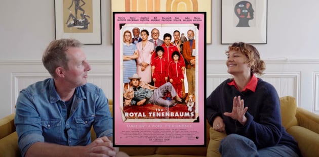

Ranking: #9
It’s a classic, but doesn’t quite shine compared to later entries.
The Life Aquatic with Steve Zissou
Now we’re getting cinematic. A lot of the design on-set was done by Eric Chase Anderson (Wes's brother), and part of the poster's aesthetic was based on his creative input.
This Wes Anderson poster introduces a more polished art direction. The symmetry, the iconic mustard yellow-blue-red color palette, and the diorama-style layout all feel intentional.
Still, there’s a lot going on without much detail. The illustrative characters over a collage art background make it visually rich, but maybe a bit too busy.


Ranking: #8
Westy, colorful, but slightly cluttered.
The Darjeeling Limited
This marks a shift: we’re now into custom typography and cultural references. The type, based on hand-lettered signs in India, was created by Rick Granados and art director January Dawson.
This one is full of personal touches and film location-specific design: photos by James Hamilton, illustrations by Eric Chase Anderson.
It also marks the beginning of geography as part of the Wes Anderson's aesthetic.

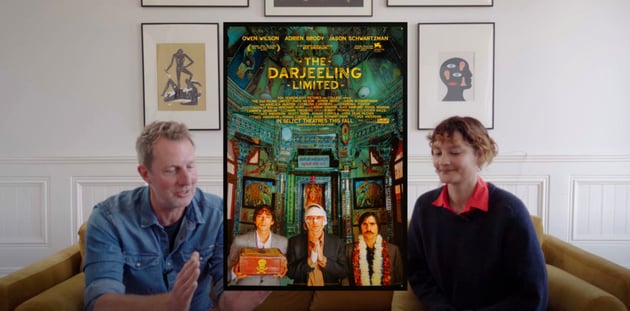

Ranking: #7
Warm, place-specific, and rich with personality.
Fantastic Mr. Fox
Wes’s first feature-length stop-motion film. The poster plays with depth, showing the characters underground with villains looming above—mirroring the story perfectly.
But visually, it feels more like a traditional children’s movie poster than something uniquely Wes. The bold Futura and bright yellow are back too.

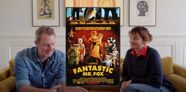

Ranking: #11
Credit to the puppet work, it's overall charming... but not his most inventive design.
Moonrise Kingdom
This one’s a showstopper. A painted backdrop by Michael Gaskell paired with Jessica Hische’s whimsical, handwritten typography makes this feel more like a storybook than a movie poster.
The type isn’t bold or functional, but it adds to the atmosphere. The layout with tiny characters in a huge landscape accentuates the story’s sense of adventure and youthfulness.
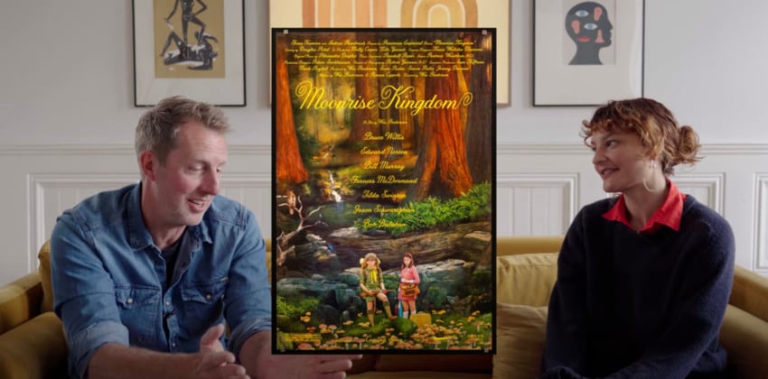
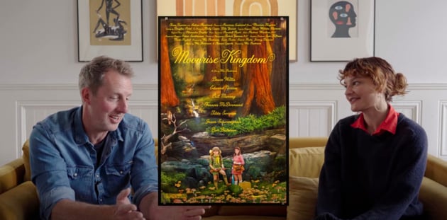
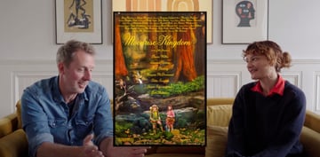
Ranking: #3
Dreamy, detailed, and beautifully executed.
The Grand Budapest Hotel
A masterpiece of poster design. There’s no Futura—this time it’s Archer, a font more in tune with the film’s European flair. The hotel model from the film takes center stage, surrounded by pastel tones and tiny storytelling details.
Typography by Annie Atkins was hand-cut, echoing the handmade props from the movie like the Mendel’s box or telegram slips.


Ranking: #1
Miniatures, lettering, color: this is peak Wes.
Isle of Dogs
More stop motion, this time with heavy Japanese influence. The Chief Graphic Designer, Erica Dorn, lived in Japan for a long time. This brought authentic typographic and design elements to the poster.
We love the vertical Japanese-style text, the red-and-white palette, and the rich textures. The layout highlights the dogs and their features without overwhelming the viewer.
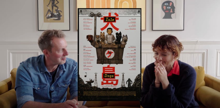

Ranking: #2
Beautiful, detailed, and full of texture.
The French Dispatch
This one looks just like the magazine from the film. Illustrator Javi Aznarez, who also created the in-film publications, brings a full editorial style here. There’s even a faux spine along the edge.
It’s illustrative, full of detail, and solves the “how do we show a huge cast?” problem by placing them in a cutaway building, each with their own space.
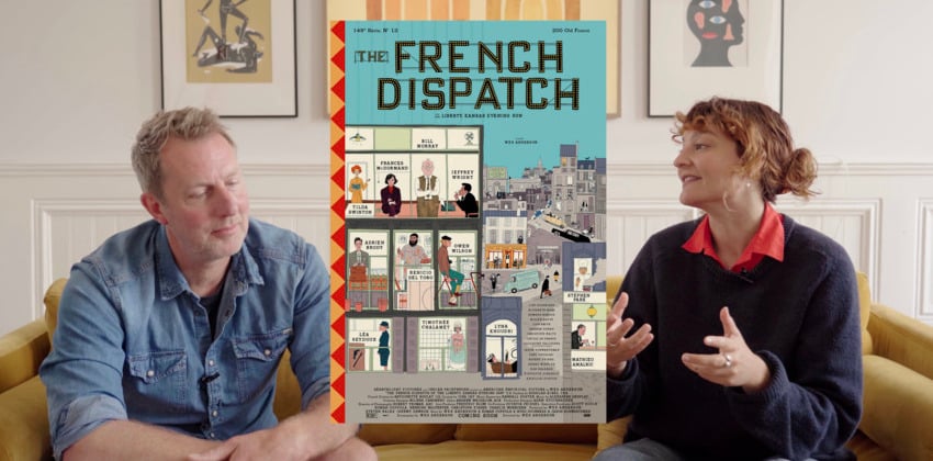
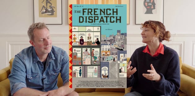

Ranking: #6
A smart, editorial Wes Anderson poster that fits the film perfectly.
Asteroid City
No cast here—just a wide-open, remote landscape painted by David Michael, who also worked on the film’s props. It doubles as an ad for the fictional play within the film.
The typography nods to mid-century American signage with its chunky drop shadows and hand-painted feel, courtesy of Erica Dorn again.
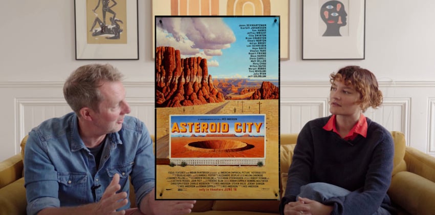


Ranking: #4
Meta, painterly, and distinctly Wes.
The Phoenician Scheme
From what we’ve seen in the trailer, this one's a bold departure. No texture, no photo elements—just flat, graphic design. The poster is all about typography, which aligns perfectly with the tiled background.
Margins are tight, the typography kerning is off (in a good way), and the cast is featured only through portraits on the wall. It leans into anti-design and does it confidently.

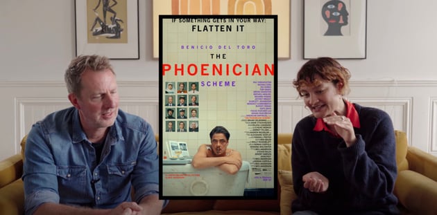
Ranking: #5
Typographically daring and refreshingly graphic.
Wes Anderson movie posters: Final ranking


Here's our final Wes Anderson posters ranking, starting with our very favorite:
- The Grand Budapest Hotel
- Isle of Dogs
- Moonrise Kingdom
- Asteroid City
- The Phoenician Scheme
- The French Dispatch
- The Darjeeling Limited
- The Life Aquatic
- The Royal Tenenbaums
- Bottle Rocket
- Fantastic Mr. Fox
- Rushmore
Feeling creative? Design your own Wes Anderson-inspired poster with the fonts, graphics, and design templates available on Envato. Every type of asset, for any type of project.
And if you’re a hardcore Wes head or big film enthusiast, you'll love these other articles and tutorials:


