
One of the biggest uses of Illustrator has always been and most probably always will be logo design. All good corporate image design relies on a great composition and superb typography - this isn't as easy as it sounds. It takes hours of sketching, hours of mocking and even hours finishing the final touches. To even get to that stage you need to know what you're doing and do plenty of research into the industry to find out what works and what doesn't for certain companies.
To help inspire you for your future logo projects we have compiled a collection of eighty stunning typographic logos. The logos are categorized into colors with some brief explanations on color meanings in logos. We want to know what your favorite logos are, so let us know in the comments section at the bottom of this post!
White
White is one of the most commonly used colors in typographic logo designs. It is known as the universal color of peace and represents purity, simplicity, sterility and refinement, making it perfect for professional, corporate images. The color mixes well with every other color, and tends to bring out the true power of brighter colors that surround it.
Codespeaks

Kayako

All Night Breakz
Spry
Moodboard
SPEK-R
DJ Coyote
Fence

Bckspace
Muse7

Lazy

Zoodos
Jus
Upside Down Productions
Mogul
Act

Logotomy
Black
Black is one of most commonly used colors in logo design, it is a very powerful, elegant and bold color. Using black in logos creates a sophistic look, again making it a superb choice for professional services.
Jill

Indulge
Brand
Fuel
Flat Land
Zip Apparel
Invizio
Ramin
Knoll
Collage
Liam
365 Design
Geek
Foot
Drum'n'Bass Light
Blue
Blue is usually the color that is linked with water, and can be seen being used in various water-based company logos below. Other than the obvious connection between the color blue and water, there are other reasons blue is a common color in corporate image design, such as how it helps to inspire trust and faith between the customer and company.
Undersea Productions

Aquaris
Koulak
Urban Groove
Aqua
Optim Optics
Green
The color green is often used in environmental-related companies (such as those in the construction or gardening industry) because of it's association with nature. However this isn't the only reason green is used in logo design - it is also a very calming color that signifies health and freshness.
Pond
Fake Logos
Ecodream

Bloom
Vessel
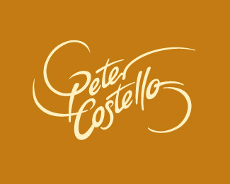
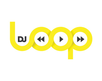
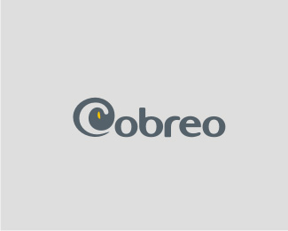
Yellow
Yellow is the hardest color for our eyes to adjust to, and therefore is usually only used in very minimal amounts, especially in corporate images. It's a positive color and works very well with dark greys and black.
Wonderlist.ca
Down Town
Peter Costello
CinkiLinki

DJ Loop
Cobreo
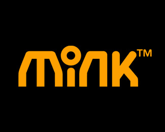
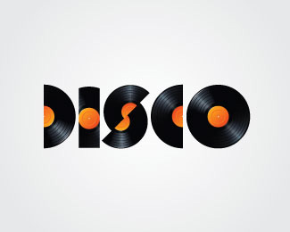
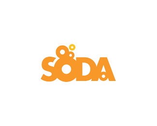
Orange
Orange is a funky color that represents enthusiasm, flamboyance, and plenty of energy. It's brightness captures attention easily (especially) in company logos mainly due to it's lack of use when compared to other colors.
Mink
Disco
Burn Unit

4C4

Soda
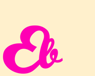
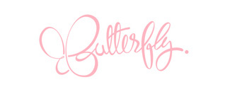
Pink
Pink is typically associated with femininity, and is therefore commonly used in logos related to cosmetic products and health care. Different shades of pink however can induce different things. For example, the elegant pink used in the 'Butterfly' logo induces softness and innocence, whereas the bright pink used in 'theBLOC' logo suggests excitement (both below).
EB
Butterfly
Crop

theBLOC
Gulp
Red
Red is a color that is quite commonly used in corporate images as it can mean many different things: passion, anger, strength and vitality. It's a color that can easily draw attention to its passers by, and therefore works well in logos.
Minimum
London London
Lowriders
Sleep Eyes Filmworks
AUGE
Mi Shutterbug

Brown
This color is getting ever more popular in logos. It is typically used in identities related to construction and development due to it being a very natural earth color suggesting earthiness, woodiness and richness. In recent years, it has seen a huge increase being used in coffee shop and restaurant logos, again for obvious reasons.
Sticky
Jupiter
Catfly
Kanga
Bona Chocolate
Violeto Flowers
Cocoa
Figure 9
3 or more colors
Using a varied color scheme in your logo design can work, as can be seen in the excellent identities below. Each different color induces different feelings, and can easily attract customers' attention if used in the correct compositions.
Bright Studios

BAMA
Art Hotel Norway
Mike
101 Princess St.

David

 By
By


