


Text is never simply text—typography, or the way type is arranged on a layout, has a huge influence over the visual impact of a message, setting the tone and mood for the reader. Type design has a long and fascinating history, and the digital fonts we use today often have incredible origin stories.
Here we’ll explore a brief history of type and typography, starting with the early serifs engraved on the monuments of Ancient Rome, learning a little about the printing press revolution of the Middle Ages, and looking at the huge impact of 20th Century Modernism and the digital age on typography as we know it today.
- Typography Before ‘Typography’
- Gutenberg’s Blackletter Revolution
- “Flippin’ eck, this Blackletter’s hard to read!”
- You Old Romantic: 18th Century Serifs
- A Typographic ‘Blip’: The Industrial Revolution
- Thank Goodness, the Modernists Are Here
- The Influence of the Digital Age
- Conclusion: From Mesopotamia to Microsoft... and Everything In-Between
Looking for the perfect font to use in your typography project? You're sure to find something to fit the bill from the huge range on Envato Elements or in these useful resources:


Typography Before ‘Typography’
To talk about the history of typography, first we need to define it:
Typography as we know it only really came into being with the invention of the printing press, but it actually has deeper origins. Many of the fonts you will see used widely today evolved from much earlier type designs.
To draw a typography timeline, in second century BC Mesopotamia, punches and dies were used to stamp letterforms or glyphs onto seals, which makes it a very early form of printing. There is also evidence that similar ‘printing’ techniques were used in Babylon, Crete, and Ancient Greece.

Many of the serif fonts we use now can also trace their roots back to Ancient Roman capital lettering, which was used to inscribe monuments and municipal buildings. Trajan Pro and Times New Roman are two examples of typefaces which owe much of their design heritage to these early Roman type styles.
Gutenberg’s Blackletter Revolution
Continuing with the history of typography, by the 12th century in Europe, hand-lettering had developed into an incredibly beautiful art form, practiced by monks who created illuminated manuscripts covered in ornate lettering designs. The style of type which was perfected by the monks is now known as blackletter—a Gothic calligraphy script.
You can check out some beautiful contemporary examples of Gothic fonts here:
 40 Best Blackletter and Gothic Fonts for Designers
 43 Best Medieval Fonts (Gothic and Writing Style Fonts)
The downside of this hand-lettering technique was that it was also time-consuming and costly, which made it accessible only to a limited group of people.
For many type enthusiasts, typography only really came into being with the invention of the printing press. In Germany, a blacksmith named Johannes Gutenberg created a machine that could process movable type, allowing a large number of sheets to be printed using ink and dies. Mimicking the blackletter type style used in hand-lettered manuscripts, Gutenberg developed the first ever typeface: Blackletter.

For the first time ever in typography history, this had the potential to be accessible to the masses. Pamphlets and flyers could be reproduced quickly and inexpensively, though it would still take many centuries for books to become a commodity that ordinary people could afford.
“Flippin’ eck, this Blackletter’s hard to read!”
In the typography timeline, the sheer blackness of Blackletter never made it the easiest typeface to read, so it was a breath of fresh air when Roman type styles became popularised in the 15th and 16th centuries.
In 1470 in Venice, Nicolas Jenson designed a highly legible typeface inspired by Ancient Roman type styles. Jenson is one of the earliest Old Style typefaces, which are defined by low contrast between thick and thin strokes.

Old Style Roman typefaces are readable and aesthetically pleasing, which led to them becoming the defining typeface style used throughout this period.
While this renewed legibility was welcome, typesetters were also starting to explore ways of saving space on layouts. Books and other print materials were still not very cheap to produce, so designers focussed on compressing tracking (space between characters) and leading (space between lines). This need for space-saving also led to the development of italic weights.
While typographers mostly use italics today to create hierarchy and difference in their typesetting, Renaissance-era typographers used slanted type styles to make the most of the limited space they had available.
Here's an article you can check out with Old Style font examples:


You Old Romantic: 18th Century Serifs
Roman typefaces remained enduringly popular for a few centuries, and it wasn’t until the 18th Century that some of the most influential type designers quietly revolutionised the serif as we now know it today.
This was the era of the humanist serifs. It all began with William Caslon, a London-based type designer, who created a more refined version of the Old Style serifs first developed by Jenson some centuries before. Caslon is a romantic and undeniably beautiful typeface, which makes all printed documents of this period appear exceptionally elegant.
A couple of decades later, in the 1750s, another English type designer, John Baskerville, created what is now known as the first Transitional typeface. Compared to Old Style Caslon, Baskerville is recognised for its thinner serifs and moderately higher contrast between thick and thin strokes. It has a more formal, sombre appearance than Caslon, and remains one of the most popular typefaces for typesetting books today.
The tide of typographic change was coming thick and fast during the 18th Century, during the Age of Enlightenment. In France, the Didot family designed one of the first Modern serifs, which are defined by very thin serifs and a very high contrast between thick and thin strokes.
#/media/File:DidotSP.png)
In a similar vein, the Italian typographer Giambattista Bodoni developed typefaces that can also be classified as some of the earliest Modern typefaces.
Didot and Bodoni are commonly used in luxury advertising and magazine design today, as they are considered to be exceptionally beautiful and chic type styles.
If you want to explore more examples from the history of fonts, we've got this for you:


A Typographic ‘Blip’: The Industrial Revolution
Here's the next chapter in typography history. After all the sophisticated developments in typography during the 18th century, the 19th century was bound to be a little disappointing. This was the era of the Industrial Revolution, and while incredible progress was made in mechanical and industrial fields, typography suffered from a cluttered approach during this time.
Type was condensed or stretched to fit onto advertising materials like posters and newspapers. An eclectic mix of styles was used to fit every available space, which resulted in an eccentric look that ranged from circus-inspired styling to the letterpress-influenced ‘vintage’ styles popular with hip coffee bars today.

The upside of all this typographic freedom during the 19th century was the development of slab serif, or Egyptian, typefaces. These were punchier, bolder incarnations of existing serif styles, and they still give a lovely antiquated feel to titles in contemporary design.
The history of typefaces is so interesting, right? Here are some great resources you can check out on these types of fonts:


Thank Goodness, the Modernists Are Here
The history of typography doesn't end there! After all the clutter of the Industrial period, typography was badly in need of a refresh. Luckily, there were some very forward-thinking chaps who did just that.
William Caslon (of Caslon fame, see above) had a great-grandson, William Caslon IV, who controversially removed the serifs from one of his traditional typefaces in the early 19th century. The style was too ahead of its time and didn’t take off, and it would be another century before the world was ready for the palette-cleansing simplicity of the sans serif.
The best-known early sans serif is Futura, which was created by German typographer Paul Renner in 1927. Renner was inspired by simple geometric shapes, which gives Futura and its relations their group name—the Geometric Sans typefaces.

At the same time over in England, Eric Gill was approaching the new Modernist mood from a different perspective. He created Gill Sans, which introduced more natural curves and organic forms to the sans serif template. This and other related typefaces are now known as Humanist Sans typefaces.

A few decades later, in the late1950s in Switzerland, another sans serif evolutionary step was made. The Swiss Style, as practiced by a group of designers in the country, was characterised by functional and ultra-legible type design. Helvetica was the star product of this modernist experiment, and it soon came to be used across signage and print design the world over.
If you want to dig more into the history of fonts and sans serif examples, check these out:


The Influence of the Digital Age
Now onto the more recent history of typefaces. Modernist sans serifs really broke tradition with all the typographic developments that had come before. But there was one final development that would extend the reach of both serifs and sans serifs, as well as typographic formatting, to an as yet unimaginably large audience.
With the invention of computers in the 20th century, fonts—digital versions of typefaces—became the new currency in typography. Despite the exciting possibilities the digital revolution could hold for type, typography as a discipline seemed for a short while a little out of place. With the limitations of screen technology, many fonts were rendered as primitive Pixel Type, and pixel-inspired styles became the trend-leading typefaces for print design too.

As computer technology evolved, the field of typography gradually opened up, making more sophisticated fonts available to all computer users. The downside of this was the overuse of ‘bad’ fonts (*cough*, Comic Sans) by every Tom, Dick and Harry.
The upside was actually the most revolutionary development in typography, ever—that typeface development could no longer only be accomplished by specialists; but instead anybody with access to vector design software had the potential to design their own fonts.
Interested in this? Don't miss out on these resources:


Conclusion: From Mesopotamia to Microsoft... and Everything In-Between
Humans have always sought out new and creative ways to communicate with others, and typography is the most visually arresting way that this has been done.
As we've explored here, the history of typography didn't simply begin with the invention of the printing press, but has a much deeper history, much of which archaeologists and historians are still only just bringing to light.
If this brief history of type has whetted your appetite for more typography-related content, you're in luck! Check out the tutorials and courses from the Envato Tuts+ YouTube channel below, which will focus on honing your type skills. You can also find the perfect font for your next project over on Envato Elements.
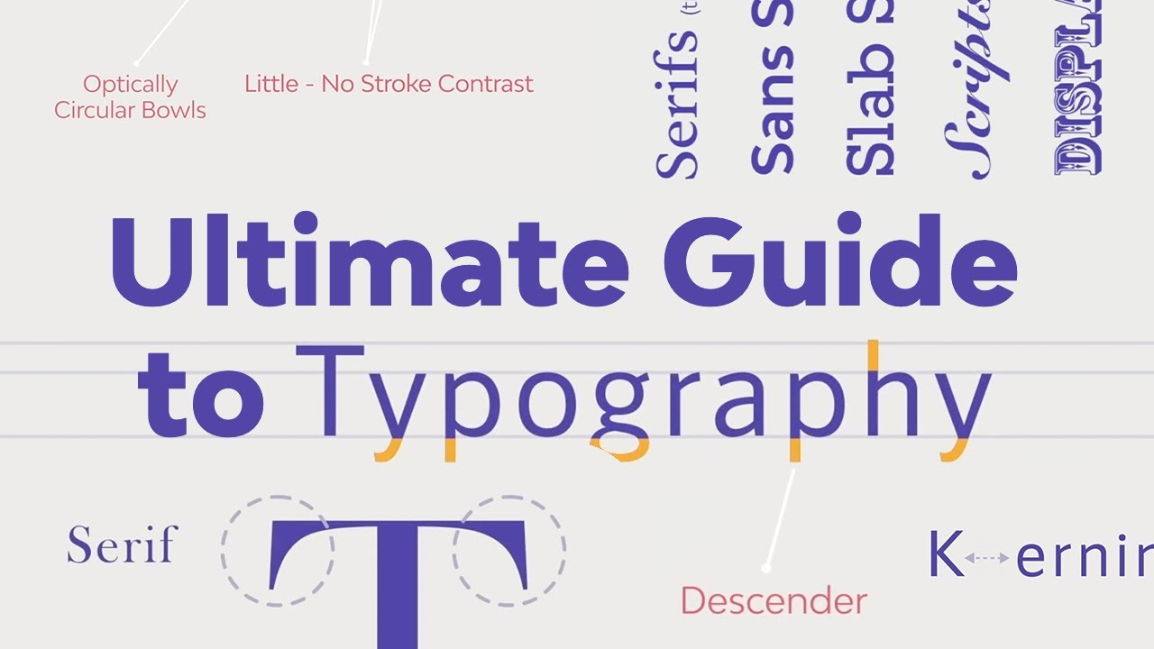

 Typography: The anatomy of a letter
 What Is Kerning, Tracking, and Leading?
 Learn Typography and Branding With These Graphic Design Courses
 5 Typography Secrets to Transform Your Designs
 The Ultimate Guide to Typography
 What Is Typography?
 A to Z of Typography: Terms, Tips, Tricks, and Hacks!
 50 Creative Typography Ideas and Examples (Design Inspiration)
 Serif vs. Sans Serif Fonts: What Is the Difference?
 What Is Expressive Typography?
 By
By


