


Creating a magazine is no simple task. But whether you’re creating a fashion bible or foodie flick-through, here you’ll find top magazine ideas and technical tips for making professional magazine spread layouts.
Watch 10 Tips for Designing High-Impact Magazines

What We'll Cover:
- Introduction
- Don’t Be Shy With Your Cover Designs
- Go Minimal for Fashion Magazines
- Spend Time Perfecting the Magazine's Contents Page
- Illustrated Graphics Make Magazines Unique
- Give a Digital Look to Print Layouts With Infographics
- Serifs Look Aspirational; Sans Serifs Look Cool
- Make Beautiful Photos the Main Focus
- Design a Magazine With a Style Theme and Stick to It!
- Think in Spreads, not Pages
- A Single Pop of Color Shouts the Loudest!
- Recap: Best 10 Magazine Tips
- Learn More Magazine With These Resources
About Your Instructor


Grace Fussell
I'm a graphic designer leading the creative agency Blue Whippet Studio, based in Manchester, UK. I'm a self-confessed 'print geek' who loves to share my experiences of graphic design with others. I've written about creative trends and design history for a wide range of publications and blogs, including Adobe, Shutterstock, Envato and InDesign Magazine.
1. Introduction
Great magazines are a balance of content and design. Delivering content in a cohesive and interesting way is important to drive up sales and to provide a unique experience for the readers. In this course we'll cover 10 tips to take a regular magazine design to a high-end one. Let's begin!
Laura Keung, video instructor
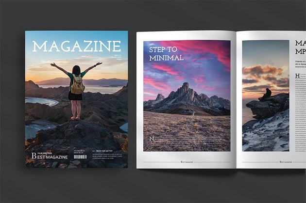
2. Don’t Be Shy With Your Cover Designs
One of the basics of magazine design is the cover. The most aesthetically pleasing magazines always have great covers. There’s no point spending time perfecting the inside pages of your magazine if casual browsers don’t pick up the issue to take a look. An attention-grabbing magazine cover design is vital for selling your magazine to readers and inviting them to delve deeper into the publication.
That being said, your magazine cover design doesn’t need to be brash. A rainbow spectrum of color and an over-packed layout can look dated and cheap, but balanced, strong headers and sub-headings paired with simple graphic callouts draw attention to cool magazine covers in a subtler way.
Stick to one A-heading (the magazine title), one strong (B) sub-heading (pulling out one article to be the main focus), and a larger selection of smaller (C) sub-headings. Almost every magazine cover uses this rule to promote balance in the layout.
Pair these headings with a strong, simple photograph and areas of white space (where you place no busy text or images), and you have a layout that’s both pleasant to look at and graphically very bold.
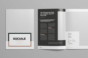
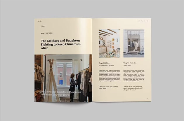
Stick with black-and-white photography for a strong look that still looks balanced and stylish. Look to slab serif and display typefaces set in uppercase characters, as in this stylish fashion magazine spread, to make text pop against your main photo.


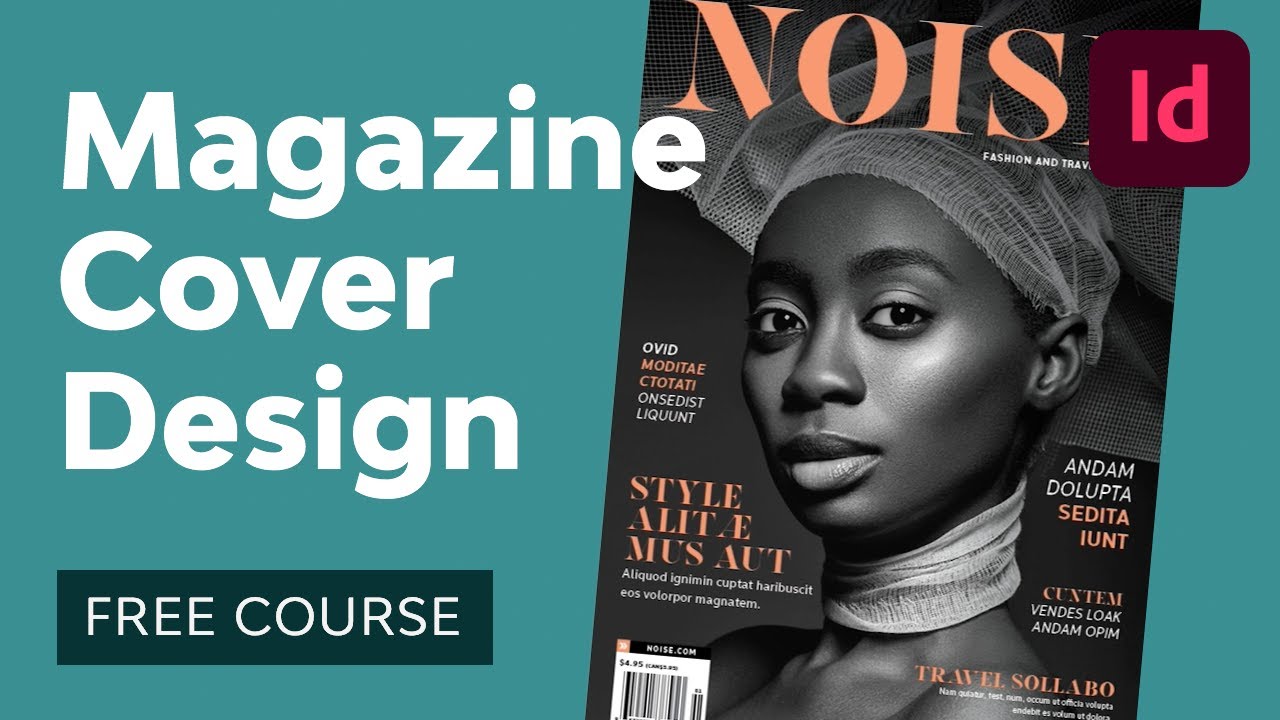
Allowing photos to ‘interact’ with typography is also a great way of making cool magazine covers appear more 3D and giving the impression that the photo is jumping out at you. Cut the subject of the photo away from the background, and layer them so that parts of the subject are brought in front of text and others behind. Check out this tutorial on how to create a magazine cover in Adobe InDesign and Photoshop that uses this effect:


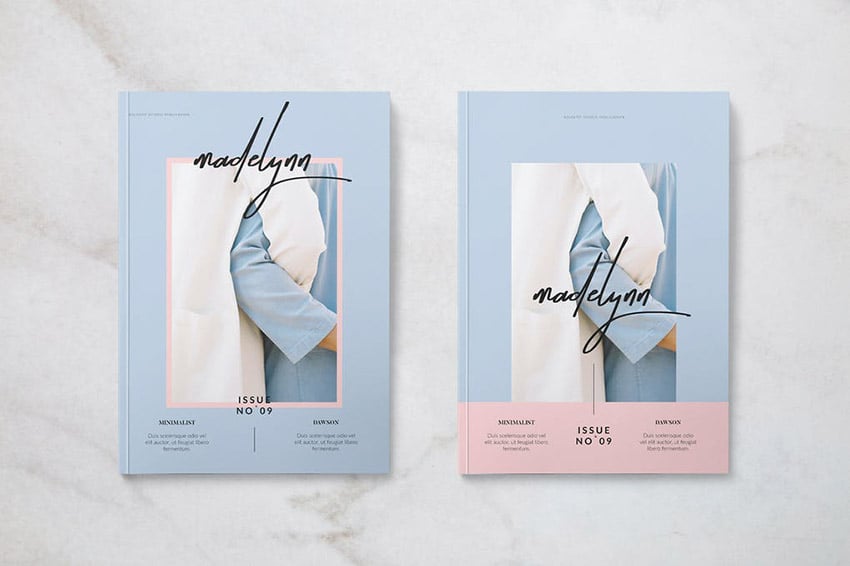
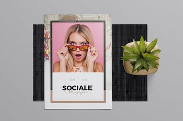
3. Go Minimal for Fashion Magazines
If you’re creating a magazine for fashion or lifestyle content, your challenge will lie in making the design look as on-trend and aspirational as possible.
Here are the basics of magazine design: make photos the focus of your layouts, allowing them to take up at least two-thirds of each page. Pair them with a bare white or pastel backdrop and rich black typography, as in this stylish fashion magazine template.


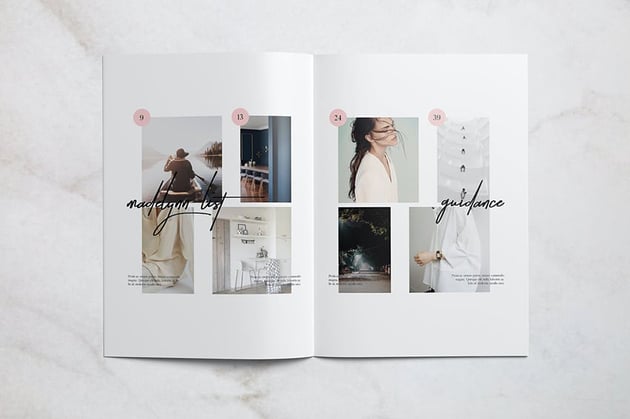


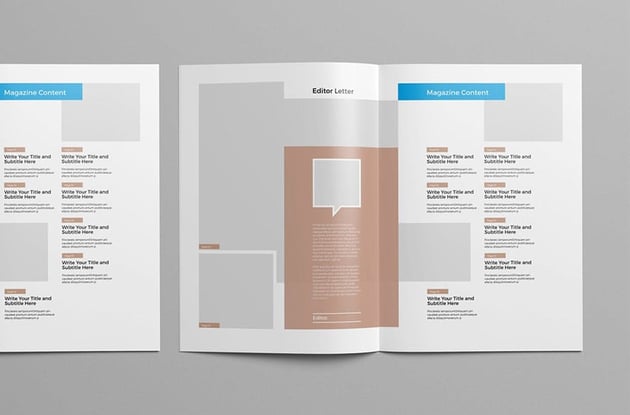
4. Spend Time Perfecting the Magazine's Contents Page
When you're learning how to make a magazine spread, pay attention to this. Once the reader opens up the magazine, the contents page will be their first port of call.
If your magazine spread layout has a large amount of content, don’t restrict your contents to one page—branch out into a full two-page spread. This will give you plenty of room to introduce a large ‘Contents’ header (try out a slab serif for high-impact typography) and lots of enticing images.
All great tables of contents of a magazine will be structured on some sort of grid layout, but it certainly doesn’t need to be restrictive or dull. Take a look at the irregular photo-grid used on this sports magazine’s contents spread—the mish-mash of large and small images looks exciting, not chaotic, and pulled-out taglines add context to each graphic. Large, stylish page numbers set in blue, yellow, and black are instantly clear and make browsing the contents of the magazine a breeze.


Or why not base your contents spread on a simpler column grid, as in this design-forward magazine template?


Restrict the number of articles you highlight in each row or column of your grid, to give more breathing space to each item and help maximize white space in your layout.
When designing your magazine, focus your energy on making your contents page as well-structured and well-styled as possible. As it's the reference spread for the rest of the publication, you want to make a good impression! You can lift typography styles and colors from the contents spread and use these as a basis for developing a consistent look across the whole magazine.
Remember that contents pages for magazines are very different to contents pages for books or reports. Magazine contents should be full of enticing images and exciting typography to get the reader in the mood for delving into the rest of the magazine’s content.
5. Illustrated Graphics Make Magazines Unique
Browse any shelf of magazines and look for cool magazine ideas, and you’ll notice that most cool magazine covers use photos as their image medium of choice. However, an illustrative cover can look unique and stylish and is a great choice for tech, arts, and design titles. On-trend flat graphics are easy to create and can make your magazine look particularly design-forward.
Vectors are a great way to express more abstract or fantastical concepts, and as a result are the perfect choice for magazines that don’t fall into the usual fashion or lifestyle niches. Take a look at the cover for this design magazine—the abstract graphic catches the eye, and it will be sure to stand out in a sea of photographic covers.


Illustrations, whether vectorized or hand-drawn, also add a lovely unique quality to special issues or collector’s editions.
Using illustrations rather than photos also helps you to promote consistency across your magazine design, helping you to develop a brand look for your publication. This makes it a great choice for magazines that need a strong branded style, such as self-promotional magazines for companies like airlines and retailers.
6. Give a Digital Look to Print Layouts With Infographics
Titles like National Geographic and Esquire are big fans of using infographics to illustrate articles in a more exciting, tech-forward way. Many magazines are moving away from traditional text-heavy article layouts and taking inspiration from websites and eBooks to create print layouts that appear more interactive and engaging.
Take a look at this cool infographic spread from a magazine style with infographics.

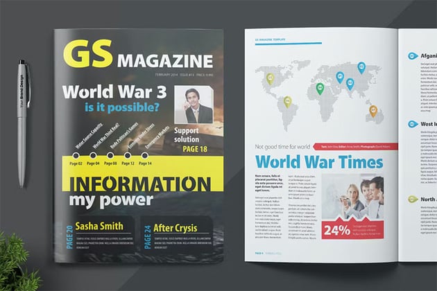

Infographics work particularly well for sports, commentary, and finance magazines. Infographics don’t need to be tricky to recreate—this tutorial shows you how to create simple infographics, including maps and charts, from scratch, directly in Adobe InDesign:


7. Serifs Look Aspirational; Sans Serifs Look Cool
Typeface styles can have particular associations with famous magazines—think of Vogue and think of Didot; think of National Geographic and think of Stone Sans.
We’ve been conditioned over time to associate particular magazine font styles with specific magazine genres, and you can use this to your advantage when designing your own magazines.
So say, for example, you’re designing a fashion magazine. If you want to make it look more expensive, luxurious, and aspirational, you can turn to an elegant magazine font serif like Didot or Bodoni for Vogue-inspired charm.


If you want to make your magazine look cooler and more youthful and trendy, you can take a clean, hip sans serif for a whirl, like Noir Pro.
For sports and tech titles, try out a solid, high-impact sans serif like Frank, or why not try a vintage-inspired typeface like New Yorker Type if you’re designing a commentary title (a fitting tribute to the typeface used by The New Yorker).


8. Make Beautiful Photos the Main Focus
Most people buy magazines for the photos, with the text content playing a secondary supporting role. Keep this in mind when learning how to design a magazine.
Fashion, travel, and nature magazines, like this travel magazine template, will often design layouts around a single beautiful photo.


You don’t need to be restricted to square or rectangular borders either; try setting photos in circular or unusually shaped frames, or use Photoshop to cut away the background from images to make them more flexible to place on stylish layouts.
You should also think about how you’re going to print your magazine and how the print finish will affect the quality of the photos. Most magazines are printed on gloss-coated paper. Gloss-coated paper won’t absorb the ink as much as matte-coated paper during printing, allowing the color to sit on top of the paper and look more vibrant and bright. If your magazine’s going to be full of photos, consider printing the magazine on gloss-coated. This is generally a little pricier than matte, but you can get low-weight gloss papers that are better value and will still give your photo layouts a lovely finish.
Make sure your magazine is ready for print by checking out this helpful guide to prepping for print:


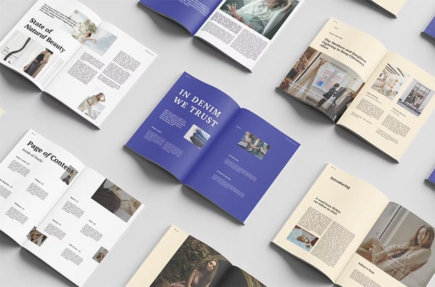
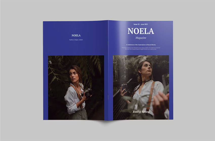
9. Design a Magazine With a Style Theme and Stick to It!
Be inspired by this strongly themed magazine template, which introduces a few key elements on the cover which are carried forward across the inside pages.


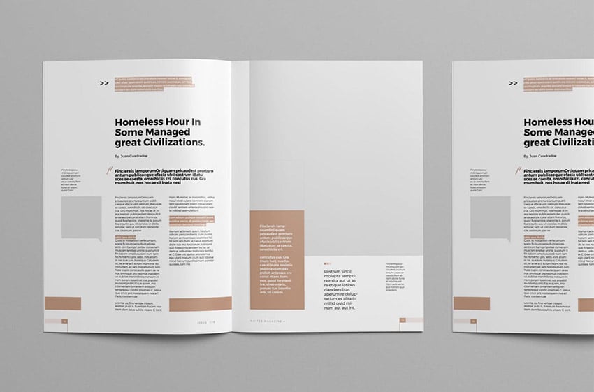


Use this checklist to make sure some or all of these elements are consistent across your magazine style:
- Color palette (choose one to three CMYK colors and use these consistently)
- Typography (use consistent typefaces, type weights, and sizes)
- Shape and graphics (use the same shapes or image borders and graphic elements across the magazine)
- Background color
- Page numbering style and running headers (place these on Parent pages to promote consistency)
10. Think in Spreads, not Pages
You'll notice how the most aesthetically pleasing magazines use them in practice. And that's why magazine spread design is important.
When going into how to create a magazine spread, you can make the experience of reading your magazine more immersive by keeping this mantra in mind while you design: “Think in spreads, not pages.”
If you’re creating your magazine artwork in Adobe InDesign, this is less of an issue as creating magazine spread design is built into the software. Set the document to Facing Pages (File > Document Setup), which will transform the layout into ‘reader’s spreads’ (laid out in the same way as the reader would actually read the magazine).
In terms of the magazine spread design, you shouldn’t be afraid of taking content across the central spine of the magazine spread. Most magazines are perfect bound, which means that the pages are glued to the spine. Unlike with some forms of binding, this means that content sitting towards the inside edge of the page (the edge closest to the spine) is less likely to be sucked into the binding. It’s not wise to place small-scale content like image captions or article text very close to the inside edge, but there’s no problem with placing larger content like headers and images across the inside edges of the spread.
This Fashion Magazine Spread Example uses this technique to create beautiful spreads that extend titles and photos across both pages.


11. A Single Pop of Color Shouts the Loudest!
Teaming a single strong color with black-and-white photography and monochrome text looks fantastic for men’s magazines and technology titles. Bright magazine fonts, banners, and dividers lend a sporty, masculine edge to layouts. It’s simple to achieve and is a great way of bringing the whole design of the magazine together (see Tip 9, above, about promoting a style theme in your designs).
Try an acid yellow or hot red for an optimistic color pop that looks great on extreme sports titles and travel magazines, like on this stylish sports magazine.


A bold red also looks really punchy and adds a modern touch to old-fashioned black-and-white photography when you design a magazine. The Samurai Magazine template shows just how well this magazine cover idea works.


Recap: Best 10 Magazine Tips


Don’t be shy with your cover designs
Get inspired by magazine cover ideas that use bold, punchy typography and photos to grab attention and sell the magazine to a casual browser.
Choose minimalist layout styles for fashion and lifestyle titles
Simple styles help trendy subject matter shine through great magazine spread design.
Spend time perfecting your contents page
As it's the gateway to the rest of your magazine, make sure to give the contents your full attention.
Make your title unique with custom illustrations
Whether vector or hand-drawn, illustrated graphics can stand out in a sea of photographic magazines.
Bring digital style to print with infographics
This is a simple, effective way for magazines to break up text-heavy articles in an aesthetically pleasing way.
Choose typography appropriately
The right typeface can give a particular personality to your magazine.
Make photos the main focus
Beautiful photography should take up at least two-thirds of your magazine; be sure to print it on gloss-coated paper to make the most of stunning pictures.
Create a style theme and stick to it
Apply consistent elements, such as color, shape, and typography, throughout your whole magazine, to make it look super-professional.
Think in spreads, not pages
Design your magazine in two-page doses and allow content to spread across the spine, to create an immersive design.
Use a single pop of color
This is a stylish, subtle way of drawing attention and looks great for sports and tech magazines.
Learn More Magazine With These Resources
The Envato Tuts+ YouTube channel has tutorials covering a wide range of topics. If you're new to InDesign or creating content with magazine templates, Envato Tuts+ on YouTube has you covered.
Our channel can help you with magazine spread design, cool magazine cover ideas, and other tech questions you might have.


The Envato Tuts+ website also features magazine design tutorials. Learn how to recreate the best cool magazine covers like Time, put together an attractive spread design for different types of content, and more.

 How to Make a Time Magazine Cover Template


 How to Create a Page Layout and Magazine Article Template in InDesign

 How to Create Your Own Magazines: A Step-by-Step Guide


 How to Create Your Own Vogue Magazine Cover


 How to Make a Magazine Cover Design (Anatomy of a Magazine Cover)

 How to Create a Zine Template in InDesign

 30 Best Zine Templates (Creative Design Layouts to Download)


 40 Magazine Templates With Creative Print Layout Designs


 27 New Magazine Templates for 2024 (PSD & InDesign Templates)


 25+ Best Stylish Adobe InDesign Magazine Templates (New for 2024)
 By
By


