

Character design comes in many styles, but they all start with the rough sketch. Often overlooked in online tutorials, technique and process videos, they are the foundation to creating quality characters. The following is an overview of rough sketches from some fantastic character design artists, with many different styles and approaches.
Introduction
This article offers the reader an insight into not just the lines themselves on paper — nor just the finished illustration — but rather a look at the thought process of these artists at the rough sketch stage. I've asked a select few character designers whose work I admire to share with us how their characters come to life. I'm going to start off with my own process, and then continue on to share the inspiring work of my fellow character designers.
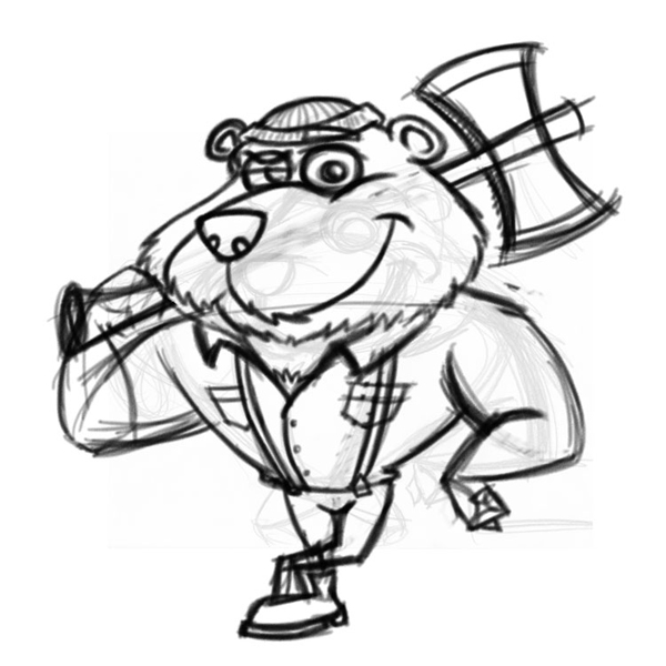
George Coghill
I like to work very loose at the rough sketch stage. In fact, I ordered lead holders from Russia with fat 5.6 mm leads so as to ensure I can't go into detail at this stage in the process. This dovetails with the style of line art I use in my illustration work as well.

As you can see from the rough sketch of this cartoon character I recently created for a client, the initial sketch is very, very loose. What I am looking to achieve here is energy, flow and rhythm. I'm looking to find overall proportions to work with and to see how the shapes are working together, including negative space.
I'll work on 5-10 of these to start with. No eraser, just graphite. I do this specifically to avoid reworking the sketch or focusing too much on details. That comes next.
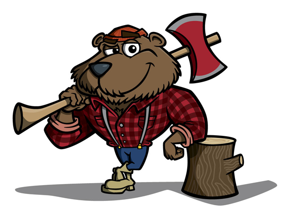
The next step is to bring the loose sketch into Photoshop and refine everything. With a Wacom Intuos4 graphics tablet and the new Rotate Canvas feature in Photoshop CS4, it makes it much easier to mimic the process of sketching on paper, with the added benefit of layers and all the other tools available.
Once the final sketch is complete it is used very closely as a template when creating the final illustration in vector form.
About George
George Coghill is an illustrator and cartoonist who specializes in cartoon character design for mascots and logos. His work can be seen at CoghillCartooning and his blog, and you can follow him on Twitter @gcoghill.
Sergio Ordóñez
After studying the brief of the project, and looking for references, I then start doodling in Photoshop with my Wacom Cintiq. Since I bought it, I have forgotten about paper and pencil and I do everything digitally because it's faster. I can do alot of transformations and corrections that I can't with traditional mediums.
First thing I do is trying to get the right pose that communicates the requested attitude, for the Otter Ninja I was looking for a mean and edgy, but still cute, attitude. I do the traditional dummy and work the pose until it's clear, taking care of proportions and action lines.
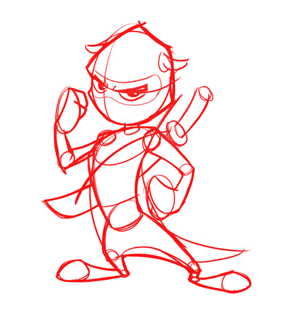
When I'm satisfied with the sketch I put his opacity down, place a layer on top and rework the sketch again and again, adding more and more detail until I get the final sketch.
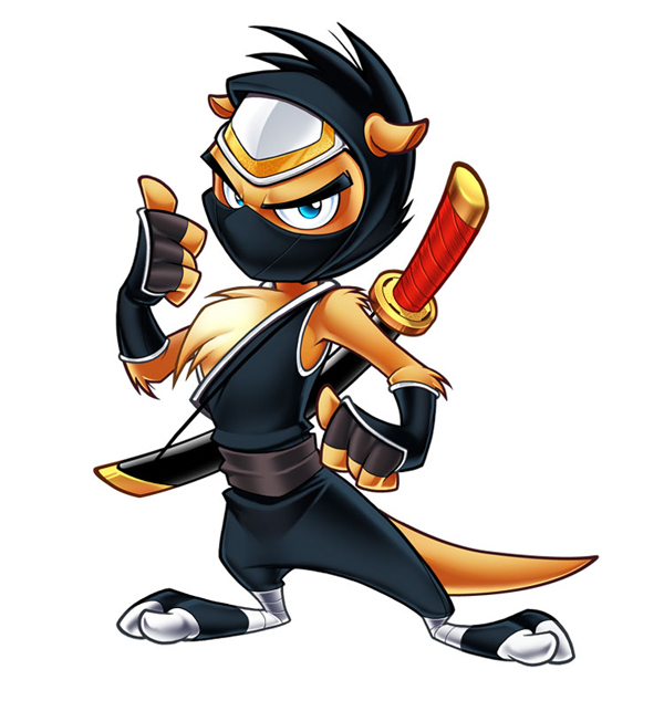
When I get the final sketch I work the final line art in high resolution (around 7000x7000 pixels) with my Wacom Cintiq and Photoshop. If needed I use Illustrator to vectorize the lineart and modify line weights.
About Sergio
Sergio Ordóñez is a 31 years old Spanish freelance web-graphic designer and Illustrator based in Berlin. Check out his blog, portfolio, Twitter and DeviantArt pages.
Glen Southern
Pretty much all my projects start as pencil sketches. Most of my work revolves around 3D modeling but I work out the character design in a Moleskine sketchbook using an HB pencil or a Faber Aquarelle. I do occasionally sketch with my Wacom in Photoshop, but I like the relaxed feeling of pencil on paper.
After I have the initial brief, I spend some time just throwing down some lines in a very loose way just focusing on shape and form and not much else. Once I hit upon a nice shape or silhouette that meets the needs of the job, I start refining it a little and work out more of the details, eyes, features, accessories, etc.

If the design is starting to work, I'll do some rough turnarounds to get a feel of the character in 3D space. If it's going to be modeled I need to be thinking in 3D right from the start. For a character model you can either do a model from reference images imported into viewports, in which case, you need an image representing the front and side profiles.
With box modeling it is much more like working with clay and you refine a character from a basic primitive in a perspective view.
Knowing how I intend to model a project dictates how I will prepare the initial sketch. Having a character worked out in 3D dimensions at pencil stage saves time later down the line.
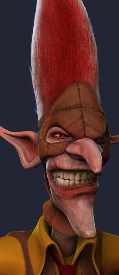
The example I've used here is a character called Spring Heeled Jack and I wanted to nail a tall, spooky looking guy with red hair. I did about five pages of shapes and two of them became the basis for Jack (see Moleskine pages). I firmed up some of his outline and details, then went ahead and sketched out his whole body in a few different poses. I used a strong ink outline over my pencil lines.
About Glen
Glen Southern is a freelance character modeler working from his home studio in Cheshire in the UK. His work is used in television, film, game and toy design.
Check him out online at southerngfx.co.uk, his blog and on Twitter as @southerngfx.
Von Glitschka
Rough sketching for me is like opening up the flood gates of my mind. Some of the images I draw out are appropriate and others aren't and that's OK. On this specific project my daughter stumbled into my studio and she got into the flow of things too. I liked her idea so much I ripped it off and repurposed it. I call this "Genetic Copyright."
Seriously though, I usually use a regular old 2B pencil. 2B or not 2B, that is the pencil. I also might use my mechanical pencil, but rarely since at this stage it's just about capturing ideas and beginning the formulation of visuals and not refining them. I also draw on anything at the moment of inspiration, be it a piece of bond paper, note paper, or napkin. Inspiration hits me at all hours of the day and I can rarely plan for it, so I just make sure to capture it when it comes about.

I am also a doodle horder. Meaning even if I sketch something I won't use I save it, put it into a folder so I can reference it later. I possibly use it as a springboard for another idea. Renewable creative energy, if you will.

About Von
Von Glitscka can be found online at GlitschkaStudios.com and twitter as @vonster.
Katie McDee
When starting a project, I try to get as much information from the client as possible. From there I start with very small rough sketches. At this beginning stage I just try to work out the shapes and quick gesture of the character.
Working small helps me to not get caught up in details (something I tend to do).
Once I have a little sketch that I feel will work well, I start working bigger to tighten the gesture, add details and expression. Oftentimes, this second stage turns into the final sketch (depending on how complex the character design is) or there will be one more, larger and even more tight drawing.
Once I have a final sketch, I send it to the client for approval and then it's color time! My favorite sketching pencils are blue Col-Erase pencils by Prismacolor and plain ol' Bic mechanical pencils.
About Katie
You can see the stuff and junk that Katie likes to draw on her websites: katiemcdee.blogspot.com and katiemcdee.com.
David "Sparky Firepants" Billings
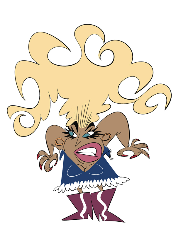
This ninja was created for a client's e-mail campaign. He does non-sucky sound healing. As in not-particularly-nutty-and-hippie sound healing work. He loves using chocolate and ninjas as devices to explain his work, hence the ninja and record cookie.
Usually I'll send a client rough sketches before I dive into the final art, but it also depends on who I'm working with. Sometimes people can get confused and scared by roughs, so sending "final" art to tweak is better for some. It takes alot of getting to know a client to make that decision, and both can work out fine when used with the appropriate person.
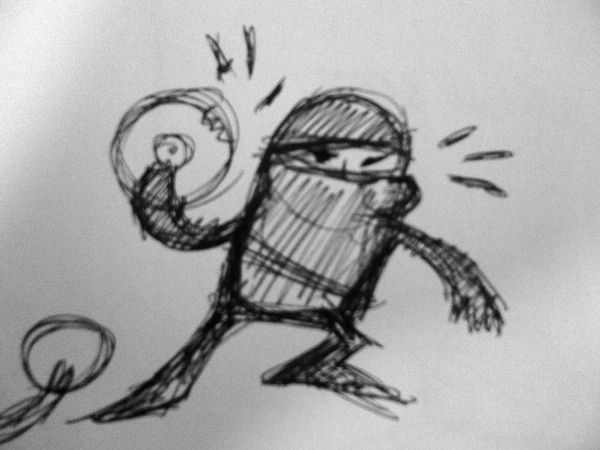
In this case, any sketches I did were only for my sake, so I worked alot rougher than I would if I was showing them to the client. Since I was working while traveling, I used my iPhone to snap a photo of the sketch. This project used ghetto scanning and the roughest sketch ever. The most important parts for me to get down on paper were the energy and basic placement of objects. I also wanted to create this character in a square space to give my client the most options for placing it within his e-mails and web site, so I had to get that down in the sketch.

My process in Illustrator is simple. I put the sketch on a layer, reduce the opacity and lock it. On a new layer, I start creating simple shapes to outline the figure. Then I start tweaking the shapes (no fill yet) to sculpt the character. In the final steps, I'll use brush strokes to create accents and things that require some flair, like his belt, eyebrows, and cuffs. These requires more of a painterly technique, which is mostly where my pen tablet comes in handy. Then I start messing around with colors, which you can see in this case are minimal.
About David
Learn more about how David creates art for clients on his site at sparkyfirepants.com.
Krishna Sadasivam
I generally work loose when I start the character design process. At this stage, I'm focusing on form, proportion, and finding an overall silhouette that reads well - something that captures the essence of the character. The form should add visual information that captures the personality or nature of the character.
The Minotaur, as depicted in the story, was locked up in the labyrinth from a very early age. He was of royal blood, half man and half bull. He feasted on unwitting victims who were dispatched to the labyrinth. I tried to heighten his menacing look by drawing the character with sharp, angular lines. My character design is largely influenced by animation. Details are minimal in favor of simplicity.
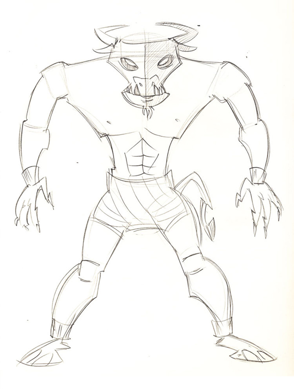
I often experiment with different shapes for both the head and body. For the head, in addition to the overall shape, I like to see the effects of moving the horizontal eye line up or down, or varying the space between the eyes. These techniques, when used singularly or collectively, can create a dramatically different character. The overall goal for me is to find a design that captures the character's personality. The exploration process is the part I enjoy the most!
I leave all the details for the inking stage, which are performed digitally using a Wacom Intuos4 tablet and Corel Painter X. Colors are applied using Photoshop. Lately, my workflow is 100% digital, using a tablet, Painter X and Photoshop CS4.

About Krishna
Krishna M. Sadasivam is a freelance digital illustrator and cartoonist based in Tampa, Florida. His work can be found at SivamStudios.
Frank Hansen
When I first come up with an idea of a character on my own I am usually very excited about and the picture, the character in action poses, doing all sorts of hyper-crazy things. They seem very alive to me, even though in actuality I know very little about how they actually look.
When I am asked to create a character for someone else I usually throw down a few rough shapes, or a face, and eventually I am overcome with the same feeling of excitement that I get about my own character ideas. They then seem very alive again and I see and feel them moving and talking.
My approach to the rough sketch stage is starts with random graphic shapes that hopefully demonstrate the personally or some action I see the character doing in my mind. I try to work this out very fast and loose at first, trying to capture the energy of the character and the enthusiasm I have for drawing them.

These shapes end up being a lot of circles and straight to curve shapes to produce a very flat graphic UPA type of design. Sometimes these rough drawings are the best drawings I create and I spend alot of time trying to duplicate them later in a cleaned up version along with other details like clothes, etc.
About Frank
Frank is a freelance illustrator/artist living in the Los Angeles area. You can visit his site or find him on Twitter.
Chris Leavens
My thought process varies pretty greatly from project to project. On many occasions, a character idea will just sort of pop into my head and I need to sketch it out as quickly as possible. This is how the mastodon-ish cyclops mountain that serves as the focal point for a piece I called "Sanctuary" was born.
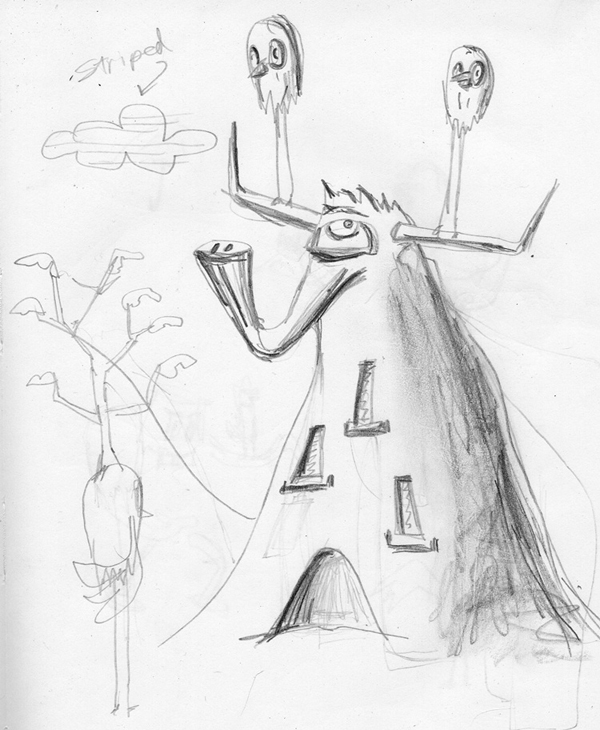
I created the piece specifically for a gallery show I participated in in July, 2009. Basically, I knew I wanted to create a character that was a living structure of some sort, something that was large, gentle-looking, and I definitely wanted an elephant's trunk worked in. If I remember correctly, I ended up drawing in the bent up horns in the original sketch to add a little bit of angular sharpness and masculinity (the forms were a bit to blobby and safe for my taste) and to balance the thin top with the wider mountain base.
A lot of times, bizarre concepts and blends of elements can yield some pretty sinister-looking, demented looking characters, but I really wanted this guy to have a benevolence to him. I think the size and openness of the eye helps to convey that. Also, the lack of shoulders (it is a mountain, after all!) helps quite a bit. The gentle nature of the beast is even further accentuated in the final piece, where I purposely gave all of the other animals, with the exception of the rabbit, a sort of wildly-ambivalent stare. The contrast adds a bit more wisdom and sentience to the mastodon mountain's appearance, I think.
For the most part, when I sketch, it's just to get ideas out. I use my sketches as references for my final work (which I refine and create digitally using Adobe Illustrator), not traceable templates. I usually just sit my sketchbook on my computer desk and redraw the original rough, making adjustments and changes, adding in color, shading, etc.

As a result, my sketches tend to be very rough and sloppy (this is one of my neater ones, believe it or not!). On the contrary, I tend to try to keep my vector drawing as clean and precise as possible, even when they appear loose and free. So most of my thought process and actual conceptualizing comes well after the initial sketch is born.
About Chris
Based in Los Angeles, Chris Leavens works primarily as an illustrator of bizarre creatures and whimsical scenes. More info and images can be found at his portfolio site, on Flickr, or via Twitter.
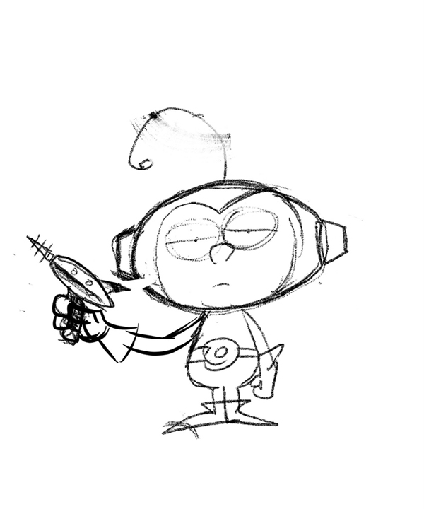
Bob Ostrom
I take several things into consideration before I begin working on a character.Who is this art for? What's the age group andwho should it appeal to?How and where will it be used? All these questions will help me determine the type of art I will need to produce.
I begin to rough out my sketches after I have the basics. Every project is different,but for the most part theprocessis the same. I work up all my rough sketches usinga red mechanical pencil.This is where I makeall my mistakes and try different things.Next Irefine with a 2mmredlead holder. Note: The reason I use red is simply because it's the easiest color to find.

Once the drawing looks good I trace over it using a 2 or 3b graphite pencil. The final step is to scan the illustration and bring it into Photoshop where I use the hue and saturation sliders to remove all the rough red pencil lines. This process saves me a tremendous amount of time and allows me to present a good clean pencil to my client for approval before moving onto the finish stage.
About Bob
My name is Bob Ostrom. I've got the best job in the world. I'm an artist.For the past 21 years I've done all kinds of cool stuff…logos, games, toys, cereal box character designs and even video games, but my favorite thing to work on are children's books. You may have seen some of my books online, at the library, or in your favorite book store. Check out my site or follow me on Twitter @bobostromstudio.
Scott Jackson
As with any design, I start with collecting reference images by using one of the most powerful and useful tool in my collection, which is Google. Back in the day before the advent of the internet the alternative was to scour libraries and bookshops in an expensive, time consuming, and often futile quest. The internet allows me to do this with infinitely more speed and productivity.
Having collated my references, I start to get my ideas and initial sketches down on paper, usually just using cheap copy paper that I also use for my printer. Although I own a Wacom graphics tablet I find this method suits me best as it is portable and I find single sheets of paper are easier to organize my ideas as I can tarea section from a page that I like which something I am reluctant to do when using a sketch pad.
I use a 0.5 mm mechanical pencil to draw using HB leads. The ones that have served and lasted me best are the Pentel P205 pencils. One of which has been with me since collage and still works perfectly today despite being used and abused by my two young sons for their own artwork. I do try to buy decent quality lead as cheap alternatives are often give poor results.
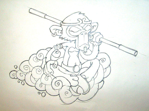
At the early stages of sketching, I have my own mental brief for the feel of the character, like how graphic or illustrative I want it to be and what qualities I'd like it to have. All my sketches start out with simple shapes to build the form and composition and this is the stage where I try to get the character's feel. In this design I'm trying to show Monkey's moody, angry side, but also capture an element of reflection in his thoughts. Kind of post battle, inner turmoil.
Once I've achieved something I'm getting to like, I move over to using a layout pad. My own preference being Goldline A4 layout pads. These are made from semi-transparent (50gsm) paper that is smooth to draw on and relatively inexpensive. They also take ink and markers very well and are perfect for visuals.

I place the rough sketch below the sheet of layout paper, and this is the point where I refine the sketch andinclude more detail. can often make several visuals, making revisions as I go, until I'm happy with the results. It's also the time I start to think about how I'm going to convert it to vectors. However, nothing is set in stone here and things can often change during the vector process and they usually do.
About Scott
Scott Jackson's illustration work can be seen at iamscotty.com.
Bob Canada
This is a sketch and final art of Futureboy, a character I created around 1997. The original version of him was a bit clumsy and complicated, so last year I decided to update and simplify him. There was a time when I would draw incredibly detailed sketches. Now that I draw most of my art digitally instead of on paper, my sketches are becoming rougher. They're more like reminders to draw something later, like a "Don't forget to buy milk" note.
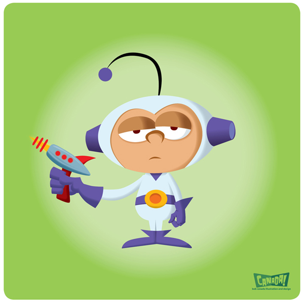
For me, a rough sketch lets me be more creative and spontaneous when I do the final drawing.
About Bob
Bob Canada's work can be found on Flickr and on his illustration blog.
 By
By


