
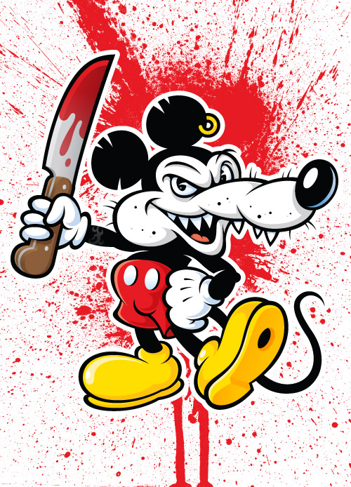
Designing a character can apply to both personal and professional projects. The character can be a mascot that works in the context of a multi-national brand, or it can simply be inspired by a well-known character within pop culture. The later is usually referred to as "Fan Art." The character "Mickey Rat" first appeared in the early 1970's as a subversive underground comic that I enjoyed as a kid. Many artists over the years have taken their own approach with the character, and this article goes over my creation of this vectorized vermin.
Rough Sketching
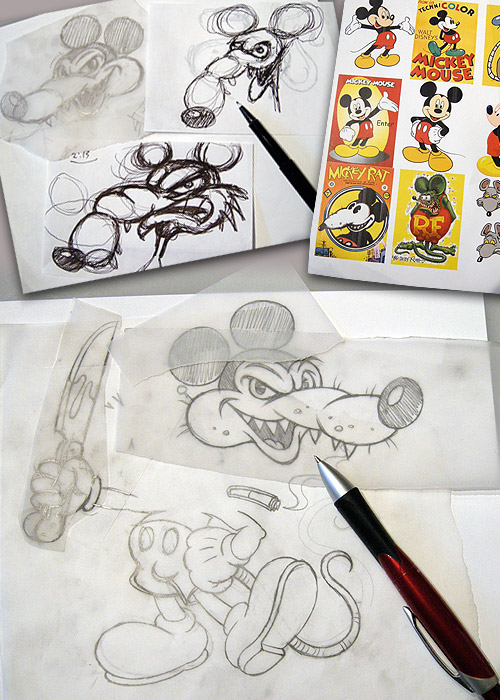
Even though our industry may be digitally driven, ideas are still best developed in analog form. Meaning, you should always work out your ideas by sketching out your visual explorations before you ever jump on a computer.
Good reference, is a must if you are creating a parody such as "Mickey Rat." But with my character I wanted to infuse him with my own personal aesthetic, gleaning attributes from my references that reinforce the subversive stereotype. With character design, universally recognizable visual stereotypes are a good thing.
When I use the term "Stereotype" I'm talking about the specific attributes that make something what it is. For example, if you were drawing an alley cat, the ears should be pointed rather than rounded and so forth.
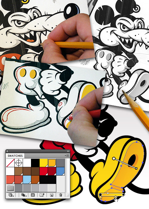
It helps to roughly draw out your art using vellum or tracing paper. Combine that with a light table and it's far easier to make adjustments, redraw, erase until you get your over all composition nailed down.
Refined Sketch
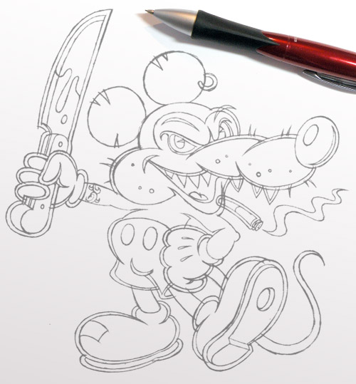
Once you have your "Rough Sketch" done you'll need to draw it out more precisely. Think of this stage as laying a foundation for your vector building. What you are doing is drawing out exactly how you need to build your vector shapes in your drawing program.
This will let you see before you start building your vector shapes how your art is going to look. Doing this will save you time because you'll remove all the guess work when it comes to the build stage, you're simply creating what you've already pre-determined in your "Refined Sketch."
I usually try to draw my art out either larger than what I need or at 100%. I also draw my refined sketch out using a mechanical pencil so my line work is fine and sharp so when I go to use it as my template to build on top of in my drawing program it serves as my vector road map.
Notice how I draw my art out with "Shapes" in mind. That is important because when I go to build it I'll build using shapes, not strokes.
Building Vectors
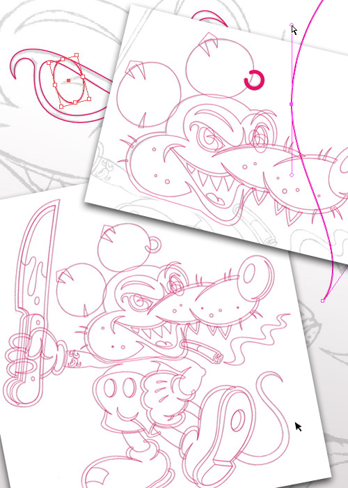
If you've drawn out your art precisely with your "Refined Sketch," then you simply scan it in, place it into your drawing program and lock it on its own layer. From that point it's all about building the art in vectors following your precise drawing as a template for building your vector shapes.
I like to finalize my vector forms before I go to color. So I create all my vector paths first, adjusting them until everything is exactly the way I want it.
There are two fundamental ways to build character art like this in your drawing program. Point by point, adjusting bezier curves to form your art as shown here. The second method will be covered in the next point below.
Build Methods
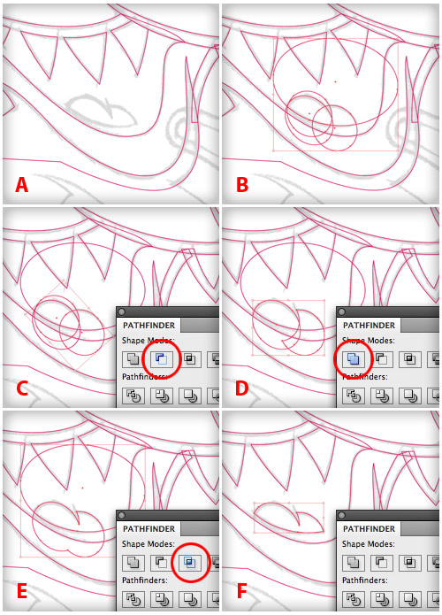
Not all vector building has to be done with the pen tool. Another method for building vector shapes is called "Shape Building."
The vector art you see in the eyes, buttons, hole in the shoe, and ear ring have all been created with "Shape Building" methods. For example I created the tongue in this characters mouth using nothing but the "Ellipse Tool" and the "PathFinder Palette."
- My refined sketch of the tongue.
- Four basic ellipse shapes to form my drawing.
- Select two of the ellipse shapes and "Minus Front" using the PathFinder Palette.
- Select two ellipse shapes and "Unite" using the PathFinder Palette.
- Select the remaining two ellipse shapes and "Intersect" using the PathFinder Palette.
- Final vector shape created by shape building.
Pay Attention to the Details
Even though you draw out all your art before you build it, there is still room to improve your art as you go through the entire creative process. So learn to scrutinize your art, become your own art director and look for areas that you can adjust and improve on.
I noticed the curves in the eye were kind of flat and the end tapered too much at the point. So I went in and adjusted the bezier curves to fix the vector shapes and improve the clarity. This is a good creative habit to get into.

Color, Highlights, and Shading
Once I have my base art done I figure out my color palette and start filling my vector shapes with color, creating blends to give depth and detail.
Even though I build my art digitally I still go back and forth between analog and digital methods throughout the creative process. I print my base vector art out and literally draw out the shading, and the highlights (shown in red), for my character art. I'll then scan this back in and use it as my template to build out my vector shapes.
Texturizing Your Art
Part the of the allure of subversive art like this is the shock value. Why would a lovable character be welding a bloody knife? Who knows, it just looked cool and fit with a dastardly vermin persona.
I wanted to play off of that. So I created a nice splatter texture. A little black Tempera paint splattered on some cardboard in my garage sufficed. I then scanned it in and created a bitmap tiff. I placed this into my drawing program and colorized it. I also experimented with other textures but ultimately didn't use them.

Final Art
To off-set the character from the background a bit, I copied the black silhouette shape of the character and pasted it to the back. Then I filled it with white and set the stroke thick to create the white halo effect.
I also decided my incarnation of this character needed a tattoo, so I created a nice tribal styled wrap for his arm.
Analog + Digital = Success!
Whether your character is meant to represent a corporate entity, a product, a service, or just a personal fan art project such as the one I've documented here, the creative process will be the same.
Learn to combine solid drawing skills (Analog) with precision vector building (Digital) to create a winning combination on all your creative projects.
Illustration Class
For more information about other "Character Design" tutorials and to take a sneak peek inside the creative process on real-world design projects for commercial purposes visit illustrationclass.com" and search using the keyword "Character."
 By
By


