

Typographic logo design in Adobe Illustrator
In this tutorial, you'll learn how to use Adobe Illustrator to customize type and create interesting logo designs.
We’ll walk through:
- The anatomy of type
- Good font pairings
- How to customize letters
- Building complete typographic logos from scratch
Let's get to it!
The anatomy of type
Let's start by looking at the following diagram labeled with various typographic terms.


Let's start with the anatomy of typography from the right:
- Cap line or cap height marks the height of capital letters and ascenders.
- X-height is the top of lowercase letters. Some letters like “a” and “p” extend beyond this.
- Baseline is where most letters sit.
- Beard line is where descenders (like in “p” or “y”) land.
Then, we have the parts of the letters:
- Bar. The horizontal stroke on a “T”.
- Beak. A pointed terminal, kind of like a bird's beak.
- Stem. A vertical main stroke.
- Tail. The decorative extension on a “y”.
- Serif. The little feet at the end of strokes in serif fonts. Fonts without these are called sans serif.
Other parts include:
- Counter. The negative space in letters like “O”.
- Ear. A small projection on top, like the one on a “g”.
- Link. Connects the ear to the loop in a “g”.
- Loop. The rounded lower part of a “g”.
- Bracket. The curved or wedge-like connection between the stem and serif.
- Terminal. The end of a stroke.
- Bowl. A fully enclosed, rounded part.
- Spur. A small projection on the bottom, like the one on an “a”.
- Descender. The descender extends below the baseline.
- Ascender. The ascender extends above the x-height.
- Shoulder. A curved stroke from stem to stem.
- Stroke. A straight or curved line in a letter.
It helps to keep the labeled diagram nearby for quick refreshers; especially since some of these terms are referenced a lot.
How to pair logo fonts
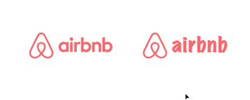
Let’s look at the Airbnb logo and a fictional jewelry brand called Elegancia, meant to evoke quality and timelessness.
The Airbnb font (which is called Cereal) is clean, modern, and a bit playful, which is great for a friendly and inclusive brand.
We’ll start by copying the Airbnb logo mark and retyping the brand name with Illustrator's Type Tool. Let’s try some alternatives to see how different fonts change the feel.
- Times New Roman: Too formal and traditional, it clashes with the playful Airbnb mark.
- Impact: Too bold and aggressive, it's not a great match either.
- Papyrus: Looks like a meme, distressed and unprofessional.
- Roboto (Medium): Better option, but generic and lacks the friendliness of the Airbnb font.
- Marker Felt: With an artistic style, it would work for an art-and-crafts-oriented brand, but not for Airbnb.


Keep these tips in mind:
- Good font pairings match in tone, weight, and personality.
- Avoid fonts that are too formal, aggressive, decorative, or generic.
- A brand's font should reflect its values, voice, and audience (there's a whole world behind the psychology of fonts!)
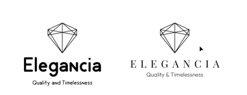
Now, we have our Elegancia logo. Let’s try something for this brand:
- Start with Playfair Display, a serif font with a premium feel.
- Change the text to all caps and increase the tracking.
- Change the font of the tagline “Quality & Timelessness” to Outfit ExtraLight, a sans serif.
- Make sure the tagline is smaller than the brand name.
- Adjust the spacing for balance.
Here's the before and after look of our Elegancia typographic logo design:


Remember to use breathing room and avoid squishing or over-spacing elements. You can even reuse elements (like the height of a letter) as a reference to maintain consistent spacing.
Serif and sans serif font pairings are always a good idea. Feel free to play with different options until you find the pairing that speaks to your project.
How to customize letters to create a logomark
Let's use the Ogilvy logo as inspiration for this exercise.
We’ll use Baskerville as a base. We'll customize the letters to try to get closer to the original type.
- Duplicate the Ogilvy text in the Baskerville font.
- Go to Type > Create Outlines. Then, ungroup everything.


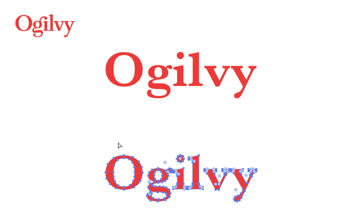
So, the Ogilvy logo has something called a ligature: this is the combination of two different characters into a single glyph. In this case, the ear of the "g" becomes the dot on the "i".
Let's try to recreate that:
- Stretch and distort the text a tiny bit to make it a bit more vertical (this is usually a big no-no, but it works in this particular case).
- Use the Direct Selection Tool to delete the dot on the "i" and the ear on the “g”.
- Use the Pen Tool (P) to reconnect paths on the "g".
- Create a new dot and ear using the Ellipse Tool.
- Rotate the ear, and adjust its weight and alignment to match the existing type.


To smooth jagged areas:
- Use the Pencil Tool (N) with high smoothness.
- Redraw over existing paths to modify them.
- Use the Smooth Tool to refine curves.


For the final touches:
- Expand the strokes.
- Use the Pathfinder to merge the ear and the dot into a ligature.
- Smooth out any kinks.
Wrap things up by checking and adjusting the kerning. Zoom out to spot any spacing issues, tighten the gaps between the letters, and align everything precisely.
Here's how our final Ogilvy logo customization looks like:


Ligatures, glyphs, and stylistic alternates
Ligatures are those creative character combinations that enhance your type. The following technique will help you quickly improve a boring typography design.
We’ll use the Cinema Sunday font, available on Envato. It's a gorgeous font with ligatures.
Write “Sunday chill” on your Illustrator canvas. We'll play with this typographic design by doing the following:
- Duplicate the “Sunday chill” text and apply the Cinema Sunday font.
- Go to Type > Glyphs. Select Alternates For Current Selection from the dropdown list.
- Grab the Type Tool. If you select individual characters or pairs, you can change them.
- Swap in stylistic alternates, replacing letters with different versions.
- Insert discretionary ligatures for more flair.


Just double-click to apply! Not every font has these options, but when they do, it transforms your design fast.
Always remember to explore the glyph panel before judging a font.
Unlimited downloads with Envato
With Envato, you get access to unlimited downloads of 22+ million creative assets and access to Envato AI Labs.
Find everything for your upcoming project, including fonts, graphic templates, Illustrator add-ons, and so much more.
Design a logo + icon by customizing a font
Our app for this exercise is going to be called "Chat". So type that name, duplicate the logo, and let's get started!
We'll use the font Siphon. Again: select the text, create outlines, and ungroup everything. We can now begin customizing:
- Mirror the angle from the “t” onto the “h” using a triangle shape.
- Align the “C” and the “h” to form a cut-through visual line. Use a literal line for the alignment, enlarging the ascender of the "h" and adjusting the triangle to keep the angle we just made.
- Adjust the kerning and letter height manually.
- Use the Reflect Tool to duplicate symmetrical parts. For the “C”, mirror the top half to the bottom for balance.


Here's how it's looking so far:


Now, let’s make it an app icon by turning the C into a speech bubble:
- Draw the tail of the speech bubble using the Arc Tool: draw a line, duplicate it, and rotate the copy.
- Select the endpoint and press Ctrl+J to join both lines and close the shape on both sides.
- Convert strokes to fills.
- Round the bottom corner of the shape so it's not too sharp.
- Align the shape with the "C". When you're happy with the alignment, select the shape and subtract it from the lettering using the Pathfinder Tool.
- Add three dots and align them in the middle of the "C" counter space.


Finalize by creating a copy of the "C" turned into the speech bubble with the three dots. Apply a white color and place it inside the app square.
Adjust the size and align it to the center of the app icon.


Design a custom logotype
We’ll recreate a modern version of the logo for the game Mordhau.
Start by drawing guides (Command/Ctrl+R), and then begin building with strokes set to 30pt. Use geometric shapes and a monospaced structure, where each letter has the same width.
- Duplicate shapes where possible.
- Delete and modify paths to shape the letters.
- Use Shift for consistent angles (like 45°).
- Use the Reflect Tool for symmetry.
- For letters like “M” and "D", build one half and reflect it.


Use colored blocks or guides to space letters consistently.
When finished:
- Expand and merge all paths.
- Clean up the edges.
- Add a background and align the final design.
And there's our custom logo, designed all from scratch!


Wrapping up
We’ve covered everything from the anatomy of typography and how to pair fonts to customizing letters, glyphs, and designing logos from scratch.
Hope you had fun following along! If you want to take your typography knowledge and Illustrator skills to the next level, check these other articles:

 The Ultimate Guide to Typography Basics


 A to Z of Typography: Terms, Tips, Tricks, and Hacks!

 How to Add Fonts to Illustrator


 How to Adjust Leading in Illustrator

 Hand Lettering: How to Vector Your Letterforms


 How to create a Studio Ghibli-inspired text effect


 How to create a lettering design in Adobe Illustrator


 How to invert a logo correctly


