


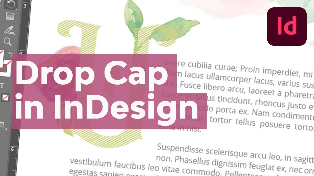
In this tutorial, we'll take a look at how to do a drop cap in InDesign. We'll start with the basics, and then explore ways you could expand your drop cap design. Whether you're designing for a magazine spread, a book, or another document, these concepts will help you create a beautiful drop cap.
What You Will Need
This tutorial uses the following assets:
- Grantmouth Vol.2 Typeface Drop Cap Font
- Floral Watercolor Illustrations
- Watercolor Brush Strokes
- Open Sans Free Font
Feel free to download these assets as your work along. Or you can work with a different drop cap font, illustrations, and other assets of your own if you prefer.
Follow along with us over on our Envato Tuts+ YouTube channel:
What Is a Drop Cap?
So, what is drop cap text? Let's begin with a drop cap definition and example.
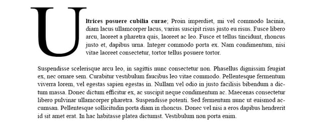
A drop cap is the first letter of a sentence or paragraph that's been made larger than the rest of the text. It spans more than one line of your paragraph and is usually included for visual interest.


Drop caps can be a fun idea for the beginning of an article, the start of a chapter, or other design scenarios. Thankfully, it's easy to create a drop cap in Adobe InDesign. Let's dig right in.
How to Do a Drop Cap in InDesign
Step 1
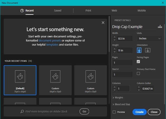
Begin in a New Document, by going File > New. I'll be working at US Letter size, or 8.5 inches wide by 11 inches tall.

Step 2
Then, select the Type Tool in your Tools panel.
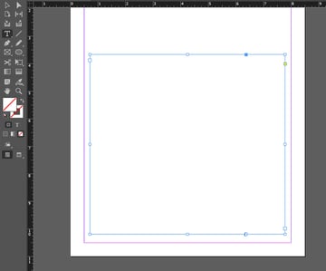
Click and drag on your document to create a large, paragraph-sized text box. It doesn't have to be perfect. You can click and drag on the resize handles at any time to resize it.


Step 3
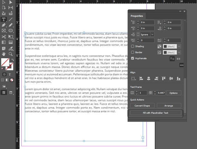
Next, Paste a paragraph's worth of content into your text box. This could be body copy from your project. Or, if you don't have any text to experiment with, you can use Lorem Ipsum.
You can also go to the Properties panel and select Fill with Placeholder Text. This will also use lorem ipsum dummy copy. Choose whichever option you prefer.


Step 4
Next, open up the Paragraph panel. You can find it by going to Window > Type & Tables > Paragraph. Here's a preview of what the Paragraph panel looks like.


Step 5
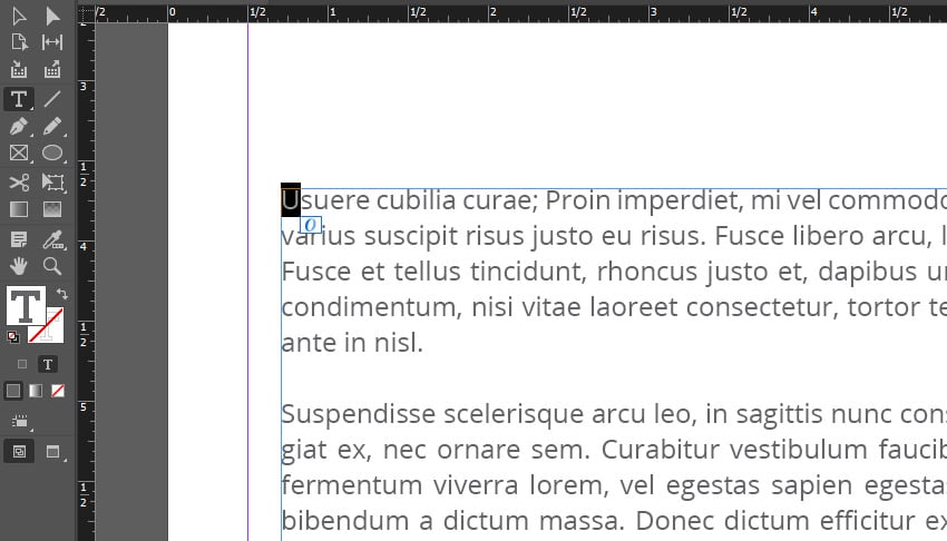
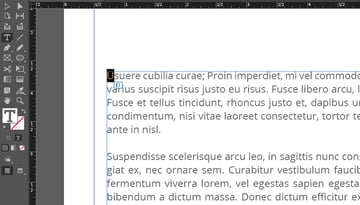
With the Type Tool active, select the first letter of your paragraph. It should be highlighted, as shown in the example below.
Tip: You can zoom in with Zoom tool, in your Tools panel, if you need a closer look!

Step 6
With your first letter selected, return to the Paragraph panel.
Edit the Drop Cap Number of Lines value, highlighted below. I went with a value of 10. Choose whatever best suits the look and feel you prefer.


Step 7
We've created a basic drop cap InDesign example here, but we could push our drop cap design further.
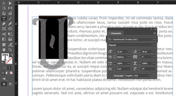
Let's start by changing the drop cap font. Open the Character panel by going to Window > Type & Tables > Character.
Then, select the Type Tool. Use it to select and highlight your drop cap. We can then turn to the font dropdown in the Character panel to change the font.
I'll use Grantmouth Vol.2 Typeface in this example. It's a vintage display font, and it'll command a lot of attention against a neutral sans serif.


Step 8
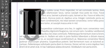
We can also change the font color. Again, you'll need to select the drop cap character with your Type Tool.
Then, turn to your Tools panel. Click the T symbol beneath your Stroke and Fill Color. This makes your color selections apply to text. We can then choose a new color by clicking on the Fill Color.


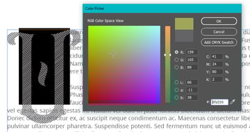
Step 9
Using the Color Picker, I selected a light green color. Once you're happy with your selection, click OK.


Step 10
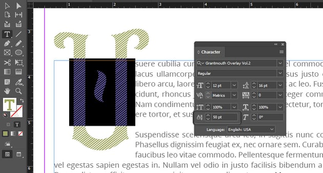
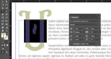
But the drop cap isn't sitting quite right on the paragraph. We can adjust this in the Character panel.
With the drop cap selected, raise the baseline 50 points using the Baseline Shift. It's highlighted in the screenshot below.

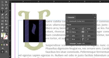
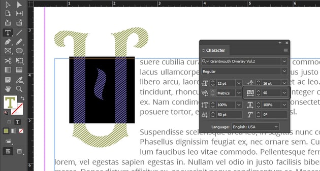
Step 11
Let's also adjust the Tracking in the Character panel. Select the drop cap, and then set the Tracking to 40. Notice how this moves the body copy away from the drop cap.

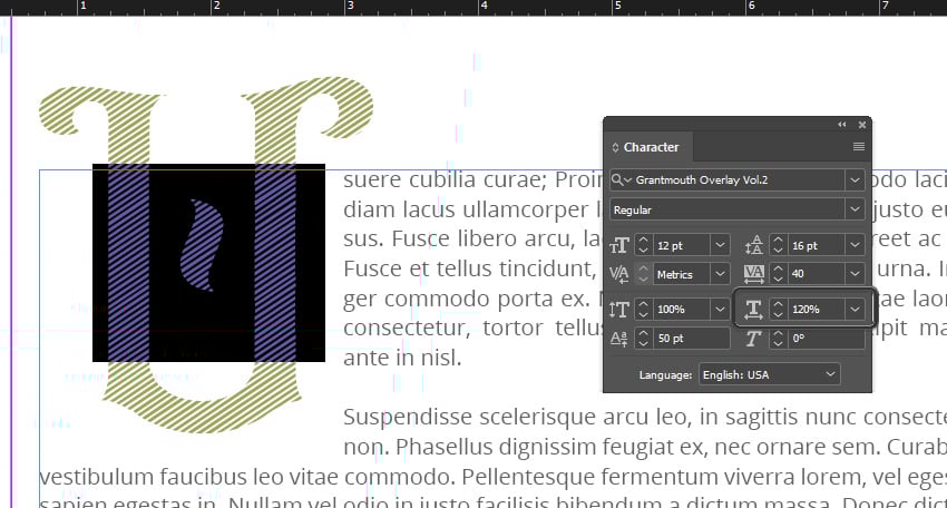
Step 12
We can also scale the drop cap from the Character Panel. For example, I adjusted the Horizontal Scale to 120%, making it a little wider. Experiment with these values, but don't distort the type too much.


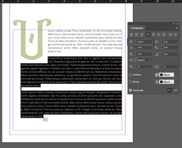
Step 13
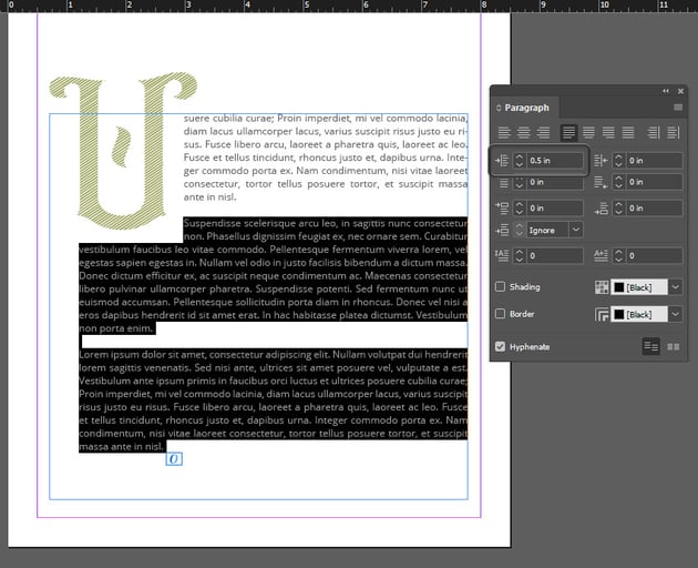
The following paragraphs don't quite line up with the drop cap the way I'd like them to. We can adjust this in the Paragraph panel.
Select the extra paragraphs using the Type Tool. Then, we can adjust the Left Indent. I went with 0.5 points here to better align the left indent with the drop cap.

Step 14
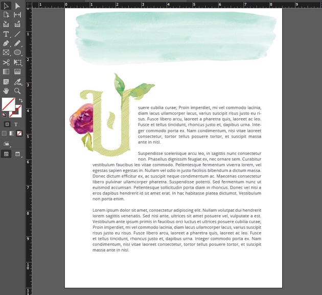
Next, let's dress things up with some imagery. I'm going to use watercolor graphics from this pretty watercolor illustration set.
Import your imagery by going to File > Place. Select the file from your computer, and then click OK. We can then click and drag to place our image into our document.

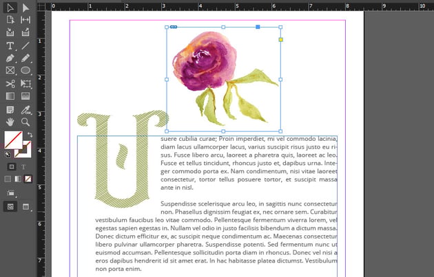

Step 15
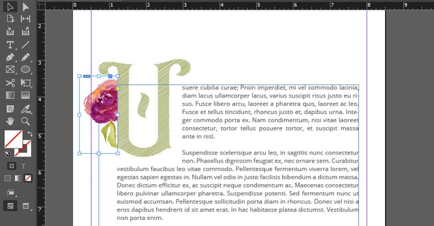
Resize this image and place it near your drop cap.
You can also crop the image by resizing the rectangle frame holding it. In this example, I adjusted the frame so that any content overlapping the drop cap is no longer visible.


Step 16
Repeat these steps to dress up your layout. I placed two more images here: some leaves and a watercolor brush stroke.
Dress up your drop cap design any way you like! This is just one possible drop cap InDesign example.
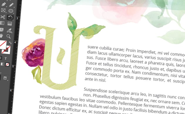
Tip: Want to preview your work without seeing any guides or rectangular frames? Go to View > Overprint Preview. Then, go to View > Grids & Guides > Hide Guides. This will give you a preview with these visual guides hidden, like the preview below.


What Kind of Drop Cap Design Would You Create?
Now that we've looked at how to do a drop cap in InDesign, what kind of drop cap design would you make? There are so many possibilities here.


If you're looking for some design inspiration, check out these fonts from Envato Elements. They make awesome monogram fonts, drop cap fonts, and more.
1. Ciera Watercolor Font and Florals

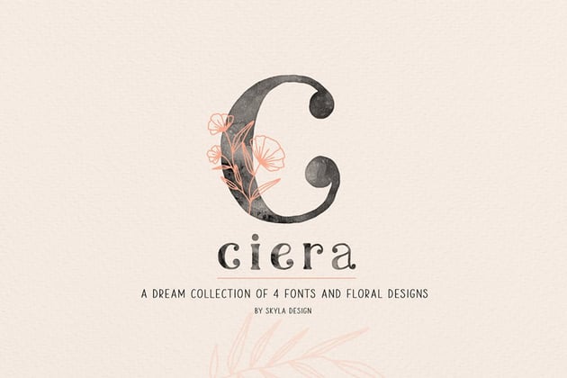

This font download includes four font files, floral design elements, and SVG files too. Use this one for your next drop cap, or use it for a logo design concept.
2. Mellica Split Monogram Font


Check out this stylish monogram font. Doesn't it take an interesting design approach? It's an eye-catching display font with a lot of potential.
3. Rancho Spicy Display Font


How about a different aesthetic? This display font has a vintage feel, and it could definitely command attention when used as a drop cap font. Experiment with aesthetics in your drop cap designs.
4. Brown Floral Monogram Font

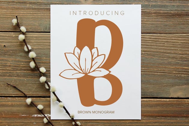
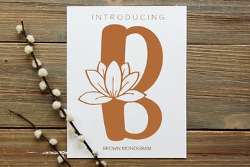
The chunky, hand-drawn aesthetic is a great fit for florals. If you're looking for a personal, organic touch, give this font a try. It includes SVG and EPS files, too.
5. Forest Line Font Condensed Display Font


Imagine this stylish display font in your drop cap design. It's an awesome fit for stylish monogram designs too. Choose from the included widths to craft different aesthetics.
Love Adobe InDesign? Check Out These Free Tutorials
Looking for even more on Adobe InDesign? Check out the free tutorials at Envato Tuts+. This is just a taste of all the free content you can enjoy right now. Push your InDesign skills further, learn something new, and have fun.

 42 Best InDesign Template Tutorials


 How to Create a Simple Magazine Template in Adobe InDesign


 How to Make a Book Layout Template in InDesign


 How to Create a Resume

 How to Customise a Business Card Template in Adobe InDesign

 How to Curve Text in InDesign


 How to Make an Image Black and White in InDesign


