

Hi, my name is Jesse Hora Dot Com. This tutorial will guide you through the process I use when creating an illustration, more specifically the technique of creating what I like to call an object illustration.
You can find the source files in the directory labeled "source" that came in the files that you downloaded. You may wish to look through them briefly before we begin.
Step 1 - Concept
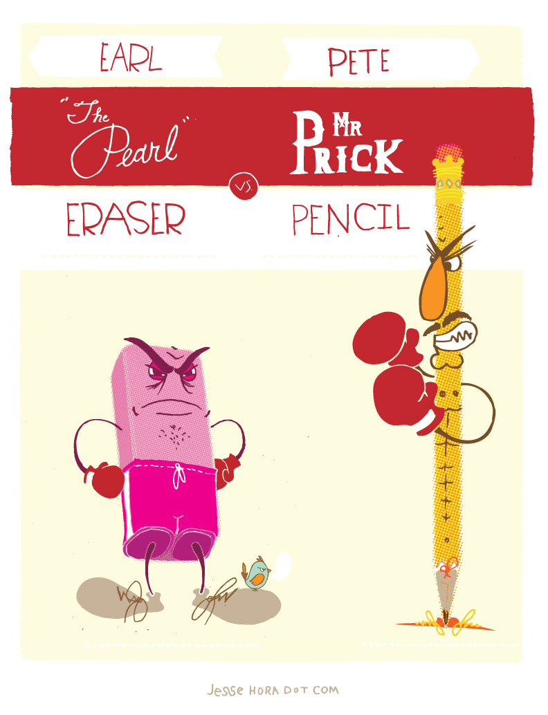
Since this is a tutorial about the technical process of creating vector (art)work, which is serious stuff, I thought it would be a nice contrast to choose content/imagery that was simple and playful. There is nothing more simple than a good ol' pencil and paper. Classic. So I started thinking and came up with the idea of doing a "Pencil vs. Eraser" illustration, inspired by vintage boxing posters, but with my twist. Concept complete, time to get to work.


Step 2a - Sketch
When coming up with ideas I always like to quickly sketch out the idea, initially just to get it on paper so I don't for get it, but also to start thinking about how it will work visually. Here is the initial super quick sketch.


Step 2b - Refine Sketch
Like most illustrators I like to draw an illustration a few times, so I start to understand how the shapes/forms/lines work (its sort of hard to explain why, but it really does help).


Step 3 - Refine Sketch
Now, I need to switch gears and prepare the images that I'll be illustrating. I snapped a couple quick little photos of the objects, you can find the original source files in the directory labeled "source" that came in the files that you downloaded. I propped the eraser up a bit with a folded up sticky note to get the right angle. You didn't need to know that, but I just want to be completely transparent.


Step 4 - Photograph
I am not a pro photographer by any means so I need to clean up the eraser and pencil photos. I am not going to show every little step here, because this is a vector tutorial, but its a fairly simple process.
For the eraser photo, select the Crop Tool and crop it to a manageable size. Go to Image > Rotate the Canvas 90 CCW. Now go to Edit > Transform > Flip Horizontal, then adjust Levels (Command + L). Cut out the eraser (however you prefer), I used the Magnetic Lasso and cleaned it up in a quick mask.
For the pencil photo go to Image > Rotate Canvas 90 CW. Adjust levels (Command + L). Cut out the eraser (however you prefer), I used the Polygonal Lasso and cleaned it up in a quick mask.
Save both files as a TIFF or PSD.


Step 5a - Object Outline
Finally, let's get into the vector stuff. Open both the files in Adobe Illustrator and using the Pen Tool create the outline of the objects. The eraser image is a bit easier so I will do that first.


Step 5b - Interior Lines (eraser)
Besides the outline (silhouette) the only other lines I will need are the edges of the eraser. It's good to have these lines for two reasons; first so I know where to draw the arms and legs of the character. And second because later on you might need the interior shapes to help define the object.


Step 5c - More Lines
Now for the pencil. Again using the Pen Tool, I will simply outline the object. On the right is a close up so that you can see I'm simply just drawing the outside shape of the pencil. Save both pencil and eraser files as AI files.


Step 5d - Interior Lines (pencil)
Because there are so many small lines and contours that could be described on a pencil I will need to decide what lines I will need and which details can be left out. The metal piece is really the only problem area, so I decide to simplify the image. I am focusing less on describing the photograph perfectly and looking more at the form of the pencil. I use the keyboard shortcut Command + Y a lot here to look at just the outlines. Keep checking how complex the line-work is getting altogether. Too many lines will mud up the image.


Step 5e - Oops!
OK, I didn't plan for this step, but I'm going to be completely transparent and show my mistake. The pencil image is far too tall to work within the illustration. There is a decent amount of detail that I am trying to get in the pencil. I need to shorten the length of the pencil so that the width can grow. I will fix it by Photoshopping out a section of the middle of the pencil and Save as an updated pencil image. I always like to save multiple versions, but thats my preference. You can save over the original if needed as well.
I will also need to fix the outline in the Illustrator file, which is actually fairly easy. Just open your updated pencil file in Adobe Illustrator, copy the original pencil outline you made in the previous AI file, and paste it on top (Command + F) of the updated pencil image. Since you pasted in front (or on top of) the new image, everything is lined up. All you need to do now is grab the Direct Selection (white arrow) and select the tip of the pencil until it lines up with the new image, then Save.


Step 6 - Print Guideline
OK, after all of those shenanigans, it's time for the fun stuff. Open a new file in Illustrator and into it copy and paste the vector outlines of both objects. I like to drop the weight of the lines to a hair line (.25) weight. Now let's print (Command + P) this! These print outs will serve as guidelines for drawing the characters. Printing out a few copies will allow plenty of room for error and restarting while drawing.


Step 7 - Draw
Next, I'll take the print outs and draw directly on them, or sometimes I like to use a light box and use a new sheet of paper. Here are a few of the initial practice drawings. At this point I'm drawing different parts of the illustration a few times to really refine the final character. I might add in some funny stuff like a mustache or a bird sitting on one of the characters.


Step 8 - Scan
Here are the final drawings I scanned. On the left I have redrawn the line-work I create in illustrator, this will come in handy later. A technique that I use to make building the character easier is drawing overlapping areas separately. For example, I will draw the shoelaces separately from the shoe, because when I compile the drawings it makes it easier to work with elements individually.


Step 9 - Refine
Now in Photoshop I'm going to prep the artwork to be vectorized in Illustrator. Adjust the Levels (Image > Adjust > Levels) to get the image at a good black/white balance. Using Threshold (Image > Adjustments > Threshold), I make the line-work only black and white pixels.
You'll notice that I have taken out the lines that define the outside of the objects. I did this because I'm going to be using a combination of the shapes inside the line-work and the actual drawn lines, so having all the line work connect will cause problems later. Also, as you can see next to the pencil image (left) I have drawn a version of the object that is strictly the outlines traced off the photos, as I might need them later for backup. I zoomed in on the eraser character so you can see a bit more detail, but I also drew the outlines of the eraser.


Step 10 - Halftone
Since I'm already in Photoshop I will now finish up the work on the object photos (remember those?). Once I have the images open in Photoshop, I will perform the same process on each image. Go to Image > Mode > Grayscale. Then Filter > Pixelate > Color Halftone. 8 is the standard pixel dimension, and usually works pretty well, but depending on the image you are manipulating, it can take some trial and error. Since you are in grayscale, the image will turn into a pattern of black dots.


Step 11 - Live Trace
Now I basically have four different important files, the halftone photo images and drawn lines for both the eraser and pencil. I will run all these files through the same exact process. Since each image is strictly black and white, using Live Trace in Illustrator is a breeze.
Open the image in Illustrator, make sure you select the image, and go to Object > Live Trace > Tracing Options. In the dialog box that pops up there are numerous adjustments and settings that can be used to refine your image. After using this function a zillion times I have stored the settings that I prefer, which are as follows; Mode of Black and White, Threshold at 128, Blur at 0, Fills at check, Strokes set to No Check, Path Fitting at 1.5px , Min Area at 2px, and Corner Angle at 1.5. Hit Trace and then Expand (top, center) and just like that you have vector goodness.


Step 12a - Compile
I like to do each character in a separate file, but it is the same process for each character, so I will explain the basic steps. Open a new document and paste in the halftone image (pink), hit Command + 2 (lock). Next go to eraser charter line-work file and select all (Command + A), go back to the new file and paste the vectorized line-work in front (Command + F) of the halftone image. Here I have colored the eraser image pink and pasted the black and white line-work on top. I also have deleted the large white background shape so that you can see what I mean.


Step 12b - Shape Solutions
Lucky for you I made another mistake and didn't draw the arms of the eraser as a separate shape. I first copy the shape I want and paste in front (Command + F). In this case, it's the shape that makes the arms, but unfortunately most of the other line-work is connected. Next, I draw (using the Pen Tool) a shape around what I want to keep, which in this case is the arms. Then I select the black shape and hit the Intersect Shape Areas on the Pathfinder palette. Then hit expand (on the same palette). All fixed now. When I delete the black line-work layer the eraser will still have arms.


Step 13a - Color
Since this illustration style is cartoonish and simple, the colors are based on what describes the shape best, and what makes the most sense. I really don't have a process for this. I just start selecting shapes and choosing colors. Also, I draw object outlines (remember I mentioned I might need those later) behind the halftone.


Step 13b - Finisher
The last thing I do is hide the black line-work shape (click on the eye icon in the layers palette) and paste the drawn object outline (remember I mentioned I might need those later) behind the halftone.


Step 14 - Finished
Hip hip Hooray! I followed a similar process to create the pencil character.


Final Image
To finish off the illustration, I created some had drawn type (could be a whole new tut on its own) and created a simple vintage boxing poster motif. Thats all folks!
Learn more about me and my process at JesseHora.com. The final image is below. You can view the large version here.
 By
By


