
Welcome back, space cadets! Today we have another special mission for you, in which you will be recreating the planets from our own Solar System in the form of an icon pack, using nothing other than our uber-powerful Illustrator.
So grab your ration of soylent and buckle in tight since in the
following minutes things are about to get heavy, if you know what I mean.
You can always expand the universe by heading over to Envato Market, where you’ll find tons of great icon packs with just a press of a button.
1. Set Up the New Document
Before we set off to creating the actual planets, let’s take a couple of seconds and set up our project’s “parameters”.
First, either go to File > New or use the Control-N keyboard shortcut to create a New Document, which we will adjust using the following settings:
- Number of Artboards: 1
- Width: 800 px
- Height: 600 px
- Units: Pixels
And from the Advanced tab:
- Color Mode: RGB
- Raster Effects: Screen (72 ppi)
- Align New Objects to Pixel Grid: checked

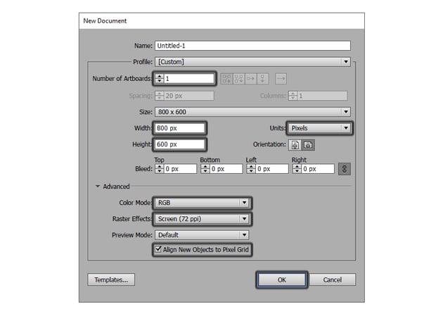

Quick tip: most of the indicated settings can be triggered by setting the document’s Profile to Web; the only one that won’t be automatically set is the Size, which you will have to manually select.
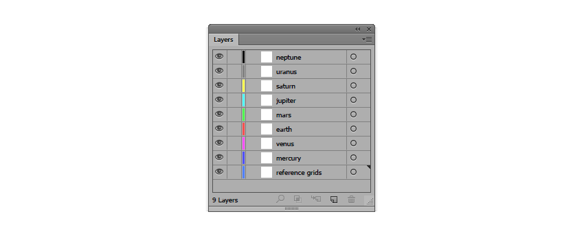
2. Set Up the Layers
Once we have our document, we can engage in layering our project, which will help us maintain a steady workflow by focusing on one icon at a time.
So, using the Layers panel, create a total of nine layers, which we will rename as follows:
- reference grids
- mercury
- venus
- earth
- mars
- jupiter
- saturn
- uranus
- neptune

The way that we’re going to be using these layers is fairly simple. First, we’ll make sure that all the layers except the one that we are currently working on are locked, by clicking on the little empty box (the Toggles Lock) found next to the eye icon.
As soon as we’ve finished creating the icon, we’ll lock its layer and then move on to the next one, repeating the same process until we’ve managed to create all of them.
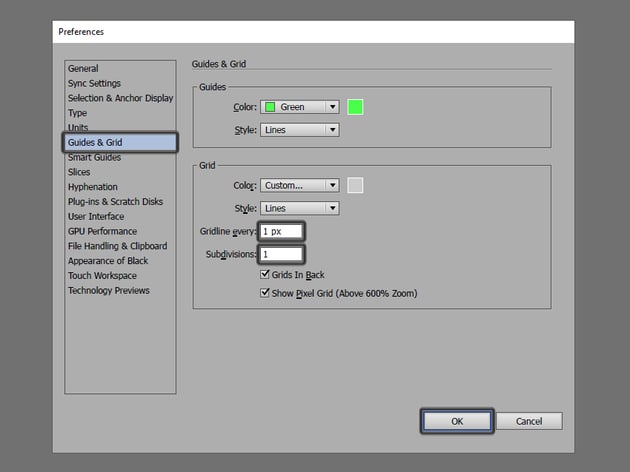
3. Set Up a Custom Grid
Since Illustrator lets us take advantage of its powerful Grid, we will want to set it up using the lowest possible values, so that we can have full control over our shapes by making sure they are perfectly snapped to the underlying Pixel Grid.
The settings that we’re interested in can be found under the Edit > Preferences > Guides & Grid submenu, and should be adjusted as follows:
- Gridline every: 1 px
- Subdivisions: 1
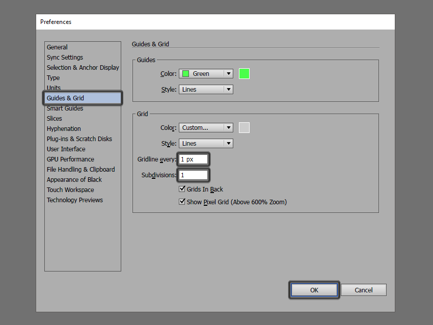

Quick tip: you can learn more about grids by reading this in-depth piece on how Illustrator’s Grid System works.
Once we’ve set up our custom grid, all we need to do in order to make sure our shapes look crisp is enable the Snap to Grid option found under the View menu, which will transform into Snap to Pixel each time you enter Pixel Preview mode.
Now, since we’re aiming to create the icons using a pixel-perfect workflow, I highly recommend you go through my how to create pixel-perfect artwork tutorial, which will help you widen your technical skills and get you up to warp speed in no time.
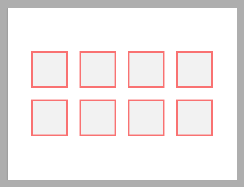
4. Create the Reference Grids
The Reference Grids (or Base Grids) are a set of precisely
delimited reference surfaces, which allow us to build our icons by focusing on
size and consistency.
Usually, the size of the grids determines the size of your icons, and they should always be the first decision that you make once you start working on a project, since you’ll always want to start from the smallest size possible and build on that.
Now, in our case, we’re actually going to be creating the icons using just one size, more exactly 128 x 128 px, which is a fairly large one.
Step 1
Assuming you’ve locked all the other layers except the reference grids
one, grab the Rectangle Tool (M) and
draw a 128 x 128 px red (#f97373)
square, which will help define the overall size of our icons.


Step 2
Then add another smaller 116 x
116 px one (#f2f2f2), which will act as our active drawing area, thus giving
us an all-around 6 px padding.


Step 3
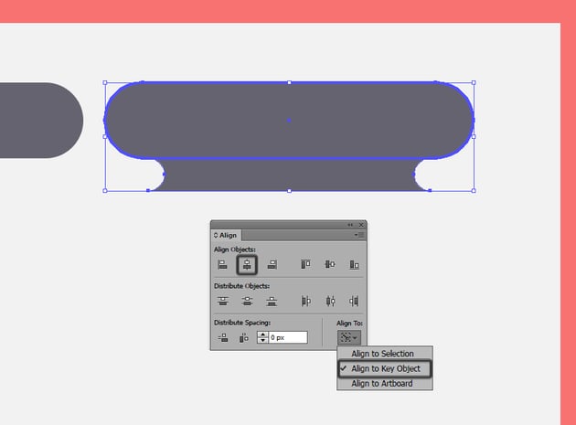
Group the two Grids together using the Control-G keyboard shortcut, and then create seven copies positioned 40 px from one another.
Stack them on two rows (four for each one), making sure to align them to the center of the Artboard.

Once we have all the reference grids in place, we can lock the current layer so that we won’t accidentally move them, and then move on to creating the universal background that we’re going to be using for each icon.
5. Create the Default "Blank" Icon
As you’ve probably noticed from the preview image, all the icons follow a similar if not identical composition or foundation, with a set of common elements found amongst all eight of them.
This means that we can build a “blank” icon that we can then use in order to create the remaining ones, by adding or removing details from its composing elements, thus making the creative process really easy to follow and implement.
Step 1
Position yourself over the first reference grid, and zoom in on it so that you can have a better view of what you’re going to be doing.
Then, using the Rounded Rectangle
Tool (M), create a 22 x 14 px shape
with a 7 px Corner Radius. Color the
shape using a purple-ish grey (#656370), and then position it towards the top
left corner of the active drawing area, leaving a 6 px gap on its left side and an 11 px one from its top.


Quick tip: at this point, I recommend you turn on the Pixel Preview mode (View > Pixel Preview or Alt-Control-Y) so that you can more easily position your shapes in relation to the underlying pixel grid.
Step 2
Create a wider 68 x 14 px rounded
rectangle (#656370) with a 7 px Corner
Radius, and position it to the right side of the previously created shape,
leaving a gap of 4 px between them.


Step 3
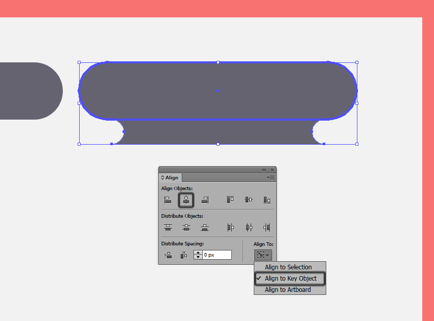
Create the third piece from the space background, which is going to act as a small connector segment.
First, draw a 58 x 6 px rounded
rectangle with a 3 px Corner Radius,
color it using #656370 and then adjust it by subtracting two 6 x 6 px circles (highlighted with red)
from its sides using Pathfinder’s Minus Front option.


Step 4
Position the adjusted shape underneath the previously created shape, and Horizontal Center Align them using the Align panel.

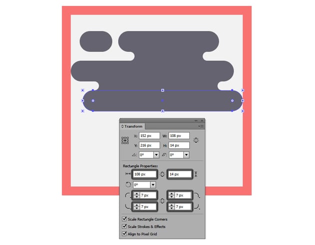
Step 5
Create a 110 x 14 px rounded
rectangle with a 7 px Corner Radius, and then color the shape using the same #656370 and position it underneath the
connector segment, making sure to align it to the left side of the reference
grid’s drawable area.


Step 6
Add another 86 px x 6 px connector segment (the size resulting from removing the two 6 x 6 px circles) and position it underneath the previous shape, leaving a gap of 14 px between it and the right side of the drawable area.


Step 7
Using the Rounded Rectangle Tool,
create another 108 x 14 px shape
with a 7 px Corner Radius, color it
using #656370, and then position it underneath the connector piece that we’ve
just created, aligning it to the right side of the drawable area.


Step 8
Leave an empty gap
of 6 px and then add a 90 x 14 px rounded rectangle (#656370)
with a 7 px Corner Radius, followed
by a smaller 18 x 14 px one (#656370).
Position the two 4 px from one another, and then make sure to align them to the left side of the drawable area.


Quick tip: if you’re wondering why we left that 6 px gap in between the background’s pieces, well that’s because we will be positioning our planet over its center, which means that it will eventually be covered up, so don’t worry about it.
Step 9
Create another 52 x 6 px connector
segment, color it using #656370 and position it underneath the wider element
that we’ve created a step ago (towards its right side) so that you’ll end up
with a 32 px gap between it and the
drawable area’s right side.


Step 10
Add the final section from the space background, by creating a 76 x 14 px rounded rectangle (#656370)
with a 7 px Corner Radius, which we
will position underneath the third connector segment, so that we’ll have a 16 px gap between our shape and the
right side of the drawable area.


Since we’re pretty much done with the overall shape of the background, we can now select all of its shapes and group them together using the Control-G keyboard shortcut so that we won’t move them around by mistake.
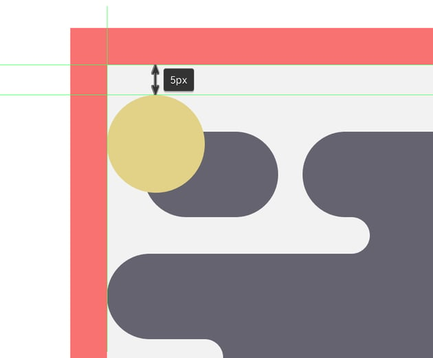
Step 11
Using the Ellipse Tool (L), create
a 16 x 16 px circle, which we will
color using a smooth yellow (#e2d388), and then position over the top left
piece of the background so that it touches the left side of the drawable area but leaves a 5 px gap towards its
top side.


Step 12
Add a subtle highlight to the little sun that we’ve just created, by making a copy of it (Control-C > Control-F) and then applying a -2 px offset to it (select the copy and choose Object > Path > Offset Path> - 2 px), which we will then subtract using Pathfinder’s Minus Front option.


Step 13
Then, select the resulting shape and change its color to white
(#FFFFFF), its Blending Mode to Soft Light, and its Opacity to 80%.


Step 14
Once you’ve added the highlight, give the sun an outer shadow, by using a 4 px offset (select the yellow shape and choose Object > Path > Offset Path > 4 px).
Color the
resulting shape using black (#000000), and lower its Opacity to just 10%.
When you’re done, select all three shapes (the shadow, the yellow one, and the highlight) and group them using the Control-G keyboard shortcut.


Step 15
Since we want the little sun to sit inside the underlying background segment, we will create a copy of the rounded rectangle (Control-C) and paste it in front of the celestial object (Control-F).
We will use the duplicate to create a Clipping Mask, by selecting both it and the objects that we grouped in the previous step, and then right click > Make Clipping Mask.
Quick tip: since we’ve grouped all the background’s elements together, you can easily access its different shapes using the Direct Selection Tool (A) instead of ungrouping and then regrouping them.


Quick tip: if you're new to Clipping Masks, you can easily learn how to use them by watching this video that briefly explains how clipping masks work.
Step 16
Move on down to the bottom section of the background, and create a
slightly larger (24 x 24 px) and slightly
darker (#d8ca8b) celestial object, using the same process to add the
highlight and the shadow, and then mask it using the wider rounded rectangle
from the background.


Step 17
Using the Ellipse Tool (L), create the “blank” pseudo
planet which will be used for each icon, by drawing a 68 x 68 px circle (#d0d0d8), which we will later customize and
adapt for each of the eight planets.
Since the celestial object will be the main focus point, make sure to position it towards the center of your reference grid.
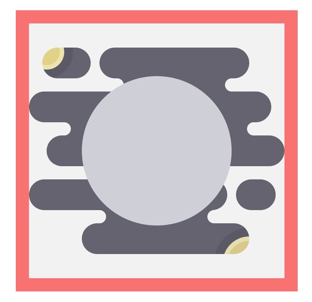

Quick tip: as you’ve probably noticed, our planet isn’t “molded” inside the background as the other two celestial objects are. Instead it overlaps it, thus creating a more interesting effect, which lets all the viewer’s attention shine on it.
Step 18
Add three subtle shadows to the planet, by applying three consecutive 4 px offsets to the circle, which you
will then adjust by setting their color to black (#000000) and lowering their Opacity to 10%.


Step 19
Compared to the planet, which will be overlapping the background, the shadows themselves will have to sit within it, as the smaller planets do.
That means that we first have to select and group all three of them (Control-G), and then use a copy of the background to mask them.
Quick tip: Now, if we were to try to use the background as a Clipping Mask, it wouldn’t actually work, since Illustrator only allows objects or Compound Paths to act as masks.
That means that we first have to select the background’s duplicate, and go to Object > Compound Path and hit Make in order to turn it into a usable Clipping Mask.

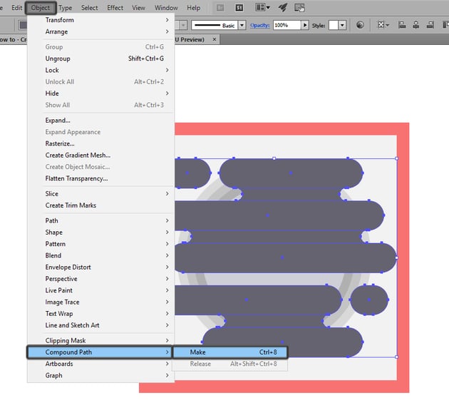

Once you do that, you can simply select both it and the shadows, and then right click > Make Clipping Mask.


Step 20
At this point, we’re pretty much done with our default “blank” icon, which means that we can now create a couple of copies (seven more precisely), and position them onto the remaining reference grids.
Quick tip: don’t forget, since each icon has its own layer, you’ll need to paste the copies onto each of the remaining layers, so that we can keep track of our work.
Step 21
Since we don’t want all of our icons to look identical, we can select the second, fourth, sixth and eighth one and reflect them horizontally (right click > Transform > Reflect > Horizontal) in order to make things more interesting.
At this point we’re finally done creating the blank icons, which means that we can now move on to adding details to each and every one of them.
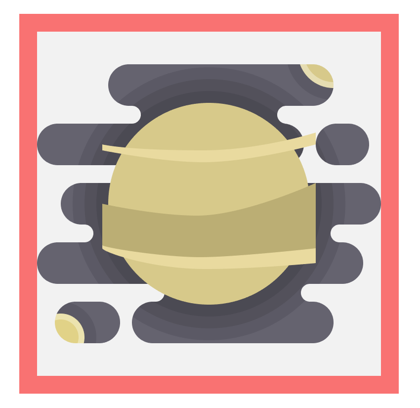
6. Create the Icon for Mercury
Now, since we’ve practically used Mercury as the default icon, that means we can easily finish it off since we already have the background and the main color. All we need to do now is take a couple of details from some actual imagery of the planet and apply some of those features to it.
Step 1
Since Mercury’s surface is characterized by a large number of craters,
we can easily reflect that in our icon by creating a bunch of circles of
variable sizes, which we will color using a slightly darker shade of grey (#aaaab2).
Step 2
Next, we'll give the planet a little pop by creating a ring-like highlight.
First, select the main grey shape and create a copy of it (Control-C > Control-F), and then apply a 2 px offset to the duplicate.
Select the resulting offset and the copy, and use Pathfinder’s Minus Front option
to create a cutout, which you will adjust by setting its color to white
(#FFFFFF), its Blending Mode to Soft Light and its Opacity to 68%.
Once you’re done, select all the icon’s elements and group them together using the Control-G keyboard shortcut.
7. Create the Icon for Venus
Compared to Mercury, whose surface reflects its violent history, Venus is a more interesting planet since it’s covered in an opaque blanket of highly reflective clouds composed out of sulfuric acid, which gives it its interesting texture. This makes it fairly easy for us to make our icon stand out using just a couple of details.
Step 1
Make sure you’ve positioned yourself onto the second layer, and then zoom in on the second reference grid.
Now, the first thing that we’re going to do is change the color of the
planet from grey to a muddy yellow (#d8ca8b).
Step 2
Using the Pen Tool (P), get
creative and draw a slightly curved section towards the center of the planet, which we will color using #bcaf75.

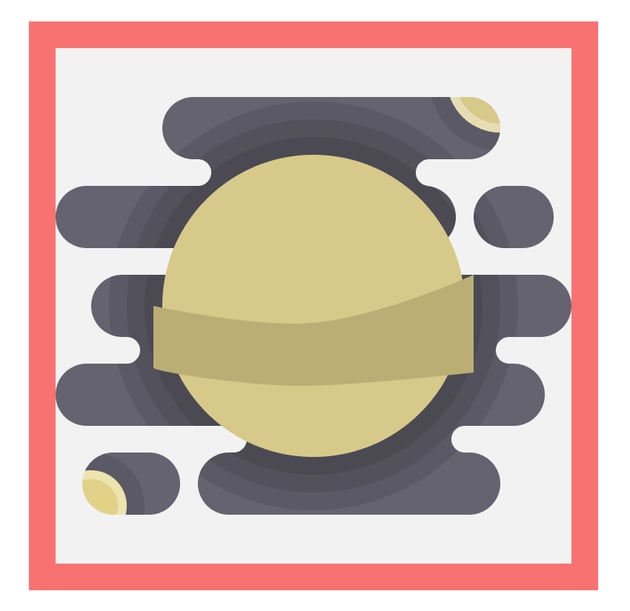
Step 3
With the Pen Tool (P) still
selected, draw two more bent lines, one towards the top and one just under the
larger one that we’ve previously created, coloring them using #eadba0.


Step 4
Since we want the cloud lines to sit within the boundaries of the planet’s surface, we’ll need to mask them using a copy of the larger circle as a Clipping Mask.
Step 5
Next, using the Ellipse Tool (L), add
a couple of elongated shapes towards the center and top of the planet’s surface, coloring them using #a59862.
Step 6
Add the same 2 px thick ring-like highlight to the planet’s surface as we did with Mercury.
Step 7
Finish off the icon by changing the left lower planet’s color to #d0d0d8
and the right upper one’s to #78d2ea, making sure to add a little green section
(#80e5c8) to make it resemble the Earth.
Once you’re done, select and group all of the icon’s elements using the Control-G keyboard shortcut.
8. Create the Icon for Planet Earth
Compared to all the other planets, Earth is special, since not only does it holster all known life, but it’s also the only planet that we know to be capable of sustaining life.
The iconic view from space is probably one of those few things forever burnt deep inside our minds, which makes this icon really fun and easy to create.
Step 1
As with the previous icon, the first thing that we need to adjust is the
color of the “blank” planet, which we will set to #78d2ea.
Step 2
Once we’ve given it its characteristic blue, we need to pick up the Pen Tool (P) and draw some “earth” patches
which we will color using #80e5c8 and then mask using a duplicate of the larger
circle.
Step 3
Give the planet its ring-like highlight using either a copy borrowed from the previous icons, or one freshly created using the same process explained a few steps ago.
Step 4
Next, add a bunch of clouds following the same process used for
the background, only this time make the shapes a little smaller. Use white
(#FFFFFF) for the color and Soft Light for
the Blending Mode.
Step 5
Finish off the icon by coloring the left smaller celestial object using
#c1c1c6 and giving it a small 2 x 2 px impact
crater (#a0a0a8) in order to make it look like our beloved Moon, and then
change the color of the second one to #d8ca8b.
Once you’re done, select and group all the icon’s elements together using the Control-G keyboard shortcut.
9. Create the Icon for Mars
Earth’s immediate neighbor is none other than the Red Planet, which for thousands of years has sparked the imagination of mankind, since many still hope it once housed precious life in a similar way that Earth does today.
Now, the planet is mostly covered in canyons and craters created by the impact with other celestial objects, which makes it fairly easy to recreate as an icon.
Step 1
Select the larger circle which acts as the planet’s body, and change its
color to #ea7d7d.
Step 2
Using the Ellipse Tool (L),
set your color to #bf6262 and create a bunch of elongated shapes and circles,
and scatter them towards the center and top-right side of the planet.
Step 3
Add a small 18 x 6 px portion
of ice (#FFFFFF) towards the north cap, making sure to mask it using the larger
circle from underneath.
Step 4
Add the ring-like highlight to the planet’s surface, making sure to position it above all the other details.
Step 5
Finish off the icon by changing the color of the smaller left planet to
#e27959 (giving it a small detail #d3674f) and replacing the right one with the
mini-Earth that we’ve created for Venus.
Once you’re done, don’t forget to select all of the icon’s composing elements and group them using the Control-G keyboard shortcut.
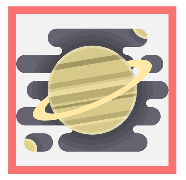
10. Create the Icon for Jupiter
We are now down to our second row of planets, and the first one that we’re going to create is the gas giant that everybody knows as Jupiter.
Compared to all the other planets, Jupiter is probably one of the most beautiful and interesting ones from our little Solar System, but also one of the most dreaded ones, due to the powerful storms that are constantly shaping it.
Step 1
Assuming you’ve made the leap from one layer to the next one, zoom in on
our current reference grid, and change the color of the planet from the dull
grey to #e27959.
Step 2
Using the Pen Tool (P), draw a couple of detail
lines, using #ff9b73 for the brighter ones and #d3674f for the darker ones, making sure to mask them so that they won’t protrude outside the planet’s
surface.
Take your time, and get creative by taking a couple of looks at some actual images of the planet in order to get a feel of it.
Step 3
Using the Ellipse Tool (L) add some shapes towards the bottom and upper section of the planet, using the same colors from the previous step.
Step 4
Add the ring-like highlight to the planet’s surface so that it will fall in line with the style of the rest of the icons.
Step 5
Finish off the icon by changing the color of the left planet to #ea7d7d,
and the one for the right one to #d8ca8b, making sure to also add a small
diagonal line to it (#bcaf75).
Also, don’t forget to select and group all of the icon’s elements together using the Control-G keyboard shortcut.
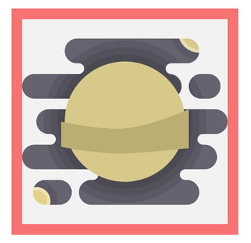
11. Create the Icon for Saturn
Saturn is the sixth planet from the Sun, and one of the few to have a ring of ice and rocks around it, giving it a unique shape.
Similar to Jupiter, the celestial object is made out of gas, which gives it its interesting texture, making it fairly easy to recreate as an icon.
Step 1
Jump over to the seventh layer, and zooming in on its reference grid
change the color of the larger circle to #d8ca8b.
Step 2
Using the Rectangle Tool (M),
create a couple of horizontal rectangles with variable heights, and color them
using #eadba0 for the lighter ones, and #bcaf75 and #a59862 for the darker
ones. Adjust the rectangles by selecting their right anchor points using the Direct Selection Tool (A) and moving
them slightly towards the top side by about 12 px.
Step 3
Add the ring-like highlight by copying it from one of the previously created icons.
Step 4
Add the planet’s belt, by creating a 98 x 26 px ellipse (#ffe9a4) and a smaller 78 x 18 px one (#ffe9a4) which you will
use to create a cutout from the larger one.
Position the resulting shape towards the center of the planet, making sure to bring the larger circle in front of it (right click > Arrange > Bring to Front), and then rotate it 24° (right click > Transform > Rotate > 24).
Step 5
Create a copy of the belt and the planet (Control-C) and paste them over all the other elements (Control-F). Then, using Pathfinder’s Intersect option, create a new shape resulting from the intersection of the two, removing the top section in order to create the illusion that the ring goes all around the planet.


Step 6
Finish off the icon by setting the color of the left planet to #e27959,
while coloring the right one using #5ad6e0 and adding a small line section to
it (#73ecef).
Oh, and don’t forget to select and group all the icon’s elements together using the Control-G keyboard shortcut.
12. Create the Icon for Uranus
The third-largest planet in the Solar System, Uranus is a particularly interesting one due to its interesting orbit and color. It’s the coldest planet near our Earth, which makes it easy to depict, as we will see in the following moments.
Step 1
Assuming you’ve already jumped layers, start out by changing the color
of the planet to #5ad6e0.
Step 2
Using the Pen Tool (P), draw
three vertical line segments, which we will color using #73ecef and mask using
the larger circle.
Step 3
Using the Ellipse Tool (L), create
two vertical elongated shapes, color them using #e1ffff, and position them
towards the top right corner of the planet.
Step 4
As we did with the previous icons, add the ring-like highlight to give the planet a nice pop.
Step 5
Next, we need to
add a vertical belt, by creating a 12 x
90 px ellipse (#e1ffff) and another smaller 8 x 86 px one (#e1ffff), which we will cut out from the larger one
using Pathfinder’s Minus Front option.
Position the resulting shape towards the center of the planet, underneath the larger circle, moving it a couple of pixels towards the right side.
Step 6
Create a copy of the belt (Control-C > Control-F) and another one of the larger circle, and use Pathfinder’s Intersect option to create the piece that will give us the impression that the belt goes all around the circumference of the planet.
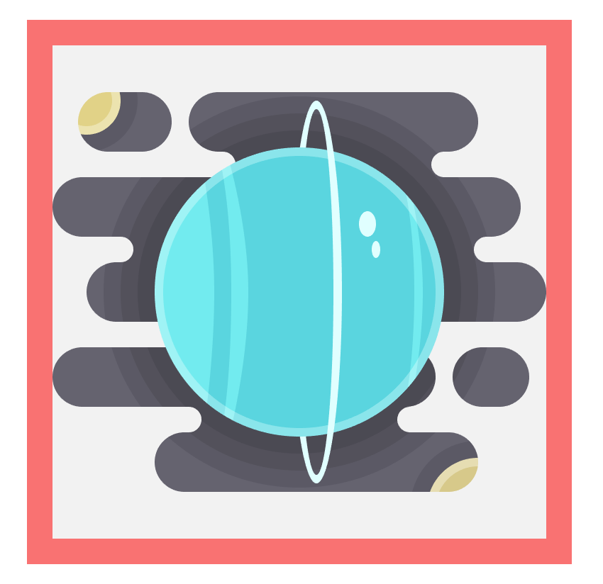
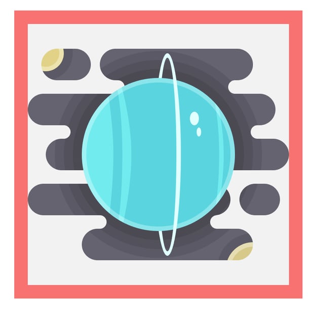

Step 7
Finish off the icon by coloring the smaller left planet using #d8ca8b
and the right one using #77afe0. Once you’re done, select and group all the
icon’s elements together (Control-G).
13. Create the Icon for Neptune
It’s been a long journey, but we are now near Neptune, and boy is it beautiful.
The farthest known planet from the Sun, and the densest one, its atmosphere is mainly composed of hydrogen and helium, giving it its characteristic blue color.
Step 1
Position yourself onto the ninth and last layer, and change the color of
the larger circle to #77afe0.
Step 2
Using the Pen Tool (P), draw
two height variable section pieces, coloring them using #e1ffff and positioning
one towards the top and the other one towards the bottom.
Step 3
Select the Ellipse Tool (L) and
create a couple of light colored spots (#e1ffff) and one darker horizontal
elongated element (#5fa1d3) towards the center of the planet.
Step 4
Add the 2 px thick ring-like highlight to keep things visually consistent.
Step 5
Finish off the icon by grabbing a copy of the right smaller planet from our Saturn icon and replacing the one that we currently have in place.
And, as always, don’t forget to select and group all of the icon’s elements together using the Control-G keyboard shortcut.
14. Add the Finishing Touches
At this point, we’re pretty much done with the project. All we need to add is the smooth “candy” gradient that will make the icons more visually appealing.
Step 1
For each icon, identify the main composing shapes, and create a copy of them (Control-C), pasting it in front (Control-F).
The shapes that I’m talking about are the space background, the larger circle representing the planet, and the ring in the case of Venus.
Then, for each copy, go to Object > Compound Path and hit Make in order to make the shapes behave as a whole.
Step 2
Select the copies, and apply a Linear
Gradient to them, using #93278f for the left color and #0071bc for the
right one, setting the angle to 90°.


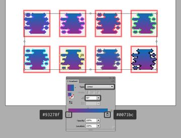
Step 3
With the copies still selected, open up the Transparency panel, and set their Blending Mode to Overlay, lowering their Opacity to 80%.


Once you have the overlays, don’t forget to select them and their underlying icon, and Group them (Control-G) so that they won’t get separated by mistake.
At Last Our Journey Has Come to an End
There you have it, cadets: a nice-looking icon pack, ready to be used for any mission, be it here or beyond the depths of space.
I hope you’ve managed to keep up with the steps, and most importantly learned something new along the way.
 By
By


