Introduction
Motion design is the beautiful lovechild of two mighty disciplines, graphic design and animation. In this short course, I'll show you how to harness the principles of both to make you a master motion designer in no time.
To follow along, download the project files and a handy cheat sheet on motion design principles:
A Brief History of Motion Design
We'll start with a very quick look at the history of motion design. While graphic design and animation as specific art forms have been around for about 100 years, motion graphics is fairly new.
In the 1940s, artists and filmmakers like Norman McLaren and Mary Ellen Bute began making experimental animations by drawing on film stock. In the 1950s, Saul Bass, already a well-established American graphic designer, pioneered the combining of graphics and animation with his titles for films like Cowboy and North by Northwest.


John Whitney plays around with World War II anti-aircraft technology, and we get the first computer-powered animation. Scanimate is born, and TV takes off.
Fast forward through the 1970s, 80s, and 90s as computer power gets better, and we invent the internet and 3D animation and so much more. We get an entire field of people working on exciting and experimental ways of moving things around a screen that is just continuing to grow and get broader every year. Motion design is an enthralling and very friendly world to get into.
"Amid all this change and development, two sets of guiding principles exist at the heart of pretty much every piece of motion graphics: the principles of graphic design and the principles of animation."
In this video, I'm going to show you the principles that I use and see the most often in the field of motion design, and I'll show you how to use them to your advantage.
The Principles of Graphic Design
Hierarchy
Hierarchy is the order in which your brain digests information. It's controlled by the weighting of elements in the design, through the use of some of the other design principles like scale, color, and alignment.


Balance and Tension
"Balance and tension" is the relationship between elements in a design that provides the overall structure. Layouts can be balanced and in harmony, or they can be dynamic and invite tension between the different elements.


Contrast
Contrast is using opposing elements for greater distinction—for example, dark and light, warm and cool, sharp and soft. Color really comes into it here, so when choosing a palette, look to have a good amount of contrast in light and darkness and in saturation.

Negative Space
Negative space considers the space around your elements to be as important as the element itself. Try allowing elements room to breathe, or you can also overcrowd on purpose. Using negative space is important in creating a sense of tension in your design.

Repetition and Rhythm
Lastly, repetition or rhythm is using the same fonts, colors, and styles over and over again to maintain consistency and tell a story. You want to keep the audience engaged, not confuse them by switching the font halfway through your project.


"If something in my design is falling flat or just doesn't seem right, I always evaluate my frames against these principles. See if you can use them or break them to make your design more interesting or appealing."
Principles of Animation
So those were the main principles of design. Now, let's look at the principles of animation. One famous set of 12 animation principles was developed by two Disney animators, Frank & Ollie. I think for some versions of motion design these can all be relevant, but for today we're going to focus on five that I think make the most impact.
I'll show you how to use these principles in After Effects with a little animated sequence that I've made. Don't forget, you can download the files if you want to follow along.
Timing
Timing is essentially like hierarchy, but in the fourth dimension of time. We can change the hierarchy over time to tell a story to engage and surprise viewers. Changing the speed and flow of our action changes the way our audience understands it and brings a different mood.
Timing can make or break your animation, so it's important to block out your animation first. Create a storyboard and figure out what your main moments of action are before you decide what happens in between them.
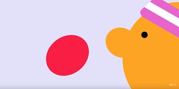
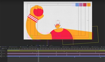
I have this little animation of a dodgeball game—it's five scenes with a bit of a twist at the end. I brought everything into After Effects and added each scene's key frames.
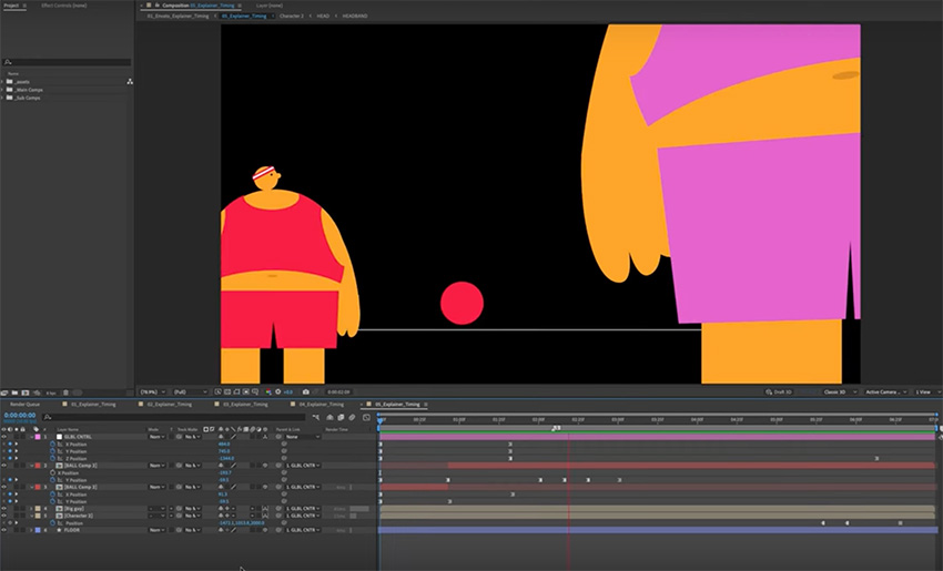


I think we need to give the fourth frame lots of time for the audience to react before we reveal the size difference in our characters. Also think about your frame rate. Changing the frame rate gives a really different feel to the animation.
Easing
Our next one is easing. This is the velocity at which things move over time. The best advice I've ever received is to get familiar with the graph editor and control your curves.


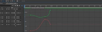
Easing is how we refine our timing, adding character and showing things like mass and weight. In the graph editor, you can edit the curves based on speed or value. I like to use a mix of both as it gives me the most control.
Anticipation
Now on to our third principle: anticipation. Anticipation primes your audience for the next movement. Imagine you're playing dodgeball. The moment you see your opponent recoil their arm to chuck the ball in your direction, you know that ball is coming your way.
You can create anticipation by adding a few frames of opposite animation before you launch into your main action. If we're thinking of our elements as having mass, it might also look good to add a little bit of squash and stretch in certain cases to show how that mass is being affected by the movement.


Follow-Through
Our fourth principle is follow-through. Follow-through is the reverse of anticipation: when that ball hits you, the energy released by your opponent's throw doesn't just disappear. Where it goes is the follow-through. The ball bounces off you, and maybe you fall backwards as a result.


Follow-through can be as simple as something sliding slowly into place, or maybe it's more of a snapback action. It all depends on how you want your animation to feel.
Secondary Animation
Secondary animation is the final flourish that really makes all the difference. It's anything you can add that enhances that main action.
So think about what that main action might cause other elements in your scene to do or how the environment around your elements is affecting them. Our character's head is probably going to move in the opposite direction to the main arm swing, for example.


The ball is going to rotate in the air, and maybe we could add some flair by giving some smoke trails to enhance that main action and show just how hard this ball is going to hit. That's all secondary animation.


Styling
Here's a secret bonus tip: lean into styling. When the client asks you to make it pop, or when you just maybe want to get a little bit funky, After Effects has a really powerful set of effects, layer effects, and of course loads of people releasing handy and experimental new plugins and scripts every day.
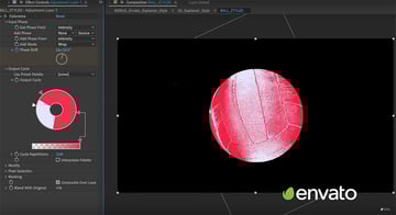
Speaking of styling, for this section I grabbed this volleyball photo from Envato, popped on a Colorama effect to bring it into the style of my project, and I was able to create a great result in no time.


Know the Rules to Break the Rules
Designing your initial animation with these tools in mind or experimenting with them as you go can be really fun. It can also get pretty wild, so use these effects with caution, and remember your graphic design principles. Some of my favorite effects to play with are Inner Glow, Displacement, and CC Lens. You can make some cool stuff with these effects, so have a play.
Now that you know all the rules, you can break them! Play around and see what feels right. Maybe your idea is to be super flowy and abstract, and you barely use any easing or anticipation. Or maybe you want a really clean graphic result, and squash and stretch looks too realistic or cartoonish. Maybe you want your piece to feel overwhelming and busy, so you remove all the negative space. It's really up to you!
So there you go: those are the principles of motion design. It's graphic design, but over time! I hope you found this enlightening. If you want to learn more, check out the tutorials below:

 The principles of design


 The basic elements of design

 Motion Design for Beginners


 Master Motion Design: Dynamic Character Animation in After Effects


 How to Add Wiggle Expressions in After Effects
 How to Do Character Rigging in After Effects
Or watch these motion design videos on YouTube: