
Taking a collection of data and showing it in a way that's not only informative but looks good, can be a hard thing to do. You need to be mindful of design while at the same making sure that the data you're presenting is shown clearly and is easy to understand.
In this Creative Session, take your data to the next level with our collection of tutorials that cover useful techniques and tips for creating infographics, charts and maps that not only look
great, but communicate effectively with your audience.
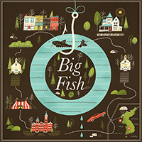
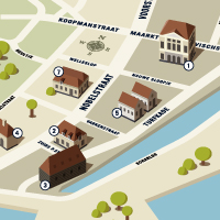
Posts in this series

How to Create a Promotional Website Infographic in Adobe Illustrator

How to Create Outstanding Modern Infographics

Quick Tip: Use Illustrator Effects to Spice Up Your Graphs

How to Add Illustrative Flair to an Infographic Without Compromising Data

Quick Tip: How to Create a 3D Map Pullout for Information Graphics

Quick Tip: How to Create a Simple Set of Map Pins
Interview with Brad Woodard - Illustration, Design, and Infographics

How to Create an Informative Map In Perspective with Illustrator

Quick Tip: Spice Up Your Graphs With Column Designs

Turn a Boring Bar Graph into a 3D Masterpiece

40 Inspirational Infographic Blogs, Portfolios, Showcases, and Resources

Create a Personalized Toolkit for Making Maps

Quick Tip: Creating a Simple Map Infographic
Tuts+ Workshop: Freestyle Map Infographic Challenge

