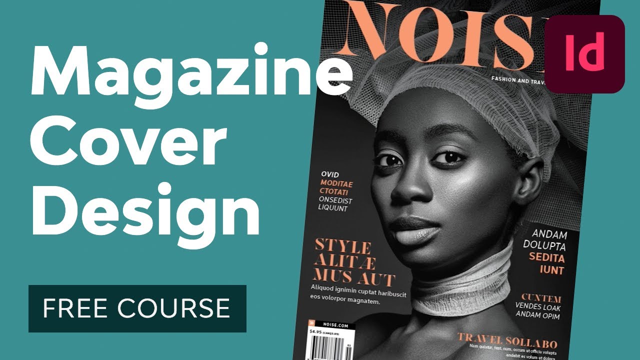
Introduction
In this first section, I'll introduce myself, talk about how I became a magazine cover designer for The Economist, and explain what you'll learn in the course. Here's a quick overview of what we'll be covering:
- how to come up with ideas and concepts for magazine cover artwork
- how to create your artwork in Illustrator and Photoshop
- how to create magazine cover layouts in Adobe InDesign
This free course is brought to you by Issuu, the all-in-one platform to create and distribute beautiful digital content, from marketing materials and magazines to catalogues, portfolios, and so much more.
Use the link below to get started with Issuu today for free or sign up for an annual premium account for a more customised experience. Get 50% off when you go to the link and use the promo code Envato50.
The Brief
As with most design projects, a magazine cover design starts with a brief. Usually, the brief is to generate interest in the main story in that issue of the magazine. You don't need to give all the details of what's in the story, but just grab readers' attention and provoke some curiosity. Often, that's done through a clever interplay of words and images.


In this course, we'll use the following story idea as our brief:
"Is AI-Generated Art Damaging the Creative Industry?"
Get Inspired
The first step in coming up with a good magazine cover design is to look for inspiration. For this brief, I'm looking back in time to find some famous TV and movie references to the dangers of technology.
At this stage, the artwork doesn't need to be brilliant or even fully thought out—just sketch some basic ideas, and you can refine them later. Here are three ideas that could work:
Daleks


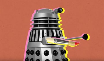
Artificial intelligence is often associated with robots, so a reference to the scary Dalek robots from the British sci-fi TV series Doctor Who could work well. We need to refer to art too, though, so perhaps the Dalek's gun could be replaced by a paintbrush.
HAL 9000
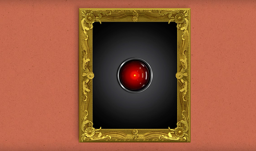
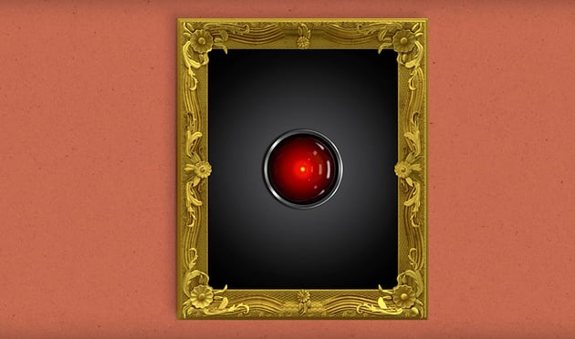
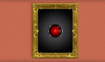
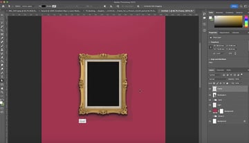
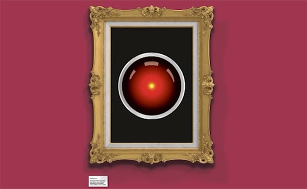
An early reference to the dangers of artificial intelligence comes from the Stanley Kubrick film 2001: A Space Odyssey, in which the computer HAL turns out to be the villain. So why not put HAL inside a gold frame to symbolise art?
Metropolis
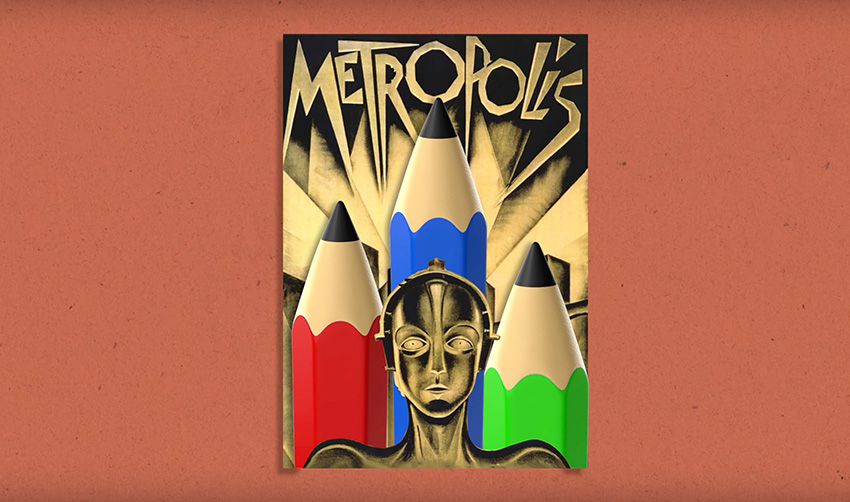

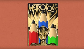
Finally, we could go all the way back to the 1927 film Metropolis and its iconic Art Deco movie poster. We'll keep the robot character but replace the buildings in the back with pencils.
Use an Ideation Grid
Next, I'm going to introduce you to a useful tool I use all the time while designing magazine covers. It's called an ideation grid.
Simply draw a grid on a sheet of paper, with four rows and four columns. We're looking at the intersection of art and technology in this design, so along the top, list some items associated with art, and down the left, list some items associated with technology.
Then, in each square, create a sketch based on the meeting of the two items. For example, when the "Robot" row meets the "Paint Brush" column, you could sketch a robot with paint-brush antennae sticking out of its head. You can see more examples in the image below:


The ideation grid is a great way to spark new ideas by combining concepts in interesting ways. Give it a try!
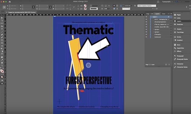
Create the Easel Artwork in Illustrator
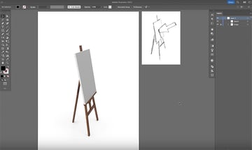
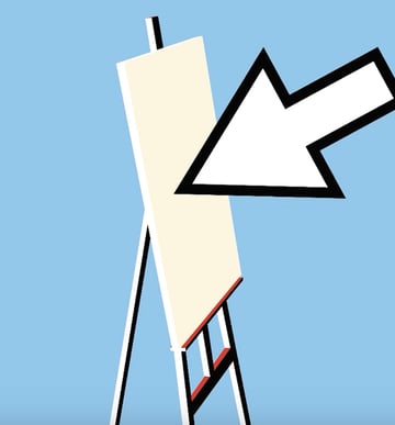
We have a few promising ideas, so let's move over to Illustrator and begin creating some actual artwork! We'll start with the idea of a digital mouse arrow hitting an easel.
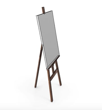
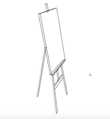
Here you can see my starting point in Illustrator. I have my basic sketch on the right, and in the main artboard I have a 3D image of an easel that I found on Envato Elements to use as a reference.


Now I'll show you how to create the artwork. Click through the gallery below to see each step in the process.


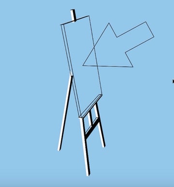


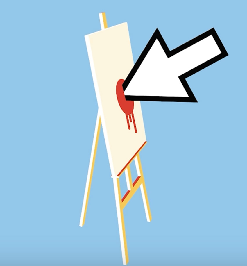

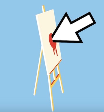
That's looking pretty good now. Be sure to watch the video for more detailed instructions on every step so that you can follow along in Adobe Illustrator and create the same illustration yourself.
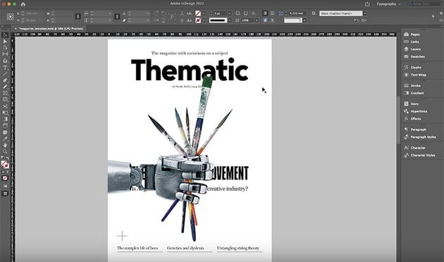
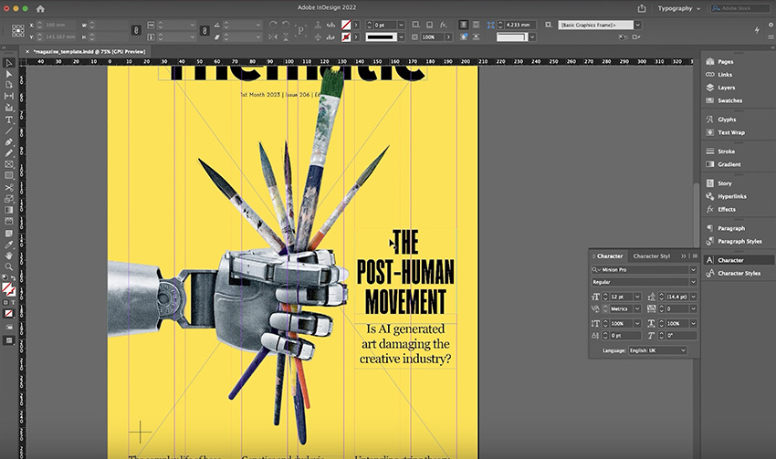
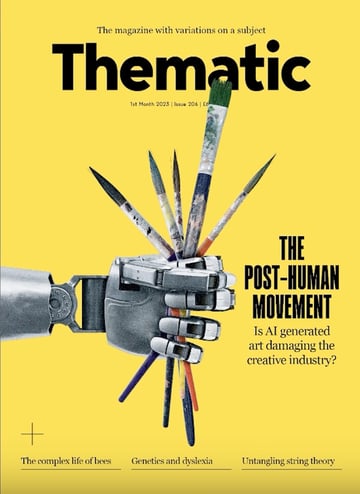
Create the Robot Hand Artwork in Photoshop
Now that we've created an illustration, let's move over to Photoshop and create some more photo-realistic artwork. The idea here is to create a robot hand holding some paintbrushes so tight that they break.
Again, I've started with some reference images taken from the 3D section of Envato Elements.


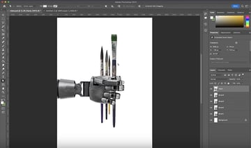
We have a decent starting point here, but we need to make it look as if the robot hand is gripping the brushes very tightly and they're starting to break. Here's how we'll do it:


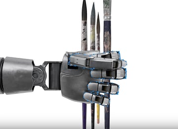

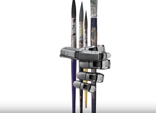


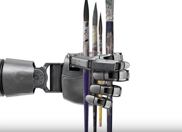
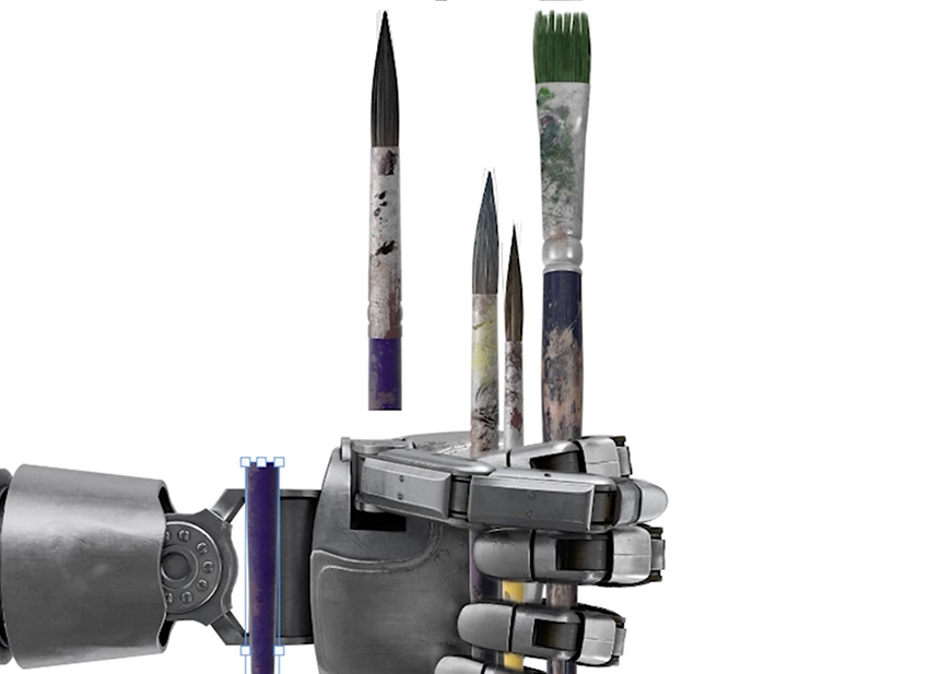
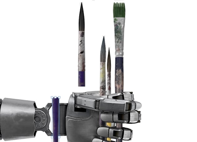


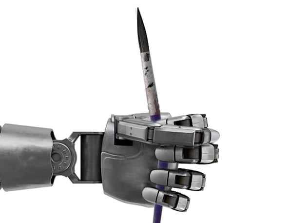
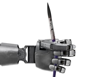


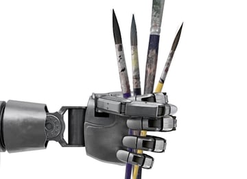
So now we have our artwork: a robot hand that appears to be holding paintbrushes so tight that they've snapped in half. Again, check out the video for more detailed instructions, and follow along in Photoshop to see if you can create the same result.
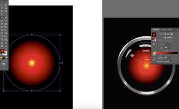
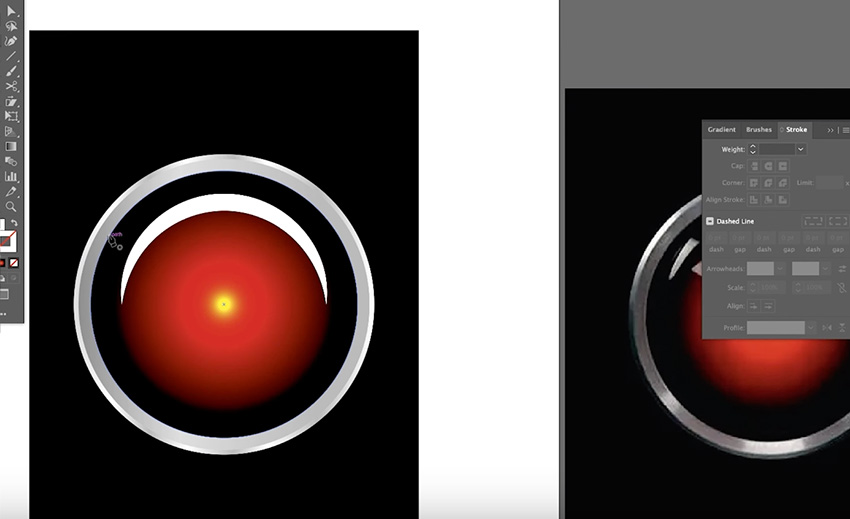
Create the HAL 9000 Artwork in Illustrator
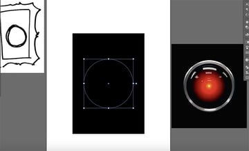
Now let's create our third artwork: an image of HAL 9000 inside a gold frame. This time, I'm going to use both Photoshop and Illustrator, along with some assets from Envato Elements. So I'm starting with a gold frame on a simple background in Photoshop, and a sketch and reference image of HAL 9000 to work from in Illustrator.


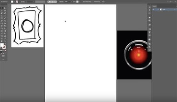
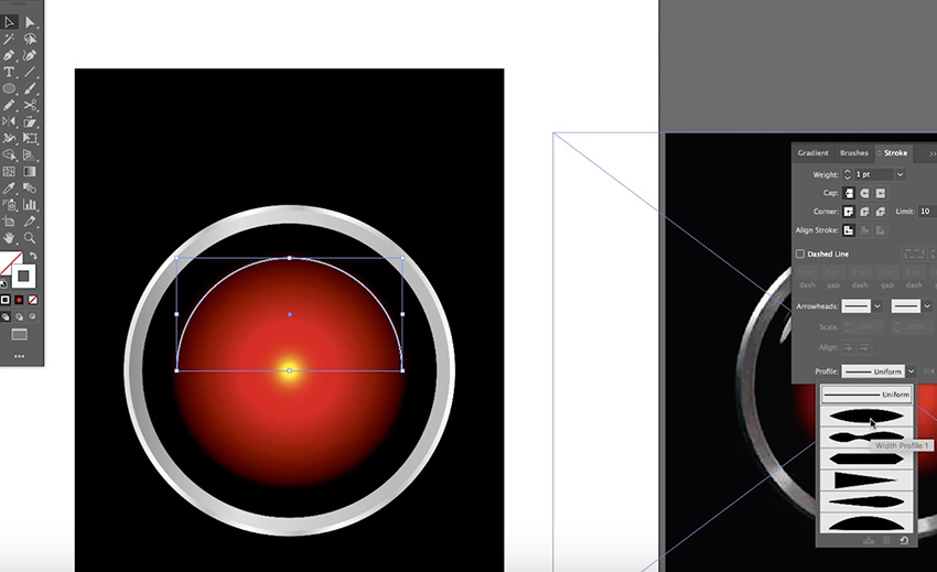
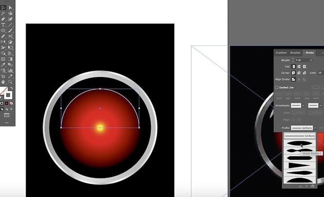
Let's start in Adobe Illustrator and create the HAL 9000 illustration. Here's the step-by-step process:


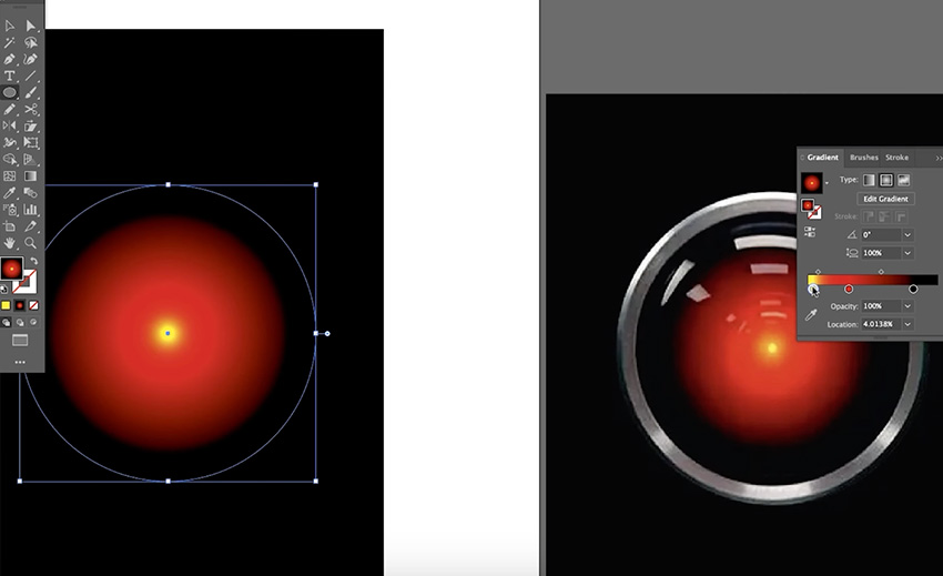


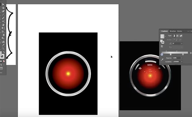


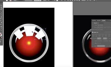

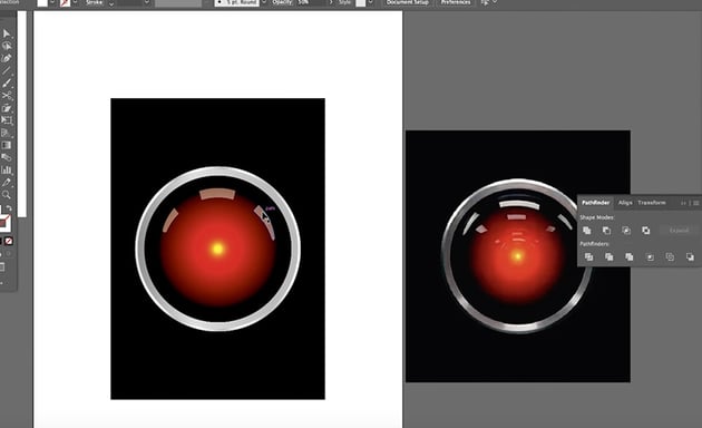

Now that we have our HAL 9000 image, we can go back over to Photoshop and place it inside the gold frame.


We can probably refine the illustration a bit more if needed, but that's good enough for now. The next step is to use these three pieces of artwork to create striking magazine covers.
Magazine Cover Design in InDesign
Now let's move to InDesign and lay out our magazine cover designs. I've set up a basic template to start working from:


It contains all the key elements of a magazine cover:
- a masthead with the title of the magazine, in this case "Thematic"
- a tagline with a brief description of what the magazine is about
- the date, issue number, and price
- the headline and subhead of the main cover story
- flashes at the bottom to preview other stories in the magazine
Because this is a fictional magazine, I haven't included a barcode, but that will often be something you have to make space for in your layout.
You'll also notice that we also have a neat six-column grid to help us as we place our text and images in the layout. So now we'll just add the artwork to create three variations for our magazine cover design.
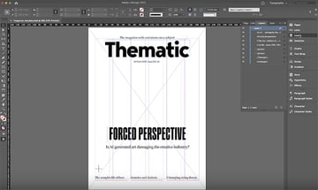
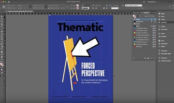
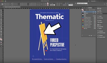
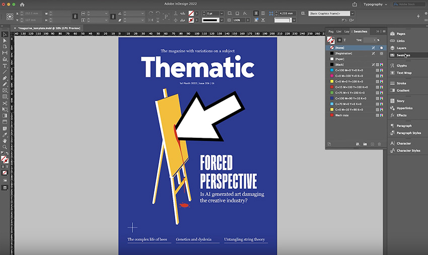
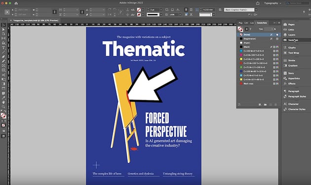
Design the Easel Magazine Cover
Now let's create our first magazine cover, using the artwork we created showing a mouse pointer hitting an easel. The process is quite simple:


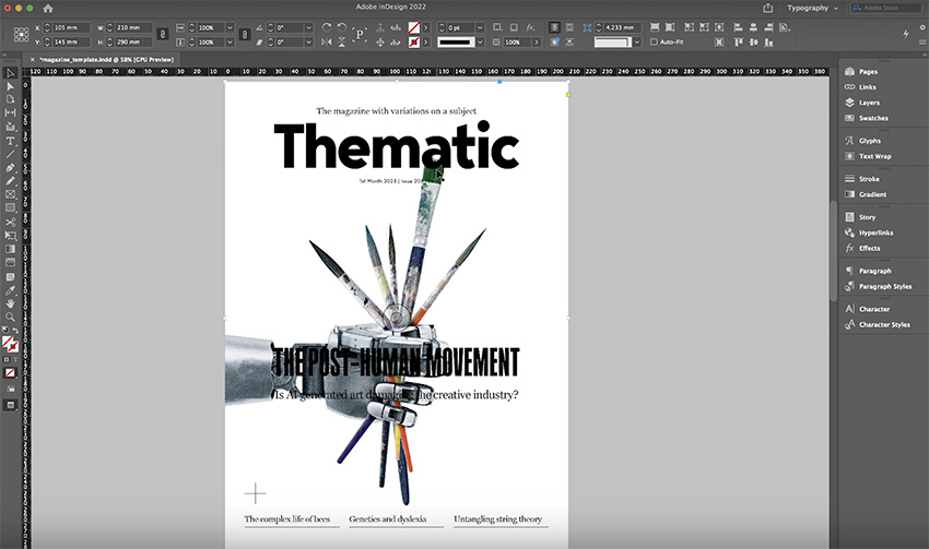
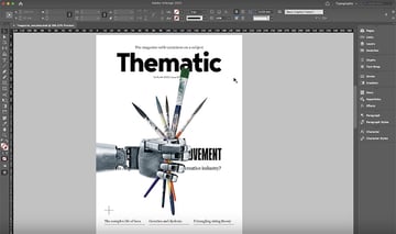
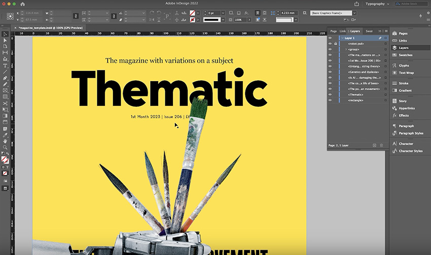
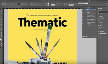
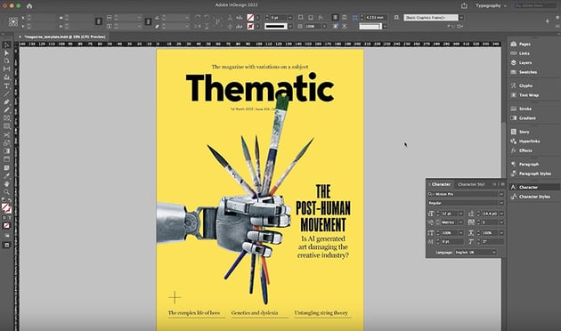
Design the Robot Hand Magazine Cover
For our robot hand crushing the paintbrushes, we'll use a similar approach—place the image, and then recolour and rearrange the elements on the page.
I'm using the same template as before, just with a slightly different headline. Here's how my design evolved step by step:


Make a few final adjustments and hide the grid.
Design the HAL 9000 Magazine Cover
Finally, let's create our HAL 9000 cover design. Again, we'll use a different headline, based on a reference to the film, but otherwise the template is the same. Here's the process for this one:

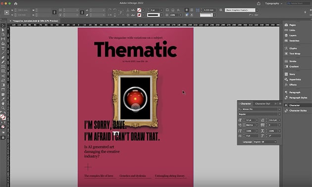


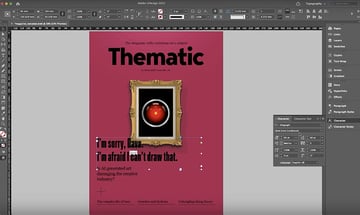
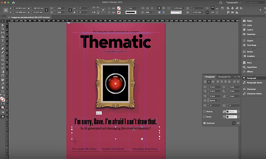


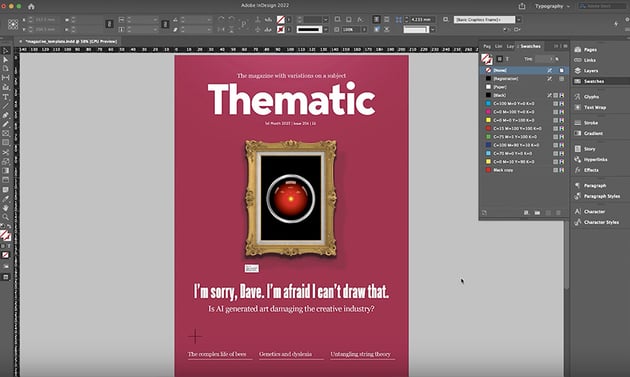
I initially made the text black to pick up the black in the HAL 9000 image, but I tried it in white, and I think that it pops more now.
Magazine Cover Review
Here are the three cover designs we've created:


These are three good options to choose from, but of course, for a real magazine you can only choose one. So let's finish by discussing the pros and cons of each design and picking a winner.
Easel
Pros:
- strong block colours
- powerful imagery with a clear message
- larger headline with more impact
Cons:
- slightly unbalanced design, with a little too much space on the left
Robot Hand
Pros:
- the hand interacts well with elements on the page, coming in from the left and covering the masthead slightly
- black and yellow colour scheme feels like an urgent warning, which fits with the theme
Cons:
- a robot hand is not the type of AI the story covers
HAL 9000
Pros:
- well-balanced, symmetrical design
- headline and subhead are easy to read
Cons:
- relies on specific movie references that some readers won't understand
And the Winner Is...
Because a magazine's aim is to attract as many readers as possible, I'd count the HAL 9000 design out because it excludes anyone who hasn't seen the film. The design looks good, but it doesn't communicate its message clearly enough.
Between the other two, I'd probably choose the easel design as the final magazine cover. Conceptually, it works the best because when you're using AI software, you're going to be seeing a mouse pointer, and the bold imagery of blood on the canvas communicates the threat to the creative industry. The robot hand is a good metaphor, but it's not as directly linked to the kind of AI that the story covers. So the easel is the winning design!
Conclusion
I hope you enjoyed this insight into the magazine cover design process and can use these tips to design powerful covers of your own.
Don't forget to visit Issuu to see how you can publish your magazine digitally. And if you want to learn more about magazine design, check out these videos next: