Introduction
In this course, you'll learn how to design professional social media templates with Figma. Whether it's Facebook posts, Instagram stories, or seamless Instagram carousel posts, Figma can handle it all.


The best part is that these social media templates will also be aligned with brand specifications. We'll be designing for a fictional real estate brand called Ascent Realty, and I'll show you exactly how to integrate the colors, typography, and overall style into the templates.
This course will teach you both the "how" and the "why" behind this design project. The "how" refers to the technical side of using Figma, and the "why" refers to the decisions we'll be making to ensure that these templates are in line with the brand we're designing for.
Also, templates save you time, so you can focus on creating great content without starting from scratch each time. Plus, they maintain that professional look that's very important for a business. Whether you're posting daily or just adding special promotions, having a set of well-designed templates will improve your social media strategy.
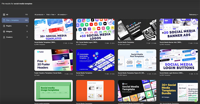
This video is brought to you by Envato
This video is brought to you by Envato, the unlimited creative subscription. Find and download ready-made Figma social media templates, along with authentic graphics, templates, photos, and fonts.


Why use Figma for social media templates?
You might be asking why you should use Figma to design social media templates. Isn't Canva or some other software better? Well, this is not a Figma vs. Canva video, but let me give you a few very good reasons why you might consider using Figma.
- It's free: Sure, Figma does have a paid plan, but even the free plan offers a lot of great features, and you can get started right away free of charge.
- It's cross-platform: Figma works directly in your browser, regardless of the operating system.
- It has a gentle learning curve: As a beginner, you'll have an easy time learning Figma because it's very intuitive. If you need help, you will find tons of training videos and free Figma tutorials that will get you up and running in no time.
- It offers amazing tools: Figma includes everything you need, from basic shapes to more advanced AI tools, like a free AI background remover.
- It can export your work to PDF: This feature might come in very handy on platforms like LinkedIn, which displays PDF files in a cool carousel format.
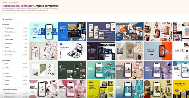
- It has readily available templates: If you don't fancy creating your own templates, there are plenty of them available for download. A great source for templates is Figma Community, where you can find both free and paid ones. I can also recommend Envato, which is a fantastic resource not just for social media templates but also for a host of other digital assets.


Key design principles for social media
Here are some key design principles we need to keep in mind as we create our social media templates:
- Consistency: You need to maintain the same design style across your posts, and this will help with brand recognition. There are a few ways you can do that, and one of them is to use the same color scheme.
- White space: Leave some space around objects in your design. It doesn't have to be white, but it does have to be there to improve the readability. Your designs need to breathe, so resist the urge to fill all the available space with information.
- Hierarchy: Visual hierarchy is very important because it helps guide the user's attention to the right places. It allows them to scan the information easily and see what's important.
- Accessibility: You need to make sure the content you're designing can be used by everyone, including people with disabilities. Among other things, this involves the use of proper contrast between the text and the background.
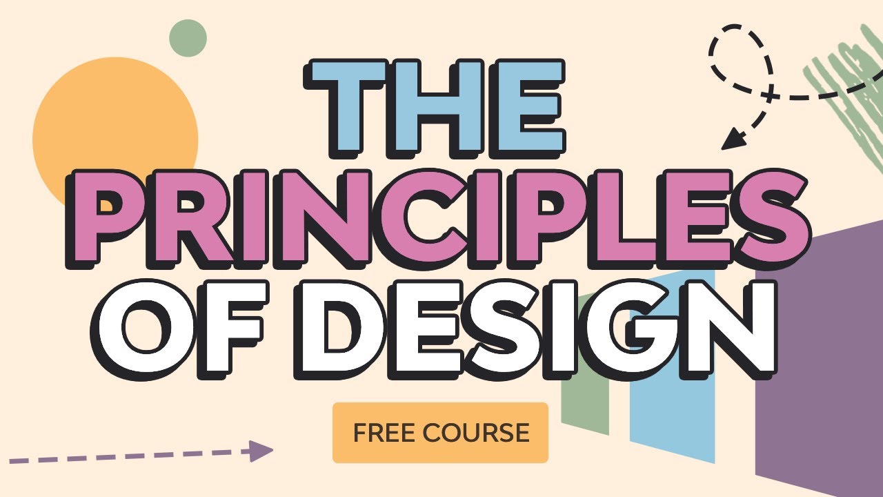
Learn more about design principles in this detailed course:
Instructor story
If you're looking for a place where you can find templates and graphic assets really easily, I recommend Envato. Recently, I was working on a website design, and this feature section needed to show an image of the client's app.


It's a Mac app, so I wanted to present it in a special, meaningful way. I found this Apple Pro Display Mockup on Envato.


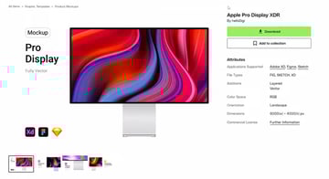
After importing it to Figma, I changed the image and then copied the whole thing into my project, adjusted the size and positioning, and I was done. Very simple, very fast.

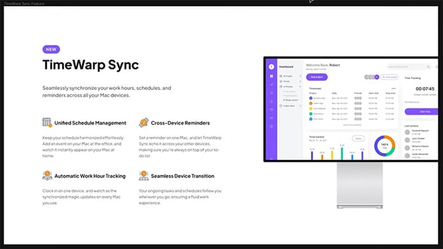
So check out Envato for all sorts of digital assets. You only need one subscription for unlimited downloads.
Choosing the right dimensions
The dimensions for social media templates depend on the platform you're designing for. Now, to give you a good resource for this, I came across a cheat sheet for the 2024 social media image sizes. This is a great article that gives you all the sizes for all the social media platforms.
Now, for the rest of this course, we'll be designing three social media templates for the same real estate agency. We'll create a Facebook post, an Instagram story, and an Instagram carousel post. That last one is going to be very interesting, so stick around. But for now, let's get started with the first one, which is the Facebook post.
Practical project: Facebook post template
As I mentioned earlier, we are designing these social media templates for a dummy real estate brand called Ascent Realty. Let's start by looking at the brand assets:

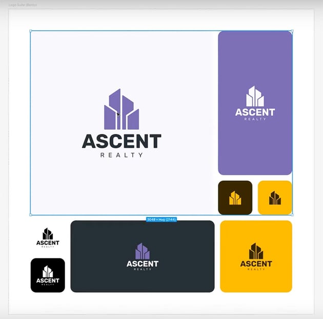

Logo suite
Here we can see the various versions of the logo, which I created based on this logo template. We have a full logo, and then we have the symbol in some color combinations. We have all these logo versions set up as components, so they're going to be easy for us to use.

Color palette
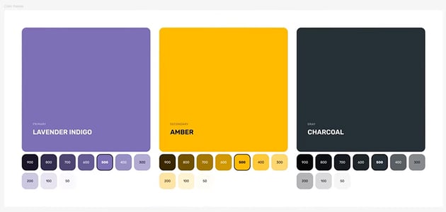
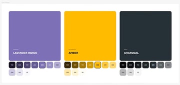
The color palette uses a primary lavender, and then amber as the secondary color and charcoal as our gray color, which we'll mainly use for text. We also have variations ranging from 50 to 900.
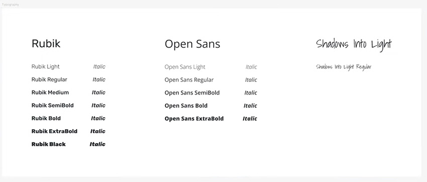
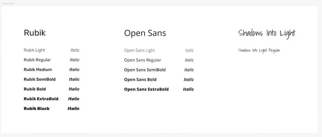
Typography
We're using three typefaces for this:
- Rubik is the main font.
- Open Sans is for body text.
- Shadows Into Light is just for accents every now and then.
I also made a type scale. It's based on a 20 px base value with a 1.25 scale, which gives us the correct font sizes to use throughout this design.
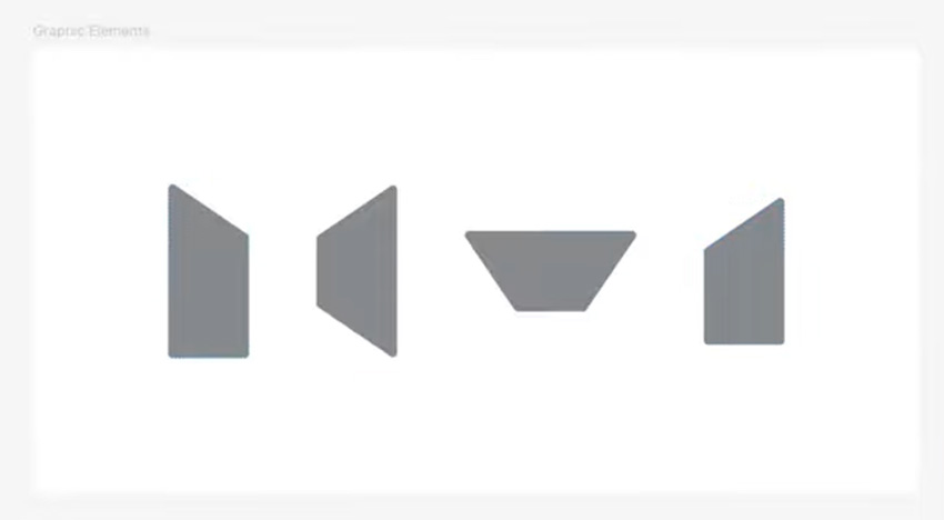
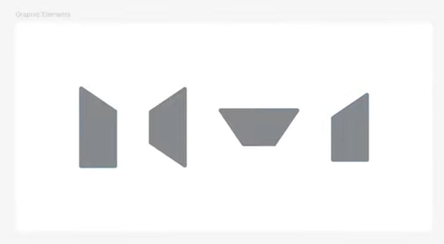

Patterns & graphics
We also have some patterns and graphics that are based on the logo design, and we'll be using these throughout this design project.
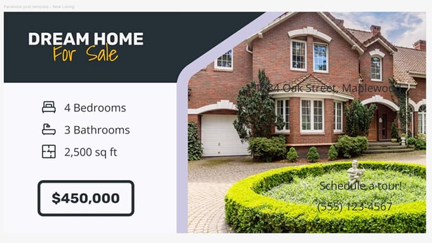
Now, let's open up the Facebook Post Template page, where I have a wireframe of the template that we need to design.


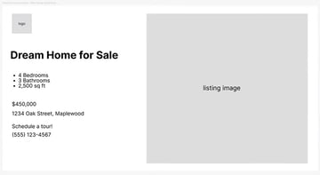
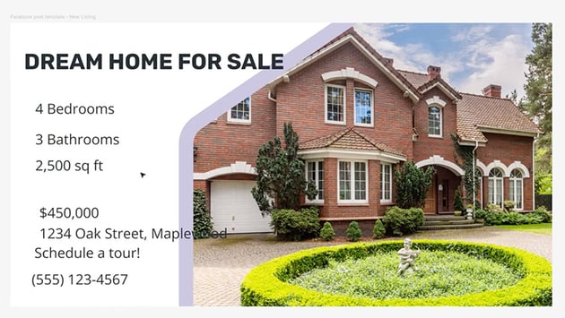
This is a template for a new listing. Whenever the agency wants to show off a new property, they can use this template to do that on social media. We have the logo, a main title, some key information about the property, a call to action, and a big listing image.
To create the template itself, let's create a new frame that's 1200 by 630 px. This is the proper size for a Facebook post.
Add the image
Now, let's design this Facebook post template in Figma. We'll start with the image because that's the biggest thing in the template. I'm using these Envato assets:
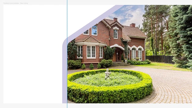
Let's go ahead and drag our image into Figma. We'll resize it and place it inside our new frame, on the right-hand side.
Now, I want to design this so it matches the brand identity, so let's go back to the brand assets and grab one of the graphics to use as a mask for the photo. So position the shape over the photo, nice and large, and then bring it to the top, group the shape and the image, right-click, and Use as Mask. That will mask the image exactly to the shape of the vector.
Now, let's also add a border that goes around the edge of the image. So we'll select the vector, duplicate it, and remove the mask from the copy. Then we just need to add a stroke in our primary lavender color, with a Size of 32 px. And this is the result:


The great thing about using masks in Figma is that it allows other users to easily change the image. They can click on the image and move it around, make it bigger, or replace it with a new image.
"Whenever you're creating templates like this that are meant to be reused, it's really important to organize your template in such a way that it's very easy to use later on. Masks are a great option for that."
In Figma, if you want to change this image to something else, you basically just double-click, select Swap > Upload New, and you can insert a new image there. Simple!
Add text and icons
Now, let's start bringing in some of the other elements. We'll copy in the text from the wireframe and give it the appropriate fonts from the brand assets.
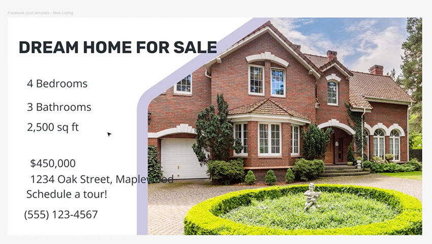

Now, of course we need to make the text look better. We'll move the address and call to action over to the right, and let's format the title to make it stand out more.
Let's start by changing "For Sale" to our accent font of Shadows Into Light. We can also add a darker background to the title by drawing a simple rectangle and bringing it under everything, including the image. For the fill color, let's use Charcoal 500. Then we can select the first line of text and change the color to Charcoal 50. For the second line, let's use our secondary color, which is Amber. Again, we'll go with 500, which is the base version of the color.

OK, that looks pretty good. Now let's work on the text underneath. We're going to add some icons from this icon set. Resize them to 40 px and set their Color to Charcoal 500.
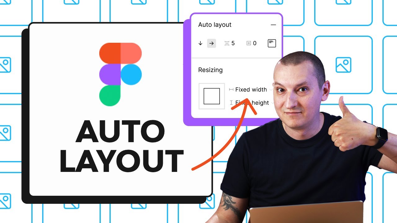
Now, let's do some Figma auto layout magic. Select the three text boxes, hit Shift-A, and then select the three icons, paste them in, and let's start grouping them up. Put the bedroom icon with the "Bedrooms" text, hit Shift-A to make a horizontal frame, align it to the middle, add a 24 px gap between, and let's push the text to the right side. Then do the same for the others.
Finally, let's make the text for the price bigger, and we'll use our main typeface here, and it's going to be bold.
It's looking good now, but remember one of the design principles that we talked about, the white space? We need to let our design breathe. So we need to add some space around the text by moving the image more to the right side. Check out the gallery below to see the before and after.


Format the address and call to action
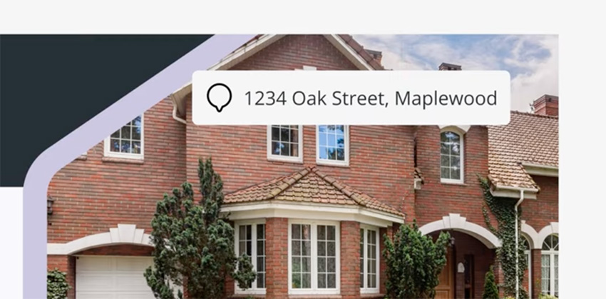
Now, let's focus on the address and the call to action. Because we're placing this text over the image, we need to either make the text a color that will contrast well or add a background to it.
Let's add a background. We'll hit Shift-A to add this to an auto layout frame, and we'll set the Fill Color to Charcoal 50. Let's use 16 px for the Padding, and 8 px for the Border Radius. Then let's add an icon to the address that symbolizes location.


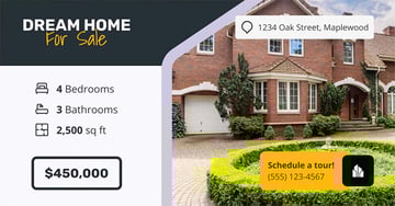
The final thing that we need to to design is our call to action, which says "Schedule a tour!" We need to display the company logo too, so let's add one of the symbol logos from the brand assets, and then set the Fill Color of the text box to Amber 500. I'm doing this because it's a very bright color, so it immediately stands out, and of course, it matches the "For Sale" text in the title.
To position the logo with the text, hit Shift-A to add an Auto Layout and make sure they're properly aligned. This time, we'll place the logo over the Amber box by using negative spacing, something like -24 px. And that's our Facebook post template!


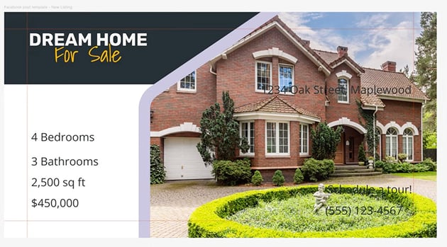
Now, because this is a template, you have to make sure that it's going to look good when you or other people change its contents in future. That means if you change some text elements, are they going to break the layout or not?
Right now, if you change the address, it flows outside the box. To fix this, we just need to set the alignment to the right side. So align the text to the right, and then select the text box and go to Constraints, and constrain it to the right side.
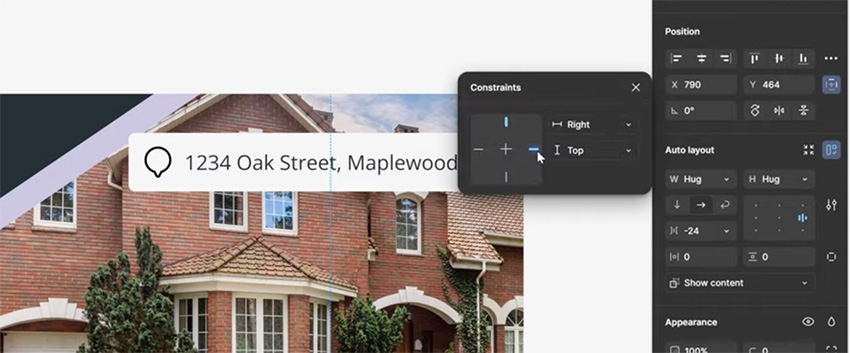


Now, if we change the text, it doesn't overflow. It's important to go through and test all the elements to make sure the layout still functions when you change the text values.
Practical project: Instagram story
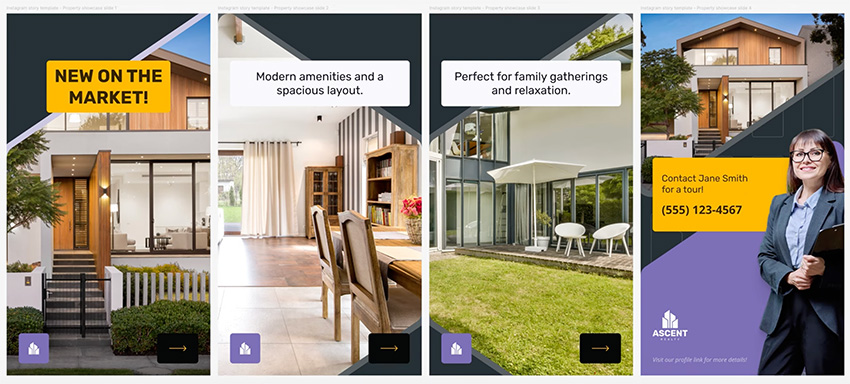
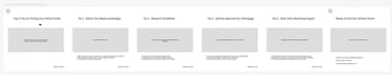
Now, for our Instagram story template, we're going to create one that's made up of four slides. Here are the wireframes:
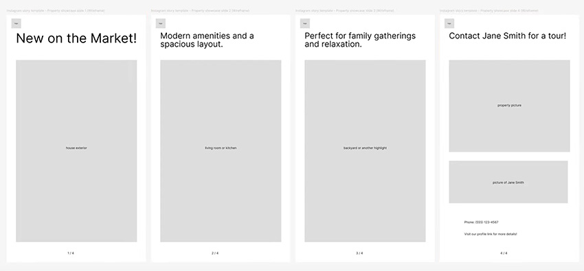

This template is for a property showcase. On the first slide, we're going to have a title and a big picture of the property. On the next two slides, we're going to have big pictures showing the main features of the property. And the last one is basically a call to action, giving people a way to contact the realtor about what they saw in the other slides of the story.
These are the assets we'll be using:
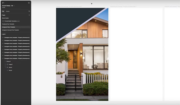
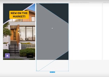
We'll start by preparing four frames that are 1080 by 1920 px. So these are in portrait mode, and they're the correct size for an Instagram story.
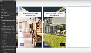
Slide 1
Because we're designing this for a brand and this is a set of templates, we need to use the same style. So of course we'll use the brand assets, but also we're going to be reusing some styles that we used in the first template, like the image that's masked by a shape.
So let's copy that into our frame, make it bigger, reposition it, and change the image. Now, instead of having a white background, let's select the frame and change the Fill to Charcoal 500.


Now we can add the title with an Amber fill to make it stand out on this dark background.
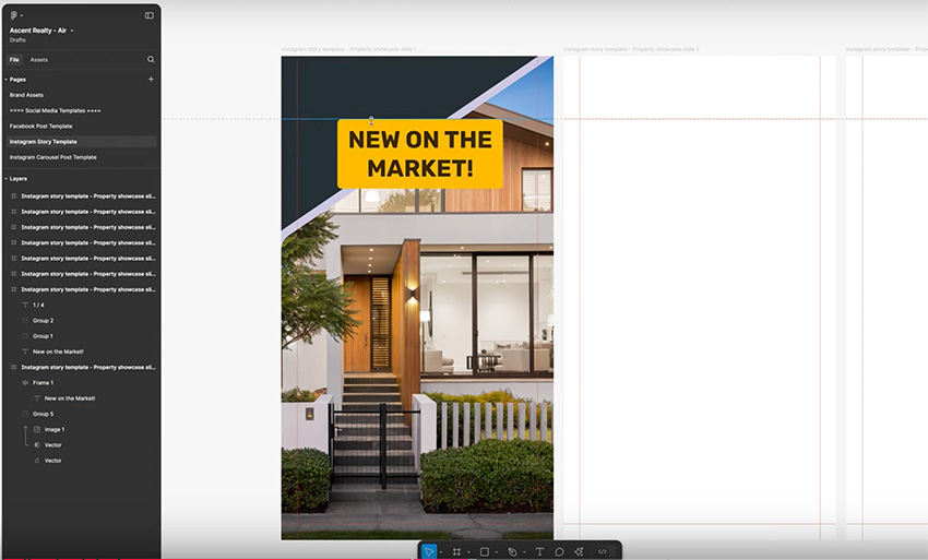


Next, we have two other things to add at the bottom of the slide: the company logo and an arrow as a cue to encourage users to swipe to the next slide.
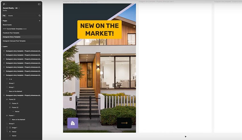


Okay, that's a good first slide. Let's move on to the second one.
Slide 2
The second slide will be similar to the first, except the title will be smaller, and we can use a different type of image.
Let's start by changing the Fill Color to Charcoal 500 to match the first slide. Let's use one of our other shapes from the brand assets. We'll paste it in and press Shift-H to flip it horizontally.


Now we can bring in our image and use this shape as the mask for it. We'll add a Stroke of 32 px, and we'll use a variation of the charcoal—we used 500 on the background, so let's go with 400 for the border to make it quite subtle.
We can just copy over the logo and arrow from the first slide, and then let's add the title. Hit Shift-A to put this in an auto layout frame, and fill it with our brand primary color, Indigo 50. Align everything to the middle, and set a 48 px padding all around. We'll use 16 px as the Border Radius. And change the Font to Rubik Regular, 61 px, 120% Line Height, and for the text color, we'll use Indigo 900. And that's our second slide done.


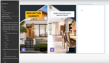
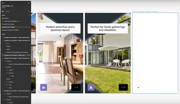
Slide 3
Our third slide is very similar, so we can set the same background color and copy and paste everything from the second slide.
Instead of having the shapes facing the right side, however, let's flip them around: right-click > Flip Horizontal. Now they mirror each other between the second and the third frames. Now just copy and paste the new text for ths slide, and change the image. And that's slide 3 done!

Slide 4
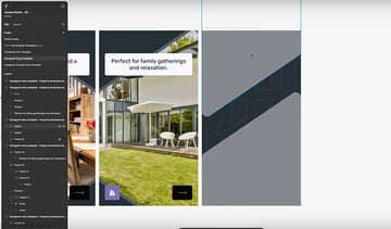
For the final slide, let's do something a bit more special. We'll use the same Charcoal 500 background that we used for the other slides, just to maintain consistency. If we go back to the brand assets, we have a pattern that we haven't used yet. So let's add that to the background, with a color of Charcoal 400 so that it's a subtle decorative element.


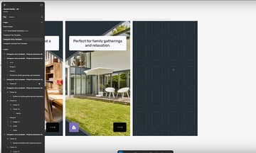
Because we've used a shape-oriented approach across our design, let's do that here as well. So go back to the brand assets, grab one of the shapes, and paste it in and position it. This time, though, press Command-D to duplicate it, Shift-V to flip it vertically, and then Shift-H to flip it horizontally and create an up-and-down style.


Place the images and add the logo and text using the same techniques you've already learned. But now we also need to add a picture of Jane Smith, our realtor. We have a photo, but I don't want the background—I just want a picture of the person.
Here's a nice trick that we can do in Figma using an AI feature that's still in beta. Click the icon at the bottom and choose Remove Background.
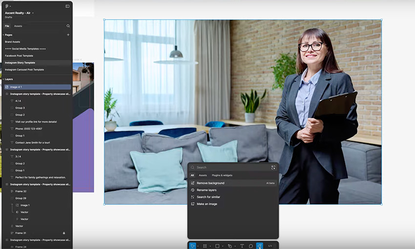
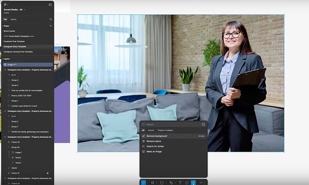

Figma is going to analyze the image, and in a few moments, it will cut out the person from the background. It actually works really well. Now we can just bring this in and resize it.
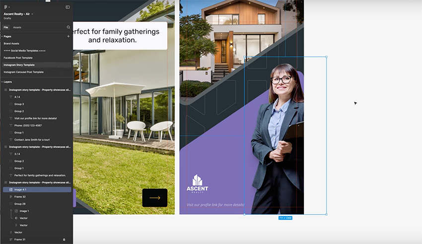

Finally, we have the call to action. We can copy and paste the Amber text box from an earlier slide, and just change the text. And now our fourth slide is complete. This is what we created in this lesson: a "property showcase" Instagram Story template for a real estate brand.
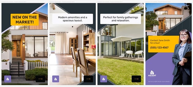

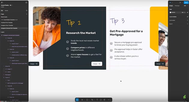
Practical project: Instagram carousel post
If you're not familiar, an Instagram carousel post is basically a series of images or videos. We're aiming to present information across multiple slides, but make them look as if the slides are all part of one big image, and you're just swiping right or left to see various portions of that image.
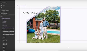
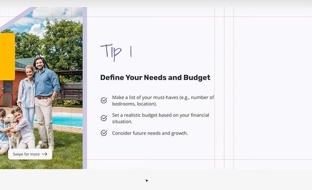
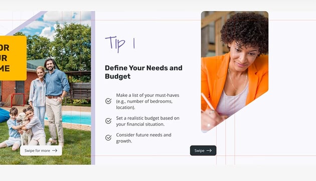
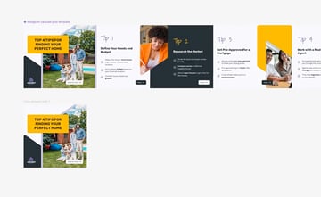
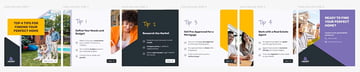
We're going to create six slides with tips for finding your perfect home:


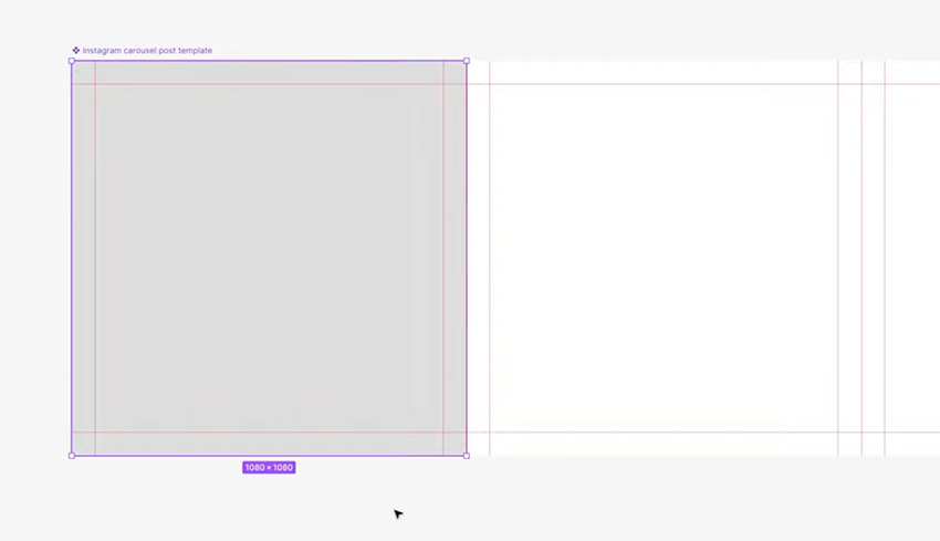
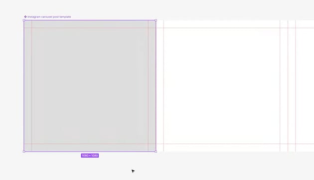
Each of these slides is 1080 px by 1080 px. Because I'm creating six of them, I just made one big frame that's 1080 px in height and then 6 x 1080 px in width. So inside it, I have six 1080 by 1080 squares, and I've created guides to show where they start and finish.
Also, the assets that we're going to be using are as follows:
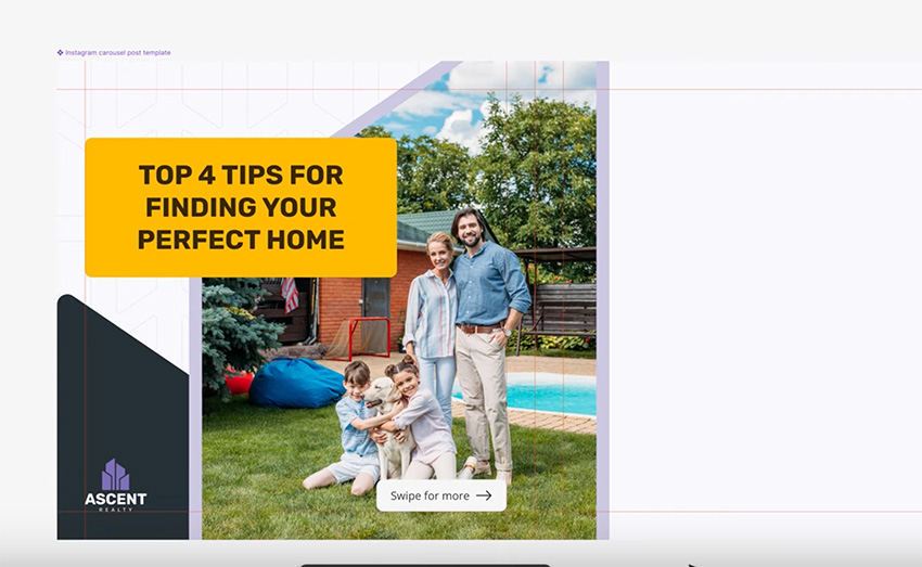
Slide 1
Let's start with the first slide, and we'll just copy the text and bring in the first image. I'm going to be alternating between a lighter background and a darker background in some of these slides. I don't want to use just pure white, so let's use Indigo 50, a very light variation of our primary color.
For this first slide, I want to use that pattern that we have available, with a subtle color of Indigo 100.
Next up, we're going to use the same angled shapes that we used in the other templates. This time, though, we'll position them so that they span two slides. Add the image using the shape as a mask—you know how to do this by now!
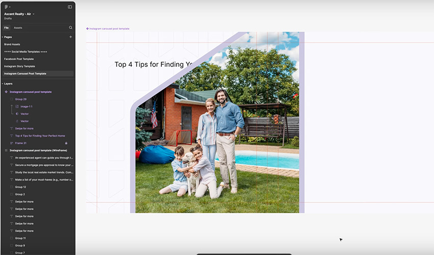

Now, let's give the text an Amber background—we can copy and paste one of the text boxes from the other templates to use the same style. And we'll add the logo and a "Swipe for more" box. Be sure to use the guides to align everything. And slide 1 is done!


Slide 2
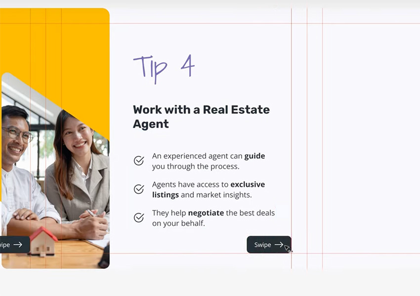
Now, let's move on to the second slide. We'll add our tips first, using the Bootstrap checkmark icon to create bullet points. We'll use our accent font for the title and the lavender color. Make sure the text is constrained to the box and vertically aligned to the center so that people can add more text and additional points without breaking out of the bounds of the box.


Now let's make the layout more interesting by adding another shape overlapping the boundary of slides 2 and 3. Make it upside-down compared with the earlier one (Shift-H, Shift-V). And we can use an image of a woman writing to tie in with the to-do list format. Finally, add a "Swipe" button, switching the colors around since we have a light background here.


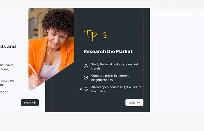
Slide 3
For our next slide, let's create a shape that's going to fill up the entire slide, using the Charcoal 500 Fill. Then we can use the same format for the text, but switch the colors to use Amber for the title and Charcoal 50 for the body text. Then we need to swap the colors for the "Swipe" button too. And that's the third slide done.


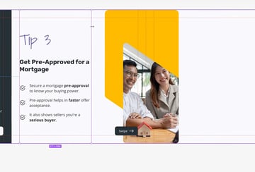
Slide 4
Our next slide is about getting approved for a mortgage. So we'll add the text using the same format as before, and then let's add some shapes and imagery. This time, we'll use two shapes—one with an Amber background and the other flipped horizontally and vertically and overlapping it to act as a mask for the image.


Now we just need to use the shape as a mask for the image, position it, and set up the "Swipe" button, and this slide is done too!


Slide 5
Our next slide is easy because we already have the image overlapping from the previous slide, so we just need to add our text.


Slide 6
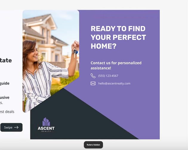
Finally, let's create the content for the final slide, which is basically a call to action. We're going to use a slightly more complex layout this time, with three overlapping shapes. One will contain an image of someone getting the keys to their new home, and the others will be overlapping shapes in Lavender and Charcoal 500.
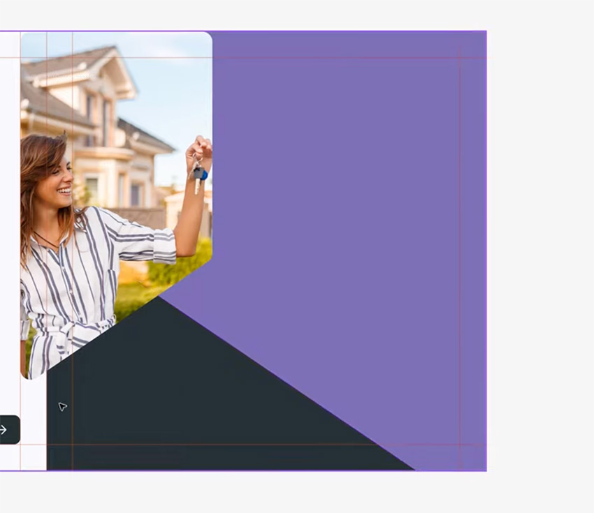

Now let's place the logo at the bottom and use the Scale Tool to resize it to 120 px in Height. Then align it with the guides at the bottom.
Finally, we're going to place our contact information, adding icons for the phone and email from the Bootstrap icon set.


Export the carousel for Instagram
Now we have all six slides created in one continuous image. Now, you're probably wondering why I did it in such a way. Why did I create a component out of this, and how are we getting this on Instagram?
I made it as one continuous image because it's much easier to work with, and I created a component because I want to chop this up into six individual slides.
Now let me show you how to get this on Instagram. What you do is you create a frame that's 1080 by 1080 px. That's the exact size of one of the slides. Then you grab the component that we just created, copy it, and paste it into the new frame, and you align it to the left and to the top. That shows you just the first slide.


You then duplicate this, and you move this instance of the main image to the left by 1080 pixels. So under Position in the sidebar, you enter X -1080. That shows you just the contents of slide 2. Then, for Slide 3, you subtract another 1080 pixels, and so on.
By the end, you'll have six separate 1080 x 1080 px frames.


Now just select all of them and Export as PNG, and you'll have six images that you can upload to Instagram and create the carousel post. When it's on Instagram, because we created overlapping images and elements between slides, people will see the partial images and constantly get visual cues to swipe to the right. And they'll get that seamless swiping experience, so it looks like one seamless image that they can see in its entirety if they just keep swiping. Pretty cool, right?
Key takeaways
Now, let's have a look at a few key takeaways from this course:
- Figma is a great tool for designing social media templates. It's free, cross-platform, very easy to learn, and it has plenty of useful tools, including AI-assisted ones.
- When designing social media templates, you should use these key design principles: consistency, white space, hierarchy, and accessibility.
- Social media platforms have different size requirements for the images you post. Make sure you use the correct one.
- When designing carousel posts, use visual cues to inform users that they can swipe right to reveal more information.
As always, don't forget to check out the free Figma tutorials on Envato Tuts:

 5 Figma Tricks and Tips for Beginners


 How to Use Figma Variants

 15+ Best Landing Page Designs for Figma 2024


 How to Use Figma’s Inspect Panel


 Essential Figma Shortcuts for Working Efficiently

 How to Fix Cropped Shadows or Overflowing Elements in Figma
And subscribe to the Envato Tuts+ YouTube channel for more content like this and to learn about web design, web development, and much more. Here are some great videos to watch next: