How to design a logo in Illustrator
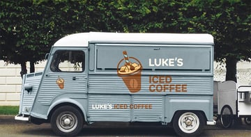
In this course, we're going to dive into the logo design process using a recent logo that I created for a fictional coffee brand, Luke's Iced Coffee.
"What's the secret to designing a logo that leaves a lasting impression? It's all about mastering the fundamentals of graphic design."
First of all, let's talk about the importance of a logo design in branding. A well-designed logo is essential for branding as it serves as the visual cornerstone of a brand's identity. If designed correctly, a logo can create a memorable first impression, communicate the brand's values and personality, and help distinguish the brand from its competitors. It builds trust and can significantly influence consumer perception and loyalty.
In summary, a logo is a powerful tool that encapsulates the essence of a brand,making it instantly recognizable and relatable to its audience.
Logo design process
Now, let's do a quick overview of the logo design process. This typically begins with understanding the brand's identity, values, and target audience, often through a detailed design brief.
This is then followed by brainstorming and sketching some initial concepts, exploring various ideas and visual directions. You can then refine your best ideas and digitize them using graphic design software like Adobe Illustrator.
During this phase, you can experiment with color schemes, typography, and different styles and shapes to create a cohesive and appealing design. And of course, you'll need to factor in any feedback from your team or client too.
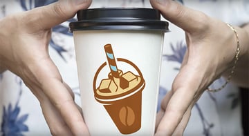
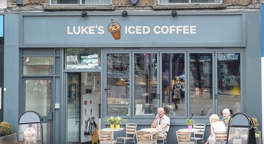
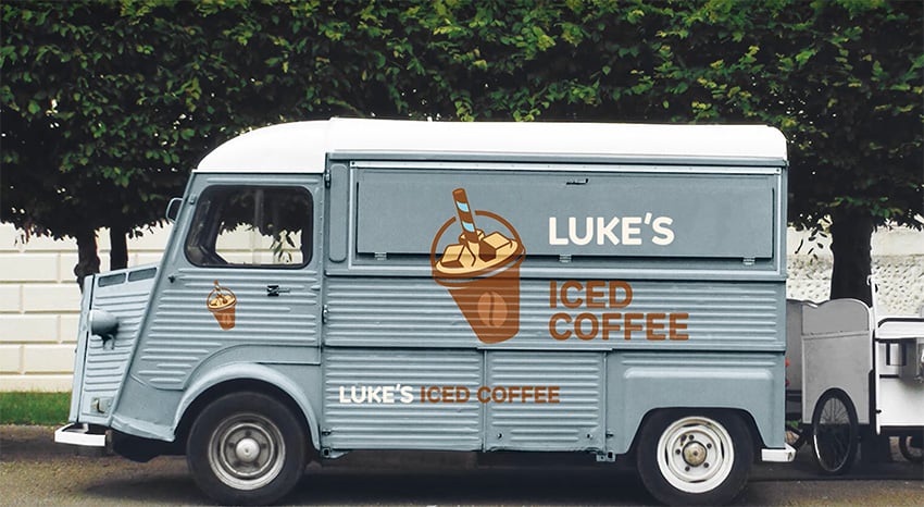
Finally, after working through any revisions, you can present the final logo to your team or client. At this stage, it's a good idea to showcase the design mocked up in a few real-world scenarios.


This video is brought to you by Envato, the unlimited creative subscription. Find and download quality graphics, templates, photos, and fonts.
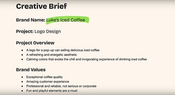
The brief
Since this was a fictional project, the brief was fairly open. We came up with the brand name, Luke's Iced Coffee, and it was always intended to be fun, like a pop-up-style van business selling ice-cold drinks in the summer. The identity needed to embody a refreshing and energetic aesthetic, with calming colors to evoke the chilled and invigorating experience of drinking iced coffee.
In terms of the brand's values, it's all about the quality of the coffee and the customer experience. They're professional and reliable, but they're not too serious or corporate, so including some fun and playful elements is a must. And the target audience is young professionals, college students, and busy people aged around 18 to 35 who are looking for a convenient and delicious way to stay energized throughout the day.


The brief here was very loose since it was a fictional project, but if you're working to a real brief, it's always a good idea to refer back to it as your design progresses, just to check that what you're creating is fulfilling the requirements.
We'll be creating this logo almost exclusively in Adobe Illustrator using a variety of different tools and techniques. Personally, I don't sketch out anything on paper—I'm more of a digital guy, and I predominantly design with a mouse or trackpad, unless it's something that has a lot of lines and a lot of curves, or perhaps some more organic shapes, in which case I'll use a pen tablet or pen display to make life easier.
Brainstorming is the beginning of the creative process for me, whether that's mind mapping ideas or having a bubble with ideas coming off it or just sketching out things very crudely. I can then pull together some initial ideas that will hopefully branch out into new ideas that will be a bit more exciting down the line.
Graphic design basics
Now, let's cover a bit of design theory. Understanding design theory will help you ensure that your logo designs are visually appealing, effective, and convey the intended message. Here's a quick overview of the key principles of design:
- Balance ensures that the logo feels stable and harmonious. Symmetrical balance provides a sense of formality and order, whereas asymmetrical balance can create a dynamic and interesting design.
- Proportion maintains the relationship between different elements, ensuring that no part of the logo overwhelms another. Proper proportion contributes to a cohesive and aesthetically pleasing design.
- Emphasis highlights the most important elements of the logo, guiding the viewer's attention to the focal point, and this helps in conveying the brand's message clearly clearly and effectively.
- Rhythm can create a sense of movement and flow within a logo, leading the viewer's eye across the design in a deliberate way. Rhythm can also add a dynamic quality and ensure that the logo is engaging.
- Contrast differentiates elements through variations in color, size, shape, or type, making the logo visually interesting and ensuring that it stands out.
Throughout the logo design process, I meticulously refined every element to ensure that everything was perfectly balanced, particularly with the logo mark. I started by exploring different layouts and arrangements, and by adjusting things like the size and placement of the text and the logo mark, I was able to achieve a cohesive look that maintains visual interest and readability. I created emphasis through a strategic combination of fills and strokes to make some areas appear bolder. Contrast was another key consideration, so I experimented with various colors and tones to ensure that the logo would stand out.
Typography
Typography plays a crucial role in logo design as it can convey the brand's personality and values through the style and arrangement of text. The choice of font can evoke specific emotions and associations. For example, serif fonts often suggest tradition and reliability, whereas sans serifs convey modernity and simplicity.
Good typography is easy to read and memorable, making the brand name easily recognizable and distinctive. Spacing, alignment, and the integration of text with other elements are also vital in creating a balanced and cohesive logo.
"Good typography not only communicates the brand's message but also enhances the overall aesthetic and the effectiveness of the logo."
Here you can see an example of another logo I designed. For this one, both the logo mark and the logo type have similar slightly rounded edges. This is so both elements of the logo fit together nicely, and this approach also aligns with the brand's values. Choosing a different typeface would drastically change not just how the logo looks, but also the feelings that it can evoke.
Color theory
Color theory is also vital in logo design because colors evoke emotions, convey messages, and influence perception subconsciously. The right color choices can significantly enhance a logo's impact, making it more memorable and recognizable, and different colors and combinations can communicate various brand attributes. For instance, blue often signifies trust and professionalism, whereas red can evoke energy and passion.
Understanding color theory will help you select colors that align with the brand's identity and appeal to the target audience. Additionally, color contrast and harmony are crucial for ensuring the logo's readability and visual appeal across different mediums and backgrounds.
"Color theory helps create a powerful visual identity that resonates with viewers on an emotional level."
For this logo, I never really left the beige, creamy, caramel-style colors, but I always wanted an accent color, something completely different, to give the brand a unique flavor and to help it stand out. Learn more about the best logo color schemes.
Design the logo in Illustrator
Now we're going to jump into Adobe Illustrator, and I'm going to show you the tools and techniques that we use to create this specific logo.
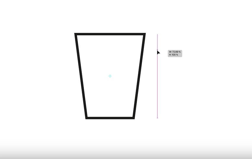
1. Create the cup
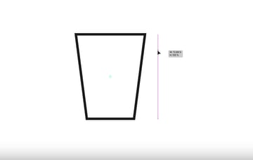
First of all, let's grab the Rectangle Tool and draw the base of the cup. Make sure the fill is set to none, and make the stroke weight a bit thicker. Now, with the Direct Selection Tool, select just the top two anchor points and press S for the Scale Tool. We can now scale just those two points out, leaving the bottom tapered in slightly.

Now, select the Ellipse Tool and click and drag to create an ellipse. Then Copy it and Paste in Place, and then drag the copy down slightly and stretch it out to the sides. Remember, you can hold Alt or Option to scale from the left and right sides at the same time. Now, let's click and hold Shift to make a circle. We're also going to move this into position, making sure everything is centrally aligned.
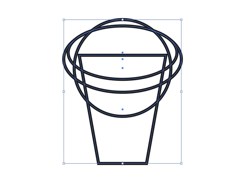
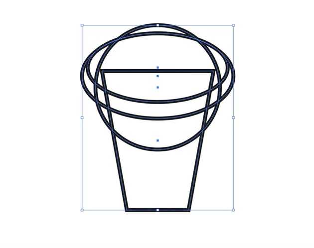
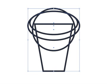
We've got a lot of lines going on, so use the Direct Selection Tool to remove any that you won't be using as part of your design. Another useful tip is to switch into Outline Mode with Command-Y, and you get a wireframe of your design. Something else I like to do is copy certain shapes and then move them out to the right or left with the arrow keys, just in case I need them later.
Now let's use the Shape Builder Tool to trim off the end points by clicking while holding Alt or Option. You can also click and drag through different shapes to combine them.
Next, we need to make the bottom line curved so that the cup looks three-dimensional. So delete the existing line with the Direct Selection Tool. Then use the Pen Tool to create a curve for the left half of the cup, fine-tuning it to make it perfectly smooth.
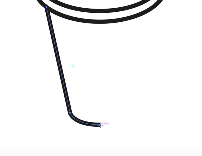

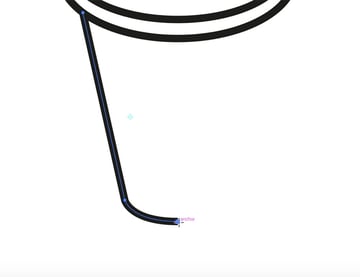
Then simply use the Reflect Tool (O) to create the right side—this ensures that it's perfectly symmetrical. Use Object > Path > Join to make the two halves into a single shape.
Now we can add a solid black fill, and let's use the Pen Tool to create a little cutout shape on the left to add a three-dimensional look.


If you need a Pen Tool refresher, try this guide:


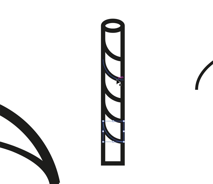
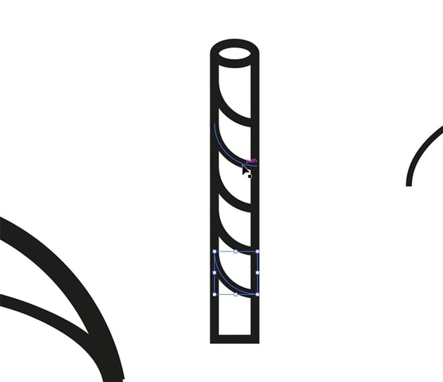
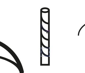
2. Create the straw
Let's create another rectangle for the straw, and we'll thicken up that stroke. Then create an ellipse the same width as the rectangle for the top of the straw. Then to create the pattern on the straw, grab the Arc Tool, and click while holding Shift to create an arc. Then drag it down with Option-Shift to duplicate it, and then press Command-D to repeat that action.
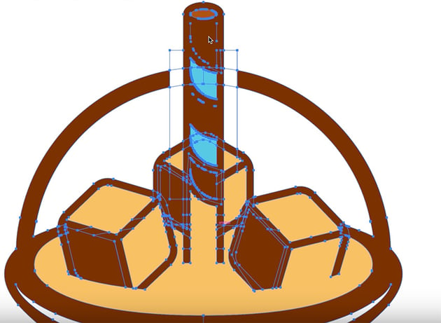
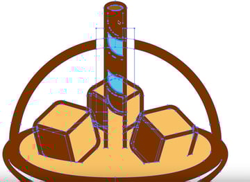
3. Create the ice cubes
For the ice cubes, we're going to grab the Polygon Tool, click anywhere, and type 6 as the number of sides. Now rotate it 90 degrees, make the corners slightly rounded, and with the Pen Tool, click in the center and then click out into the corners. We now have a 3D cube.
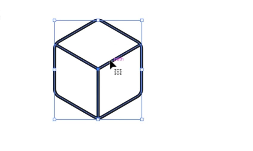
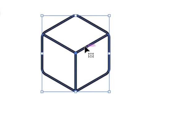

Create two copies of the cube, and resize and rotate them to make them look slightly different. Position them on top of the cup, at the base of the straw.
4. Add color
Now that we have the basic elements of our design, it's time to add the color palette. I like to create small circles for each color, and then fill them in using the appropriate hex codes, in this case:
#58cae8#f9c166#7c3200#af5315
Now I can use the Eyedropper Tool to apply these colors to each element of the design. The keyboard shortcuts are I for the Eyedropper Tool and K for the Live Paint Bucket Tool, just so that it's quicker to switch back and forth between them.
So now we can position the ice cubes and straw properly and apply the colors to those too.
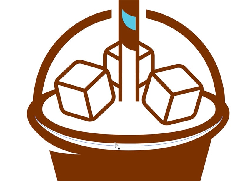
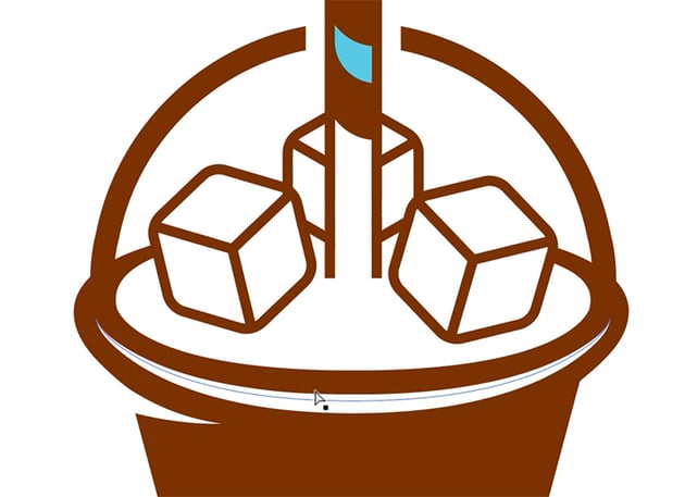
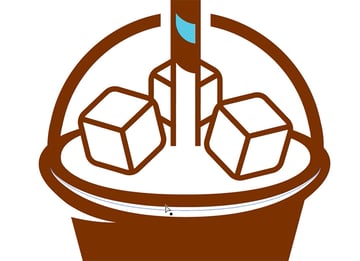
I want the ice cubes to look as if they're sitting in the iced coffee, so I'm going to use the Pen Tool to draw a curved white shape to cover the bottom part of the ice cubes. I'm also going to add a solid brown shape to the left side of each ice cube to act as a shadow.
5. Create a coffee bean symbol
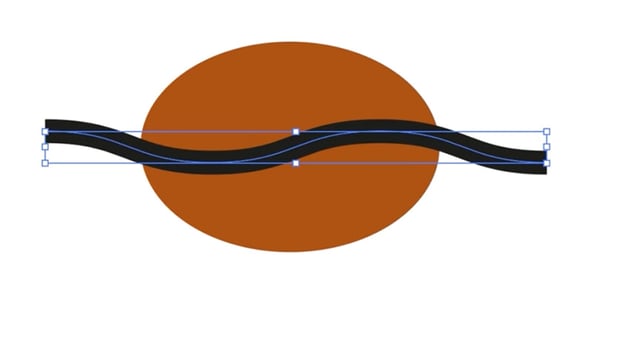
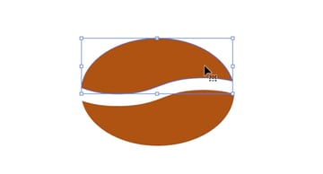
Next, I'm going to create a coffee bean symbol with an ellipse and a horizontal line. Simply add a Zig Zag effect to the line, set to Smooth and with 2 Ridges per Segment. Then we can use the Shape Builder tool to knock out the black line from the brown ellipse. Finally, group both halves, and we now have a coffee bean symbol that we can rotate and move onto the cup.


6. Fine-tune the design
We're almost finished with our design. We just need to make some final adjustments to make sure everything looks perfect and symmetrical. It's also a good idea to delete any unneeded shapes and anchor points just to keep things simpler and easier to manage if we need to make changes in future.
A simple fix if you see small gaps is to use the Pen Tool to create shapes to cover them up, and then the Shape Builder Tool to combine all the shapes. You can also use the Direct Selection Tool to select and delete small pieces you don't need.

And now we have a finished design!


Text treatment
Now it's time to add text to our logo design. This involves three simple steps:
1. Add the text
Use the Type Tool to add the text in three text boxes aligned to the left. Select the New Rubrik Edge font, and use the blue accent color for "Luke's". Tighten up the Tracking a little to make the letters a bit closer together.
2. Align the text with the design
Next, rotate the cup so that the right edge of the cup lines up perfectly with the left edge of the text. Give these two elements a bit of breathing space, and then center the text with the logo mark on the left.
3. Add a background
Finally, let's draw a large rectangle for the background, giving it a pale creamy caramel color to complement our design.
And our logo design is finished! I hope you can take everything you've learned and apply it to your next design project.
If you're still eager to learn more about the logo design process, try these free logo design tutorials from Envato Tuts+:
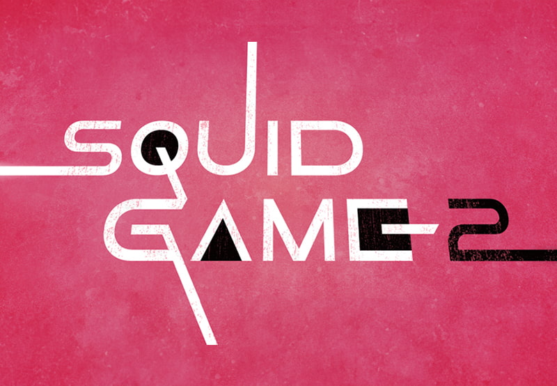

 How to create the Squid Game logo


 How to Create the Transformers Logo in Illustrator


 About the Harley-Davidson Logo: Skulls, Wings, and Fonts

 How to Draw the Ghostbusters Logo

 How to Create the Dune Movie Logo


 15 Best Rose Logo Designs (Including Red & Black Roses)
And you can keep watching more videos from the Envato Tuts+ YouTube channel. Here are some recommendations: