

Intro
This isn’t just some cute character doodle session. This is the full process of designing a character that looks cool and is actually built to move.
-
It covers everything from early sketch to final polished art
-
Breaks down how to prep every limb, joint, and floating eyeball for animation
Whether it’s for slick motion graphics or explainer videos, this guide is: Straightforward. Practical. Built for animation.
Part 1: Who are we creating?
Step one in Illustrator character design: ask the obvious question
Who the hell is this character? What’s their deal? Why does it exist?
Yeah—it absolutely matters whether this is for a client project or your personal portfolio. Skipping this step is how you end up animating a featureless, soulless blob.
For client work: decode the brief before you draw
Best tip to start: read the brief like your job depends on it—because it does.
If characters are part of the ask, figure out the vibe:
-
Funny?
-
Serious?
-
Sentimental crybaby?
-
Offbeat but somehow still corporate-approved?
For personal projects: steal from life, then exaggerate
No brief? Cool. Make one up to make your life easier.
Start with what’s around you:
- Is there a scene in your city you keep noticing?
- A stereotype that’s begging to be exaggerated?
Blow it up, distort it, turn it into something that only barely resembles reality. That’s where the magic is.
This project: a clash of weirdos

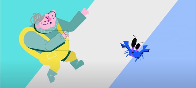

The plan is to create a face-off between two characters for animation. Think video game intro screen.
Start by pulling descriptors out of a hat (literally or metaphorically). Example: alien, grandma, fisherman, baker, postman, boy, secretary, ecstatic, glamorous, ugly, crab.
Mash them together until something weird and oddly perfect comes out.
- Grandma vs. Crab? Sure. Why not.
- Ecstatic alien postman? Absolutely.
- Ugly glamorous secretary crab? Perfection.
Part 2: Sketching
Quick reality check
This is not your moment to win an art award. This phase is about one thing: ideas. You may not build a masterpiece, but you need a good design direction.
It’s not about being a great illustrator—it’s about thinking fast.
Character selection: welcome to the weird zone
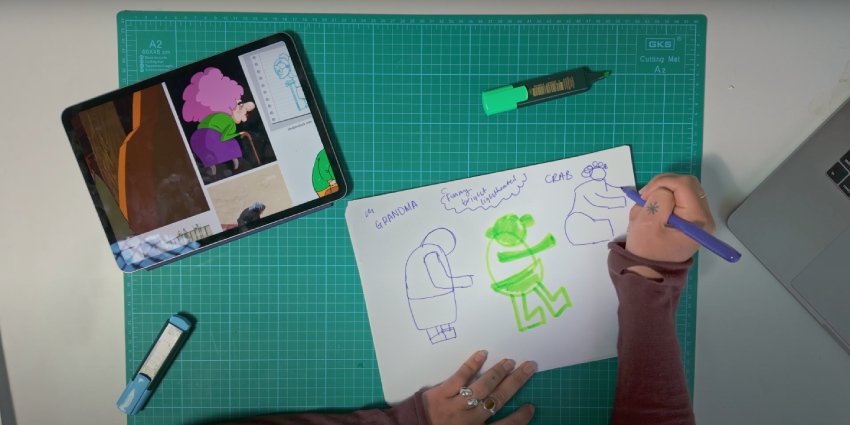
Two words were pulled: “grandma” and “crab.”
What came out? A fisherman grandma vs. a crab. It's confusing, chaotic, and exactly what you want.
Build your own scene (a.k.a. don’t wing it)
Before the pencil hits the paper:
-
Write down your chosen keywords (yes, actually write them).
-
Toss in some additional tone descriptors: comical, bright, funny, light-hearted. This sets the mood.
This is the foundation. Don’t skip it.
Gather reference imagery (because memory lies)
Time to sketch your character design for animation
Don't think, just draw.


Start blocking out shapes using your grandma references.
-
Big arch = hunched back
-
Circles = hips and head
-
Rectangles = feet, legs, maybe arms if she’s blocky
Keep it ugly. Keep it simple. You’re building a design skeleton, not painting the Mona Lisa.
Shape = personality (yeah, it’s a thing)
-
Rounded shapes feel soft, safe, friendly
-
Sharp, pointy shapes feel dangerous, sketchy, or unhinged
-
Big exaggeration = big personality
Give the character some visual flavor:
-
Giant glasses
-
Hunched-over sass
-
Short proportions
-
Cranked-up “grandma-ness”
The crab: chaos in eight legs
This dude is the contrast character. He should feel weird.
-
Pointy? Yes.
-
Googly eyes? Definitely.
-
Emotionally unavailable? Probably.
Look up crab anatomy. Then break it. Crabs are weird. Lean into it.
Think about animation early
Ask:
-
How will this move?
-
Is this going into cel animation or a rigged puppet setup?
-
Will it need to twist in 3D space or just stomp across screen yelling at clouds?
If lots of perspective shifts and time aren’t an issue, go with cel animation. For explainer videos or reusable movements like walking/jumping: rig it. A rig = a reusable puppet. One setup, infinite motion.
Plan the poses
What will your character do? How will they move? And what poses are needed?
-
Pose with a fishing rod?
-
Leap at a crab mid-battle?
-
Do a full wind-up punch like an arthritic Ryu?
Great designers have camera rolls full of awkward reference shots. Own it.
Final sketching pass
Take the best sketches, refine them:
-
Sketch shapes into key poses.
-
Add clothing, accessories, and any defining features.
Once there’s confidence in the direction, snap pics of the best sketches and bring them into Illustrator.
Repeat for the crab
Same steps:
-
Reference-heavy
-
Block out shapes
-
Push the personality
Acting like a crab is optional—but if you commit, commit hard.
Sketching is about speed, weirdness, and direction—not perfection. Get in, get weird, and get out.
Part 3: Initial drawing
Pick your poison
Time to start drawing, take that sketch and make it look like it belongs on purpose. Choose your weapon:
-
Photoshop is cool, if chaos and texture are your thing.
-
Designing a character in Illustrator is today’s battlefield. Clean, crisp, vector-perfect.
-
Something else is also fine, as long as it doesn’t make you punch your screen.
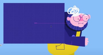
Start with a giant artboard
Go big. No one thrives in a shoebox. You want space to breathe, build, and make mistakes loudly.
-
It forces focus on value and contrast—the lifeblood of readable design
-
You’ll deal with color later, once you’ve nailed shape, form, and intent
-
You'll avoid muddy color disasters
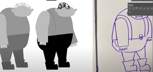
Trace, adjust, repeat
- Trace over the sketch. Spoiler alert: it won’t be perfect. That’s fine.
- Adjust light and dark to separate limbs, shapes, and features.
- If you don’t trust your eyes, flip the canvas and watch the mistakes reveal themselves.
This is the grind phase. You’re not painting the Sistine Chapel. You’re building a machine.
Flip it or flop it
Check the silhouette. Constantly.
- If it’s unreadable in silhouette, it’s going to be a disaster in color.
- Find muddled areas, fix them, check again. Rinse, repeat.


Tools of the trade (Illustrator edition)
You've made up your mind, you're designing a character in Illustrator. Here's what you'll need to survive:
Knife Tool
-
Perfect for shadows
-
Copy (CTRL+C), Paste in front (CTRL+F), slice and dice
-
Delete the fluff, keep the drama
Width Tool
- Great for tweaking stroke width.
- Used to bulk up those crab legs.
Shape Builder Tool
-
Your best friend when paths start getting political
-
Merge or separate shapes like a pro
Brush Tool
-
Great for when you want a more hand-drawn, organic feel
-
Bonus: You can re-edit selected lines
Shortcuts to save your sanity
-
CTRL+F2 = Lock shapes
-
ALT+CTRL+2 = Unlock shapes
-
V = Normal Selection Tool
-
A = Direct Selection Tool (surgical precision mode)
Embrace the chaos (or don’t)
-
Make copies as you go. Compare progress.
-
Stay messy in early phases if it speeds you up.
-
If you prefer order, layer like a control freak from the start.
-
Either way, get it done.
Rendering doesn’t need to be a precious, polished ritual. Use the tools. Break the rules. Just don’t end up with a crab that looks like roadkill.
Part 4: Color
Color without panic. Because grayscale was starting to feel too safe.
Lock it down before the chaos hits
If you're happy with the design, that's awesome. Time to add color—a.k.a. the part where fear kicks in.
-
Start a fresh project. You’re not about to color directly onto that cluttered grayscale mess.
-
Break it up: limbs, body, head—each gets its own layer.
-
Lock the stuff you don’t need to touch. Laser-focus on what matters.
Think of it as prepping for war. A colorful, emotional war.
The color struggle is real
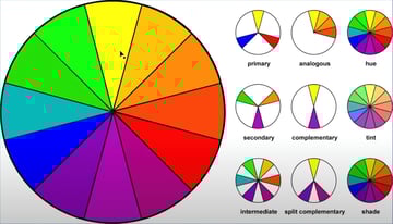
Some people just “get” color. While for others, it's a total war zone. For the color-impaired, the only lifeline:
- The Color Wheel (yes, it’s not just a decoration)
- Color Theory (because vibes alone aren’t enough)
- Blatant Reference Theft (because genius borrows and desperate designers Ctrl+J)
Strategy for survivors
You've already worked in grayscale, so there’s a rough value map. But saturation might change everything—stay flexible.
- Look for art with the energy you want—bright, loud, happy, maybe even a little unhinged
- Steal like an artist—pull colors from those references and tweak them a bunch.
Don’t just throw paint at it
Use a real strategy. Choose a combo from the holy trinity:
- Triad (three colors, evenly spaced—chaotic good)
- Complementary (opposites attract—spicy)
- Analogous (next to each other—smooth operator)
Once you've got your killer combo:
-
Tweak until it doesn’t make your eyes bleed.
-
Match the tone and message of your piece.
-
Keep values close to what worked in black and white.


Quick value check trick
Want to know if your color job is holding up or quietly imploding?
-
Add a black layer on top of everything.
-
Set blend mode to Color.
-
Toggle it on and off like a switch.
-
If your values hold up, you’re golden. If not, back to tweaking.
Color doesn’t have to be a meltdown. Stack the layers. Steal the palette. Flip the switch.
Final Thoughts
Part 5: Texture
Textures—because flat is boring (unless that’s the look... But let’s assume it’s not)
When texture’s the main character
If the final style is begging for that gritty, grimy, brush-stroked glory, don’t fight it. Photoshop or Procreate is where that magic happens. Why?
-
These tools have brush libraries so deep you could drown in them.
-
Smudge, scratch, scribble—it’s not about being neat. It’s about being interesting.
Still stuck in Illustrator? Fake it
So you’re committed to the clean, cold embrace of Illustrator. Cool. Here’s how to punk up your vectors while you're in there:
-
Quick cheat: slap a Roughen Effect on the whole thing.
-
Suddenly your crisp vector art has that hand-drawn swagger.
-
Warning: it behaves differently based on shape size, so yeah—manual tweaks ahead.
-
Hit the Appearance panel to dial it in.
When in doubt, steal a texture
If you don’t feel like starting from scratch and would like a cool texture effect, join the rest of us.
-
Download a texture from the net—fast and dirty. Example: a premium knit texture from Envato—perfect grandma sweater energy.
- Toss it into Photoshop, change the colors to match the character’s sweater.
-
Then import it into Illustrator using a clipping mask:
Hit Control + 7 and boom, textured perfection!


Flat is safe. Texture gets remembered. Suddenly your flat art has dimension, attitude, and a little vintage weirdness.
Just don’t forget:
-
Save a clean, untextured version.
-
Animators don’t want to wrangle 200 layers of mess.
-
Keep your chaos contained. Preferably in a clearly labeled folder.
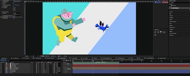
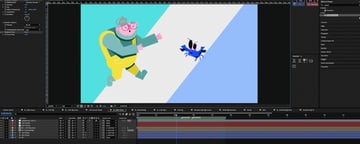
Part 6: Prepping for animation
Prepping your character design for animation (a.k.a., stop making your animator cry)
Build it like a puppet
-
Designing for rig animation is basically kindergarten puppet rules: limbs + joints = motion.
-
Every point that needs to move should have a clean, circular joint.
Skip this, and you’re left with nasty joint cuts snapping like cheap plastic.
Draw first, joint later (or vice versa)
Whether you build the puppet parts as you go or slap joints on after—the rule stays:
Think like a puppet master.
-
Joints can be added after sketching or during—either works.
-
Just keep that puppet anatomy in mind as things come together.
-
Use R to rotate a selected limb and check if the bend’s smooth.
-
Hit Command + Y to jump into outline mode and make sure the anchor points are aligned like a pro.
Kill the details (at the joints)
Avoid intricate designs near the bends. They'll warp like bad plastic surgery once animation kicks in.
Keep joints clean and simple. Let the limbs bend without creating visual crimes.
Layer like a maniac
Every moving part gets its own layer:
-
Hand
-
Forearm
-
Upper arm
-
Even the shadow
It takes time, but it pays off in every second saved during rigging. Messy files = rigging hell. Organized layers = smooth workflow + fewer threats of rage quitting.
Pose it out
Help your animator by building a reference sheet of key poses and angles. Especially important if the character’s starring in more than a one-hit-wonder scene. Include:
-
Hand positions
-
Accessories
-
Facial expressions
-
Mouth shapes
-
Angles: front, back, side, ¾ view
For the grandma:
-
Just two key poses: standing and fight.
-
One in-between jumping pose.
The crab should get the same treatment.
Add a few background bits if you’re feeling fancy. Just remember these aren’t showpieces. They're functional references.
Keep it clean (enough)
The last part of prepping for animation is to stay clean.
Only the rigging pose needs to be meticulously layered.
Dump everything else into a storyboard layer.
Just enough clarity to make sense. No need to break your back making every angle production-ready.

Just go with the flow and don’t expect instant brilliance!
This character design for animation took multiple variations, a few re-sketches, and outside opinions before it stopped being a snooze. It took three days from rough idea to final look.
So if the first version flops:
-
Gather more references
-
Get feedback
-
Touch grass
-
Try again!!!
Get animated with Envato
Needing Illustrator actions? No sweat. Photoshop brushes? Have your pick. Millions of other premium digital assets for your animations? Look no further. An Envato subscription gives you access and unlimited downloads of a massive library of creative items!
Plus, Envato has an even better offer: a powerful stack of AI tools that can make your craziest animation ideas come to life (including ImageGen). They're all included with your subscription (except for Enterprise accounts).


