
What makes a font easy to read? Looking for easy fonts to read? Whether you're looking for the best body copy fonts or more info on choosing fonts that are easy to read, this article has you covered.


What Makes a Font Easy to Read?
What makes some fonts easier to read than others? Often, this leads to questions like: are serif fonts easier to read in printed media? Or are sans serif fonts easier to read on screen?


The most readable font for your project is going to depend on a few key points, and no two projects are ever going to be the same. There's some nuance to it, like all aspects of design. Let's go through some ways that you can choose, use, and design typography to maximize readability.
1. Clarity and Simplicity
In general, clear and simple fonts are easier to read. Decorative fonts with ornate details should be avoided for longer passages of text, especially paragraphs, like body copy. However, there is some nuance to this advice. There's a time and a place for decorative fonts, like display type—body copy just isn't one of them.

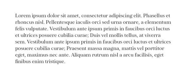


The amount of copy can play a big role in a font's readability. The more text you have, the more you should keep things simple. Notice how, with a larger quantity of type in a decorative typeface, very quickly it becomes overwhelming to read.
Generally speaking, the smaller the font, the more you should avoid decorative aspects. That's because the smaller the font, the harder it is to see smaller details. Keeping it simple will help keep things legible. Notice the difference in the example below.
The example on the left scales quite well. While the smaller text is more difficult to see and read, it's still pretty clear. In the example on the right, we have all these beautiful, ornate elements—and they're almost completely lost at a small size. It can hinder readability too.


Larger fonts, however—like titles or headlines—can remain legible, even with decorative aspects. That's why display fonts can work nicely at larger sizes. We have plenty of space to take in the details.
2. Consistency
Consistency also has a huge impact on both readability and legibility. For example, imagine if you had a sentence where every word was in a different font. It wouldn't just look disjointed—it would read very disjointed too. Body copy needs to be fluid. We don't want to break things up, as it distracts.

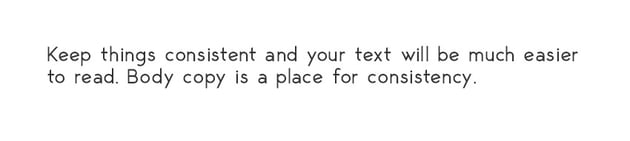


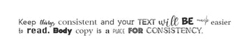
This also applies to font design. Easy-to-read fonts embody that same consistency from letter to letter that helps things read in a fluid and continuous way. If, for example, one letter is vastly different, things would really stand out.


This is an exaggerated example, but it illustrates the point: the F stands out because it isn't a fluid continuation of the font's weight, strokes, or style. That's one of the challenges of designing easy fonts to read—that beautiful, fluid aesthetic takes a lot of attention to detail.
3. Adequate Font Size
We briefly mentioned size (or scale) earlier, but keep in mind that no matter how clean and beautifully designed the font, size still matters. Something like a 3pt font is always going to be difficult to read, even if it's one of the easiest-to-read font designs ever created.


Generally speaking, I like to keep my fonts above 8pt when I'm designing for print—and even that is quite small. If you have to work with tiny type, make sure to keep it as clean and simple as possible. It would not be a place for decorative type.
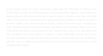
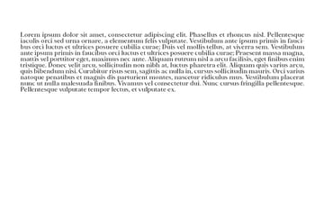
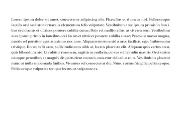
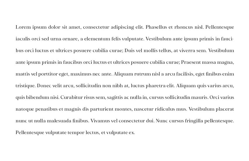
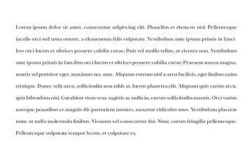
4. Appropriate Line Length
If you're hunting for the best body copy fonts, you'll want to keep this tip in mind. Even the easiest-to-read font needs an appropriate line length. Take a look at this example.


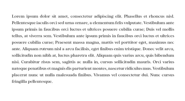
In the first, we have very short lines of copy. It makes the text look very disjointed. Notice how it feels as if it's breaking up the sentence. In the second example, we have longer lines. It's just far more fluid to read. Generally speaking, avoid paragraphs that have very short line length.
5. Contrast
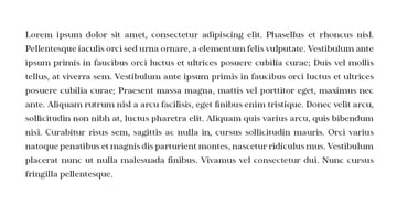
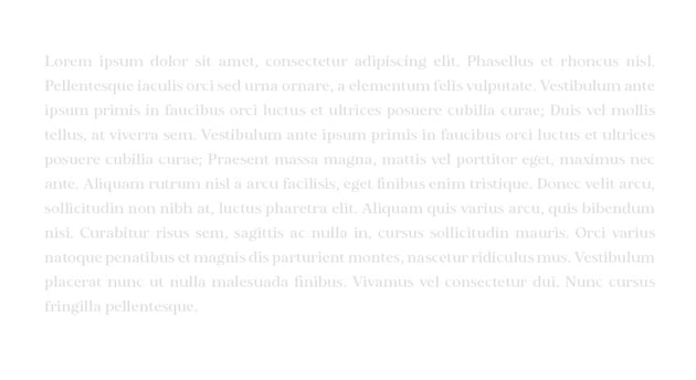
Contrast refers to a difference in value. Here's a visual example of some copy with high contrast against the background and low contrast against the background.


Lower contrast doesn't necessarily hurt readability at large sizes, but it can make a really big difference once the type starts getting small. Here's a passage of body copy with different contrast.

Higher Contrast
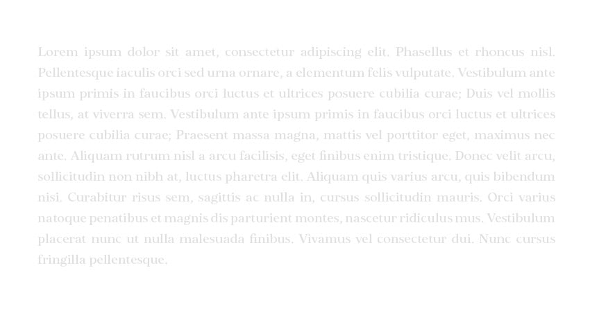
Lower Contrast
When in doubt, keep contrast higher at smaller sizes to keep the text easier to read. It doesn't necessarily have to be at 100% contrast (like black on white), but it is typically best to avoid very low contrast when your copy is small.
6. Spacing (Kerning, Tracking, and Leading)
The spacing of your text is essential. The most readable font ever could turn sour if the spacing was inconsistent or distracting. For example, letters that were squished too close together would make things very difficult to read. Likewise, if the letters were way too far apart, it could also make for a disjointed experience.
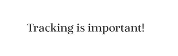
Tracking is the space between all letters—as shown in the below examples. Keep things moderate and consistent throughout so that the spacing is comfortable and consistent. If the letters are too close together, it's cluttered and hard to read. If they're too far apart, things start to look too separate and disjointed, and it's hard to maintain an easy-to-read flow.


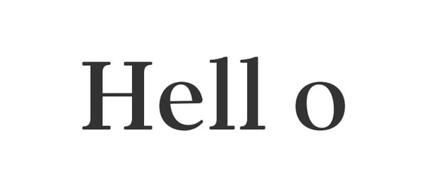
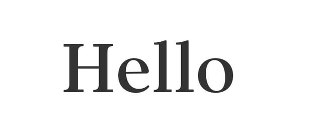
Kerning is also an essential part of this—that's the space between individual characters. Keep an eye on your kerning for any aspects that may disrupt readability. In this case, notice how the spacing really hurts how this word reads. Hello turns into "Hell o"—that's not right at all.


Leading is the space between lines of type. Again, the key here is moderation. If the lines are too far apart, they start to look disjointed, rather than fluid. If they're too close together, it feels cluttered and difficult to read. Try targeting something around +4pt to +6pt in leading for moderate line spacing that keeps things feeling connected, without feeling cramped.


What About Designing Easy-to-Read Fonts?
Working with copy is one thing—what if you want to design easy fonts to read? There are many reasons why someone would want to do that. For example, easy-to-read fonts tend to be very versatile because they typically work well at a variety of sizes and in a variety of roles.
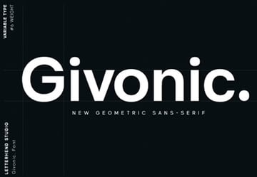
Take a look at this example. This font is elegantly designed. It's clean, simple, and highly legible. It looks beautiful at large, stand-out sizes, but stays elegant and easy to read at smaller sizes too.


One thing to note here is that the earlier tips all apply to font design too.
- Keep the letterforms consistent in terms of shape, tilt, and spacing.
- Check out how your font scales. Does it read easily at smaller sizes?
- Are there decorative elements? You could always include them as alternates for designers to use when they're working in more decorative spaces. This way, the default letters are clean and appropriate for body copy.


Font Readability FAQ
Let's address some common questions associated with fonts that are easy to read. Keep in mind, like with most aspects of design, you're ultimately going to need to use your experienced eye to make the best design decisions for your projects.
Which Is Easier to Read: Serifs or Sans Serifs?
Are sans serif fonts easier to read on screen, or are serif fonts always the best choice? Which is the best for reading: serifs or sans serifs? Let's put that debate to rest.


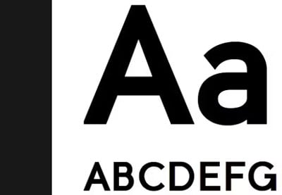
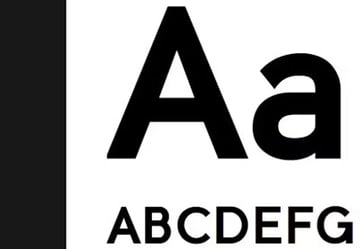
Years back, it was often common to hear that serif fonts reigned supreme when it came to readability (I remember being taught this in design school). However, that's not necessarily a universal case. Are serif fonts easier to read? Not always. Sans serif fonts can prove to be very easy fonts to read. For example, it's not unusual to see Helvetica as a font option when reading an eBook. This very article is displayed in a sans serif font.
So, ultimately, there is no universal "winner" between serifs and sans serifs when it comes to readability. Sometimes, it may just come down to preference. Choose a clean, simple font with consistent strokes that best matches your project's aesthetic—whether it's digital or printed.
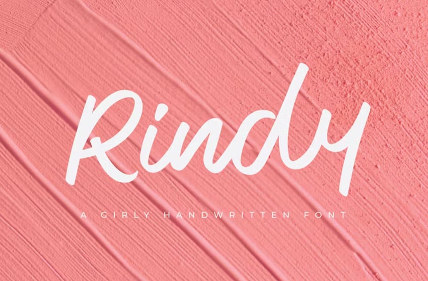
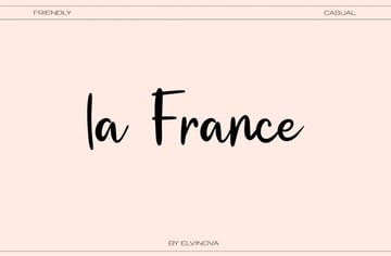
Are There Easy-to-Read Cursive Font Designs?
The short answer is: yes! There are absolutely easier-to-read cursive font designs out there, but keep in mind, they are still not going to be the best body copy fonts. Let's take a look at an example paragraph in a cursive font.


It's just not as easy to read, even if we follow the majority of our design tips. It's because cursive fonts, by design, are rather artistic, with their flowing, beautiful strokes. They're best for shorter passages. However, that's not to say some cursive font designs aren't more legible than others. Let's say, for example, you want a small watermark in a cursive font or something that scales clearly for a business card.


In these cases, choose a cursive font that is simple and clean—a middle ground—rather than an overly decorative calligraphy font.
What Are Some of the Best Fonts for Magazine Body Copy?
If you're looking for some of the best fonts for magazine body copy, keep in mind that one size does not fit all. Make sure to consider the following when choosing fonts that are easy to read for your magazine project:
- The overall aesthetic of your project and brand—a serif font, for example, might be right at home with a fashion brand. However, if your magazine is tech-based, you may find that a sans serif is a better match. Your body copy font should be a supplemental choice that doesn't distract.
- Test out different fonts for the best fit—don't be afraid to test out multiple typefaces. Try them at different sizes and make some samples to see which is easiest to read. Don't hesitate to ask for test subjects to give your body copy a read and survey their results.


Check Out These Beautiful, Easy-to-Read Fonts
Looking for fonts that are easy to read? Look no further! If you're choosing the best body copy fonts for your projects, these fonts could be an excellent choice. They're versatile, packed with options, and beautifully designed.
In addition, you can find thousands of easy-to-read fonts on Envato Elements. One low price gets you unlimited access to the entire font library. Make sure to check it out!
1. Just Sans Font Family (OTF, WOFF)


This is an amazing font family, packed with options. You get seven different weights here, from light to extra bold, so it's a great fit for not only body copy but also points of interest. It also has the potential to pair well with so many different fonts.
2. Elgraine Serif Font Family (OTF, WOFF)


Do you prefer a serif font? Then this font family might be the perfect choice for your project. This is another font that ranges from thin to black in weight, each with matching italics. It's a beautiful, professional typeface, perfect for any design toolkit.
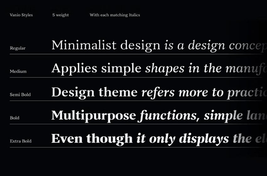
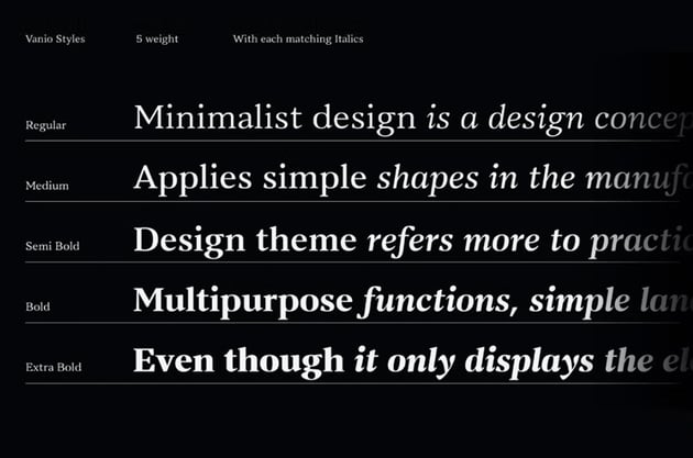
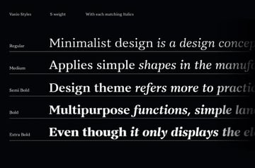
3. Vanio Serif Font Family (TTF)


Perhaps you prefer a wedge serif. This serif font is highly legible but has a different aesthetic from a transitional serif like the previous font. It's another font family with tons of options—ten variants and italics.
4. Joeman Informal Sans Serif Font (OTF, WOFF)


Here's an interesting example of an easy-to-read font. Unlike some other sans serifs, this one has a more informal, rounded look. It just goes to show that you can have other font styles that are still very readable and scale nicely.
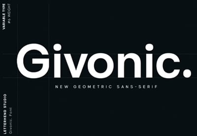
5. George Sans Serif Font Family (OTF, TTF, WOFF)


This beautifully designed, geometric sans serif font is a versatile choice. You get four weights, each with matching italics. If you're looking for a sans serif font that scales well, look no further. It's a great choice.
Explore Even More Font Inspiration
Check out even more font inspiration right here at Envato Tuts+. Here are some amazing resources for serifs, sans serifs, easy-to-read fonts, and more.
 15 Fonts Similar to Franklin Gothic


 40 Best Rounded Serif Fonts (Serif Fonts With Rounded Edges)

 40 Best Rounded Sans Serif Fonts (Bold Rounded Fonts)

 What Fonts Are Similar to San Francisco?

 15 Best Minimalist Fonts (Clean Modern Fonts to Download Now)

 What Fonts Are Similar to Playfair Display? And What to Pair With It
Learn More About Typography
Want to learn even more about typography? There is a wealth of free tutorials on Envato Tuts+ that you can explore right now. Push your typography skills further today!


