
In this course, you'll learn all about the rules of composition, master famous composition techniques like the rule of thirds, and learn how to use software to create the most striking designs.
Watch the Full Rules of Composition Course
What You'll Learn
- What are the rules of composition?
- The principles of composition in design
- Famous composition techniques
- What is the rule of thirds?
- What is the golden ratio?
- Professional composition tips
- Which software to use for compositions
- And more!
About Your Instructor


Laura Keung
I'm a design writer, mentor, and entrepreneur leading Laura Keung Studio, currently based in Munich, Germany. I had my first design client during my first year of university and since then, I fell in love with the design process. With 12 years of experience in the industry, I lead my own design studio and collaborate with other creatives on branding and editorial design projects.
1. Introduction to the Course
In this course, you’ll learn what composition is, its key principles, and the techniques you can apply all across any visual work, as well as tips on creating great compositions.
2. What Is Composition?
About 65% of people are visual learners. It takes as little as 13 milliseconds to identify images. A well-composed design tells a story and sets the tone. A strong composition will make the viewer linger on the page.
Photography and artwork are the same way. While some terms aren’t the same, the basic idea is the same. The goal with compositions is to place elements within a design, frame, or canvas so that it can tell a story, look harmonious, and appeal to the viewer.

3. Key Principles of Composition
3.1 Focal Point
This focal point definition comes from photography, but it’s also applicable to design. For example, in this poppy photograph, the focal point is the flower. The blurry background and the position of the flower enhance the focal point even more. The focal point is also brought in through the use of color, the bright red being a stronger color against the washed-out green background.


Now that we know the focal point definition, it's easy to identify it on this image of the Birth of Venus by Botticelli: Venus is the focal point. She’s standing on a giant scallop, and this element emulates an altar for the main subject. The other figures around her are looking at her, so this is also a great example of imaginary leading lines looking at the focal point. Those leading lines help us direct our eyes to the main subject.


3.2 Scale
Scale can be used to create different effects on the viewer through their perception of size. On the famous Giselle poster by Armin Hofmann, the ballerina is placed on the right side of the page. While the two typography boxes are different sizes, the one with ‘Giselle’ is considerably larger. In comparison, the scale of this word is much larger than the details on the top text box and almost matches the body of the ballerina. We can assume there’s equal importance between the title of the show and the ballerina.

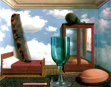
Scale can be used for orientation or disorientation. The latter is the case for René Magritte’s Personal Values artwork. We can see a room with furniture of normal proportions, while the other objects are shown on a bigger scale, creating a visual contradiction.


3.3 Contrast
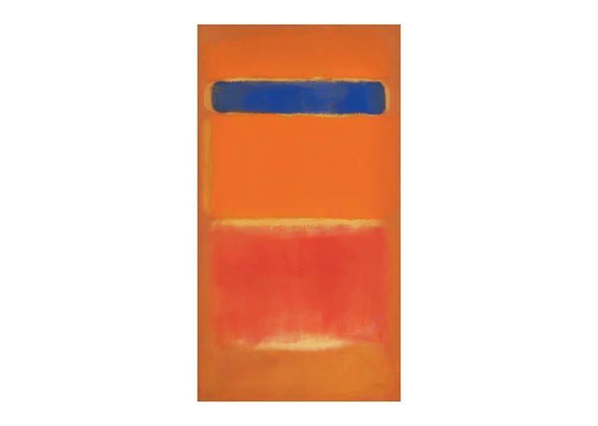
In this painting by Rothko, contrast is shown through the different color values of blue, orange, and red. Moreover, the blue stripe is significantly narrower than the big orange and red elements, while thin yellow brush strokes also divide some of these colors. So we can see a contrast in color and brush strokes.


In this photograph, contrast is shown through color but also through disruption. The constant vertical lines on the background are cut by the subject with a bright yellow raincoat.


3.4 Leading Lines
Leading lines: these lines point to the main focal point and lead the viewer to it.
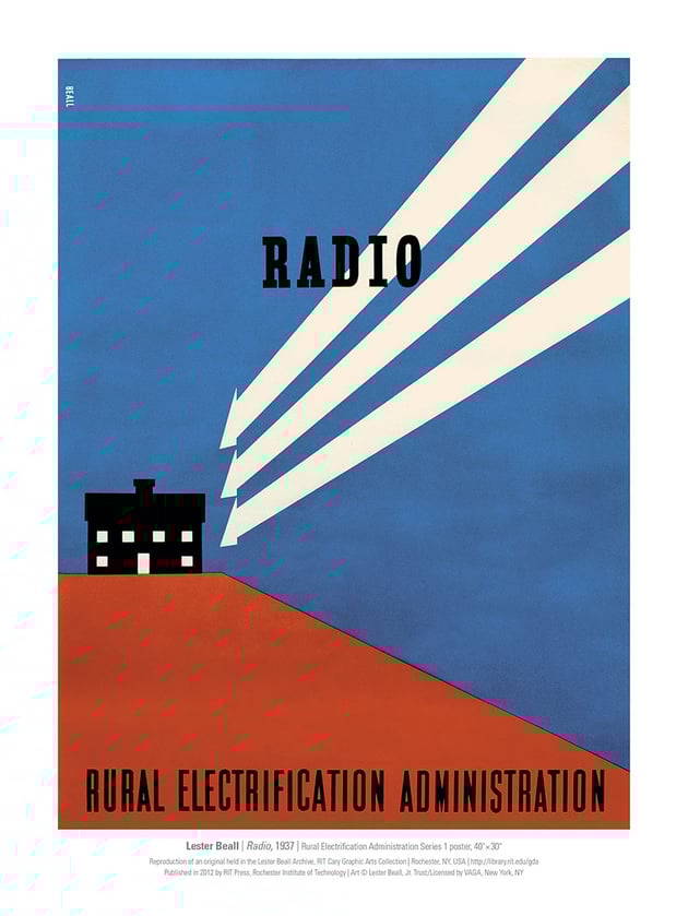
On this Lester Beall poster, the leading lines are very apparent. The lines mimic street power lines, and in this case, these elements direct us to the house placed on the left-hand side of the poster.


Converging lines: A group of lines that point towards a focal point from all directions.
In this photograph, the perspective from below makes the trees converge at the top and point to the leaves and branches.


3.5 Hierarchy
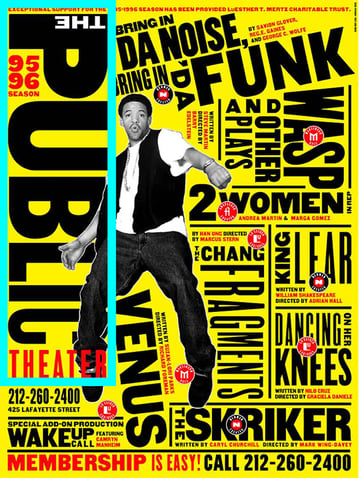
To talk about hierarchy in design principles, we can use this Paula Scher poster example in which there are multiple sizes of type content. The element of most importance is the name of the theater, the Public Theater. The rest of the information is different theater shows with their respective details, and these are set in a smaller type size.


In art, hierarchy can be achieved through the use of light and value—the intensity in which the light hits the subject or subjects. In this case, the chiaroscuro technique in art is a perfect example of how to apply hierarchy.
In the painting The Holy Family of Francis by Raphael, Jesus and Mary are brightly lit compared to the other subjects. The further back, the darker the image gets. So the light is on the main subjects, automatically directing our eyes to the center of the painting.
#/media/File:La_Sainte_Famille_-_Rapha%C3%ABl_-_Mus%C3%A9e_du_Louvre_Peintures_INV_604.jpg)
3.6 Depth of Field
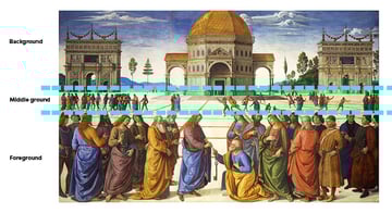
In this Perugino artwork, the depth of field is extensive; we can see the foreground, middle ground, and background. We can see the scene in the front, and the depth of field extends to the mountains. This principle helps the artist tell a bigger story and set the mood of the artwork.
#/media/File:Entrega_de_las_llaves_a_San_Pedro_(Perugino).jpg)
In this photograph, depth of field is achieved by photographing the subject slightly off-center and using the location, like the hallway. In photography, the smaller the aperture, the greater the depth of field that can be achieved—meaning the background is blurrier.


3.7 Balance
Symmetry involves arranging the elements in a frame equally, divided into two identical halves. Such is the case of this poster by Jacqueline Casey. If we’re to draw a line through the center of the poster, we can see that there’s an equal number of elements on the left as on the right side.


Asymmetrical balance is a bit trickier because it involves visual weight. Visual weight can be different-sized elements, different numbers of elements, or even different colors. In Van Gogh’s Starry Night, the black element is counterbalanced by the big, bright yellow element on the right. If we draw an imaginary horizontal line through the middle of the artwork, the right side contains a dark hill, and this also helps balance the dark shape on the left.


3.8 Space
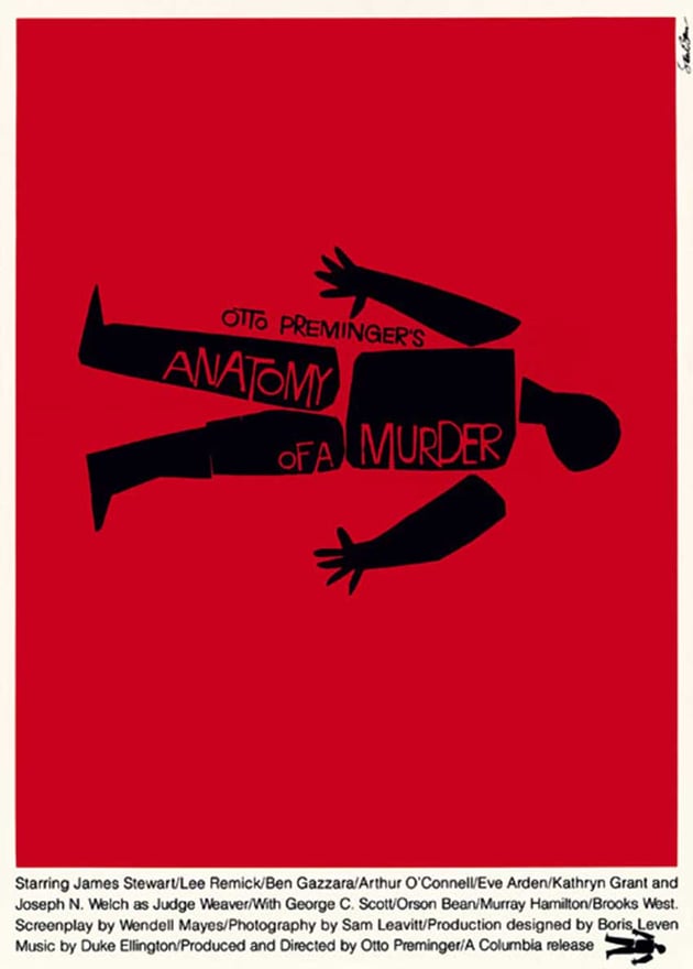
The famous designer Saul Bass liked to play with space in his designs. In this Anatomy of a Murder poster, there’s a copious amount of negative space surrounding the body. Moreover, the cutout of the movie title on the body adds another layer of play with the positive and negative space.


René Magritte’s surrealist work is known for being playful. In this specific artwork, we see a man standing next to his own silhouette and looking into the distance. The negative space in this artwork is the sky and the beach in the background.


3.9 Repetition and Pattern
The Marilyn Diptych by Andy Warhol is a great example of repetition. This silkscreen painting is composed of 50 images. In this specific artwork, the repetition of the portrait has a specific meaning—the different and abundant meanings in Marilyn Monroe’s legacy.


In this photograph, repetition and pattern are seen on the wall that acts as a background for the four subjects. The background is very geometric and the pattern is broken by four humans, creating an interesting juxtaposition between rigid lines and organic shapes.


4. Composition Techniques
There are a few techniques that can help artists and designers create compositions with a punch. It's time to apply the principles of composition that we learned above and mix them with composition techniques. Let's take a look:
4.1 Rule of Thirds
What is the rule of thirds? This is one of the most basic techniques when it comes to composition. It helps create balanced images and indicates areas where the viewer’s eye goes to naturally.
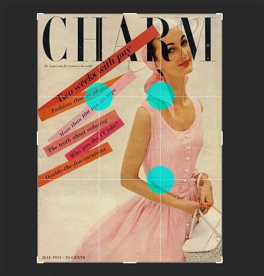
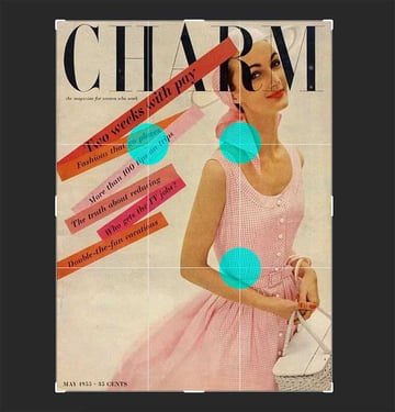
Let's see examples of the rule of thirds in design. In this image by Cipe Pineles, the subject is placed in line with the far-right guide. The two intersections are where the viewer’s eyes tend to go. To counterbalance the subject, the cover lines are scattered around the intersection on the top left.

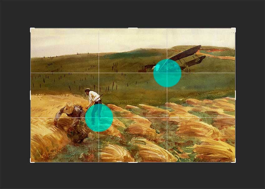
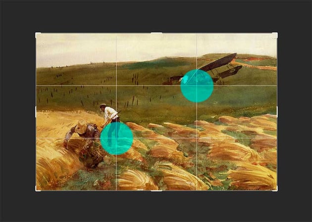
In this John Singer Sargent painting, the airplane and the farmer are placed opposite each other and on two opposite intersections. This type of composition technique helps create a beautiful and almost symmetrical balance in the painting, making it a clear example of the rule of thirds.

4.2 Rule of Odds
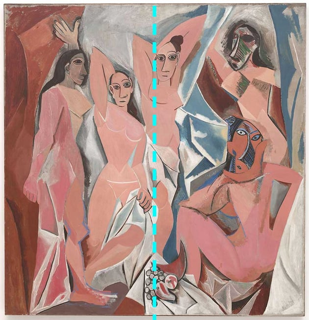
In this Picasso painting, the rule of odds is applied by portraying five females. The third female is placed directly center of the page, creating an almost symmetrical balance in the artwork.


In this photograph, the rule of odds is applied with three magnolias. The second magnolia is also placed in the center of the photograph to create a beautiful balance.


4.3 Golden Ratio
Now let's move on to ask "What is the golden ratio?"
This ratio is commonly found in nature, thus giving the viewer a very natural feel when looking at a composition. The spiral begins at any corner of the frame and grows at the rate of the golden ratio.
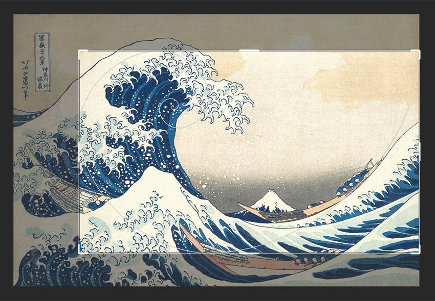
Here's a golden ratio example. Hokusai’s The Great Wave off Kanagawa is one great example of many paintings that are loosely based on the golden ratio. While the ratio doesn’t exactly dictate where the elements should go, it’s usually a very close approximation.


Even contemporary pieces like the ones by Piet Mondrian include the golden ratio. His famous modernist pieces and rectangle-square compositions were carefully constructed to find balance even in all the irregular divisions, another great golden ratio example.

4.4 The Golden Triangle
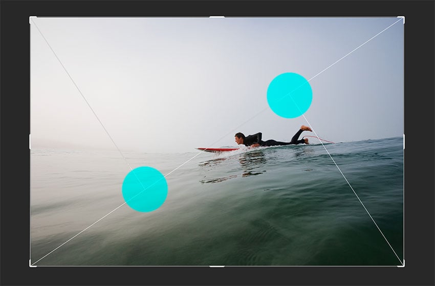
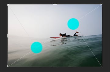
In this Snyders artwork, the golden triangle is used by placing the subjects on the bottom triangle. Filling up this space and following the diagonal line that runs across from top-right to bottom-left creates visual interest.
In this photograph, the use of the golden triangle is used by placing the main subject close to the intersection of the lines on the right side and also the line that runs across from the top-right to the bottom-left. Any elements placed along the lines can also attract the viewer.

4.5 Framing
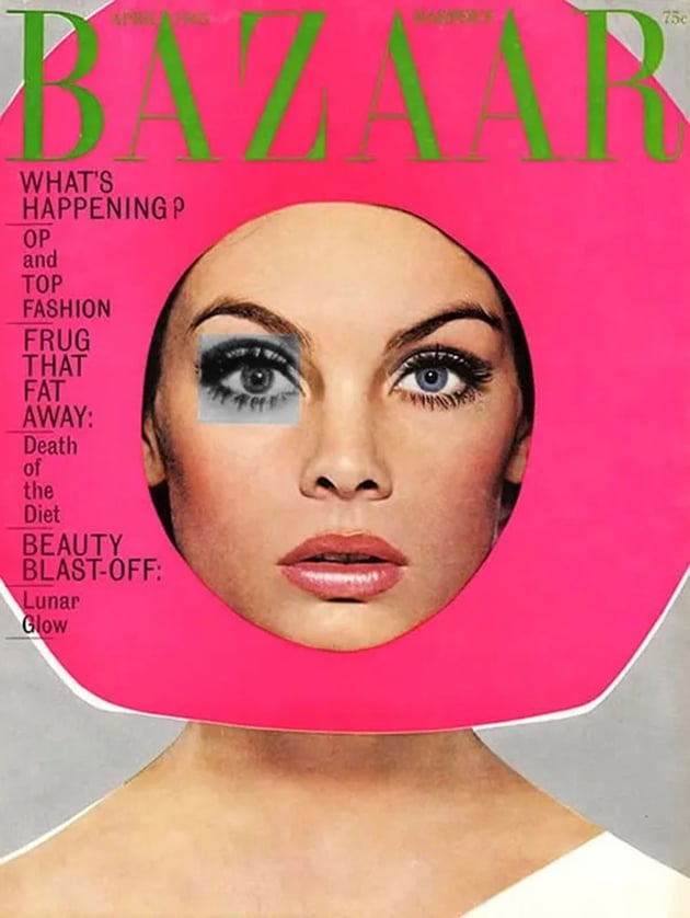
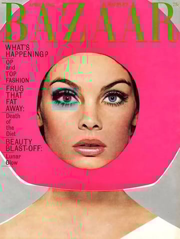
This Bazaar cover by Ruth Ansel is constructed as a collage, the framing is created with the fuchsia round element, which creates emphasis on the model’s face. In addition, it highlights the cover lines on the left side.

In this photograph, the frame is created with the arch to highlight the beautiful pink flowers and the boats and mountains in the distance. The viewer’s eyes can instantly focus on the distance, perhaps also disregarding the rest of the image and only taking in the arch.


4.6 Dominance
In this case, the elements highlighted are the gooseberries against a contrasting background.


4.7 Foreground, Middle Ground, and Background
In this Perugino artwork, we can see that the foreground holds the main subjects, the middle ground holds secondary elements, and the background is composed of architecture and mountains.


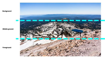
In this photograph, one or two of the three parts house the focal point, while the others tend to be out of focus to enhance the focal point. In this case, the foreground and middle ground are in focus, while the mountains in the distance aren’t as clear.


4.8 Lead Room
In this Johannes Vermeer artwork, the woman has lead room in front of her, and this helps the artist tell a story and set the feeling for the artwork.

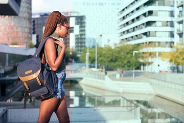
In this photograph example, there’s a big amount of lead room in front of the subject. In this case, we can see the subject mid-walk, so the subject is not running out of space and won’t be walking out of frame.


4.9 Left to Right
The same goes for the direction in which the subject is walking. In this Nicolas Poussin painting, we can see he chose to create a separation between the sacred (on the left) and the profane (on the right). While everyone in the painting is walking to the right, a couple of the subjects look to the left, the past, which can also mean nostalgia for leaving things behind.
#/media/File:Poussin-Fuite_en_Egypte-MBA-Lyon.jpg)
In this photograph, we can see a group of people, again walking from left to right. The composition also includes mountains on the horizon line and a good amount of lead room, which gives the impression that there’s still a long trek ahead.


5. Tips on Making Great Compositions
Now that you have learned the principles and techniques, it's time to take a look at some composition tips that can help take your work to the next level:
5.1 Layering
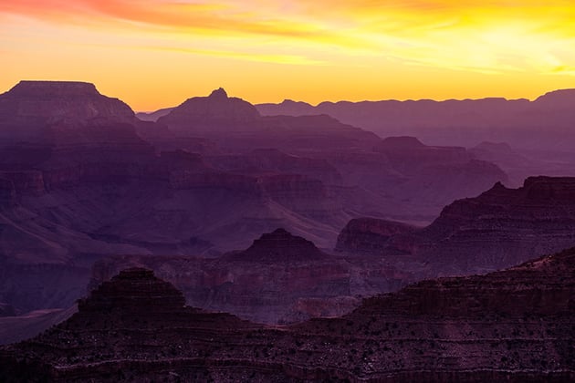
Layering is a great composition tip. In this Grand Canyon image, the sunrise gives a beautiful purple shadow on the mountains. The layering of the mountains and the slightly darker and lighter shades help to give a more realistic 3D illusion.


In graphic design, layering refers to the layering of elements. Famous designer David Carson experimented with analog tools to create compositions. In this case, we can see the mix of almost collage-like cutouts, paper, ink, or brush strokes. This type of layering helps in a composition to create emphasis, hierarchy, and most of all texture.


5.2 Horizon Line
Frederic Edwin Church’s painting Cotopaxi includes the horizon line running right through the center of the artwork. This line helps divide any elements from the top or bottom. In this case, the line creates an amazing depth of field, which is enhanced by the waterfall, the smoky volcano, and the mountains in the far distance—all three elements are important.

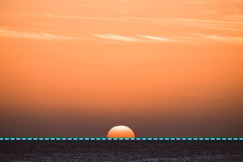
In this photograph, the horizon line is low, and this is used to emphasize elements like a dramatic sky or the sunset. On the other hand, a high horizon line means that the main focus is the foreground.


5.3 Perspective/Unusual Points of View
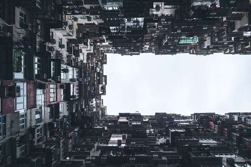
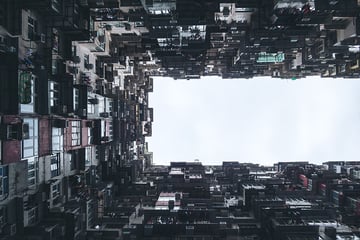
This photograph is an extremely low point of view of crowded residential buildings. This type of angle enhances even more the towering and overpowering feeling these buildings have, especially in a city like Hong Kong.
When it comes to art or illustration, this Mernet Larsen artwork is a great representation of multiple unusual points of view. While the work is highly abstract, it also contains multiple scenes in one with disorienting perspectives that make it all even more interesting.
5.4 Filling the Frame
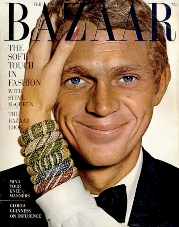
This Bazaar cover by Ruth Ansel is a great example of filling the frame with Steve McQueen. The zoomed-in image also highlights the subject's blue eyes, which would have been harder to had he been standing further away.


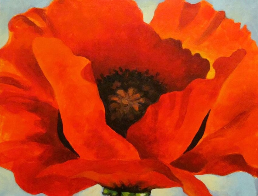
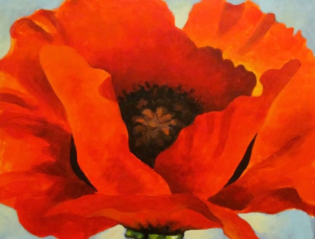
Georgia O’Keeffe’s Red Poppy is a great example of filling the frame. Poppies are small flowers, and by filling the frame, we can see all of the details on the flower, giving us a striking look at what is usually known as a dainty and small object.

5.5 Simplification
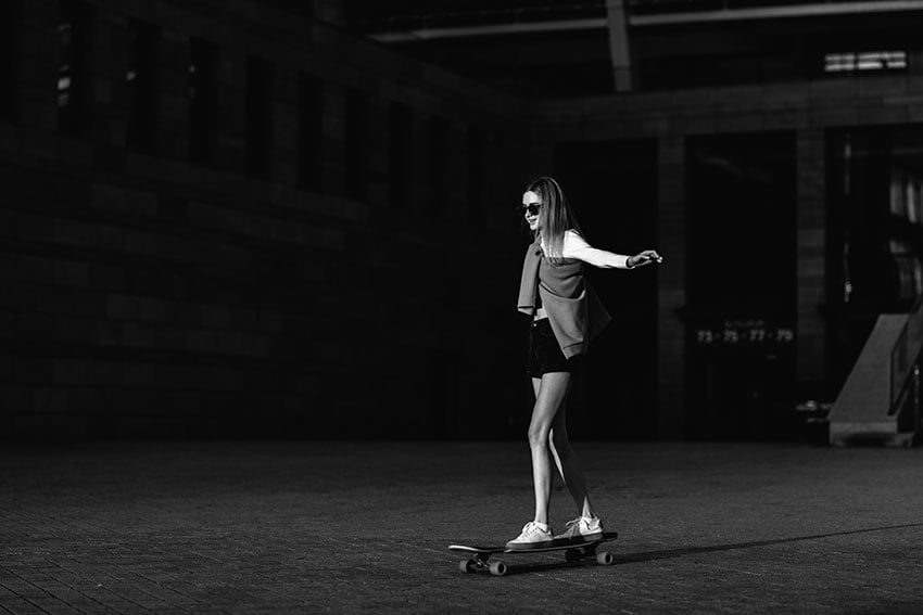
In this example, we have an image of a woman on a skateboard in black and white. The background is very dark, acting as a blank canvas and allowing the photographer to highlight their subject. In this case, the woman is slightly lit, casting a small shadow behind her and just enough to still keep the background dark.


Paul Rand’s Eye-Bee-M poster is well known for its simplicity. The poster was created in support of the IBM THINK motto; the designer represented each letter with an object, creating an interesting visual word puzzle. The simplicity of this poster speaks volumes.


5.6 Contrast
In the poster below by Ladislav Sutnar, the orange and yellow are much brighter colors that stand out from the dark background. In this case, the orange color calls for attention before the other elements—making it more important in hierarchy.

In photography, it’s an instrumental tool that refers not only to shapes but also to colors. A contrasting photograph usually has bright colors that are opposing on the color wheel or can even be in black and white and have strong variations.


6. How to Use Software for Compositions
Applications have made it really easy for us to apply composition techniques and find the perfect points to place the subject and other elements. Applications like Adobe InDesign and Adobe Illustrator allow us to create grids to create compositions easily.
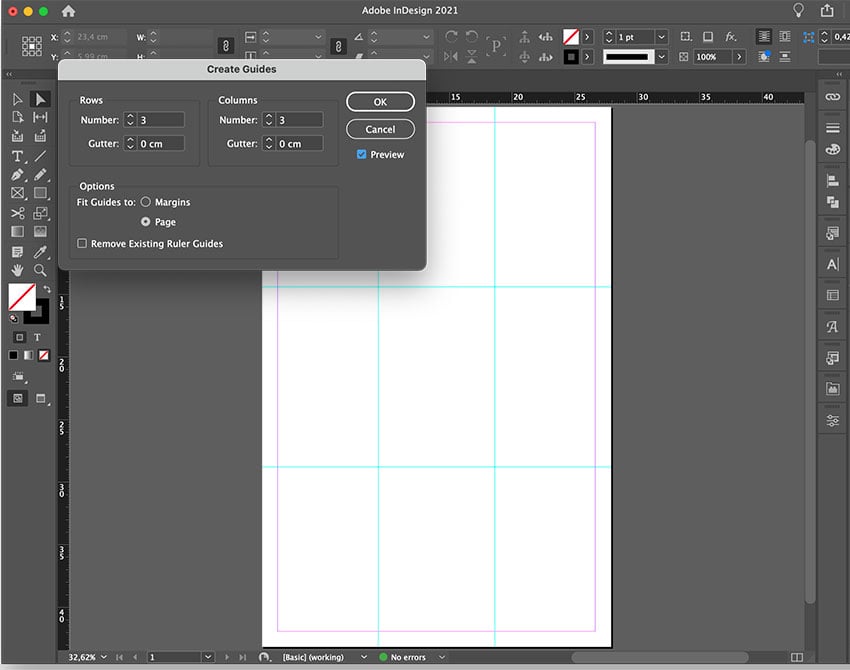
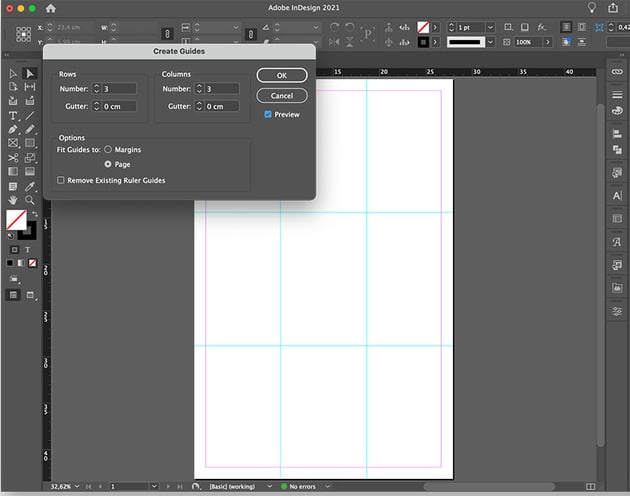
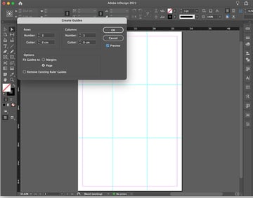
6.1 Adobe InDesign
In InDesign, we can create custom grids to be used for anything from simple poster designs to elaborate multi-page editorial documents. Grid systems are extremely helpful when it comes to building a composition. This software is a little more basic compared to Photoshop.
In InDesign, create a new file. Head over to Layout > Create Guides. There, set the number of rows and columns you’d like and the gutter. In this case, we can use the rule of thirds and set the Number of Rows and Columns to 3 and set the Gutter to 0.


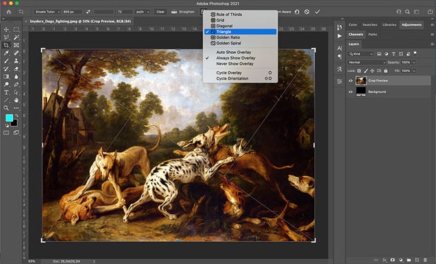
6.2 Adobe Photoshop
In Photoshop, you can test your image with the Crop Tool and choose from the different composition tools. Select the Crop Tool (C), and draw a crop box over the image. Head over to the Overlay Options on the options bar and select the composition tool of your liking. There’s everything from the rule of thirds to the golden ratio, golden spiral, triangle, and more.


Conclusion
In this course, you learned what composition is, the different principles to use, and techniques to apply, like the rule of thirds, the golden ratio, and the triangle.
You also learned some useful composition tips to help you create meaningful and striking images. Now it's your turn to apply these techniques and start creating your own designs and art!
Learn More About Design
If you want to learn more about design, here are a few videos and courses from the Envato Tuts+ YouTube channel you'll love:


Or if you prefer written tutorials, try our huge library of Design Theory tutorials and more practical resources. Here are a few to get you started:

 How to Design With Grids and Break Them


 How to Make a Grid in Illustrator


 How to Create a Photoshop Grid Template


 The Basic Elements of Design

 The Principles of Design

 Teach Yourself Graphic Design: A Self-Study Course Outline


 Color Theory for Beginners

 65 Design Terms You Should Know

 Smart vs. Stylish: How to Balance Design Principles With Design Trends


 Become a Better Designer by Exploring Universal Beauty: Myth vs. Reality

 By
By


