
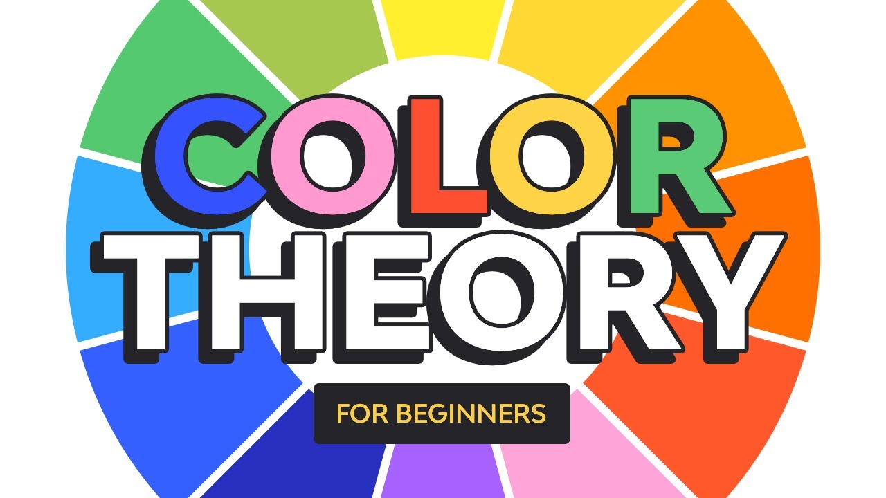
Colors are a powerful visual tool that can help us evoke certain emotions. In this course, you’ll learn all about the fundamentals of color theory that can help you create your own color palette.
Watch the Full Color Theory for Beginners Course
Jump to content in this section:
What You'll Learn
- What is color theory in art?
- What are color harmonies?
- What are RGB and CMYK?
- How to create a color palette for branding
About Your Instructor


Laura Keung
I'm a design writer, design mentor, and entrepreneur leading Laura Keung Studio, currently based in Munich, Germany. With 12 years of experience in the design industry, I lead my own design studio and collaborate with other creatives on branding and editorial design projects.
1. Introduction
Colors are very important visual elements that can make or break any design. Through color theory, you’ll learn what the color wheel is, its many classifications, the different color qualities, color harmonies, and color modes.
At the end of the article, you’ll find a quick guide to color psychology and how you can create successful color palettes or color combinations.
2. What Is Color Theory in Art?


Color theory is a guide to mixing colors. Through the use of the color wheel, designers can create color schemes that produce emotions and behaviors in audiences. Sir Isaac Newtown created the color wheel theory in order to explain the nature of primary colors.
The color wheel theory separates colors into primary, secondary, and tertiary colors. While there are also other color qualities that can help us create even more colors, a good color palette will have a variation of all these qualities: hue, saturation, value, tint, tone and shade. Let’s take a look at their meanings and some examples.
2.1 Primary, Secondary, and Tertiary
The color wheel theory consists of:
Three primary colors: red, yellow, and blue.
By mixing each of the primary colors, we can get secondary colors: green, purple, and orange.
By mixing primary and secondary colors, we can get tertiary colors like yellow-green, purple-blue, and so on.


Education Business Template (Google Slides, PPTX)


In this Education business template, we can see an example of a primary color arrangement using red, yellow, and blue. This is based on the art of paint mixing. The different levels of tint, tone, and shade make the color palette more pleasant.
Future Lab Creative Education PowerPoint Template (Google Slides, PPTX)


By mixing the primary colors with each other, we can get three color combinations. In this example, the secondary colors on the wheel are orange, purple, and green.
Colorful Slide Template (Google Slides, PPTX)

When we mix primary and secondary colors, the color wheel expands to even more options. Tertiary colors are the 'in-between' colors, like turquoise, purple-blue, pink, red-orange, yellow-orange, etc.
2.2 Hue, Saturation, and Value
There are also color qualities of each color on the wheel.
What is hue? Hue is any color on the color wheel—it’s another word for color.
Saturation is the intensity or purity of the color. This controls if we want the color to look more saturated, meaning vibrant, or desaturated, meaning dull.
Value has to do with how light or dark a color is. This is where we get into shade, tint, and tone.


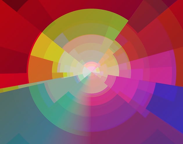
Colorful Polygon Backgrounds (JPG, PNG)


The left image is the original version of the image on the right. The right image is converted into black and white so we can see how different hues and their saturations have different values. Yellow and orange colors are a lighter grey, while darker colors like purple and red are a darker grey.
2.3 Tint, Tone, and Shade
A shade is created by adding black to a hue, in other words darkening a color to make it rich.
What is tint? Tint is created by adding white to make a color less intense.
What is tone? Tone is created by combining black and white or grey with a hue.


Now that you know what hue, tint, tone, and shade are, you'll be able to break down your designs better for clients.
2.4 Color Temperatures: Warm and Cold
The color wheel can also be split into two main temperature groups:
Warm colors are associated with the sun, warmth, fire, energy, and action. Yellow, red, orange and their different shades are warm colors.
Cool colors like blue, green, and their different combinations are associated with calm and peace.


Geometric Backgrounds (JPG)


Warm colors are anything from yellow to pink on the color wheel, plus their different shades. These bright colors transmit playfulness, happiness, energy, and passion. In this image, we can see a myriad of triangles with different shades, tints, and tones of orange. When using a single hue with its different properties, we can achieve a sense of depth.


This is the same image example, but with cool colors. These colors transmit calmness, relaxed feelings, and quietness. As in the previous image, here we have a mix of the same hue with different tints, shades, and tones that add depth.
3. Color Harmonies
Color harmony refers to colors that look appealing, balanced, and just work beautifully together. These harmonic colors are a great guide to creating your own color palettes. By adding the qualities we discussed above, you can mix and match different colors and achieve a great-looking color palette. Let’s take a look at some of these harmonic colors you can put together.
3.1 Complementary Harmony
What is a complementary color scheme? These are colors that are opposite each other on the color wheel, such as red and green. Such color combinations create a high level of contrast. Complementary colors at their maximum saturation tend to create a vibration when paired together, so it’s best to use a different shade, tint, or tone. Let's take a look at some complementary color scheme examples.


Retro Geometric Seamless Patterns (AI, EPS, JPG, PNG)

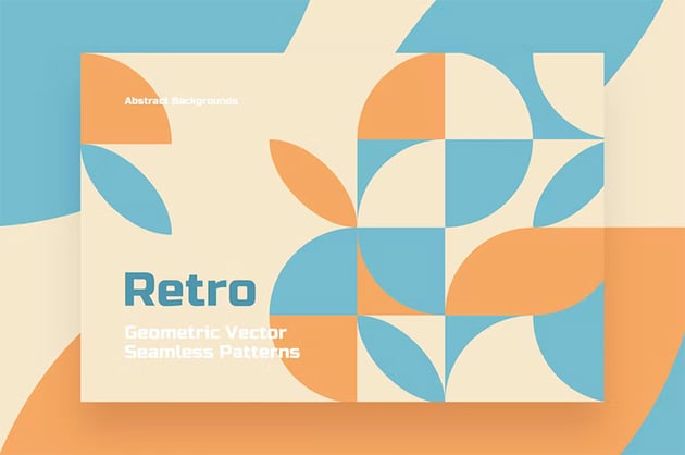

This complementary color scheme example is a combination of two hues, light blue and light orange, in similar tints. We can see that these two colors create maximum contrast, and therefore a more vibrant design.
12 Vintage Patterns (AI, EPS, JPG, PNG, SVG)

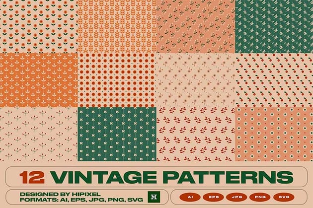
While this vintage pattern includes multiple colors, the red and green are two directly complementary colors. In this case, both hues are used in darker shades. Now that you know what a complementary color scheme is, show us your combinations!
3.2 Analogous Harmony
What is an analogous color scheme? This scheme works by combining a main color with colors that sit next to it. This color scheme can produce a calming energy to the eye. To complete a color palette with maximum contrast, combine it with one of the complementary colors. Let's take a look at analogous color scheme examples.


Bakery Cafe Banner and Landing Page (AI, EPS, PNG)

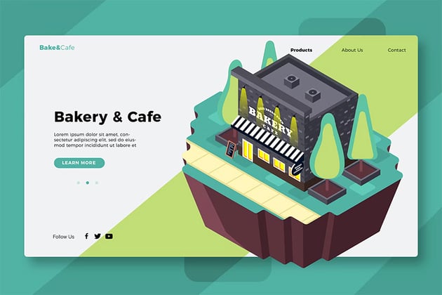

This analogous color scheme example creates a pleasant look on the landing page. The analogous color combination uses colors that sit next to each other, and since they aren't that much different, they can create a very natural look.
App Development Flat Concept (AI, EPS, JPG, PNG, PDF, SVG)


Analogous color schemes are great for gradients—since the colors are similar, they can create a pleasant gradient that doesn't look forced. In this example, blues and purples are being used as technological colors. Using different tints, shades, and tones can help avoid a clash of all these colors. Now that you know what an analogous color scheme is, it's your turn to try it.
3.3 Monochromatic Harmony
What is a monochromatic color scheme? This monochromatic color scheme takes just one basic color from the wheel and uses different shades, tones, or tints to create a palette. It looks simple, cohesive, and elegant. To complete a color palette with this type of harmony, it’s best to combine them with neutral colors like black and white. Now that you know what a monochromatic color scheme is, let's take a look at an example.


Geometric Background (JPG)


This example of a monochromatic color scheme takes one color and uses its different tints, shades, and tones to create a composition.
Happy Halloween With Pumpkin and Cute Cats (AI, EPS, JPG, PNG)


This second example involves many more colors, but in essence, the colors of the pumpkin use a monochromatic harmony. To spice up the composition, the designer decided to add other colors to create contrast.
3.4 Triadic Harmony
What is a triadic color scheme? This scheme uses three colors that are evenly spaced on the color wheel, forming a triangle. This scheme gives a strong visual contrast, with harmony and color richness. The colors in this triadic color scheme are balanced. Let's take a look at some triadic color scheme examples.


Ice Cream Shop Poster (AI, EPS, INDD, PSD)

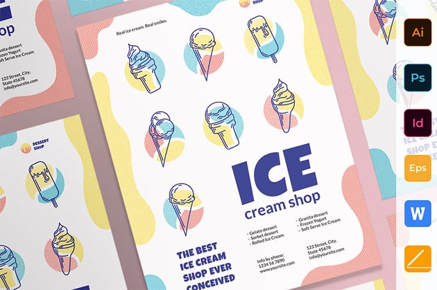
This triadic color scheme example features colors that are also primary colors on the color wheel. These three colors go well, as long as they aren't used to their maximum saturation. To avoid the risk of clashing colors, try using the other color properties like tints, shades, and tones.
Company Business Profile (Google Slides, PPTX)


This company profile features red-orange, green, and purple, while using the dark blue and yellow as contrasting colors. This triadic example uses the dark color as a canvas, while the triadic colors are used as accents at their maximum saturation. In this case, maximum saturation works because the colors are used sparingly. Now that you know what a triadic color scheme is, let's look at your combinations!
3.5 Tetradic Harmony or Double Split Complementary
What is a double split complementary color scheme? Tetradic colors are two sets of complementary colors that form one palette. These colors work best when one of the colors is dominant and the rest are used as accent colors.


Modern Website Hero Header Template (PSD)
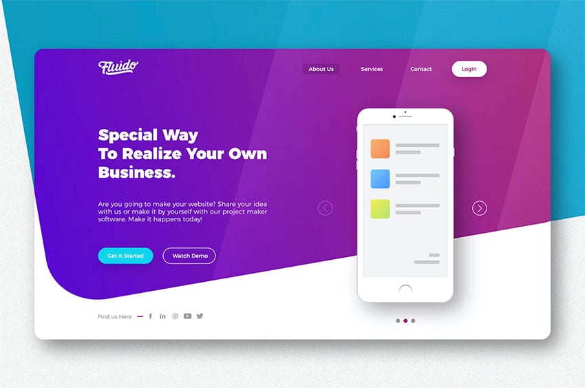


This header template uses a tetradic color palette, while using two of them as a gradient. The blue and purple create a nice background gradient, while orange and green become accent colors. With this harmony, it's better to choose one or two colors as dominant colors and the rest as accents.
Colorful Resume CV (AI, EPS, PDF)


This colorful resume uses the tetradic color harmony in a slightly different way. In this case, white is a dominant color, or the neutral color in this palette, while blue, red, and yellow are used abundantly. Green is used sparingly, but this color completes the tetradic harmony. Now that it's clear what a double split complementary color scheme is, show us your combinations!
4. RGB and CMYK
It’s essential for designers to know how and when to use these two different color modes. As colors don’t look exactly the same on screen and printed, knowing how and when to use them can be a time-saver. Depending on whether your project will end up being shown on screen or printed, you can choose RGB or CMYK. Let’s take a look at their differences and when to use them:
4.1 RGB
4.2 CMYK


One important thing to know is that the colors we see on screens will never be as vibrant when they’re printed. Files that are set in CMYK mode can get slightly washed out. That’s because the CMYK method is very limited compared to the number of colors we can create with RGB.


5. How to Create a Color Palette for Branding
Color psychology is a powerful tool to use in graphic design. Colors can affect a person’s impression of a brand and evoke certain emotions. Just as warm colors are associated with sun and fire and cool colors are associated with peace and calm, the rest of the color wheel also affects perceptions and behaviors. Creating your own color palette can be quite intimidating, but if you understand the basics of the color theory wheel, it can be quite easy. Let’s take a look at some color psychology to understand each color and how to create your own color palette.
5.1 Color Psychology
Based on cultural background, gender, age, and many other factors, colors can be perceived in different ways. Based on many studies, colors can evoke certain emotions, for instance:


5.2 How to Create a Color Palette
Let’s put together the meaning of each color with the color harmonies to create some color palettes. We’ll create three color palettes, each based on a color harmony, and tweak the colors to different tints, tones, and shades. Let’s get started:
Complementary Color Scheme
Step 1
For this color palette, I’ll select two complementary colors. I’ll start with purple-blue and orange-yellow.


Step 2
I’ll add a semi-triadic combination—in this case, that’d be the secondary color, orange.


Step 3
Here, I want to tweak the blue to have more blue than magenta. To add more contrast, I want the yellow to have more saturation, so I’ll add some more yellow to it. I'll do the same for the orange.
For the last two neutrals, I’ll use black and white.


Step 4
Let’s say that we want the neutrals to have some color. The first neutral has a warm undertone and is based on the yellow. The second neutral color has a cool undertone and is based on the dark blue.


Analogous Harmony
Step 1
For this color palette, I’m choosing the green-yellow analogous color scheme.


Step 2
To create contrast, I’ll choose the purple that’s three colors away from the green.


Step 3
I’ll tweak each color. I'd like the green to be a bit darker and more saturated. I want to take the saturation just slightly off the lime green. And for the yellow, I just want a lighter tint to create more contrast against the other colors.
I’m choosing to base the neutral color on the purple.


Step 4
In the image below, you can see the main color palette if we were to choose black and grey as the neutral colors.


Tetradic Harmony
Step 1
For this color palette, I’m choosing the tetradic scheme or double split complementary colors. I’ll start with the same colors on the wheel and choose the lime green and its complementary and the orange-yellow and its complementary.


Step 2
I’ll start tweaking each color. I’d like the green to be more saturated. To add contrast, I want the yellow to have a lighter tint and the blue-purple to have more magenta and black. The magenta or red-pink is a little too saturated, so I’ll use a different tint. For the neutral color, I’m using a color based on the pink.


Step 3
When using the tetradic color scheme, it’s difficult to use all three colors, especially if used at their maximum saturation. In that case, it’s best to have one main color, and the rest can be used in smaller amounts.


6. Conclusion
Colors are a powerful visual tool that, when used correctly, can get not only feelings but also ideas across. Some of us might have learned the basics of the color wheel in school, but mastering it doesn’t have to be difficult. Understanding the color theory wheel can help you create a myriad of color combinations that can even be the main character in your design. Now that you know what color theory is, don't be afraid to share your designs.
Learn More About Design Theory
If you liked this course, you might want to explore more awesome videos from the Envato Tuts+ YouTube channel:


And if you prefer written content, here are some great articles to help you continue learning:

 How to Make a Pastel Color Palette in Photoshop


 10 Best Logo Colour Schemes & Combinations (With Examples)


 Trending: How to Color Block in Graphic Design


 Summer Color Palette Inspiration: Trending Palettes and Templates

 Sunset Color Palette Inspiration: Trending Palettes and Templates

 How to Use the Color Replacement Tool in Photoshop

 Teach Yourself Graphic Design: A Self-Study Course Outline


 What Are the Graphic Design Trends for 2023?

 By
By


