
With digital tools (such as, a combination of Poser and Photoshop) one can create 'faux' cover designs much like the surface effects of traditional painting techniques. Furthermore the speed, turn around, and cost benefits in work flow these tools provide might just put a much cherished form of illustration back at the magazine editors doorstep. Let's review a case study on creating a "Faux Fantasy and Adventure Magazine" cover, with an authentic look and worn vintage feel from yesteryear.
Introduction
During the first half of the twentieth century painting and drawing was the preferred choice of editors for the covers of their magazines and story (Pulp) anthologies. Cover Art presold multiple titles visually on the street via the news stands that hundreds and thousands walked by each day, with both homely and lurid narrative images paraded to attract their attention.
Commercial Cover artists, armed with traditional techniques and tools, were expected to represent scenes dramatically, attract reader's attention, and turn out work on time and without defect. Their originals were on canvas or board, photographed down to size for reproduction, and then usually discarded, unless the canvas could be painted over again. Ideas for covers, often negotiated with editors, would develop traditionally with the use of models (often the artists themselves), and objects, and lighting, for pictorial reference (usually Polaroid photographs); under-painting to secure the design and composition; and tonal and color principles applied in the final painting.
Photography eventually became the default choice for magazine covers and story (Pulp and Adventure) anthologies gave way to television. However, it is interesting how digital tools have not only sought to emulate the surface effects of traditional painting and drawing, but also can offer, in combination, something of the traditional cover artist's working process.
First Ideas
Whether working to an editor's brief of for one's own ends there always has to be an idea. Here we see a 'faux' magazine/book cover design produced mainly as an exercise in celebration. Let's review the process of creating this cover.
Thumbnails
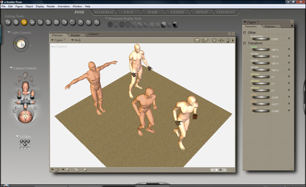
These days it's as easy to sketch out designs and picture compositions in a program like Photoshop as it is with a pencil and paper. However, I often prefer to use a program like Poser (SmithMicro) or Daz Studio (Daz3D) to explore a possible number of options and indeed to discover options I cannot easily visualize.
Poser and Daz Studio provide a kind of virtual stage with actors, props, scenery, and lighting set-ups that you can stage and pose to various ends. It also allows you to change your viewpoint of scenes/scenarios using cameras (focal distances, etc).
Pictorial Reference
Poser and Daz Studio also provide the means to produce image files of your scene/scenario for use either as reference or as finished pictures in themselves. I tend to utilize the low end of Poser's toolset because my intended picture lies elsewhere on the continuum of representational imagery.
Composition
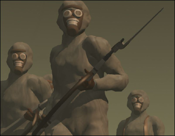
Having organized the 3D figures, props, and scenery, and having adjusted the lighting and cameras in different ways, I have settled on a view/ composition that look promising.

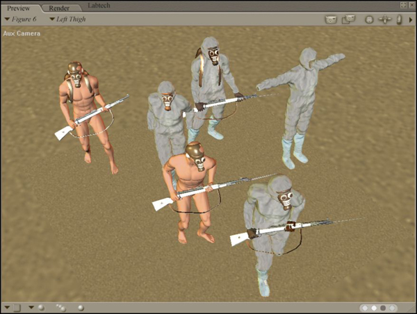
Under-Painting
I now refine or optimize each of these scenes so that they can function for Photoshop as 'under-paintings' do for traditional painting. This means adding relevant details to the scenes (period clothing and props, hairstyles, facial expressions, and gestures, textures and colors) and adjusting lighting.

It then remains to render the scene as a TIFF image file with an appropriate resolution (approximately 280dpi) for working with in Photoshop.
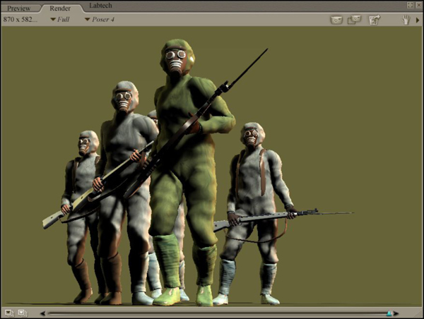
With the image file in Photoshop (at RGB or CYMK) edits and corrections can be made to the Poser render. These are usually required because the base image for the final painting needs to have all the basic elements in place, especially if you choose to apply any 'filter' effects or 'actions' that will transform all aspects of the image.
Painting
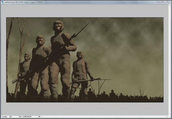
The next step or steps, or the 'Painting' as I call it, involves a fairly intuitive use of Photoshop's basic tools and usually involves adjustments of color, tone, brightness and contrast, some use of masking, some blending using layer options, some use of filters (cut out, and dry brush mainly), smudging and painting with preferred brush types, and the usual standing back and squinting!
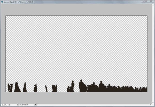
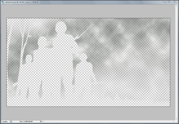
In the case of this picture a stronger context was needed for the figure group, so a background image of figures (made from the same group multiplied in silhouette) and a 'brooding' sky was introduced using Photoshop's masks, layers, and 'clouds' fill.
Publication
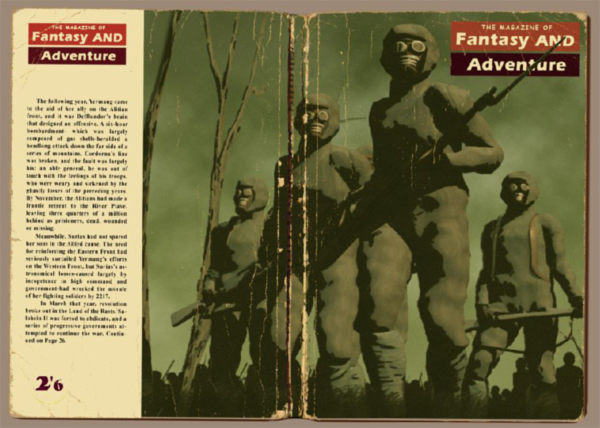
The idea of then further manipulating the finished images as 'faux' publications just seemed like the best kind of 'picture frame' the original artwork could possibly have. It also meant extending the creative challenges to now include Cover Design and Typography. Furthermore the Cover Art and the Cover Design could also gain more authenticity if they were presented as real (scanned) objects, a subterfuge further strengthened by the apparent evidence of 'wear and tear' composited in Photoshop.

The final cover is below.
 By
By


