
Every semester, in my Illustrator classes, my students always want to know how I create the Motorcycle Portraits I am known for. I often give them a brief explanation, but I have never really sat down and described the process in detail...until now. My approach to getting a "realistic" look in my work is a bit tedious, but I think you will agree that the end results are well worth it. Enjoy!
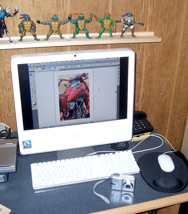
1. Using the Proper Equipment
Another question I get a lot from my students is, "What kind of computer should I buy to become a great illustrator?" My response is simple: I tell them that the question they should start off with is, "What kind of camera should I get to capture my reference images?" Stop stealing all your references from Google!!!
A computer is only as good as the techniques and steps you put it through to generate your images. A computer does not necessarily make you a good artist. YOU are the artist...the computer is just the medium for your art. You have to start out with a unique vision and a good eye for composition. I don't have any top of the line equipment. I shoot all my reference images with a simple, point-and-shoot, 8 Megapixel Kodak Digital Camera. I work in Illustrator CS4 on a 19 inch iMac. That's all I really need.
2. Getting the Reference Shot
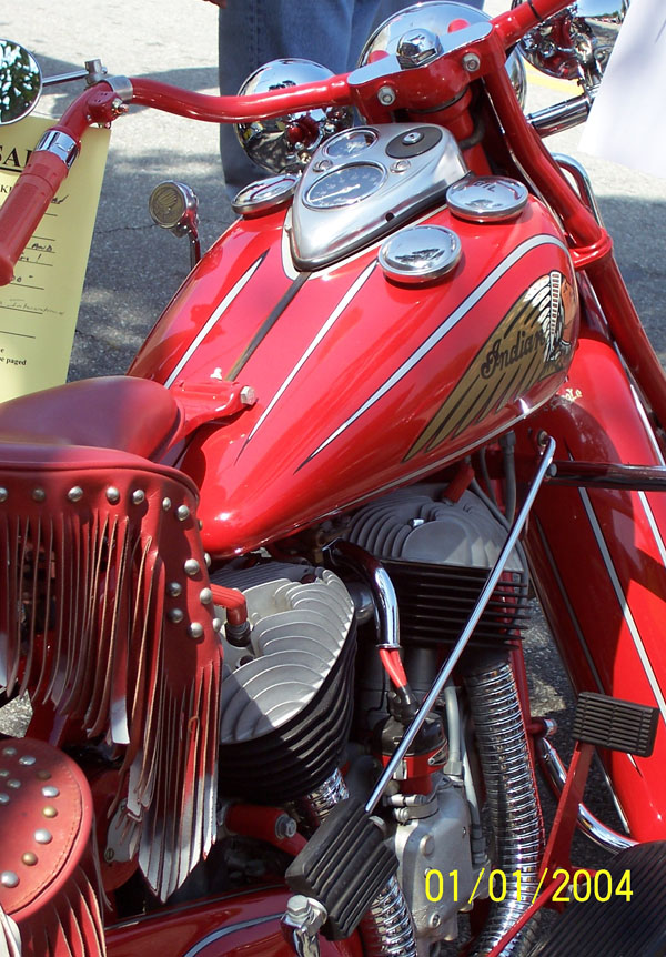
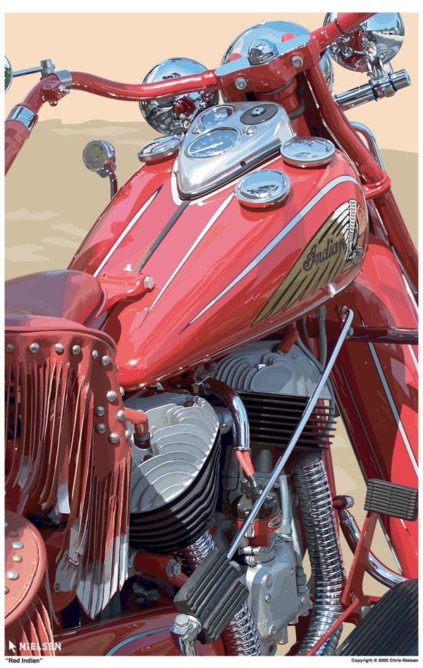
I draw whatever captures my attention. I typically find the motorcycles on display at outdoor shows and events. I came across this particular Indian Motorcycle at a car show in Beverly Hills. It was just parked up against the sidewalk among a bunch of other bikes, but this one caught my eye!
When I take my reference shots, I take as many different angles as I can. I will be the first one to admit that I am NOT a photographer, I am an illustrator. I never know which shot is going to work until I get home. Most of them, to be honest, don't come out well at all. For this bike, I shot about 25 different views. I only liked two of them when I downloaded the images. The other ones just didn't do it for me, so this is the final image I decided to work with.
3. Setting Up the Illustrator File
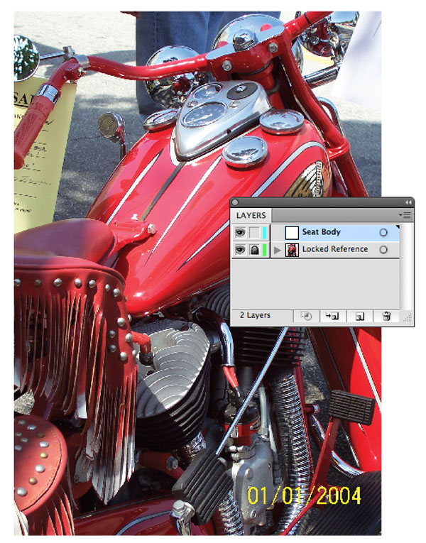
One rule I always tell my students is: In order to trace, Choose File Menu and Place. Then I tell them to set up their scans as Templates so they can draw, or trace, over them.
I don't follow my own advice! When it comes to my personal work, I don't like working over a dimmed template layer because I like to focus in on all the amazing details of a motorcycle's assembly. I place my reference shot into my Illustrator file, but I do not set the layer as a template. It is easier for me to work on top of the saturated image. Sure, it makes it a little more difficult to see my line work, but I have learned to live with that. I am stubborn and stuck in my ways, what more can I say?
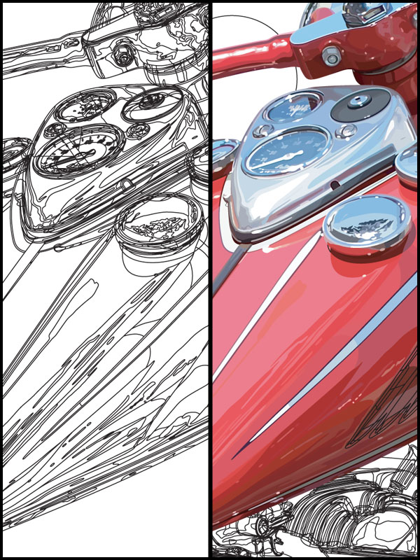
4. Start With the Big Shapes
A motorcycle is made up of so many elements put together. So, to start out, I create the larger elements first, as you can see here. I draw the basic outline of an object when I begin. Details will come later in the "Dividing" process.

5. The "Divide" Pathfinder
Now that I have a few larger objects to focus on, I zoom in for the detailed work to begin. And, when I talk about details, I am referring to the way I see color breaking down into multiple, smaller shapes. As I have shown here, I work on a series of individual paths that cross over the larger shape that I started with. In this case, I have focused on the seat of the motorcycle. I have also dimmed the scan so you can see things better in this demonstration.
With a few lines started, I then select the larger seat shape and one of the lines that is crossing over it. On the Pathfinders Panel, I Click the Divide Pathfinder and then Ungroup the results. Now I am left with two medium sized shapes - the resulting shapes of the larger seat object that has now been literally divided into pieces!
I can then move on with more lines, cutting the medium sized shapes into smaller and smaller pieces for colors in the next step.

6. Working In Sections
After some of the larger objects have been divided down into the smaller shapes, I apply colors to see how it is all coming along. For my work, I select one of the smaller pieces and use the Eyedropper Tool to sample color directly from the underlying photo. If I don't like the color I get, I tweak it with the Colors Panel. I tend to do that quite a bit!

7. The Progress
Here are some more "Work In Progress" shots as I have continued the Dividing and Coloring process to bring this work to completion.
The Final Results
So, there you go! 100,000 + anchor points and over 400 Layers later, and there she is! And, keep in mind, this process works the same for me, regardless if I am working on another motorcycle, or a dog, or a portrait of a person. I like the Stylized Realism I get with this creative process I have developed and I would love to see what you come up with in your own explorations. Good Luck!
 By
By


