
Sharp fonts can be an eye-catching, energetic design choice. In this list, we'll look at a collection of fonts with points. Check out this inspiring list for some font inspiration.


Envato Elements is an amazing resource for display fonts, including fonts with points. Whether you're looking for sharp edge fonts or other display font types, you can download from a library of thousands of fonts, with no limits. One low price gets you access to the entire font library!
15 Sharp Fonts to Download Now
1. Exton Sharp Edgy Fonts (OTF, TTF, WOFF, WOFF2)


Exton has a futuristic, sci-fi look, doesn't it? It's a typeface that tries to avoid curves and goes for straight lines and sharp edges—even the "O" is made up of straight lines!
This font is a great choice for:
- If you're looking to communicate a tech vibe, a font like this could be a strong choice.
- Notice how the straight edges are rather the opposite of keywords like organic or informal due to their very rigid nature.
- This font is a clean, versatile choice that works well at large sizes and smaller sizes too.
Keep an eye out for:
- This font is stylish with some minor decorative aspects, but it's not so decorative that it doesn't work well at small sizes. You can go pretty small here, but be wary of how it might read as body copy.
- If you opt to use this as the only font in your design, consider using weight to help establish hierarchy.
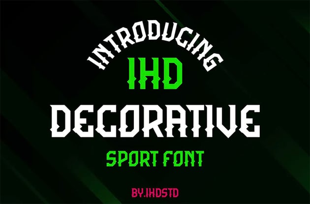
2. IHD Decorative Sharp Typefaces (OTF)


If you're looking for a pointed sans serif font, you can't do better than IHD Decorative, which has points sticking out of the middle of the letters. It would be great for a gaming logo, sports team banner, or other high-impact design project.
This font is a great choice for:
- This sharp font is quite decorative, so this one would be a great choice for points of emphasis, like logos, titles, or headlines. That decorative aspect could make the type stand out.
- In this case, a spiky font aesthetic is rather energetic and visually interesting. The vibe isn't necessarily tech-centric. This could work well for events, activities, and sports.
- Consider trying out text effects with this font too. It could work particularly well with a stroke or border, if you have two key colours to highlight.
Keep an eye out for:
- Keep in mind that those decorative aspects might become less visible at smaller sizes. Consider keeping this font larger, so those parts don't get lost.
- Likewise, this may not be the strongest fit for body copy—the decorative aspects could hurt readability in a situation like a paragraph of text.
3. Maverick Sharp Edgy Fonts (OTF, TTF)


Sticking with the sports theme, here's Maverick, an ideal pointy font for use in gaming, team logos, jerseys, etc. Or feel free to switch it up and use it in a completely different context!
This font is a great choice for:
- This is another font with points that crafts a really interesting aesthetic. Notice the stylish contrast between points and curves here. It could imply a lot of movement.
- This is a clean, stylish font that could pair well with high-contrast elements, particularly shapes and bold colours.
- It might also be worth experimenting with layering this font, if used for emphasis. For example, imagine it with a bold stroke or drop shadow in an eye-popping colour.
Keep an eye out for:
- This font is quite clean and legible, so it scales well. Use it large or use it smaller. However, it does have some decorative elements, so it may not be the strongest choice for body copy.
- You have a lot of options when it comes to making a font pairing with this font. Just keep in mind which of your choices you want to have as your emphasis and which is your complement.
4. Incisionax Pointy Solid Font (OTF, TTF)


Make a splash with Incisionax. It's a high-impact display font that's sure to catch your viewers' eyes. Sharp typefaces like this one are ideal for small amounts of text at large sizes, but don't be tempted to overuse it—it's not suitable for body text.
This font is a great choice for:
- This pointy font has a lot of energy. It could work well for posters, signage, and even T-shirts. Try it out for logo designs, titles, and headlines.
- Given the energy and the cutouts here, this could work well for energetic situations like fitness, dancing, and media that revolves around action.
- As this font is so angular, it would likely pair quite nicely with a clean, sans serif font.
Keep an eye out for:
- As this font gets smaller, we may lose some of its details. Those cutouts feel bold and exciting at larger sizes, but may just look like a blip when really small.
- If working with body copy, consider using a font that supplements this one.
5. Taper Sports Sharp Slab (OTF)


Wow, those points look sharp enough to cut you! Taper Sports font is a dynamic, high-energy font that would be ideal for sports or gaming, but could also be used on a wide variety of posters, brochures, etc.
This font is a great choice for:
- Sharp fonts like this one quite literally look edgy. Think about how this font visually communicates. The point creates a look that feels sharp in the sense that it can imply things like movement, speed, or an edge.
- This is why fonts like this can work well in industries like sports, fitness, competitions, and gaming. These are spaces that often have content that revolves around energy and excitement.
- Remember, display fonts are often designed to command attention—so use this font for points of emphasis.
Keep an eye out for:
- Supplemental copy, like body copy, would not be a point of emphasis, so use something more neutral if you've got this kind of content in your design.
- Your design choices can affect how this font communicates. In a highly saturated colour, the energy could look even more intense. Low contrast and low saturation could read quite differently.
6. Boxline Sharp Type (OTF)


Most of the sharp edge fonts we've looked at so far have been thick and bold, but here's a slim, monoline typeface that's elegant and refined. This would be great for posters or signage.
This font is a great choice for:
- If you're looking for something more visually distinct, sharp edge fonts like this one could be a great fit. It's a more decorative display font and will be visually memorable.
- Working with a stylish, modern design that features a lot of hard, angular elements? Then a font like this one could fit right in.
- This font is particularly strong at large sizes and with a strategic amount of copy. For example, this could work very well as a title on a poster design.
Keep an eye out for:
- Notice how this font gets a little more difficult to read at smaller sizes with longer strings of copy. Being display type, it may be best to keep this larger.
- Also, being a thin font, if you do go smaller, make sure to keep the level of contrast high. This can help keep legibility strong.
7. Deunah Pointy Solid Font (OTF, TTF, WOFF)


Here's another pointy solid font, with spurred edges to give it a prickly look. Deunah is full of personality, and it's a great choice when you want your text to have a strong impact.
This font is a great choice for:
- Pointy fonts come in many styles, and this one almost has a Western vibe to it. It gives it a vintage feel that could be further played into with added design elements.
- This font with points is also quite bold. In the above example, it's quite high contrast against the background, as well. Notice how strongly it stands out and commands attention.
- In this case, these sharp letters have points that revolve around the serifs in a more traditional way. It doesn't necessarily translate into energy, but does lend to a potentially ornate aesthetic instead.
Keep an eye out for:
- Notice how well this font pairs with a more neutral supplement, as we see in the example above. If you're going for a vintage look, consider trying a serif complement.
- This pointy font is so bold that it may scale nicely to smaller sizes. However, the decorative nature probably does not lend itself well to body copy.
8. Quick Starter Sharp Letter Font (OTF, TTF, WOFF)


You can really feel the wind in your hair with this font. It communicates speed very clearly, so of course it's perfect for any project with a racing theme, but you could also use it more widely for any design where you want to give the impression of strong forward motion.
This font is a great choice for:
- If you prefer fonts with points that have an energetic quality to them, then this font is likely right up your alley. Notice how the points imply movement, almost as if pointing in a specific direction.
- Text effects could also be a great fit for this font. Try it in chrome, for example, for a visual association with cars. You could also try this with a highly saturated gradient to further imply energy.
- It's easy to imagine this font on a poster design or T-shirt because it's so bold, eye-catching, and memorable.
Keep an eye out for:
- This spiky font has a lot of weight. It would likely scale down nicely, while still maintaining legibility. However, the decorative aspects could hurt readability in longer strings of copy.
- A clean sans serif font could be an excellent font pairing with this one. Try something like that if you need to work with body copy.
9. Cornera Pointy Letter Font (OTF, WOFF)


If you're looking for smooth curves, you're in the wrong place. Cornera puts a strong emphasis on straight lines and sharp corners, and the result is a unique, eye-catching display font that's ideal for logos and headlines. It comes in two weights: regular and bold.
This font is a great choice for:
- A sharp font, like this one, can work nicely if you're planning to work with a clean, modern aesthetic. Those hard edges lend themselves to an inorganic look.
- This is another pointy font that could work really well with tech-themed projects. You might even be able to push this towards a Y2K look with the right colour and design choices.
- Consider keeping this font large—it's a display font with unique visual qualities. Use them to help create a focal point.
Keep an eye out for:
- This font is quite thin (although it does have a bold version). At smaller sizes, this may cause an issue—so keep things bold, high-contrast, or both if you do need to go smaller.
- Consider complementing this font with a clean, neutral sans serif font, instead of using this display font for long passages of text.
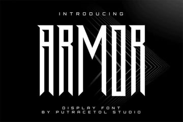
10. Armor Sharp Edge Fonts (OTF, TTF, WOFF)


Armor is about as tall and thin as a font can get while still remaining legible. If you want sharp ends, a geometric look, and a very condensed style, this is a perfect option.
This font is a great choice for:
- Don't these sharp letters look powerful? Notice how the points could be visually associated with a sword. There's so much strong energy here.
- Use the way this font communicates to your benefit. For example, an eye-catching font like this could work well for logo design or on a T-shirt.
- Simple text effects could enhance this, especially if you're using this font as a point of emphasis. Imagine this, for example, with a simple shadow to emphasize its height.
Keep an eye out for:
- Because this font is so lengthy, it may be best to keep the actual words displayed brief and to the point. Otherwise, legibility could become an issue.
- Sharp edge fonts, like this one, often pair nicely with a clean sans serif font, and this one is no exception. Turn to a neutral supplement for body copy.
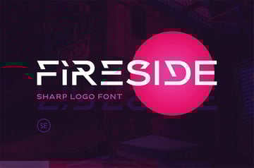
11. Fireside Pointy Letter Font (OTF, TTF, WOFF)


Sharp, edgy fonts like Fireside are great when you're trying to give your designs a futuristic look. It comes with upper-case and lower-case letters, numbers, symbols, and multilingual support.
This font is a great choice for:
- If you like fonts with points, but you also fancy some creative cutouts, give this font a look. It makes for a visually interesting typeface.
- This display font could be wonderful for logo design and poster design. It has so many interesting cuts and points that could make for memorable type.
- You can also mix and match the upper and lowercase letters included in this font download to explore alternative solutions.
Keep an eye out for:
- This one is so graphically interesting that it's best left as the star of your design, not as a supplement. Consider sticking to titles and headlines with this font.
- There's such a clean, sleek look here, so if you opt for a font pairing, keep that aesthetic in mind. Sans serifs could pair well, while serifs might not match as nicely.
12. Mirage Pointy Letter Font (OTF)


For a sharp letter font with a sporty vibe, try Mirage. It's a great decorative font for all sorts of display purposes, from headlines to posters. Download it and give it a try!
This font is a great choice for:
- This is a very different font with points—it's perfect if you're looking for an unusual aesthetic. It has a mix of interesting points and opposing curves.
- Use these distinct visual features to your advantage. For example, play into them if you opt to use this for a logo or T-shirt design.
- This display font is beautiful when used large and as a focal point.
Keep an eye out for:
- How the font visually communicates matters. So, for example, this is rather energetic and exciting, with lots to see—it might not work nicely for a formal occasion like a wedding.
- This font is a bit of a wildcard, so make sure any fonts you pair with this are neutral and don't compete.
13. Batten Sharp Type (OTF, TTF, WOFF)


With its unique sharp-edged style, five different weights, and a range of alternates, Batten CPC is a stylish display font to use when you want to create sharp type with an eye-catching look. Try it on headlines, signage, and posters.
This font is a great choice for:
- Highly angular, pointy fonts can make for a really interesting aesthetic. This one could go in many directions—imagine it on a wood texture, for example. It could look carved into the surface, due to its hard edges.
- This font also comes in multiple weights, so there's a lot to experiment with here. You could use it for a main title and then use a variant for subtitles, for example.
- Large sizes suit sharp fonts like this display font very well.
Keep an eye out for:
- Thin fonts can become harder to see and read at smaller sizes. If you opt to go quite small, consider a bolder variant and/or value choices that have higher contrast.
- If you have a lot of copy in your design, consider pairing this one with a simpler-looking font.
14. Haext Regular Pointed Sans Serif Font (OTF)


With its hand-crafted style and clear runic influence, Haext could work well as a horror movie title font. But context is everything, so it could also be very effective in a range of other projects. How would you use it?
This font is a great choice for:
- This font has sharp letters, but unlike the others in this list, it's also quite organic. It looks handwritten and has a rather rustic appearance. It pairs well with rough textures.
- Display fonts, like this font with points, are designed to be visual and graphical. Use it to showcase a particular phrase or title in an eye-catching way.
- If you have a single word or a small collection of words to highlight, something this decorative could be an excellent way to showcase it in a memorable way.
Keep an eye out for:
- This font would likely not be a strong choice for body copy, paragraphs, or particularly long passages of text. Instead, consider trying a clean serif font as a complement.
- There are a lot of beautiful thin strokes in this font, so be wary of legibility when using lower-contrast values and colours, regardless of size.
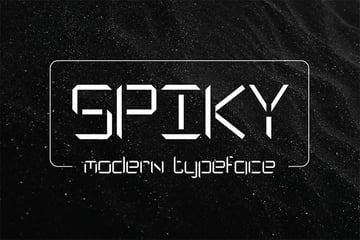
15. Spiky Pointy Solid Font (OTF, TTF, WOFF)


With its sharp edges, straight lines, and gaps in the letters, Spiky has an old-fashioned sci-fi vibe. It comes with four styles (light, regular, medium, and bold), and web fonts are included.
This font is a great choice for:
- If you want to play into a tech-heavy theme, the aesthetic of this sharp font would be right on target. It also looks a bit like the cutout variables we might see in an old-school digital clock face.
- You could push this aesthetic further with highly saturated, high-contrast colours. For example, imagine this in a stark neon. This could be a great fit for science fiction projects too.
- This one could be a great choice for titles or logos. You could also consider pushing it with a text effect, like a saturated outer glow.
Keep an eye out for:
- This font is likely best reserved for strategic use. Too much copy in this font could prove to be overwhelming to read due to its decorative nature.
- Given the sleek, tech-inspired aesthetic, a clean sans serif font could be a perfect complement if you want to create a font pairing here.
Which Sharp Fonts Are Your Favorites?
There are so many options to explore if you'd like to try working with fonts with points. Love eye-catching, memorable display fonts? Check out these other inspiring font collections from Envato Tuts+.

 32 Best Military Fonts (Army Stencil Fonts)


 45 Best Thin Serif Fonts (Narrow and Skinny Fonts to Download)


 41 Best Tall Skinny Fonts (Long, Thin Fonts)

 39 Best Sports Fonts (For Logos, Jerseys, and More)

 21 Best Line Fonts (Double & Multi-Line Fonts)

 36 Best Wide Fonts (Extra Wide & Extended Fonts)
 By
By


