

1. Affinity Designer 2 Tutorial
Affinity Designer 2 is here, and I'm going to show you everything that you need to know to get started. It offers vector and raster in one app, it offers a fully featured iPad app, and you can even open Adobe files! Best of all, there's no subscription required. Follow along to learn how to use Affinity Designer from start to finish.
You can start by downloading all the creative assets we'll be using in the course:
2. Interface Tour
Let's start by taking a look at the interface of Affinity Designer 2. Up at the top, you have the menus that you're probably used to from any other app. If you're on Mac you're also going to have an Affinity Designer 2 menu, where you're going to find things like the app settings.


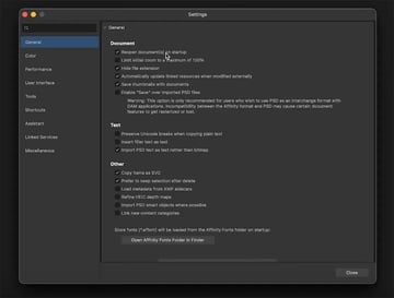
From the settings, you can click the tabs on the left to control your color management, choose performance settings, customize your shortcuts, etc.
Affinity Designer Menus
Here are the other menus in Affinity Designer 2:
- File: for importing new files, exporting, etc.
- Edit: paste controls, autofill, etc.
- Text: text controls like size, spacing, etc.
- Layer: one of the most powerful menus in Affinity Designer when it comes to working with objects and layers.
- Select: another powerful menu where you can select things based on type, e.g. by fill color or stroke color, by name, etc.
- View: things that pertain to the interface, like guides and rulers.
- Window: where you can control which panels are open.
- Help: quick links to video tutorials and documentation, plus a search bar where you can type in a function and get taken straight to the relevant menu.
To make sure we're all on the same page, I'm going to go to Window > Studio > Reset Studio. That will remove any customizations I've made and bring back all the defaults.
Command Bars
The command bars are the two bars at the top of the interface. The context bar changes depending on what you have selected and which tool you have active. Above that is the main bar that stays the same no matter what you're working on.
On the left are the three personas:
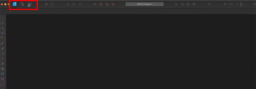
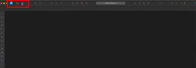
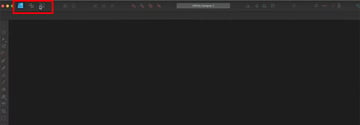
- The Designer Persona is the heart of Affinity Designer, where we're going to do most of our work, especially with vectors.
- The Pixel Persona is great for sketching and painting. I personally use it more on the iPad app.
- The Export Persona is what you use once you have your document created and need to export it.
Each persona has a slightly different menu at the top, but a lot of the tools are the same. You'll find buttons to change the current view, to align and position objects, to turn snapping on and off, etc.
2.1 Get Seriously Creative With Envato Elements
This course is brought to you by Envato Elements, the largest unlimited creative subscription in the world. Get seriously creative! Click the link below to learn more.
3. Artboards and References
Now, let's get started with our first document. Go to File > New, and on this screen you'll see options on the left for opening recent files, using templates, and opening sample documents, which are premade designs that help you see how things are made.
We're going to click on New, though, and use one of the web presets. The presets are handy because they automatically give you an appropriate document size, color settings, etc. We're creating a social media post in this example, so scroll down to Web and select Social Media Story Post. Set it to Portrait orientation.

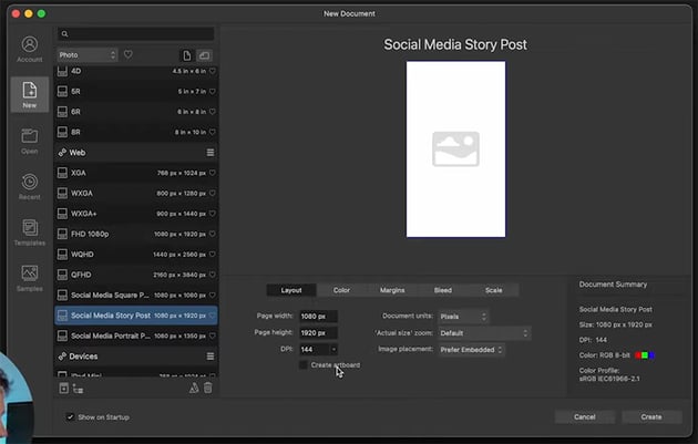

We can leave the settings at their defaults, and then go ahead and click Create.
3.1 Creating an Artboard in Affinity Designer
There are a couple of different ways to create artboards in Affinity Designer. The easiest is just the Insert Artboard button in the top toolbar. You can click multiple times, and it will create artboards in the same dimensions as the document default.
You can also select the Artboard Tool from the left toolbar and use it to click and drag to create an artboard in any dimensions you want. You can see both tools highlighted below, along with the different artboards I created with them.

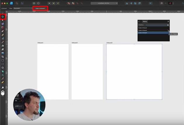
One other useful feature that you can see in the screenshot above is the Cycle Future option in the History panel. If you've ever worked with something like GitHub, you might be familiar with this—basically we've got a fork where we changed something (in this case, I deleted one artboard and created a different one), and we can go back and choose which version we want to go forward with.
If you're used to other apps like Illustrator, you might assume that when you undo and then do something different, it's going to throw away that history, but Affinity Designer actually keeps it.
3.2 Get Seriously Creative With Envato Elements
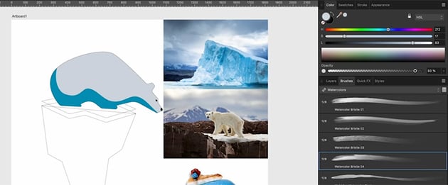
To create designs, we're going to need some creative assets like stock photos and graphics. I use Envato Elements for this because it's a flat monthly rate and it saves me a ton of time to have high-quality assets ready whenever I need them. I put together a collection over on Envato Elements where you can download everything I'm using in this course.
3.3 Add Reference Images
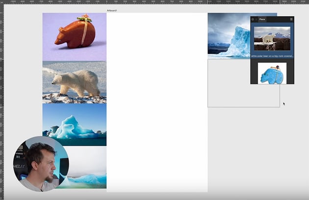
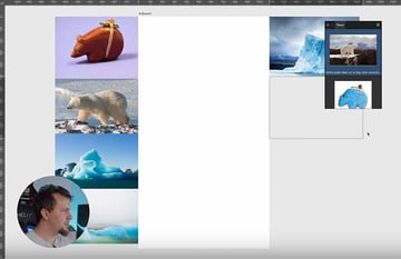
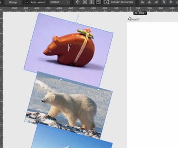
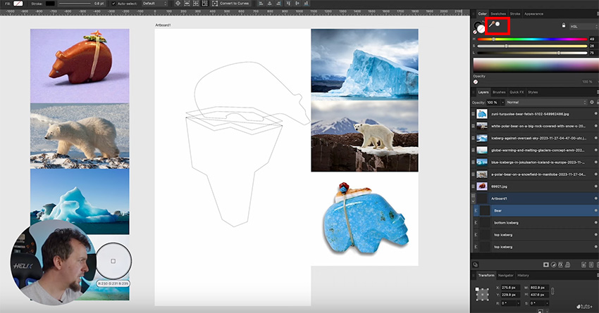
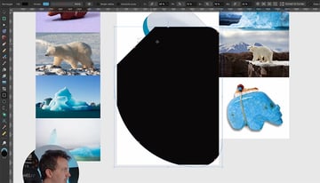
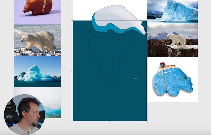
When you've downloaded the images, go back to Affinity Designer and click on the Place Image Tool on the left sidebar. Then select the images from your hard drive and click Open.
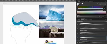
You'll see a little stack open on the artboard, where you can select which image you want to place. As you click and drag to place them, they'll be removed from the queue.

4. Basic Tools
In this section, we're going to look at some of the basic tools in Affinity Designer, such as the Move Tool, the Pen Tool, and more.
4.1 How to Use the Move Tool in Affinity Designer
Now that we've imported the images, let's have a look at the Move Tool (V). This is analogous to the Select Tool in Illustrator. It's the black arrow icon at the very top of the toolbar.
You can select multiple objects with the Move Tool by holding Shift, or you can also drag a box around them. When you have a selection active, you can transform it using the handles on the corners or the sides. If you want to keep things proportional, just hold Shift as you drag. If you want to scale from the center of your selection, hold the Command key (or Control on Windows).
We can also rotate using the little handle at the top or just outside the selection, near one of the corners. Holding Shift will make it rotate in 15-degree increments.


Now that we have something selected, you'll see some options appear on the context bar.

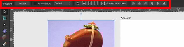
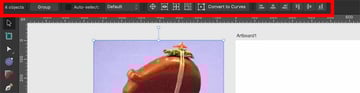
Let's go through these options:
- Group lets us quickly group our selection.
- Auto Select lets us select things in the interface instead of in the layer stack.
- Origin creates a little blue circle that you can use to rotate and scale around a particular spot.
- Hide Selection hides all the interface lines, making it a bit easier to see what the object is lining up with as you move it.
- Show Alignment Handles can be handy for making fine adjustments and ensuring that objects get positioned exactly where you want them.
- Transform Objects Separately makes each item within the group scale or rotate separately instead of all together.


4.2 How to Use the Pen Tool in Affinity Designer
The Pen Tool is the heart of any vector drawing application. The Pen Tool in Affinity Designer is pretty similar to the one in apps like Adobe Illustrator, with a few notable exceptions.
With the Pen Tool active, we get new options in our context bar at the top.


We've got options for the fill and stroke, with a dropdown for stroke options, and then we have some different modes. I'm mostly going to be using Pen Mode, but there are other options like Smart Mode, which is great for creating organic shapes, or Polygon Mode, which only creates corners instead of curves. Then there are some other options to help you customize the tool for particular uses.
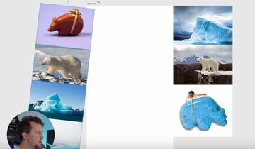
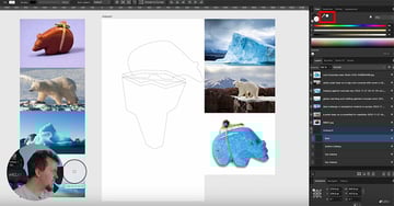
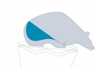
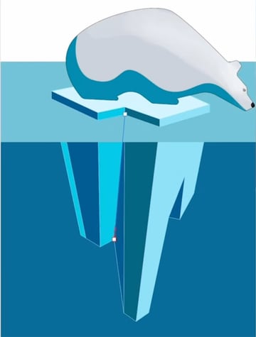
Let's see how the Pen Tool works in practice, though, by creating a simple drawing of a polar bear on an iceberg. Here's the whole process, step by step.


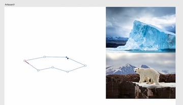
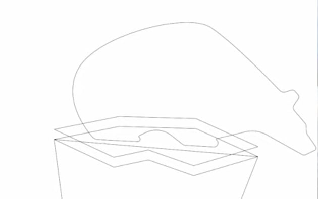
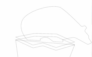
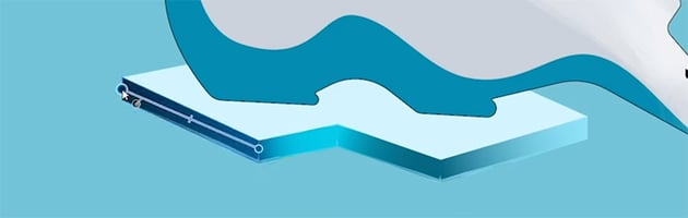
Start by drawing the iceberg using just corners. So just click once on the artboard, then click again to create a new point, following the shape of an iceberg. To close the shape, either click on the first point again or click Close Curve in the context bar.

Now duplicate the iceberg drawing by going back to the Move Tool (V) and holding the Option key while dragging the shape downwards.
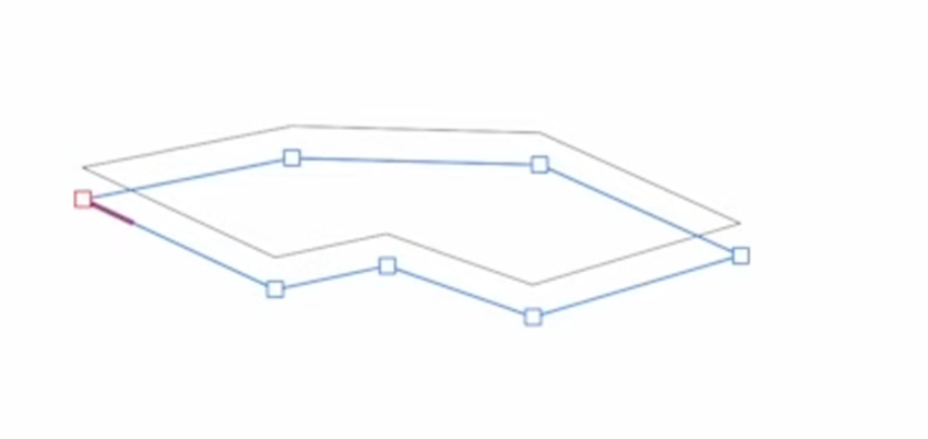
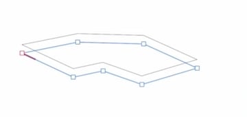
Now we can go ahead and fill in the body of the iceberg. Go back to the Pen Tool (P) and just click to create a rough iceberg shape. It doesn't have to be perfect because we'll come back later and fine-tune it with the Node Tool. Click the button in the context bar again to close the shape.


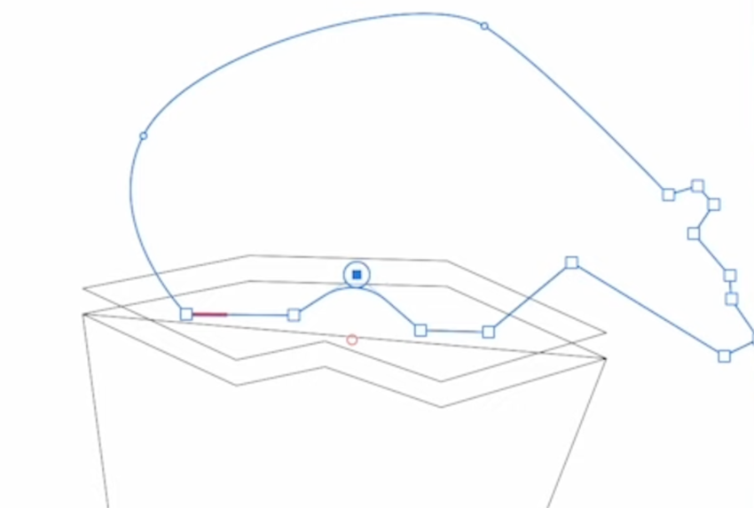
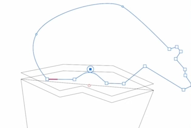
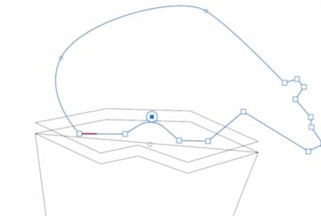
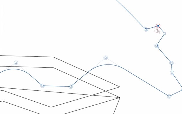
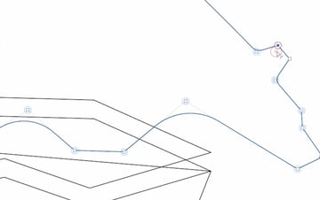
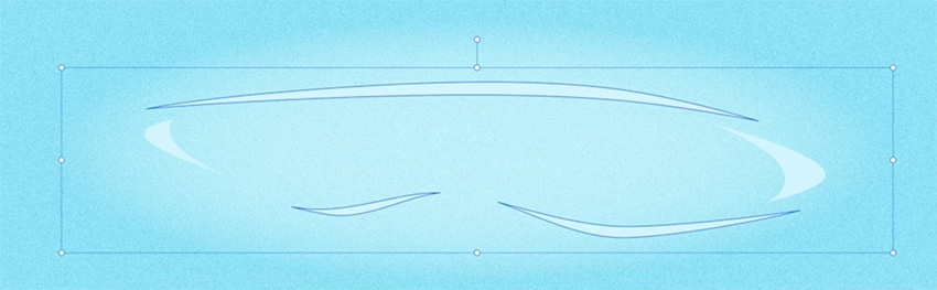
Now let's start creating the polar bear using the reference images. We'll use a mix of curves and corners for this. To create a curve, just click and drag, and you'll see a line appear. This lets you drag around to refine the shape of the curve.
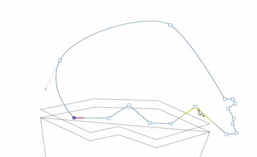
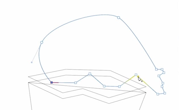
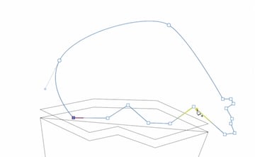
Once you've done some curves for the back, add some corners for the head and feet. Again, draw freely because we can fix things later with the Node Tool.
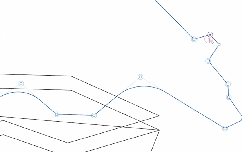
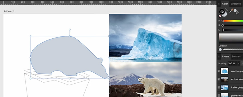
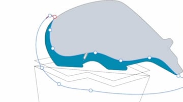
4.3 How to Use the Node Tool in Affinity Designer
The Node Tool has a lot of familiar options up at the top. We have options to convert to sharp, smooth, and smart, and then we have actions for splitting curves, breaking curves, smoothing curves, etc. There are also some snapping options, and we have a box for Transform Mode, which we'll use right now.


The head of our polar bear is a bit small, so let's click on Transform Mode, and you'll see that we get all the same controls that we had for the Move Tool. Use them to select the points for the head and scale them up. We can also rotate the head a bit.


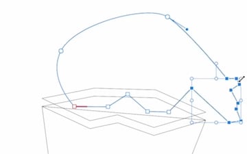
You can see how handy this Transform Mode is when you're working with multiple points all at once. You can scale and rotate instead of having to go in and move each point individually.
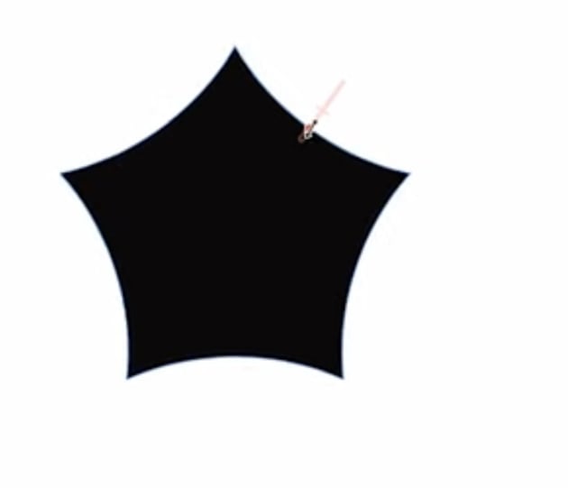
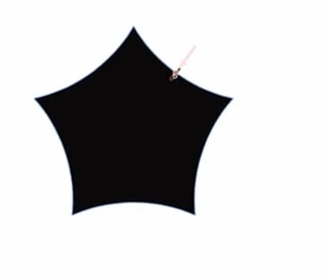
4.4 How to Use the Corner Tool in Affinity Designer
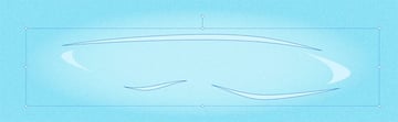
Next up is the Corner Tool. We're going to use it to add some curvature to our bear around the feet and head. Click and drag on the belly, and you can see we've got a perfectly symmetrical curve. We don't need to worry about having multiple points or how those bezier handles are going to interact with other nodes.
You can also choose from multiple different corner types in the context bar:


We'll stick with simple rounded corners, though. It's a useful way to soften the corners a bit and make them smoother. Zoom in and add a small amount of rounding to each of the corners on the head.
The Corner Tool gives you a lot of control over how rounded they are, so some of them you can keep fairly sharp, and for others you can add a lot of roundness.
Here's how our bear is looking now.

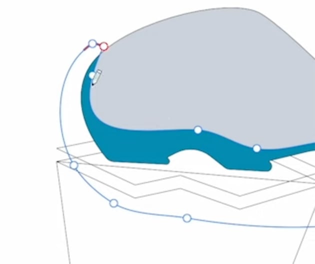
4.5 How to Use the Pencil Tool in Affinity Designer
The Pencil Tool is a great option for designers who find the Pen Tool a bit tedious or just want a more natural look.
I'm going to be using the Pencil Tool with my Wacom tablet, but you can also use it with a mouse and keyboard. This tool draws vector shapes with a click and drag or pen input. You can set the stroke color, and you can also set the fill and the width of the stroke, all using pen pressure or through the Stroke panel. The Pencil Tool also has Sculpt Mode, which lets you tweak your shape after you've created it.
Before we use the Pencil Tool, we'll need some color. So let's activate the Move Tool and make sure that the polar bear shape is selected. Also make sure that your Color panel is visible.
On the Color panel, click on the Eyedropper icon and then drag across to the image at the bottom left here and sample the gray color from those clouds.

To apply it, just click that sampled color in the Color panel, and it will be applied to the shape you have selected—in this case the bear.


Now let's draw a shadow with the Pencil Tool. Deselect the bear, choose the Pencil Tool, and check the context bar at the top.


We want to make sure that the Width is active and Sculpt is turned off. The other default options you see here should be fine, using a rope stabilizer with the length set to around 30 and the other options checked.
Finally, I'm also going to activate the Insert Inside button in the top right of the screen. What that means is that when I draw the shape, I'm going to have the bear shape selected, and it's going to add my drawing inside the bear by clipping it to that shape.
Now that we're all set up, we'll start using the Pencil Tool to draw a shadow in the next section.
4.6 How to Clip Layers in Affinity Designer
Now let's start drawing! Select a blue color from one of the images using the Eyedropper, make sure that you have the Pencil Tool active and the bear shape selected, and follow the steps below.

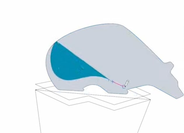
Just draw a curvy shape with your pen on the tablet, or click and drag with your mouse, and you'll see your shape being created using the blue fill color we chose.


Continue drawing smoothly across the bear shape, and you'll see points being added automatically. Drag back around to the beginning to close the shape.


Let's activate Sculpt Mode now and use it to tweak this shape. Simply by drawing across your line, you can add to your shape or subtract from it. It can take a bit of practice to get it right. For best results, make sure that you start and end on part of your curve. Sculpt Mode is a great way to add some curvature without having to get in there and manually move all those nodes around.
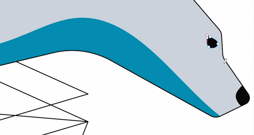
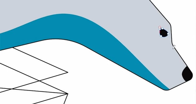

While we're working with the Pencil Tool, we'll also add a nose and an eye for the bear. Turn Sculpt Mode off now, and change the stabilizer from rope mode to Window mode. Window mode is based on the speed of the cursor, and it gives us more control over the shapes. Use the Eyedropper to select a black color, select the bear shape again, go back to the Pencil Tool (N), and draw a simple curve for the nose and a teardrop shape for the eye.
With the shadow and the nose, notice that because we activated Insert Inside, the shapes only appear inside the bear, with nothing outside. In the Layers panel, you'll see your new drawings clipped to the bear layer. If you move the bear around, the drawings will now move with it.
You can clip something to a layer simply by dragging it onto that layer, or you can create a mask by dragging onto the icon of a layer. Masking is the opposite of clipping: it means that the bear only appears where it's revealed by the mask.
4.7 Get Seriously Creative With Envato Elements
Struggling for a spark? Fire up the largest unlimited creative subscription in the world. Find and download authentic graphics, templates, photos, and fonts. Get seriously creative, and go supernova with Envato Elements.
5 Layers and Shapes
In this section, we'll look at how to work with layers and shapes in Affinity Designer. We'll cover the vector brush and parametric shapes.
5.1 How to Use the Vector Brush in Affinity Designer
Next, let's have a look at the vector paintbrush. The vector paintbrush combines raster and vector elements. It paints raster strokes and texture along a vector line.
We'll use the vector brush to add a highlight to the bear. Activate the Paintbrush Tool in the left toolbar, and you'll see a new set of options in the context bar at the top.


Change the Stabilizer to Window mode and change the value to about 35. For the color, I'm going to select the same color that we have for the bear. Change the Blend Mode to Screen and set the Controller to Brush Defaults if it isn't already.
Now we'll go into the Brushes panel and choose a watercolor brush.

Make sure the bear is still selected, and activate Insert Inside. Now just paint over the bear. The effect is subtle, but just keep adding multiple strokes to build up the effect.


We want the effect to go under the shadow and the eye and nose shapes, so make sure to select your brush strokes, group them, and move them under the shadow and eye and nose shapes in the Layers panel.
5.2 How to Use Parametric Shapes in Affinity Designer
We've added quite a bit of detail to the polar bear, so next we need to add some color to the rest of the scene. We're going to be using parametric rectangles to add some water and a sky to the scene.
"Before we get into using those parametric shapes, I want to discuss the power of parametric shapes in Affinity Designer. It's really one of the most powerful tools in the app."
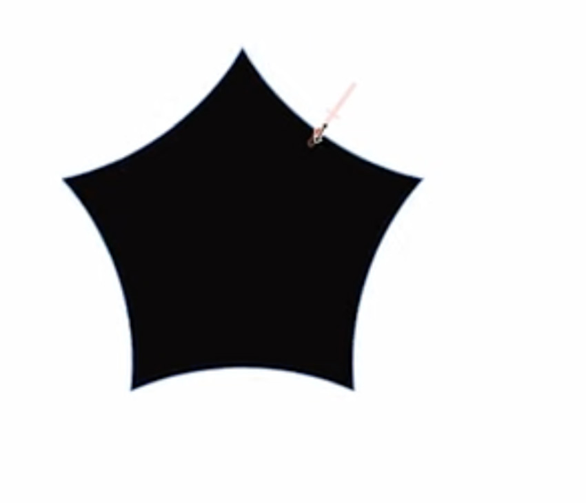
In the left toolbar, if you click and hold on the polygon icon, you'll see a whole range of different shapes you can create. Let's start with a simple polygon. Choose it from the toolbar, and click and drag to create the shape.
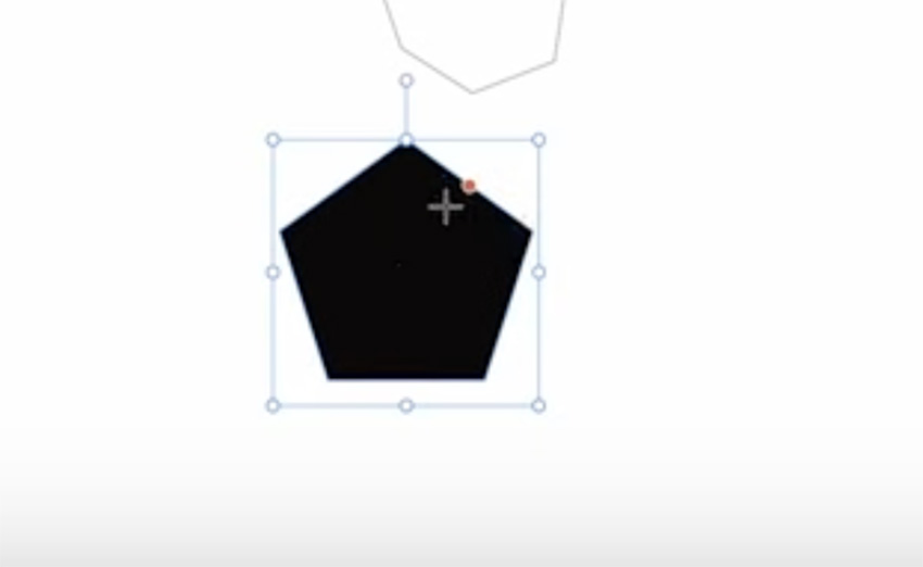
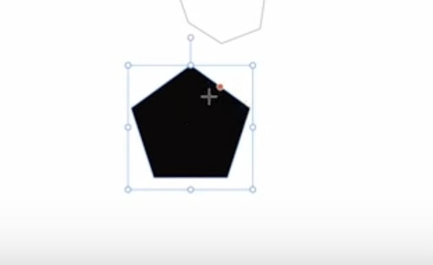
Just like the images that we worked with before in the Move Tool, you can scale or reposition the polygon. You'll also see a slider on the side, which you can drag to create curves.
In the context bar at the top, we've got our fill and stroke just like with other tools, and we also have some presets. So we can easily change it to a hexagon, heptagon, octagon, etc.


6 Color
In this section, you'll learn about color in Affinity Designer. We'll cover the Swatches panel and talk about the power of global colors.
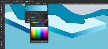
6.1 How to Use the Swatches Panel in Affinity Designer
As I start adding colors to my scene, I want to be able to reuse these colors. So it's a good time to talk about swatches in Affinity Designer.
When we first open the Swatches panel, it has a selection of default colors.
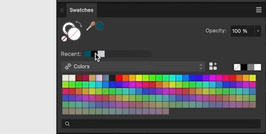


We can click the dropdown to access a lot of different color libraries, but for this project I want to create my own color palette. So click the hamburger menu at the top right of the Swatches panel, and choose to Add Document Palette. We'll start adding to this palette next.
6.2 How to Use Global Colors in Affinity Designer
The document palette gives us access to a really powerful tool called Global Colors.
"With Global colors, we can change the color of everything that has a Swatch applied by changing the Swatch itself, and everything will get synced."
Now let's draw a rectangle for the sea and give it a dark blue color.


Next, select this rectangle and add that blue as a Global Color in the Swatches panel. Then click that swatch to apply it to the rectangle as a Global Color. From now on, if I change this color in the Swatches panel, the change will automatically get applied to this rectangle and anything else with the same swatch.
Now let's create the surface of the water by drawing a lighter blue rectangle at the top. Whenever you add a new color, add it as a Global Color too.
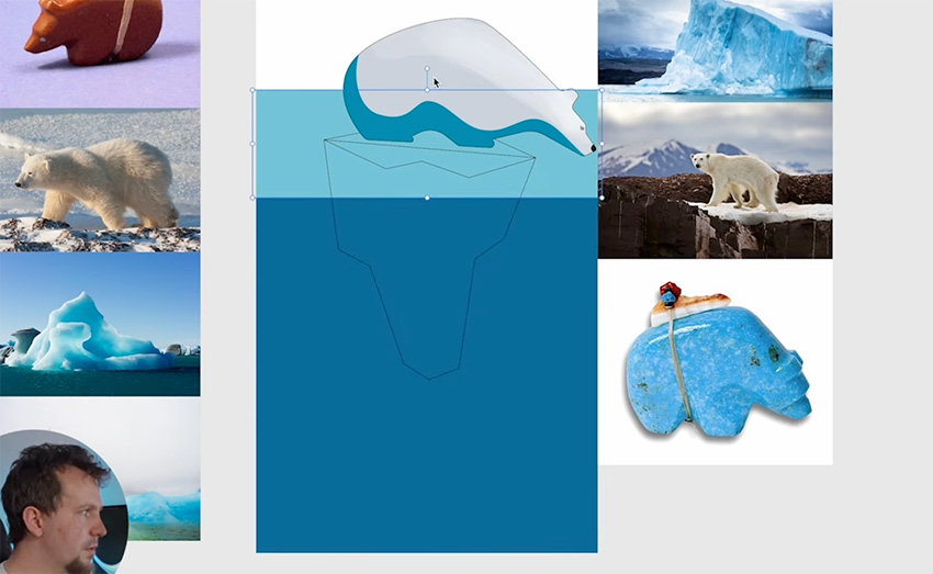


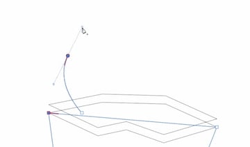
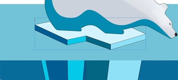
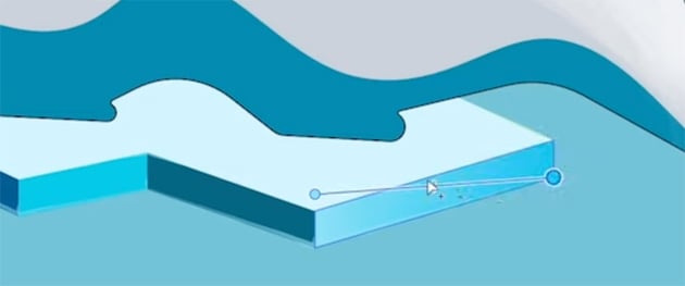
Next, we want to add some detail to the top of the iceberg. First, use the Pen Tool in Line Mode to join the two shapes with straight lines.


We also need to delete that straight line going across, so let's switch to the Node Tool and just click on that curve to make it active. Then in the context bar at the top, you'll see a Break Curve button. Click that button to break the curve, and then delete the two nodes to remove the line altogether.
Now we can use the Vector Flood Fill Tool to fill the shapes with different shades of blue.


Since they're Global Colors, we can change them as needed in the Swatches panel, and everything will update.
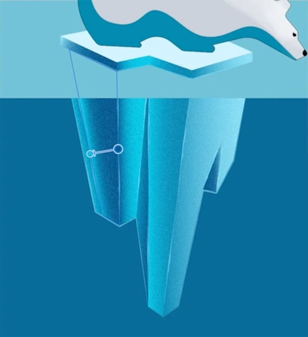
7 Shadows and Highlights
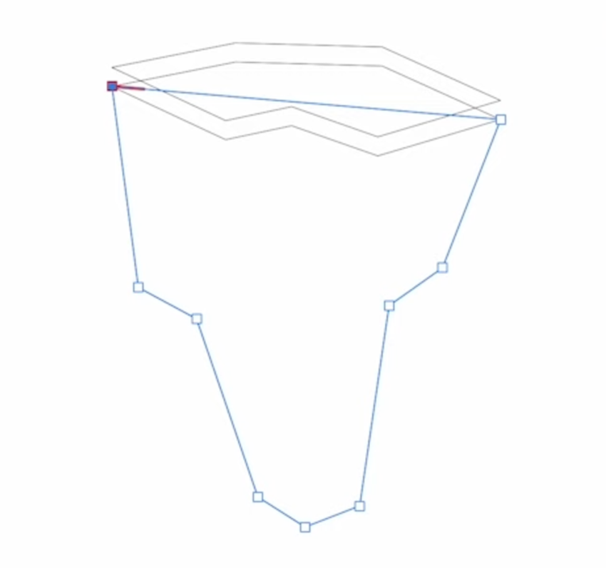
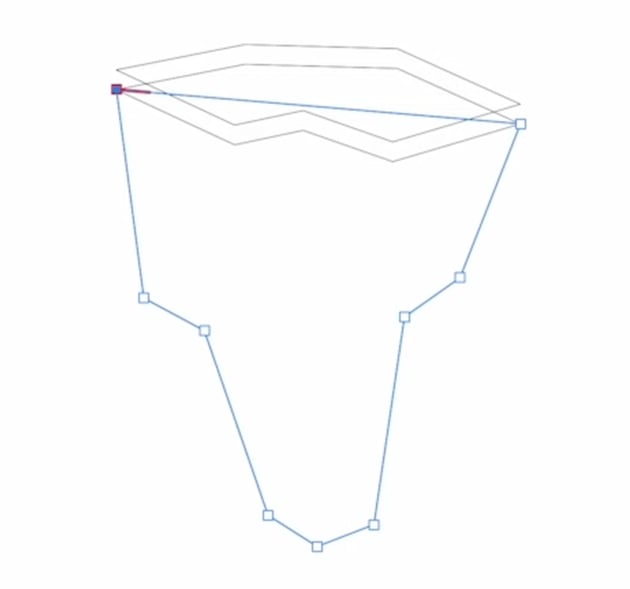
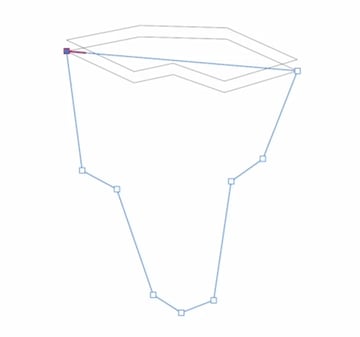
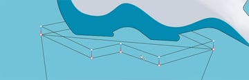
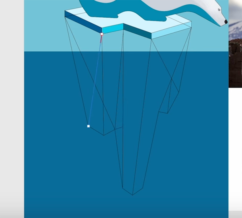
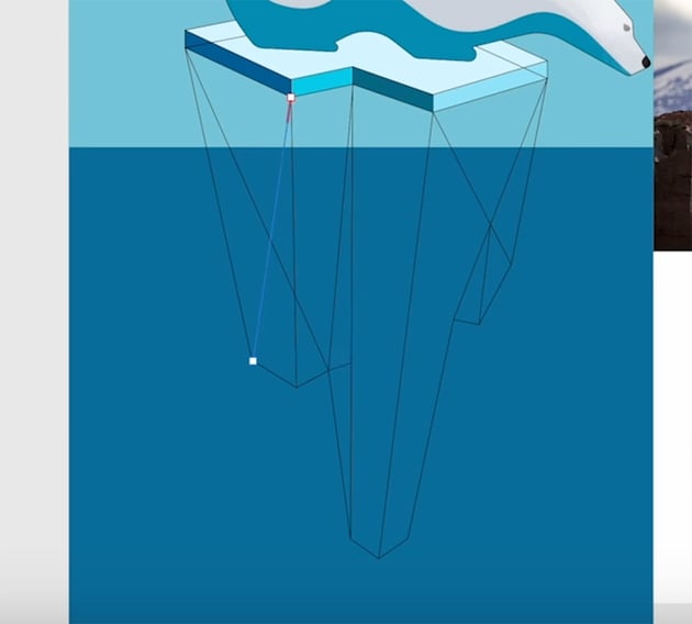
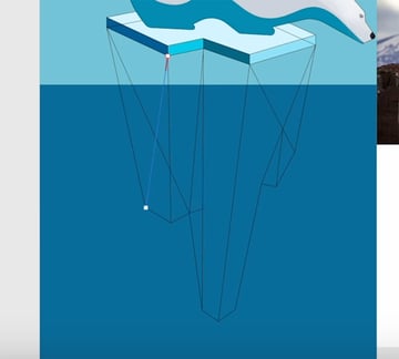
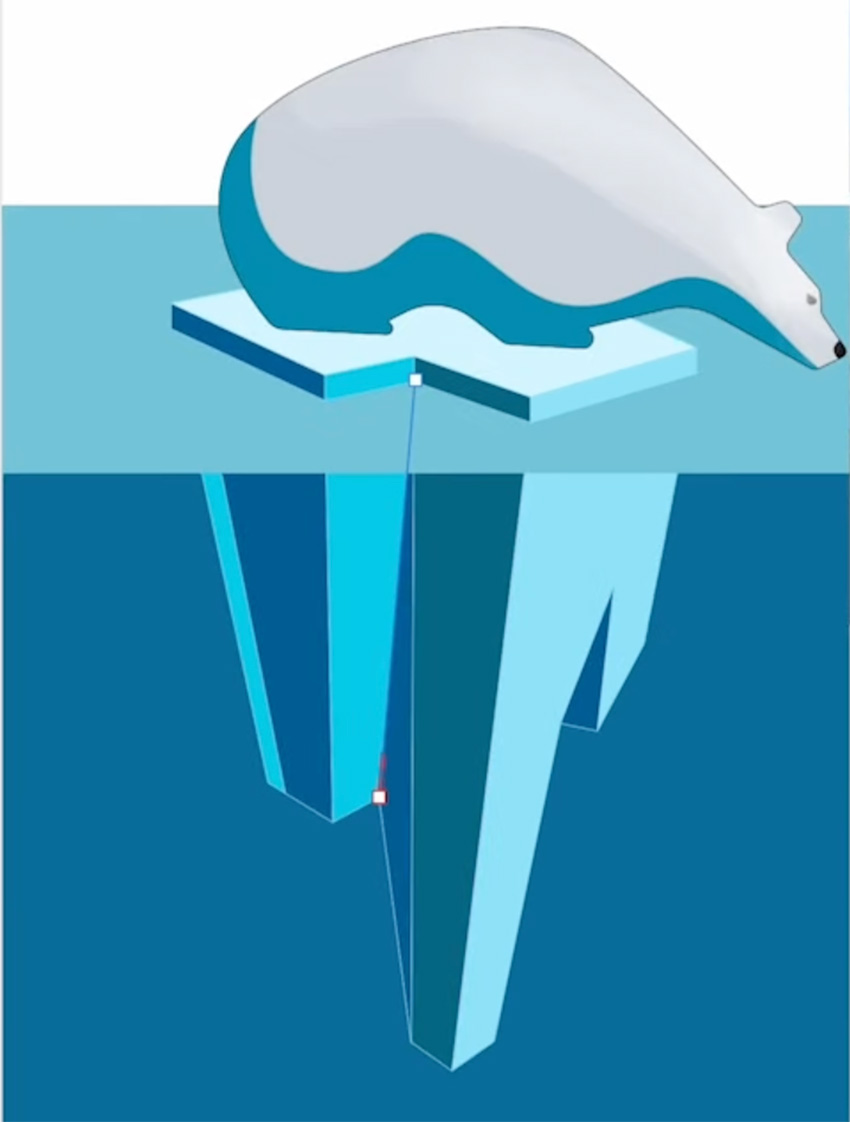
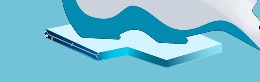
Now let's fill out the bottom part of the iceberg with shadows and highlights. First, switch to the Node Tool and tweak the points to refine the shape of the iceberg.
Then we can draw some lines just like we did on the top part to connect everything up. So go back to the Pen Tool, which should still be in Line Mode, and start breaking the shape up to create shadows and highlights. You should end up with something like this.
7.1 How to Use the Flood Fill Tool in Affinity Designer
Now that we have the shapes created, we can use the Vector Flood Tool to fill them in with different colors. This is where Global Colors really come into play—all we need to do is choose colors from our Swatches panel and start applying them to the shapes within the iceberg.


Continue applying different shades of blue until the whole bottom area is filled in. Click and drag to apply the same color across multiple shapes at once.
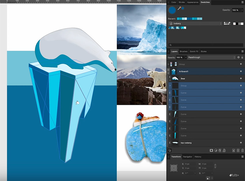

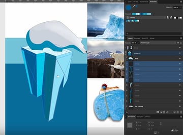
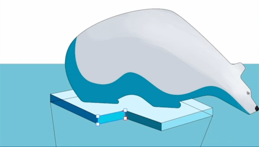
Now we need to make the iceberg look as if it's sticking out of the water instead of just sitting on top of it. To do that, we need to rearrange our layers in the Layers panel until it looks like this:


And finally, we can delete all the extraneous lines and make the remaining lines a nice light color instead of black.

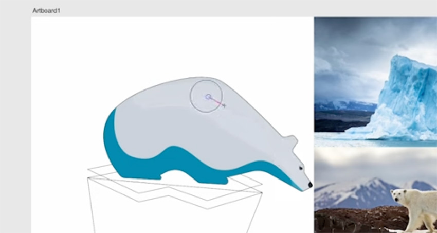
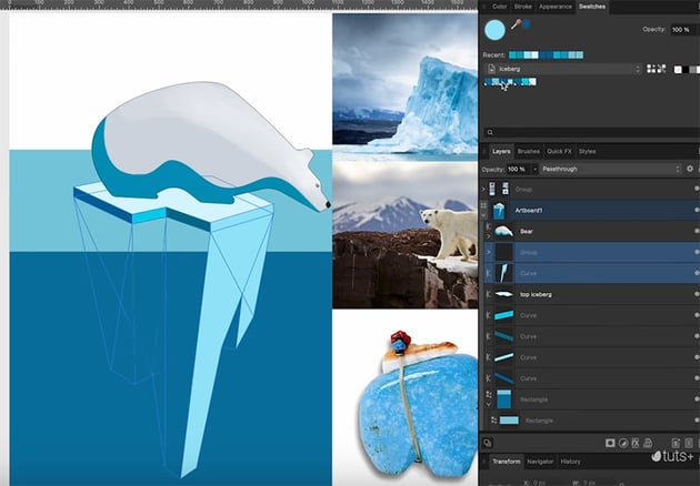
We can also hide our reference images now, since we don't need those any more.
8 Texture and Detail
Now that we have the color applied, let's go ahead and add a brush to give the shapes a bit of texture and make them feel more natural.
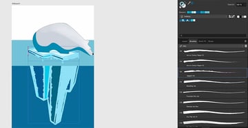
8.1 How to Use the Brush Tool in Affinity Designer
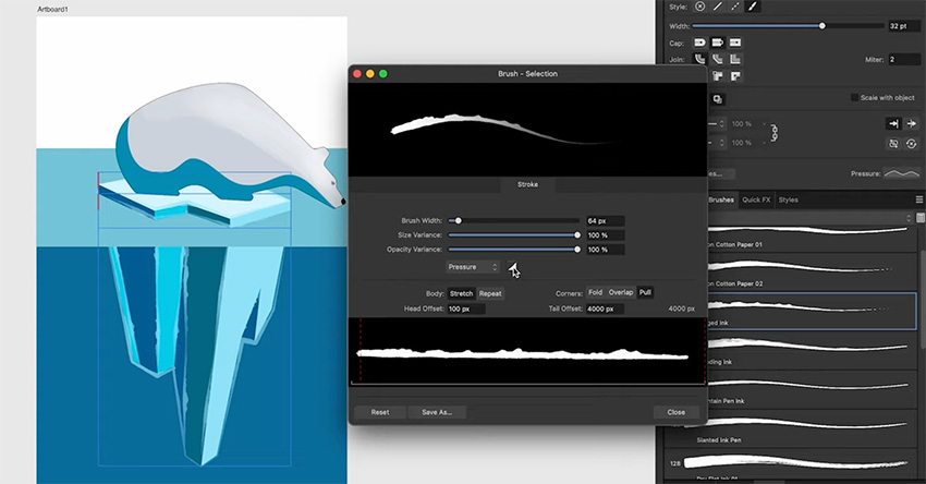
Start by selecting the outlines in the Layers panel, and then go to the Brushes panel. You have lots to choose from, but I'm going to go to the Inks section and choose the Jagged Ink brush.
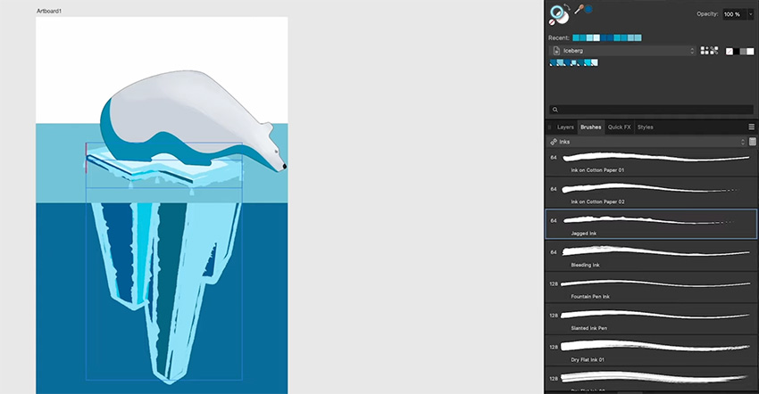

You can see that the brush has been applied to all the lines, but the effect is a little heavy. So let's go to the Stroke panel to make some adjustments.
We have lots of different settings we can change, but I'm going to focus on the Pressure settings. Even though we didn't draw these lines with a pen or tablet, we can still change the pressure curve to create the effect of varying pen pressure. Just click on Pressure to bring up the curves, and drag points on the curve to create some nice variation.

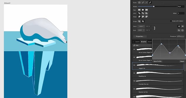
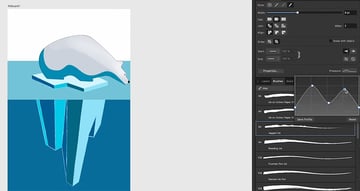
Finally, let's go back to our jagged ink brush and add some opacity to it. To do that, click on Properties and drag the Opacity Variance up to 100%.


Finally, let's change the Blend Mode to Lighter Color.
8.2 How to Use Gradients in Affinity Designer
Now that we've got the colors applied to the iceberg, let's add a bit of texture with some gradients. This will help create that surface scattering look that we've got in one of the reference images, where the light is bouncing around inside the form.
We'll start by creating gradients for the top of the iceberg. Activate the Gradient Tool and take a look at the options in the context bar. The Context is set to Fill, which is what we want, but let's change the Type to Linear. When you do that, a slider appears, allowing you to change the position of the colors. Then you can click on one of the knots on the gradient to change the color of each end.


Go through each shape in turn and apply linear gradients, making sure the colors meet at each change in direction, so that we get a nice undulating color.

Next, let's add some noise. With the shape selected and the Gradient Tool active, you can add noise in the context bar. Click on Color to open up the noise settings, and drag that slider at the bottom to add Noise.


Now that you know the process, let's do the same thing for the bottom of the iceberg: add gradients, and then add noise.


We can also add gradients and noise to the water and give a subtle background to the sky.
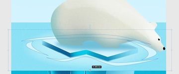
We've been kind of bringing the level of detail in the background up to match the polar bear, but now we've gone beyond the level of detail that we had in the polar bear. So let's add gradient fills and noise to make it fit in with the rest. Select the bear and add a linear gradient.

Then we'll change that to a much lighter color using the sliders, and give it a warmer color by adding a bit of yellow, as well as some noise.
"Subtle gradients and a bit of noise go a long way in making everything feel more natural and breaking up that smooth vector look."
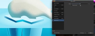
Affinity Designer has adjustment layers, which we'll get into a bit later, but it also has effects, which can be applied to layers individually. We can get to the effects in a couple of different places. We have the Quick Effects panel, but we also have an Effects button on the Layers panel.
So let's select the bear's shadow and click the Effects button, and that's going to bring up a floating menu with a lot of different options. One that I use a lot is Gaussian Blur. Go ahead and select that and increase the radius, and that's going to give us a nice soft shadow.


Now let's add a shadow on the ice under the bear. I'm going to use the Pen Tool, this time in Smart Mode so that we can create an organic shape.
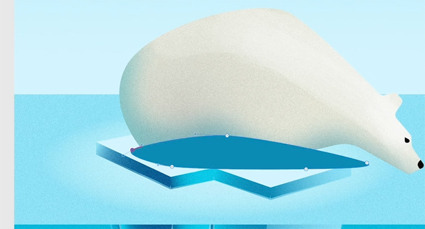


Now drag it down in the Layers panel so that it's under the bear, and add a Gaussian Blur effect with a much lighter color and less opacity.


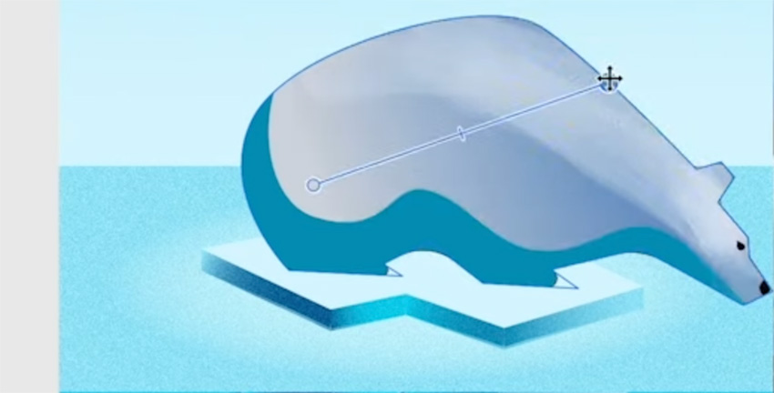
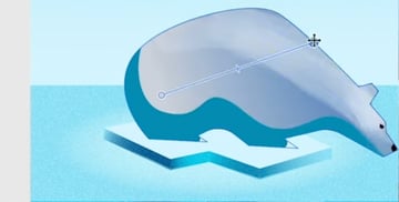
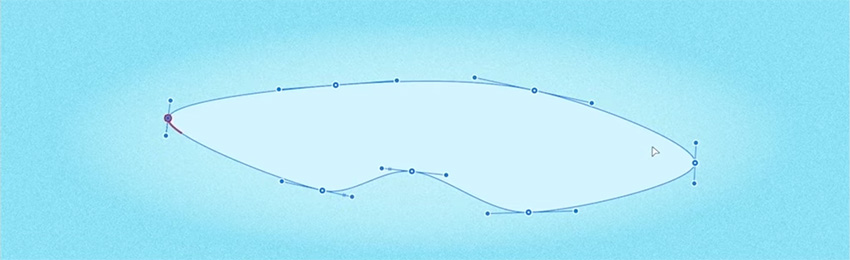
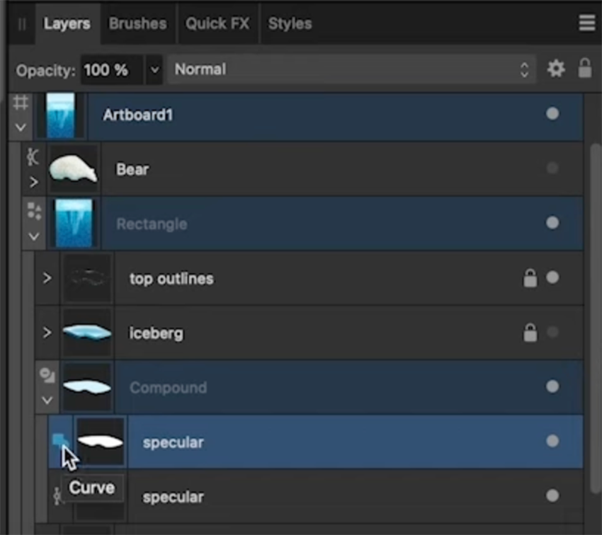
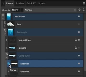
Finally, I want to create a specular highlight here and use that to show you how to work with compound shapes and the very powerful tool Contour Tool.
So let's duplicate the top of the iceberg and use that for the specular highlights. Now switch to the Node Tool and press Command-A to select all the nodes. Then convert these to Smart Nodes in the context bar. That will give us a nice organic shape that we can use in the next section to create a specular highlight effect.


8.3 How to Use Compound Shapes in Affinity Designer
Now we're going to use the shape we just created to make a compound shape in Affinity Designer. Start by hitting Command-J to duplicate it, and then make the one underneath a bit larger. Then select both shapes.
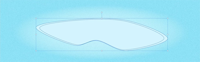

Go to Layer > Create Compound. When you do that, you'll see a little symbol appear in the Layers panel to indicate that it's a compound shape.

Now we can manipulate our compound shape to create a nice ripple effect for the water.
"This is a really fun tool to play with because we can also combine it with the Contour Tool to do some fun organic things and create liquid effects."


Click on that blue icon in the Layers panel and select Subtract from the dropdown menu.
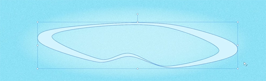

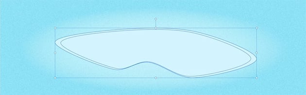
Grab the Move Tool and distort the base shape by squashing it vertically, expanding it horizontally, and rotating it slightly.


Select the compound shape, choose the Contour Tool, and reduce the contour to get a liquid effect.

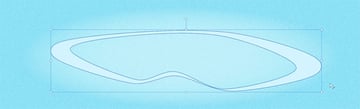
Duplicate the compound shape, and apply a similar process to create more ripple shapes.
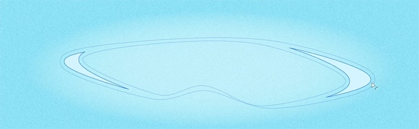
Now we can bring back the bear and the iceberg, and you can see that our illustration is coming together. Just change the Blend Mode to Lighter Color and select a slightly different color for the fill, and your ripple effect is complete.


8.4 Adding Final Details to the Bear
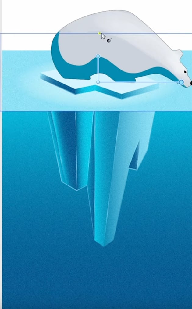
Before we export this project, I just want to scale the bear and iceberg down a bit. We can use tags in the Layers panel to make it easier to select all the right layers, and then simply use the Move Tool to scale it down and center it nicely in the illustration.


9 Export
Now that we've finished our design, let's export it using the Export Persona.
"The Export Persona does not have nearly as much going on as the main Affinity Designer persona, but it is a nice workspace for getting your work out the door and making sure that it's exported to all the different formats that you need."
9.1 How to Use the Export Persona
To export your project, start by going to the Export Persona and selecting the artboard you want to export in the Slices panel.
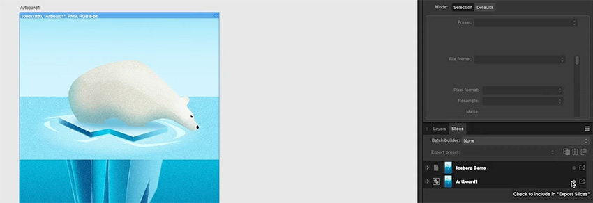


We can also click the arrow on the left to expand this and see all of our different presets.
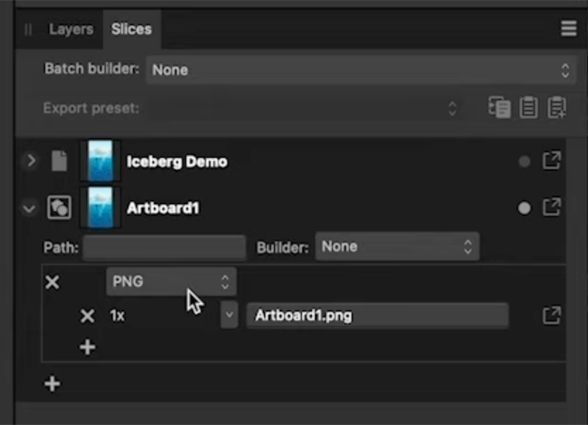


The great thing about the Export Persona is that we can add multiple different export formats here. So we can keep the default PNG format but also add an additional PNG that's twice as large, an SVG, and a WEBP file. And we can choose specific options to choose for each one.
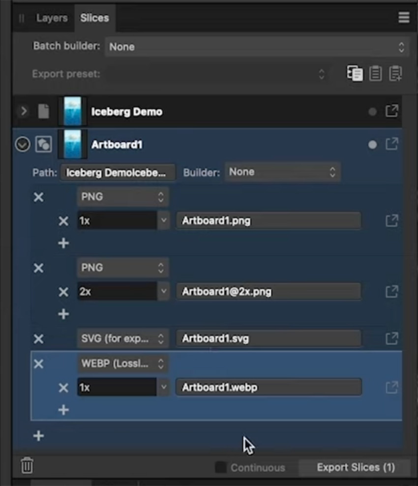


Then we can choose a path to save to and the naming conventions to use for the files.
Now click Export Slices, and choose a location. You'll see the files in your chosen formats, all packaged up inside a folder.
10 Text
Now let's move on to our second project for this course and look at text. Affinity Designer has some pretty powerful text-editing tools, and we're going to explore those in this project. We're also going to have a look at some of the raster editing capabilities that we have available in the Pixel Persona.
Let's get our Affinity Designer interface set up for this. I'm going to go to Window > Studio > Reset Studio to get the default panels back. Then I'll go to Window > Text > Character and Window > Text > Paragraph to bring up those two panels, and I'll dock them both on the left of the screen.
Create a new document (File > New) and choose Social Media Story Post again, but this time leave it in the landscape format and just click Create.
10.1 How to Use the Artistic Text Tool in Affinity Designer
When it comes to text in Affinity Designer, we've got two text tools:
- the Text Frame Tool
- the Artistic Text Tool
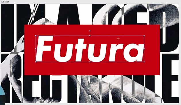
So with the Artistic Text Tool active, we're just going to click and drag on the artboard, and whatever size we get when we drag, that's going to be our font size. Now type in some text—I typed "Futura".
We can change the font either from the context bar at the top or from the Character panel. I prefer the Character panel because it gives us a lot of other controls over different aspects of our text. So go ahead and change the font to Futura PT.

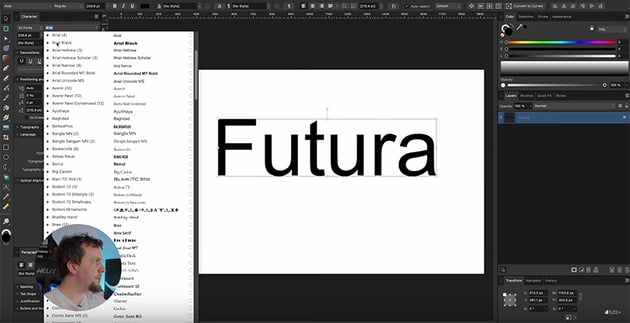

Now change the Weight to Heavy Oblique and put it roughly in the center.
Next, let's add a new text box and type "in a red rectangle." Change the Font to Tungsten. We've got all lowercase letters, but I want to change this to all uppercase, so we'll open up the Typography options in the Character panel, and this is where we can click on the All Caps button.

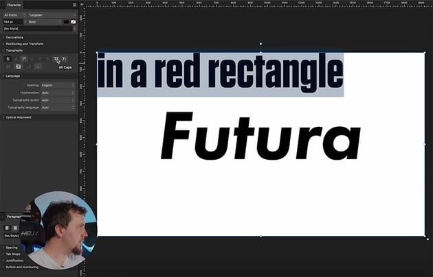
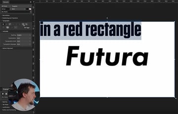
Now let's do some formatting of the text:
- Scale it up.
- Center align it.
- Decrease the Leading to bring the letters closer together.
- Break the text up into two separate text boxes.
- Change the font for the "RECTANGLE" text to Tungsten Compressed and the font for "IN A RED" to Tungsten Narrow.
- Scale both text boxes up so that the text is touching the edges of the artboard. Stretch them out to fill the space if necessary.
This is what you should have so far:


In the next section, we'll see how to add an image to this text.
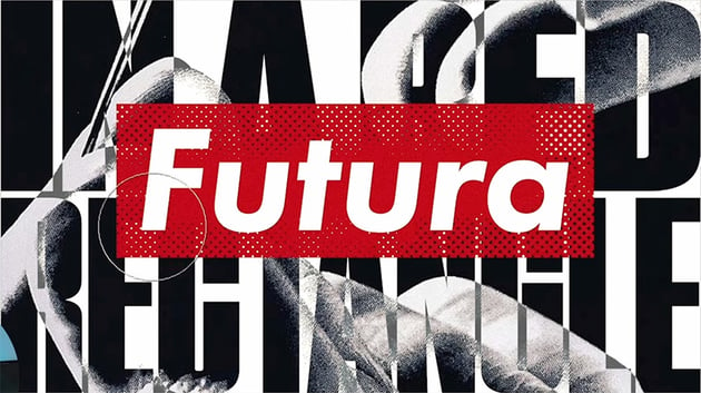
10.2 How to Add a Mask in Affinity Designer
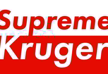
Let's see how to use masking to add an image to the text. Start by grouping both text boxes, and then add an image behind it. I'm using an image from this article:
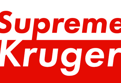


To add a mask, all we have to do is take the text layer in the Layers panel and drop it on the image's layer thumbnail.


Duplicate the image (Command-J), get rid of the mask from the duplicate, and bring it back behind the text layer. Now we can use the Divide Blend Mode to blend the image in a bit with the background.
Next, let's bring the "Futura" text back and create a rectangle to frame it. Use the color picker to make it the same red as the rectangle in the original image, and change the text color to white.


10.3 How to Use the Pixel Persona in Affinity Designer
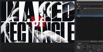
Next, we're going to switch over to the Pixel Persona and start painting some textured masks.
In the Pixel Persona, we have a completely different toolbar on the left, and all of these tools are for working with raster editing.
"The Pixel Persona in Affinity Designer doesn't have the kind of depth that a program like Affinity Photo has, but it does offer a decent selection of tools for drawing and painting and doing quick touch-ups to raster images."
Switch to the Brush Tool, and then select the rectangle and click the Mask Layer button in the Layers panel. That will add a raster mask that we can now paint on.
With that mask selected, go into the Brushes panel and select Halftone Brush 03. Now, at the top, you'll see lots of controls you can use for really detailed painting, and if you click More, you'll see a whole range of settings.
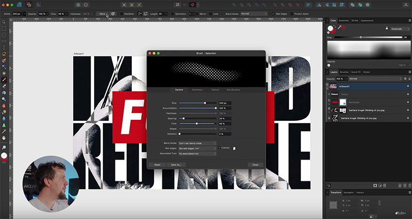


This gives us all the controls we need for how our brush works with the pressure and tilt on our tablet. I'm going to leave these at the default settings because I just want to brush a bit of a mask onto the text. Now I'll just lightly brush onto the text, and you can see how it's revealing the image behind it. The harder I press, the more halftone we get.
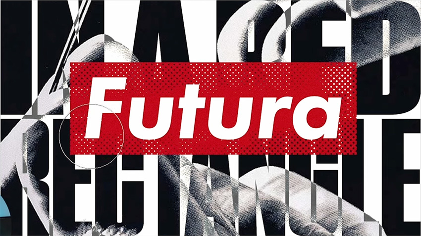

Finally, let's add a bit of texture to the text in the background as well. So add a new mask to the image, and this time, select Brush Pattern 03 in the Textures section of the Brushes panel. Make it just a little bit larger but decrease the flow so it's not too strong. Now lightly brush over the text to create a nice texture.


11 Final Tips
We've now finished our second project of working with text in Affinity Designer. Before we wrap this tutorial up, though, there are a couple of final things I want to show you.
11.1 How to Use the Resource Manager in Affinity Designer
First, I want to show you the Resource Manager (Window > Resource Manager). This is a really handy panel for getting information about all the files that you might have brought into Designer.

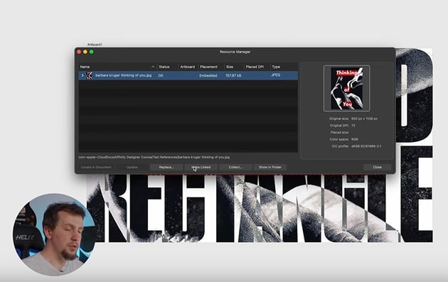
By default, it embeds any images you bring in, but you have the option to make them linked, and that can be very useful if you have lots of reference images and you don't want to deal with a huge Designer file, or if your system just doesn't have that much memory. You can also use linked images if you're doing a lot of work in Affinity Photo and you want those changes to automatically update in Affinity Designer.
You can click on each image to get more information about it. To make it linked instead of embedded, simply click Make Linked. Then you can click Show in Finder to find its location on your hard drive. If you have images scattered throughout your system in different folders, you can click Collect, and it will bring them all together and put them in one folder for you.
One more thing I want to show you is the Assets panel (Window > Assets).

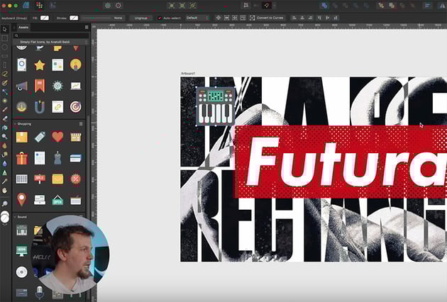
This panel gives you access to ready-made icons to use in your projects. They come as fully editable vector artwork, so you can easily change the colors, delete parts of the icon, etc. Having access to assets like this really speeds things up.
That concludes our course on Affinity Designer. I hope you found it helpful and learned a lot. If you want to learn more about Affinity Designer, try these free tutorials:

 How to Convert a Stroke to a Shape in Affinity Designer


 42 Best Affinity Designer Templates (T-Shirts, Business Cards, Brochures, and More!)


 How to Create an Affinity Designer Greeting Card Template


 How to Make a Neon Text Effect in Affinity Designer

 A to Z of Affinity Designer: Tips, Tricks, and Hacks!


 How to Remove a Background in Affinity Designer
Or watch these awesome videos:


