Advanced Photoshop techniques
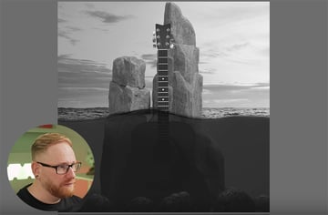
In this advanced Photoshop course, we're going to be creating some highly creative album artwork. This will involve compositing multiple images together, adjusting the lighting, submerging half of the design in water, and adding plenty of visual effects.


For this course, we're also going to be using some assets from Envato, the unlimited creative subscription. To download high-quality graphics, templates, photos, and fonts, click the link below.
Preparation
In Photoshop, let's create a new document and set the dimensions to match those of a CD, so 120mm Width and Height, and we'll use a Resolution of 300 dpi, with RGB Color Mode.
The next thing to do is plan out your design and find some assets to work with. I used some images, 3D renders, Photoshop brushes, and other assets from Envato, all of which you can download here:
When you've downloaded them, open them all in Photoshop. Then open each one in turn and select all, copy, paste into your blank document, and put each one on a separate layer. Then name your layers appropriately so that you can easily identify each item. By the end, your screen should look like this:


Composition
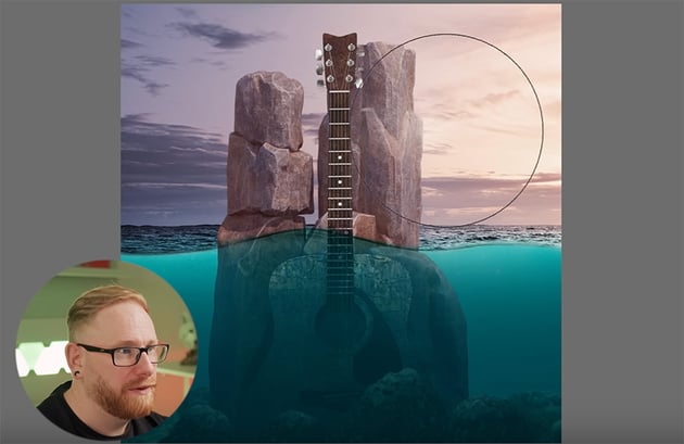
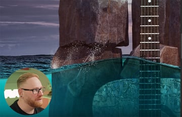
The next step is to position the assets roughly in the right places on the canvas. They're all quite large, so we need to scale them down (Command-T) and start positioning them. We want the surface of the sea to divide the design in half, so use that as the starting point.
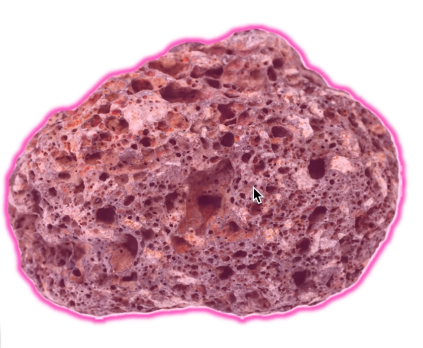
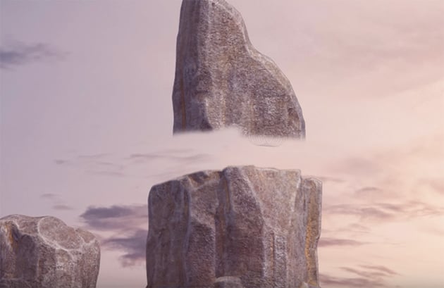
For the rocks, we're using a single rock photo with a white background, so the first thing to do is remove the background. We can do this easily by using the Object Selection Tool and adding a layer mask. Because it's a simple, clear image with a white background, this tool does a great job, without needing any manual adjustment.


Now we can build a seabed just by duplicating this rock (Command-J) and rotating the copies to make them look different. Of course, you can also download different rocks and add them for extra realism if you want.
For the sky, we need to add a layer mask and then grab the Brush Tool, make sure black is selected, and use one of Photoshop's default soft brushes to brush away all the sea above the wave.

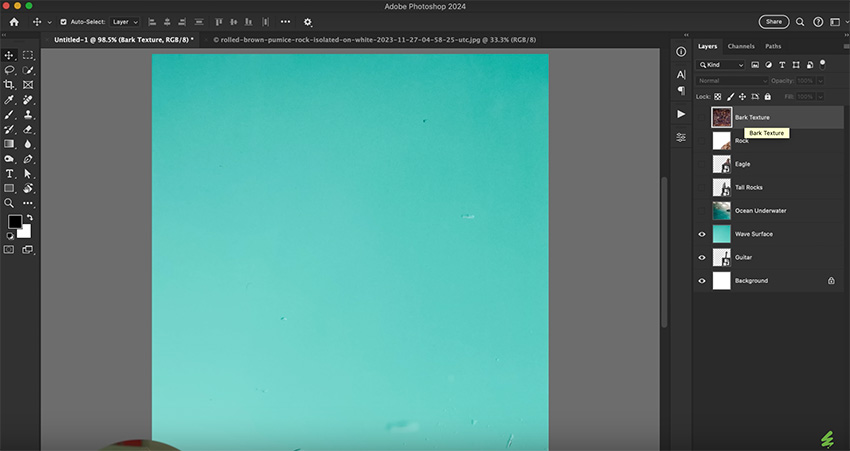
We're going to add a bark texture to the guitar too. So resize it and move it into position. I like to duplicate the image and flip it instead of using a very large image. That way, we can keep the texture a bit smaller. Now we can select the bark and the guitar and hit Command-E to merge them. Then hover between these layers and hold down Option and add it as a clipping mask.

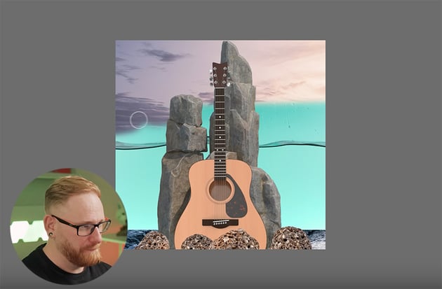
We'll come back to that guitar later and refine everything, but that's pretty much how it's going to look.
Creating an underwater effect
Now, we need to start making everything look as if it's underwater. Here are the steps to follow:


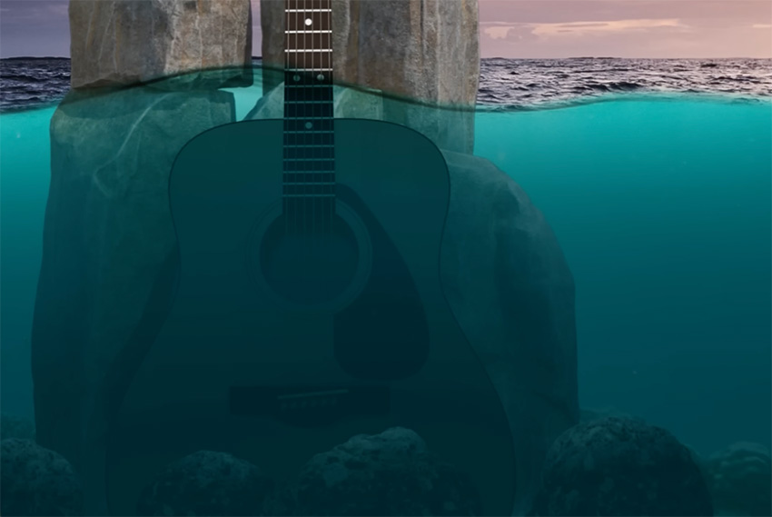
Add a solid color layer, and use a mask to brush away everything that's above the water, so that the blue only affects what's under the surface.


Adjust the background image to make the distant ocean appear above the wave, and use Multiply blending mode to blend it in.


Move the rocks layer under the color mask so that they appear underwater. Then select the guitar and add a Hue/Saturation adjustment, checking Colorize and choosing the blue ocean color. This makes the guitar match the overall sea color so that it looks underwater.
Retouching underwater elements
Now let's work on the underwater elements some more.

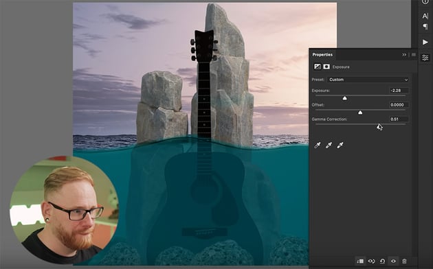

Start by adding an Exposure adjustment layer. All three sliders should be pretty much in a straight line. And then just mask that out above the water so it's not being affected.
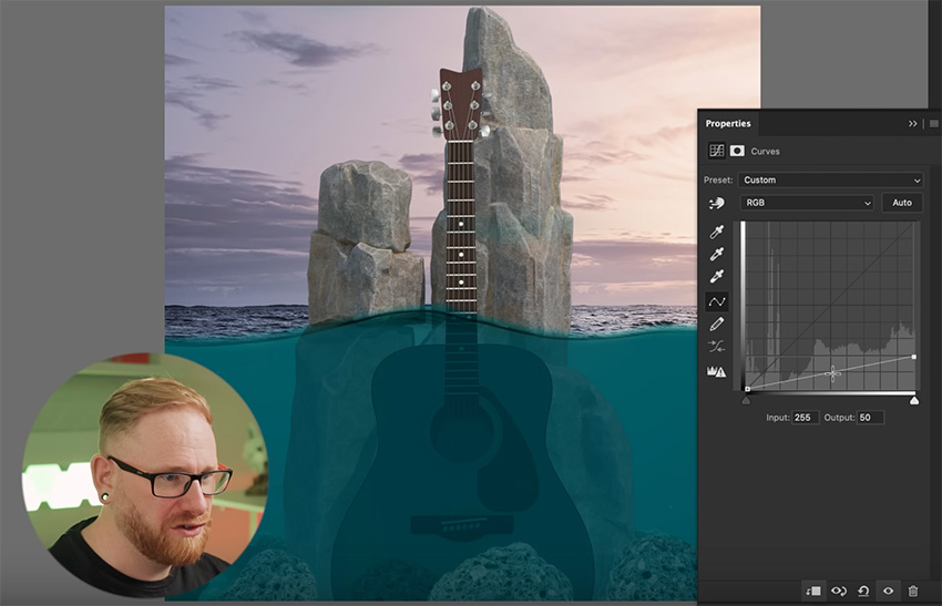
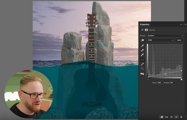
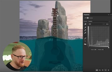
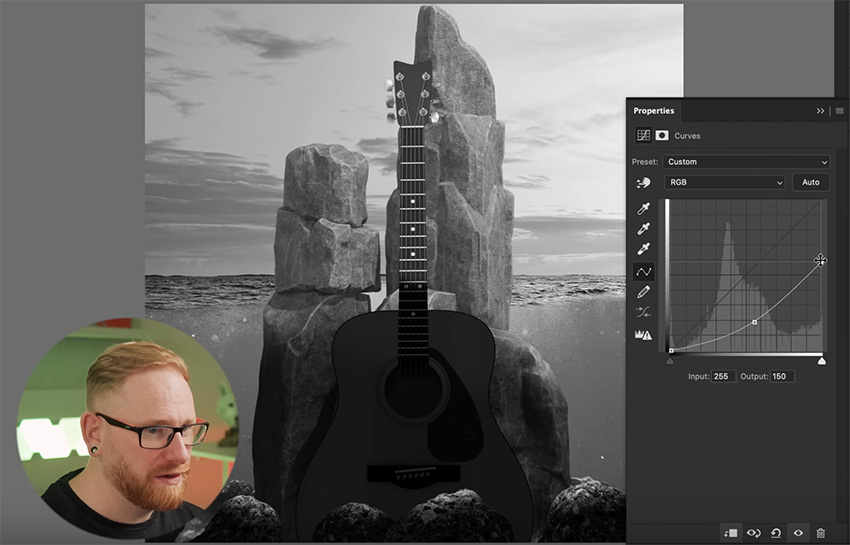
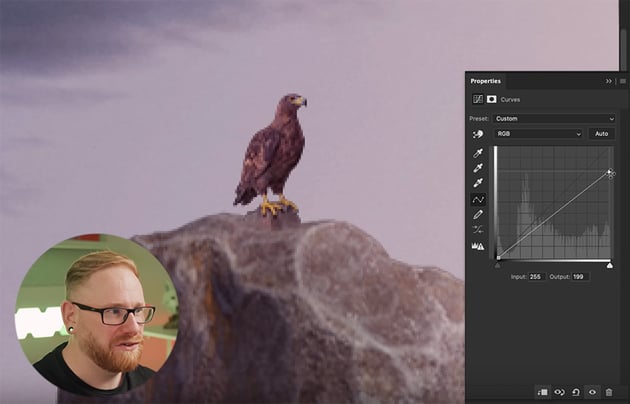
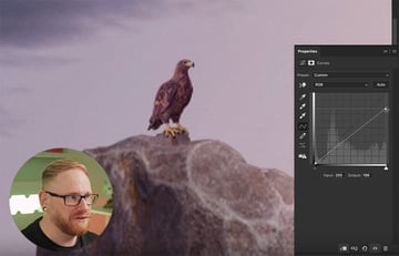
Now let's do the same for the rocks, but we can use a Curves adjustment this time. Clip it to the rock and drag the right point down. If you want a bit more contrast, just give it a slight bend. We can also brush along the top of the rock to make that part lighter. Then do the same for all the other rocks.

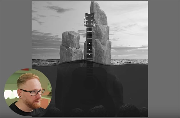
When balancing exposure, a trick that I like to use all the time so to go to the top of the layer stack and add a Hue/Saturation adjustment layer. Then bring the saturation all the way down so that the whole graphic becomes completely black and white. That helps you see where the exposure is balanced correctly and where it's not.


Now start making adjustments to the areas where the exposure looks uneven. For example, the rocks above the water look washed out, so we'll add some contrast there. And the guitar is too dark, so we can lighten that a bit.


Then hide the adjustment layer so that you can see the colors again, and make some final adjustments to refine the look. I decided to make the top part of the water a bit lighter and the bottom part murkier.
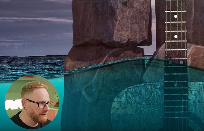
Balancing color
Now, let's start balancing the colors. First, add a Solid Color Adjustment Layer to the sky, picking a bright blue color. Change the Blending Mode to Color, clip it to the sky, invert it, and then brush along the ocean surface.

Of course, this blue is too bright, so we'll need to drop the opacity down a bit, and then in the end it just makes the water a bit more blue and blends the two halves together a bit more seamlessly.
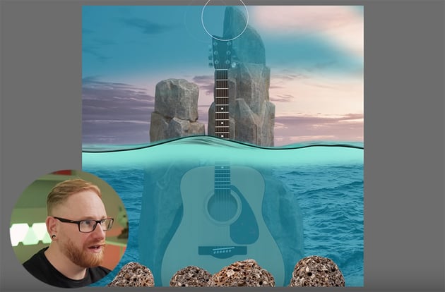
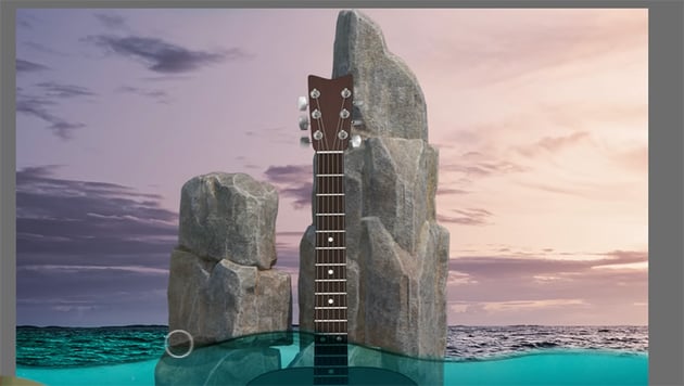
Also, let's use a Color Balance Adjustment Layer to make the tall rocks pick up some of the pink from the sky.


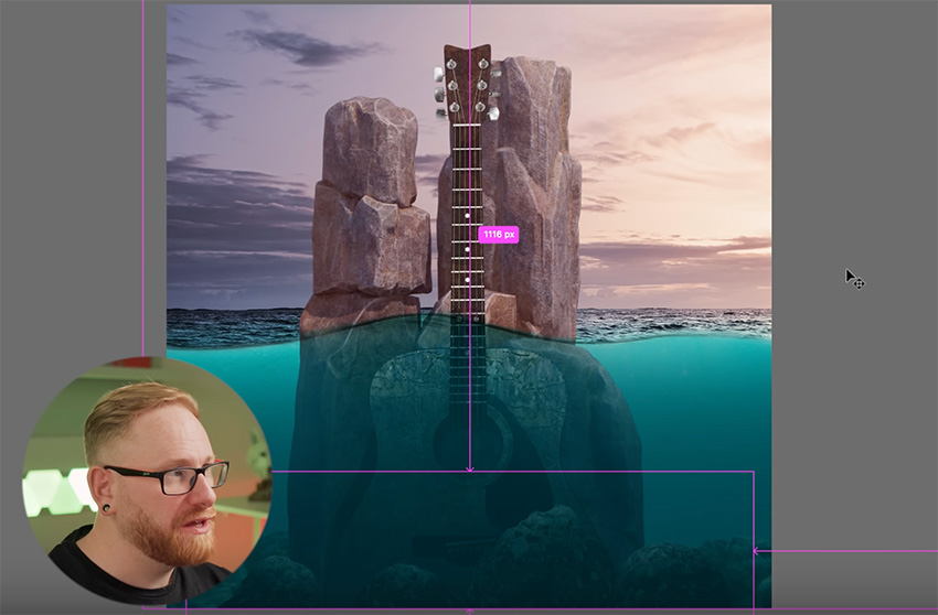
Also, I want the top of the guitar to stand out above the rocks, so let's trim the top of the rock on the right using a simple Layer Mask. Use a large brush to remove the bulk of the rock area above the line shown below, and then go back over the edge with a smaller brush to make it sharper.


Finally, let's add a Curves Adjustment Layer to the guitar and bring that curve down to make it darker. Then just brush over the right side to make it lighter because the light's coming from that side.


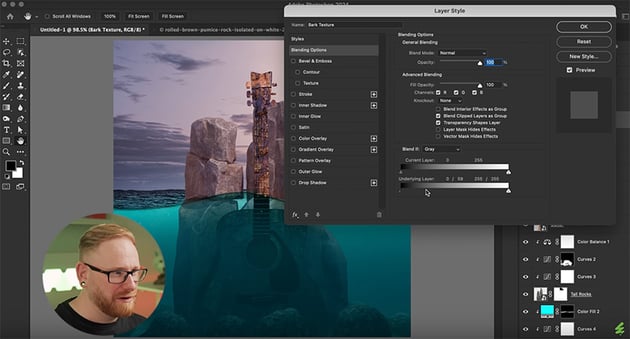
Blending texture
Next let's add that bark texture to the guitar. So make that bark layer visible, and then right-click and go to Blending Options. Grab the left slider from Underlying Layer, hold Option, and click and drag it to the right to blend that texture through onto the guitar.


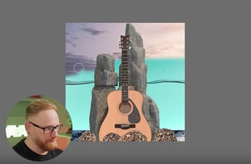
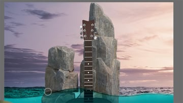
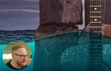
This is also a good time to spend a few minutes polishing everything up and save the document. Here's how it looks now.


Adding a sun flare highlight
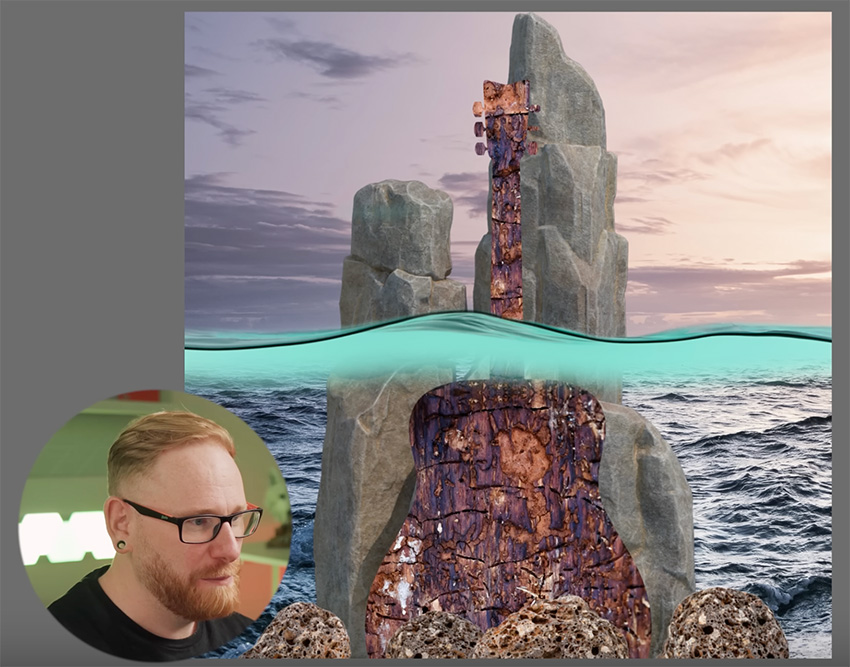
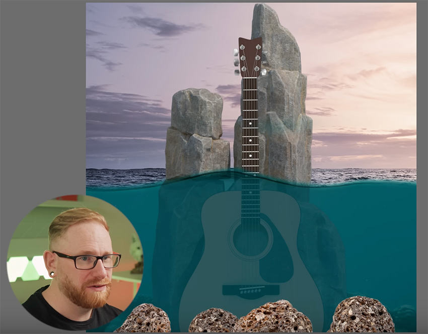
Now I'm going to add a few more visual effects, starting with a sun flare highlight on the rocks. So let's go to the top of the layer stack and add a Solid Color adjustment layer based on a bright part of the sky. Then invert it, select the brush tool, and bring the Opacity down to 10%. Make the brush nice and big, and just add a bit of lighting to one side.


We can also refine it by adding some highlights on other parts of the rocks that would catch the sunlight.
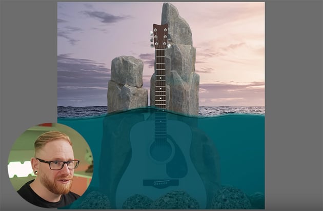
Next, let's make the underwater area a bit darker and add a Solid Color adjustment layer using blue, and then just brush away to remove it from the sky so that we're only affecting the water.


Also, the tall rocks are just blending straight through to the water, and it looks a bit two-dimensional. In reality, the rocks would go into the water, so we need to brush along the water line to create that effect.

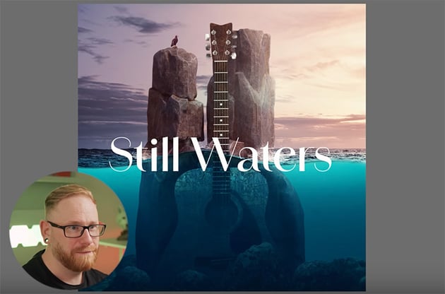
We'll also adjust some of the shadows on the rocks and make some other small changes. Here's how it should look so far.


Adding water splashes
Now let's add some water splashes using the Photoshop brushes we downloaded at the beginning. If you haven't downloaded them yet, you can find them here:
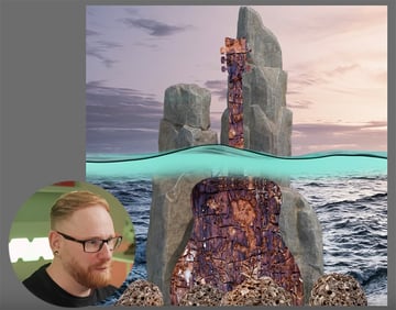
Pick a brush you like and use it to add some splashes to the bottom of the rocks, where they meet the water.
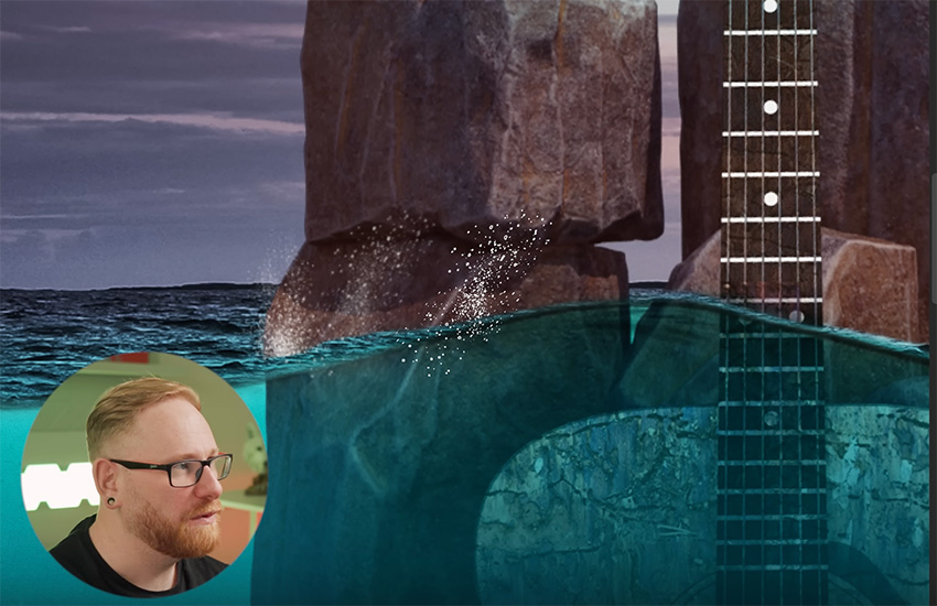

Use some of the spray brushes too, and play around with them to get the effects you want. Here's how it should look in the end.


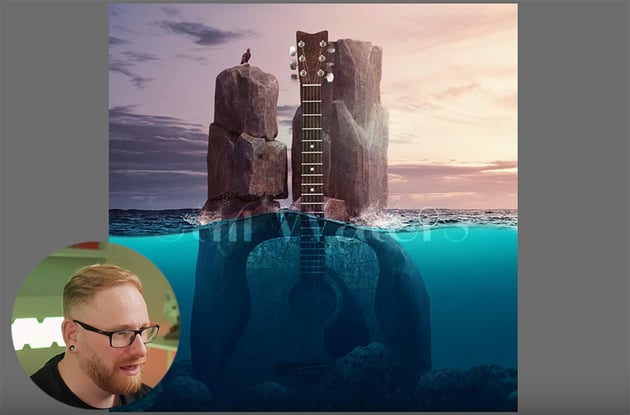
Also, let's turn on that eagle layer and position the eagle on top of the rock on the left. Then just blend him into the rock by brushing away some of the rock he's standing on, and then add a couple of adjustment layers to match the colors and lighting.

Using a LUT
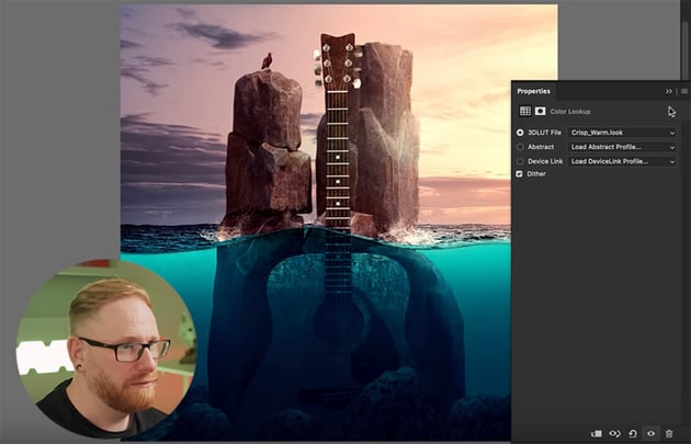
There's another type of adjustment layer that I like to use, and that's a lookup table (LUT).
"You can think of LUTS as being like color profiles. They're used quite a lot in video, and they do very specific things to the colors in your image."
To add a LUT, simply click on the adjustment icon in the Layers panel and add a Color Lookup. Then you can click through the options and see how they affect your composition. I chose to use Crisp_Warm.look.


Adding & Blending Text
Of course, our album cover needs some text too. Let's see how to add text and blend it so that it looks as if part of it is underwater.

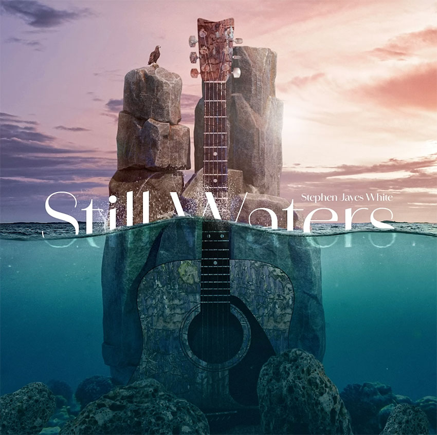
First, add the album name "Still Waters" using the Amandine Medium font. Position the text half above the water and half under the water.


Create two duplicates of the text layer, and then right-click on one and Convert to Smart Object. Add a Ripple filter, change the Blending Mode to Soft Light, and add a small amount of Motion Blur. Then use a brush to mask away everything above the water.
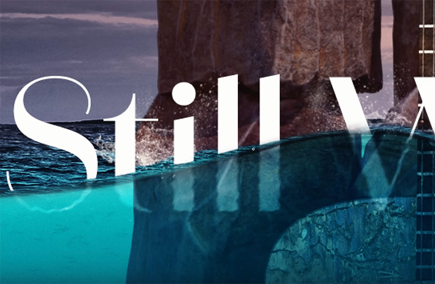


On the other layer, mask away the bottom half of the text that's under the water. So we've now separated the text into two halves. Then use a small brush to remove some of the top parts so that the letters appear to finish in the water.
Finish by adding the artist's name just above the album name in smaller text.
Enhancing with Camera Raw
Last but not least, we'll add a Camera Raw filter to enhance our album cover. Copy everything into a new layer and convert it to a smart object. Then go to Filter > Camera Raw Filter.
There are loads of settings you can use to refine your composition. In this case, we could increase the contrast and bump up the highlights, and then the effects that I love using the most are Texture and Clarity.
"Just by dragging up the texture and the clarity together, you really can make your designs stand out."
I also like to add a bit of grain and a subtle vignette.


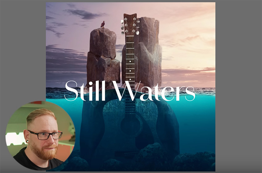
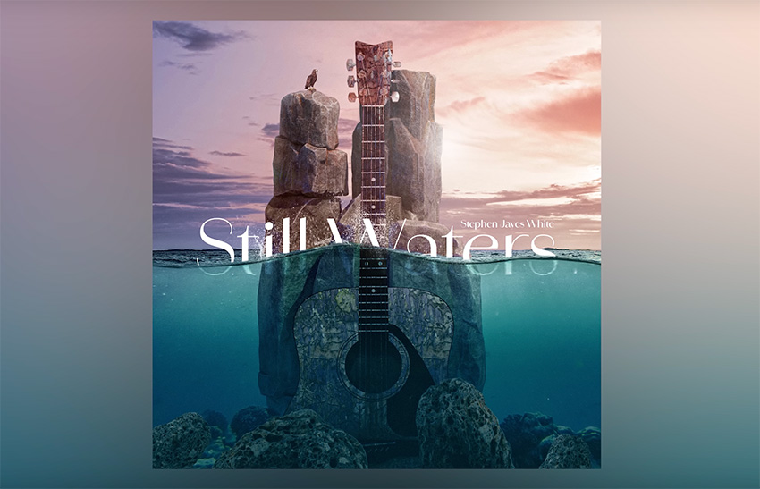
We're now done with our design! Using all of the tools and techniques we've covered, if you spend a bit longer on it, you can end up with something that looks like this.


Creating a mockup
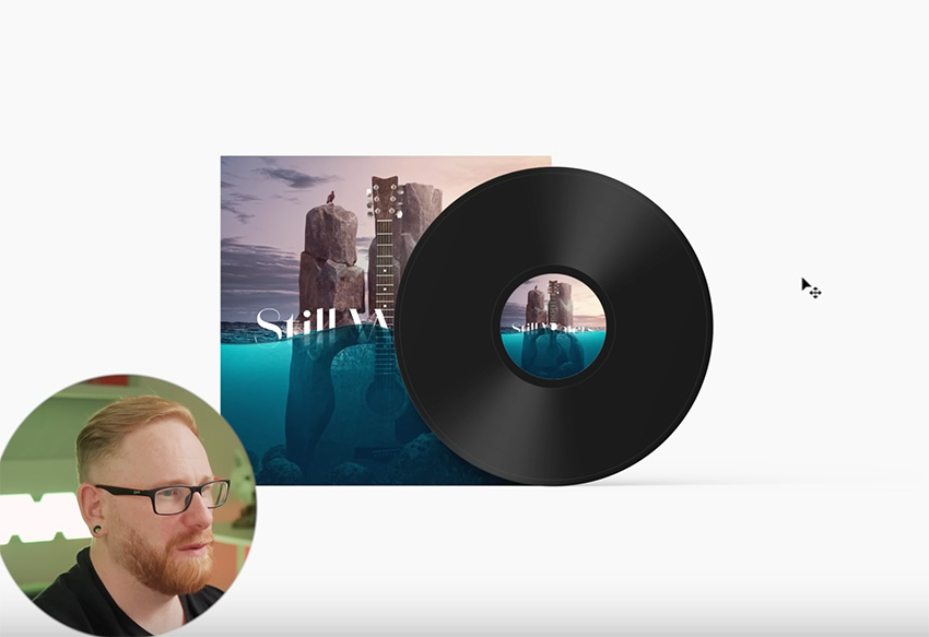
Once you've finished your design, why not create a mockup to show off how it would look on a real album cover? You can find loads of great CD mockups and even vinyl mockups on Envato. I decided to use this cool vinyl mockup.
All you have to do is copy and paste your design into the smart objects provided in the template, and you get this amazing result.


That's it for this course! Hopefully you learned a bunch of new tricks and tips for photo manipulation in Photoshop.
If you want to learn more about photo manipulation in Photoshop, read these tutorials:

 How to Create a Living Galaxy Photo Effect in Adobe Photoshop


 How to Create a Photo Caricature in Adobe Photoshop


 How to Make a Matrix Effect in Photoshop

 How to Create a Surreal Water Photo Manipulation in Adobe Photoshop


 How to Create a Glowing Fireflies Photo Manipulation in Adobe Photoshop


 How to Create Tim Burton Inspired Art in Photoshop
Or watch these videos: