


At this point you’ve probably figured out that we here at Envato Tuts+ have a deep and ever-growing love for the dark mysteries that lie beyond the incredible vastness of space, which is why this tutorial will follow the same trend.
So if you’re like us, buckle in since in the following moments you’re going to see how easy it is to create a Space Observatory Badge using Illustrator’s most basic shapes and a couple of visual treatments.
Also, you can always expand your universe by heading over to Envato Market, where you’ll find tons of inspiring space artwork just waiting to be clicked on.
That being said, let’s get back to our regular broadcast and start
working on our little project.
1. Set Up a New Document
As usual, start off by creating a fresh document by going over to File > New or by using the Control-N keyboard shortcut, and adjust it using the same settings as below:
- Number of Artboards: 1
- Width: 800 px
- Height: 600 px
- Units: Pixels
And from the Advanced tab:
- Color Mode: RGB
- Raster Effects: Screen (72 ppi)
- Align New Objects to Pixel Grid: checked


Quick tip: most of the indicated settings can be triggered by setting the document’s Profile to Web; the only one that won’t be automatically set is the Size, which you will have to manually select.
2. Set Up a Custom Grid
As you might already know, Illustrator allows us to take advantage of its powerful Grid, which we will adjust by setting it to the lowest possible values, so that we can adhere to a “pixel-perfect workflow”. By doing so, we will take full control over our shapes, ensuring that our illustration ends up looking as crisp as possible.
The settings that we’re interested in can be found under the Edit > Preferences > Guides & Grid submenu, and should be adjusted as follows:
- Gridline every: 1 px
- Subdivisions: 1


Quick tip: you can learn more about custom grids by reading this in-depth piece on how Illustrator’s Grid System works.
Once we’ve set up our custom grid, all we need to do in order to make sure our shapes look crisp is enable the Snap to Grid option found under the View menu, which will transform into Snap to Pixel each time you enter Pixel Preview mode.
Now, since we’re aiming to create our illustration using a “pixel-perfect” workflow, I highly recommend you go through my how to create pixel-perfect artwork tutorial, which will help you widen your technical skills and get you up to speed in no time.
3. Create the Badge’s Main Shapes
Compared to some of the other projects, we will be using a single-layer-approach this time, since we want all our shapes to be grouped together instead of being separated on different layers.
Step 1
Using the Rounded Rectangle Tool, create a 148 x 188 px shape with a 14 px Corner Radius which we will color
using #32323a, and then position it in the center of our Artboard with the help of Illustrator’s Align panel.


Quick tip: when making alignments to the Artboard, always make sure that the Align To option is set to Align to Artboard; otherwise, your selected objects will maintain the same positions.
Step 2
Select the shape that we’ve just created, and using the Transform Panel adjust the roundness of its two bottom corners, by individually increasing their values to a hefty 74 px.


Quick tip: if you find that you can’t individually adjust the corners, you probably have the Link Corner Radius Values enabled which is preventing you from doing so. This can be easily fixed by clicking on the little chain icon, which should now allow you to adjust each corner without worrying that the same value gets applied to all the other ones.
Step 3
Once we’ve finished adjusting the bottom corners of our main shape, we’ll need to give it an outline, which we will do using the Offset Path method.
First, select the shape, and then go to Object > Path > Offset Path and enter 8 px into the first value field, leaving all the other ones as they are, and then click on OK.


Quick tip: if you’ve never used offsets before, but want to learn more about them, I recommend you go through this tutorial on the two main methods for creating line icons, which will show you all there is to know.
Step 4
Since we want the outline to stand out from our fill shape, we will have
to change its color to something darker (#1f1e23).


At this point, we have our badge’s main shape, but instead of continuing working on its inner background, we will focus on the observatory itself, and come back once it's finished in order to add in all the little details.
If you’re wondering why, well the reason is because we need to create and position all the other elements in relation to the observatory.
Yes, I know we could have started with the observatory in the first place, but I wanted to show you that the creative process isn’t always as easy and straightforward as you might expect, compared to that of recreating something using a tutorial.
4. Create the Space Observatory
The first piece of the badge that we’re going to start working on is the space observatory, which will be a pretty straightforward process as you will see in the following moments.
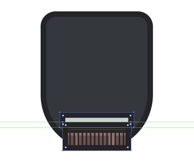
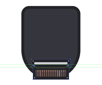
Step 1
Select the Rectangle Tool (M) and
create an 84 x 26 px shape, which we
will color using #68514c and then center on the Artboard, aligning it to the bottom side of the badge’s main fill
shape.


Step 2
Select the shape that we’ve just created and give it a nice thick 8 px outline (#1f1e23) using the Offset Path method (select > Object > Path > Offset
Path > 8 px).


Quick tip: as you can see, we’ve intentionally aligned the brown segment to the fill section of the badge so that their outlines can overlap, which allows us to use a precise workflow, where our shapes are carefully created and positioned.


Step 3
With the outline in place, start adding details to the observatory’s
base, by creating an 84 x 4 px rectangle
which we will color using #1f1e23 and then align to its top side, making sure
to lower its Opacity to 40% to make it act as a shadow.


Step 4
Next, add an 84 x 4 px horizontal
divider which we will color using #1f1e23 and then position under the shadow
that we added in the previous step.


Step 5
Add another thinner 84 x 2 px divider
(#1f1e23) and position it over the shadow itself, making sure to center align
the new shape to it.


Step 6
Create another 84 x 4 px white
(#FFFFFF) rectangle which we will position underneath the thicker horizontal
divider, making sure to adjust it by setting its Blending Mode to Overlay and
lowering its Opacity level to 40%.


Step 7
Next, create a set of fourteen 2
x 18 px rectangles (#1f1e23) positioned 4 px from one another, group them (Control-G) and then position them over the lower section of the observatory’s
base.


Quick tip: you can take full control over your shapes and their relative positions by switching over to Pixel Preview mode (Alt-Control-Y or View > Pixel Preview) which will allow you to pinpoint and move each shape using the underlying pixel grid as a reference system.
Step 8
Using the Rectangle Tool (M) add
a couple of vertical highlights to the observatory’s base, making sure to set their
color to white (#FFFFFF), their Blending
Mode to Overlay, and their Opacity to 40%.

Once you’re done, select all the shapes making up the observatory’s base, and group them together using the Control-G keyboard shortcut, so that you can easily select and move them if you ever need to.
Step 9
Grab the Rectangle Tool (M) and
create a 92 x 6 px shape, which we will
color using #ced0d8 and then give a nice 8
px thick outline (#1f1e23). Position the two towards the upper section of
the observatory’s base, making sure that the two outlines overlap.

Step 10
Add a 92 x 2 px rectangle
(#FFFFFF) towards the top section of the grey shape that we’ve just created,
making sure to set its Blending Mode to
Overlay and lower its Opacity to 60%. Then add two vertical highlights underneath it using the same
transparency values, right aligning them to the thinner highlight that we added
to the brown segment.


Step 11
Next, add a 92 x 2 px horizontal
divider line (#1f1e23) on top of the grey shape, positioning it towards its
center.


Step 12
Finish off this section of the observatory, by adding a stack of six 112 x 2 px rounded rectangles (#1f1e23)
with a 1 px Corner Radius positioned 2 px from one another, which we
will group (Control-G) and position
over the grey shape.


Once you’re done, select and group the elements of the current observatory segment together using the Control-G keyboard shortcut.
Step 13
Create an 84 x 4 px rectangle,
which we will color using #706f7a, give an 8 px thick outline (#1f1e23), and then position them both towards
the upper section of the grey shape, making sure that their outlines overlap.


Step 14
Using the Rectangle Tool (M) create
an 84 x 2 px shape (#1f1e23), which
we will center align to the top side of the darker fill shape, and then turn it
into a shadow by lowering its Opacity to
40%.


Step 15
Give this section some dimension by adding a 16 x 2 px rectangle (#1f1e23) to its center, positioning it right
underneath the shadow that we’ve just created.


As always, don’t forget to select and group the sections elements together using the Control-G keyboard shortcut.
Step 16
Grab the Ellipse
Tool (L) and create a 92 x 92 px circle
(#ced0d8) which we will adjust by selecting and removing its bottom anchor point using the Direct Selection Tool (A) and then give the same 8 px thick outline (#1f1e23),
positioning the two shapes towards the upper section of the observatory.


Step 17
Create a copy of the dome’s fill shape, (Control-C >
Control-F) (1) and then add an 84 x
84 px circle (highlighted with red) which we will use to create a cutout
with the help of Pathfinder’s Minus Front shape mode (2). Change the
color of the resulting shape to white (#FFFFFF), and then turn it into a
highlight by setting its Blending Mode to
Overlay and lowering its Opacity to 60% (3).


Step 18
Grab the Rectangle Tool (M) and create a 108 x 2 px horizontal divider line (#1f1e23)
which we will position towards the lower section of the dome, leaving an empty
space gap of 2 px between it and the
larger outline.
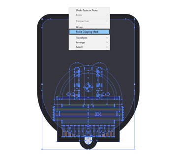
Since the side sections of our divider line go all the way outside our dome’s outline surface, we will have to create a copy of the blue-ish fill shape (Control-C > Control-F) and use that as a Clipping Mask (right click > Make Clipping Mask).


Quick tip: if you've never used Clipping Masks before, you should really check out this article that talks about the advantages of using the Clipping Mask over Pathfinder's Shape Modes.
Step 19
Add a 12 x 54 px rectangle (#1f1e23)
to the center of the dome, which will act as the inner darker section where the
lenses and mechanism are. Make sure to align the shape to the bottom side of
the underlying object, cutting and pasting it (Control-X > Control-F) inside the Clipping Mask that we’ve created for the horizontal divider.


Step 20
Next, start working on the arch girders, by creating an 8 x 50 px rounded rectangle (#706f7a)
with a 2 px Corner Radius, which we
will adjust by removing the roundness from its bottom corners, and then give it
an 8 px outline (#1f1e23) using the Offset Path method, positioning the two
shapes towards the left side of the shape that we created in the previous
step.


Step 21
Add a couple of highlights (color:
white; Blending Mode: Overlay; Opacity: 20%) and shadows (color: #1f1e23; Opacity: 40%) to the girder using basic rectangles, making sure
that they don’t overlap.


Step 22
Finish off the arch girder, by adding a 12 x 4 rounded rectangle (#1f1e23) with a 2 px Corner Radius to its left side, overlapping it with its
outline, and then position it just above the horizontal divider at a distance of
2 px from it.


Once you’re done, select and group all of the girders elements together using the Control-G keyboard shortcut.
Step 23
Select the girder that we’ve just created, and create a copy of it (Control-C > Control-F) which we will position towards the right side of the dome, making sure to reflect it vertically (right click > Transform > Reflect > Vertical).


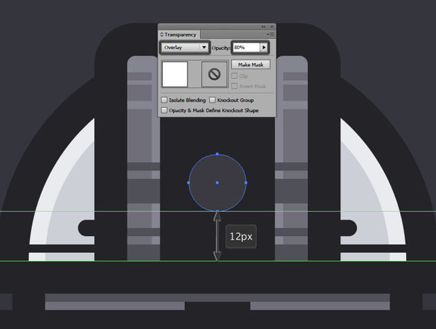
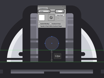
Step 24
Using the Ellipse Tool (L) create a 14 x 14 px circle, which we will color
using white (#FFFFFF), and position towards the center of the dome at about 12 px from its bottom side.
Turn the shape into a lens by setting its Blending Mode to Overlay and lowering its Opacity to 80%.

Step 25
Add some details to the lens, by adding a ring-like highlight (color: white; Blending Mode: Overlay; Opacity: 20%), a top-half reflection (color: white; Blending Mode: Overlay; Opacity: 60%), and two 2 x 2 px circles as a set of smaller reflections (color: white; Blending Mode: Overlay; Opacity: 60%, 20%).


As always, don’t forget to select and group all of the shapes together using the Control-G keyboard shortcut.
Step 26
Finish off the
dome, by adding two 4 x 54 px rectangles
(#1f1e23) one to each girder, making sure to lower their Opacity to 20% since
they will act as shadows.
Once you’re done, select all of the dome’s elements and group them together (Control-G).


Step 27
Using the Rounded Rectangle Tool create
a 12 x 22 px shape (#ced0d8) with a 6 px Corner Radius, give it a 2 px thick ring highlight (color: white; Blending Mode: Overlay; Opacity:
60%) and an 8 px outline (#1f1e23),
and then group (Control-G) and
position the shapes towards the lower section of the observatory, leaving a 2 px gap between them and the
horizontal divider.


At this point, we can select all of the observatory’s different sections, and group them together using the Control-G keyboard shortcut.
Step 28
Now that we have finished working on the observatory itself, we need to mask its lower section so that it can follow the curvature of the underlying badge.
To do this, first select the badge’s fill shape, and create and paste a copy (Control-C > Control-F) of it on top of everything else. Then, simply select both the duplicate and the observatory, right click > Make Clipping Mask.

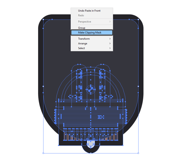
As you can see, our observatory is now perfectly masked, which means that we can start working on the background and bring our little badge to life.


5. Create the Mountain Landscape
The first element from our background is the mountain landscape that will give our illustration a lot of depth, which at this point is exactly what it needs.
Step 1
Grab the Pen Tool (P) and, using the observatory as your main reference point, draw two mountain tops
using #9b9ea8 as your fill color. Since this step of the process allows for a
lot more freedom, take your time and get creative so that in the end you’ll
come up with something unique.


Step 2
Once you’re done, give the shape an 8
px outline (#1f1e23), and then group the two shapes (Control-G), and then cut and paste them (Control-X > Control-F) inside the observatory’s Clipping Mask, making sure to send them
to the back (right click > Arrange
> Send to Back).


Quick tip: you can easily enter a Clipping Mask by double clicking on the objects that are a part of it, or by right clicking and selecting Isolate Selected Clipping Mask.
Step 3
Isolate the mountain landscape, and using the Pen Tool (P) start adding some rough lines to each side of the
observatory, using #1f1e23 for the dark sections, and #9b9ea8 for the lighter
overlapping ones.


Step 4
Once you’re done, finish off this section of the illustration by adding a couple of highlights (color: white; Blending Mode: Overlay; Opacity: 40) here and there, making sure to position them underneath the lines and segments that you created a moment ago.


Quick tip: you can easily exit Isolation Mode once you’re done working on a specific section of your illustration by pressing the Escape key or by right clicking and selecting Exit Isolation Mode.
6. Create the Background
Once we have our observatory and mountain landscape, we can now focus on the little background, and start adding in little details to make the badge pop.
Step 1
Add an all-around inner highlight to the badge, by first selecting the fill shape and creating a copy of it (Control-C > Control-F).
Then apply an offset of -4 px to it, which we will use to create a cutout with the help of Pathfinder’s Minus Front option.
Once we have our desired shape, all we need to do is adjust its transparency
by changing its color to white (#FFFFFF) and setting its Blending Mode to Overlay
while lowering its Opacity to 80%, making sure to group and send it
to the back along with the badge.
Step 2
Using five concentric rectangles with different width values, create the
light beams by adjusting their anchor points and adding new ones until you get
them looking diagonal. Then, set their color to white (#FFFFFF) and adjust
their transparency by setting their Blending
Mode to Soft Light, and their Opacity to just 10%.
Step 3
Once we’ve added the light beams, we can now create the overlapping shadows created by the observatory and the mountains.
To do this, first we have to select the main shapes composing these elements, and then apply an 8 px Offset Path to them which we will then cut (Control-X) and paste (Control-F) inside our badge group.


Step 4
Since this isn’t exactly the look that we were going for, we will have to first mask the shapes using the inner section of the ring-like highlight.
To do this, simply create a copy of the highlight, paste it in front of our shadow, and then right click > Release Compound Path, and select and use the center shape as a Clipping Mask for our shadow, while deleting the remaining one.


Step 5
All we need to do now is create a Compound Shape by selecting our shadow and going over to Pathfinder’s submenu, where we need to click on Make Compound Shape, which will allow us to lower the Opacity of the shapes that make up our shadow to 40%, without having any overlapping areas break the uniformity of our transparency.


Step 6
The last thing that we need to do is add the little stars, so take your
time and create a nice interesting pattern using #b2a45f as your main fill
color, and once you’re done, exit the badge group, and select all of the
illustration’s elements and group them together using the Control-G keyboard shortcut.


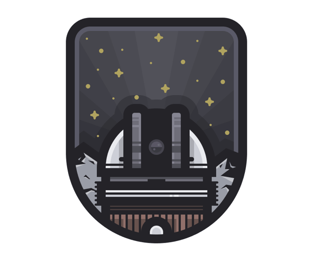
It’s a Wrap
It might have taken us some time, but with a little patience, we’ve finally managed to create this awesome looking badge that we can use in any future projects.
I hope that you’ve managed to understand and follow each step, and most importantly learned something new during the process.
 By
By


