
Learn to create a strong, yet sleek shield design complete with battle scars, blood, and swords. We'll use various shapes and effects to create a strong illustration and provide a wallpaper as well. Learn how to apply cutting slashes and glowing highlights to this triumphant composition.
Final Image Preview
The final design we'll be creating is below. Successful completion of this tutorial requires an advanced knowledge of Adobe Illustrators tools.


Step 1
This artwork contains several different layers, each with a unique element or set of elements on it. We'll not be highlighting when we make a new layer. Use your discretion when deciding to create new layers.
Start by drawing a rectangle using the Rectangle Tool (M). Give the rectangle a complex gradient to simulate a rounded bar. Make a copy of this shape and keep it off to the side. You can use the shape to make other curves this way.


Step 2
In order to give the impression of the metal bar being bent we first need to expand the object. Go to Object > Expand, then click OK.


Step 3
Bend the bar by going to Object > Envelope Distort > Make with Warp. We've selected the Arc style, but you can give your object any effect you like. It's good practice to have an idea of the overall shape that you want your shield to be before you start giving arbitrary bends to your bar.


Step 4
Use the bar shape that you placed off to the side to create another curved bar in a different shape. When you overlap the ends of the bars you'll notice that it does not look very realistic as is.

Step 5
Now we'll remedy the blunt overlap of the bars. Use the Pen Tool (P) and draw around the bar as shown below. Select both the shape you just drew as well as the bar that you want to eliminate the blunt edge from, then go to Object > Clipping Mask > Make to instantly mask out the square tip, as shown below.


Step 6
Use variations of shorter bars and unique bends until you've made a creative design.


Step 7
To acquire perfect symmetry in your shield simply make half the shield and use the Reflect Tool (O) to create the other half.


Step 8
Draw the face of the shield by tracing the shape of the bars.


Step 9
To achieve a realistic metal surface give your shield a combination of a gradient, Inner Glow, and Drop Shadow. Enter the variables shown below to achieve this effect. Note that your artwork size determines how the effects like Inner Glow and Drop Shadow are applied. For artwork that is large you'll need to enter values much higher than what is shown below. If your document and artwork fall around the size of 8.5 in by 11, then your values should be similar to what I've shown below.


Step 10
Pick a blackletter style font for the letter. We've chosen one called Cloister. Give the impression that the letter is somewhat inset on the shield by entering the values shown below. Notice how the edge of the V looks slightly lighter. This is achieved with a white Outer Glow and helps give the V an inset look.


Step 11
Making the background shape is simple. Draw a rounded corner rectangle using the Rounded Corner Rectangle shape.

Step 12
Create intricate details by going to Effect > Distort & Transform > Pucker & Bloat.


Step 13
Create the burst pattern in the background by first drawing a circle and giving it a substantial stroke weight.

Step 14
Select Dashed Line and enter a value in the first Dash box. Depending upon how big your circle is your values may be different than what's shown below. Typically, smaller values produce a more intricate design.
Note: Give your circle a larger weight (notice now that my stroke weight is 70) if your lines are not meeting at the center.

Step 15
Give your background a dramatic gradient and slight drop shadow. Place the burst shape over the background, give it a white fill and lower its opacity. The values below apply to the background shape and not the burst shape.


Step 16
Create slashes that will go on top of the background by using simple shapes. Draw an angled line to start.

Step 17
Draw a few triangle shapes and give them fairly dark gradients.

Step 18
In order to give the illusion that the slash is protruding from the background we'll give the slash more depth. Draw another slash shape.


Step 19
Give the shape a Gaussian Blur by selecting Effect > Blur > Gaussian Blur.


Step 20
Move the shape closer to the slash so that it looks like it's a shadow. Repeat this shadow technique to create a highlight (which is of course only visible when the slash is over a darker surface.)


Step 21
Duplicate the slash, then vary its size and rotation to make more slashes.


Step 22
We'll make a believable sword by first starting with a modified triangle shape.

Step 23
Apply a gradient that has an abrupt color shift in the center to signify that the sword has light hitting one side. Give the sword a Drop Shadow too.

Step 24
Duplicate the sword a few times and strategically place it around the shield creating a sense of hostility. Use the placement of each sword to your advantage in terms of composition. Where you place each sword plays into the overall feel of the artwork. All the swords on one side or swords that are in perfect symmetry, for example, look staged and unnatural. Ensure that the swords meet perfectly at the edge of the background by first grouping all the swords and then applying a mask that is the same shape as the background.


Step 25
Create blood by using Illustrators built-in ink options. Go to Window > Brush Libraries > Artistic > Artistic_Ink to see your options. Using the Pen Tool to draw a line with a red stroke, then select an ink option from the list.


Step 26
In order to manipulate the ink you'll need to expand it by going to Object > Expand Appearance. Using the Direct Selection Tool (A), select the single line that is left over after you expand your ink shape, then delete the line.
Select your ink using the regular Selection tool (V), then in the Pathfinder Palette select Divide. Next, go to the top and select Object > Expand. Now you'll be able to apply different gradients and effects to each ink spot.

Step 27
Small details help raise the overall effectiveness of the artwork. When placing blood on a sword, for example, ensure that you give the blood a subtle gradient to give the impression that the light hitting this surface affects it the same way that the light hitting the sword's surface affects the sword.


Step 28
This is what your design should look like right now.


Step 29
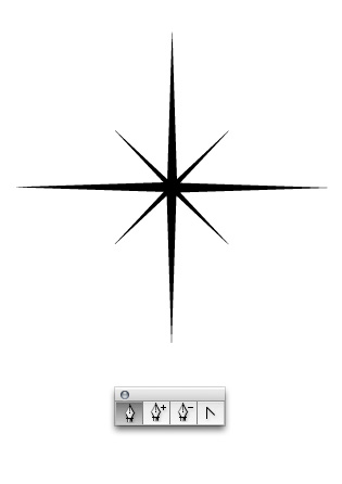
Create sparkles by drawing a simple star shape first.
Step 30
Place them in moderation throughout the illustration near edges of sharp objects or where your illustration would benefit from the added detail. Give the impression of twinkling effects by blurring a select few of the stars. To blur a star go to Effect > Blur > Gaussian Blur.


Step 31
Next, we'll create a haze that surrounds some of the highlights to give the indication of general light reflection. Draw a simple white shape that follows the edge of an object below it. Go to Effect > Blur > Gaussian Blur, and enter the variable shown below.


Step 32
Observe the effect achieved.


Step 33
Once you apply more general haze highlights you'll see how it helps with the overall illusion of objects being shiny.


Step 34
Add another grunge element to the background using an ink option. Access the ink options by going to Window > Brush Libraries > Artistic > Artistic_ChalkCharcoalPencil.


Step 35
Reduce the Opacity of the grunge graphic, then place it behind the shield, but above the background.


Step 36
Finish the illustration by adding some elegant type. We've used Trajan Pro for the words Triumph and Jonathan and Bikham Script for the word Vectortuts.


Final Image
Here is the final illustration. You've just learned how to create a strong, yet sleek shield design. As an added bonus I've included a cool desktop wallpaper in a whopping 1680 pixels by 1050 pixels. Download the Tiumph Wallpaper. Now it's your turn to create something. Just remember to have fun and use new techniques that you haven't yet experimented with!
Subscribe to the VECTORTUTS RSS Feed to stay up to date with the latest vector tutorials and articles.
 By
By


