


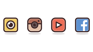
In today’s tutorial we're going to approach a somewhat different theme and learn how to create some social media icons, using some simple shapes such as the Rounded Rectangle Tool and Ellipse in combination with the power of the Align and Stroke panels.
Oh, and don’t forget you can always expand the project by heading over to GraphicRiver, where you’ll find tons of awesome social media icon packs, just waiting to be used.
Looking for the right social media icon pack? Check out our recommendations in this article:


1. How to Set Up a New Document
Since I’m sure that you already have Illustrator up and running in the background, bring it up and let’s set up a New Document (File > New or Control-N) using the following settings:
- Number of Artboards: 1
- Width: 800 px
- Height: 600 px
- Units: Pixels
And from the Advanced tab:
- Color Mode: RGB
- Raster Effects: Screen (72ppi)
- Preview Mode: Default


Quick tip: some of you might have noticed that the Align New Objects to Pixel Grid option is missing. That's because I’m running the new CC 2017 version of the software, where great changes have been made to the way Illustrator handles the way shapes snap to the underlying Pixel Grid.
2. How to Set Up a Custom Grid
Since we’re going to be creating the icons using a pixel-perfect workflow, we’ll want to set up a nice little Grid so that we can have full control over our shapes—that is if we’re running the older version of the software.
Step 1
Go to the Edit > Preferences > Guides & Grid submenu, and adjust the following settings:
- Gridline every: 1 px
- Subdivisions: 1


Quick tip: you can learn more about grids by reading this in-depth piece on how Illustrator’s Grid System works.
Step 2
Once we’ve set up our custom grid, all we need to do in order to make sure our shapes look crisp is enable the Snap to Grid option found under the View menu, which will transform into Snap to Pixel each time you enter Pixel Preview mode.
Now, if you’re new to the whole “pixel-perfect workflow”, I strongly recommend you go through my how to create pixel-perfect artwork tutorial, which will help you widen your technical skills in no time.
3. How to Set Up the Layers
With the new document created, it would be a good idea to structure our project using a couple of layers, since this way we can maintain a steady workflow by focusing on one icon at a time.
That being said, bring up the Layers panel, and create a total of five layers, which we will rename as follows:
- layer 1: reference grids
- layer 2: snapchat
- layer 3: instagram
- layer 4: youtube
- layer 5: facebook


4. How to Create the Reference Grids
The Reference Grids (or Base Grids) are a set of precisely delimited reference surfaces, which allow us to build our icons by focusing on size and consistency.
Usually, the size of the grids determines the size of the actual icons, and they should always be the first decision you make when you start a new project, since you’ll always want to start from the smallest possible size and build on that.
Now, in our case, we’re going to be creating the icon pack using just one size, more exactly 128 x 128 px, which is a fairly large one.
Step 1
Start by locking all but the reference grid layer, and then grab the Rectangle Tool (M) and create a 128 x 128 px orange (#F15A24) square, which will help define the overall size of our icons.


Step 2
Add a smaller 120 x 120 px one (#FFFFFF) which will act as our active drawing area, thus giving us an all-around 4 px padding.


Step 3
Group the two squares composing the reference grid using the Control-G keyboard shortcut, and then create three copies at a distance of 40 px from one another, making sure to align them to the center of the Artboard.
Once you’re done, lock the current layer and move on to the next one, where we’ll start working on our first icon.


5. How to Create the Snapchat Icon
We’re going to kick off the project by creating an icon for Snapchat’s newest addition, the Spectacles, which are an extension of the service that has been recently made public.
That being said, make sure you’re on the right layer (that would be the second one) and then zoom in on the first reference grid so that we can get started.
Step 1
Create the icon’s main shape using a 96 x 96 px rounded rectangle with a 16 px Corner Radius, which we will color using #F2CD66, and then center align to the underlying active drawing area, at a distance of 4 px from its top edge.


Step 2
Give the shape a ring-like highlight, by creating a copy of it (Control-C > Control-F) which we will adjust by flipping its Fill with its Stroke (Shift-X), and then setting its color to white (#FFFFFF) and its Weight to 8 px, making sure to align it to the inside afterwards.


Step 3
Since we’ll want the highlight to be a little bit more subtle, we’ll need to select it and then lower its Opacity to about 30%.


Step 4
Once we’ve finished adjusting the highlight, we can add the icon’s main outline by creating another copy of its main shape (Control-C), which we will paste in front (Control-F), flipping its fill (Shift-X) with an 8 px thick Stroke, with the color set to #3A2121.
At this point, you can also select and group (Control-G) all of the icon’s composing shapes since it will make it easier to handle them if you ever need to.


Step 5
Start working on the little eye by creating its main shape using a 56 x 56 px circle, which we will color white (#FFFFFF) and then center align to the underlying yellow shape.


Step 6
Add the pupil using a 32 x 32 px circle, which we will color using #3A2121 and then center align to the white shape that we created in the previous step.


Step 7
Add the little cutout from the pupil’s top-left corner by creating a 12 x 12 px circle, which we will color using white (#FFFFFF) and then align to its left and bottom edges using the Align panel.


Step 8
Give the eye a subtle inner shadow by creating a copy (Control-C) of its white circle, which we will paste in front (Control-F) and then adjust by flipping its fill (Shift-X) with an 8 px thick Stroke (#3A2121), making sure to set the alignment to the inside and lowering its Opacity to 20% afterwards.


Step 9
Finish the eye by adding an 8 px thick outline (#3A2121) to its main body, and then select and group all its composing sections together using the Control-G keyboard shortcut.
Once you’re done, do the same for the entire icon.


Step 10
Finish off the icon by adding an 88 x 10 px ellipse, which we will color using #3A2121 and then center align to the bottom edge of the underlying active drawing area.


Step 11
Turn the ellipse into a subtle shadow by lowering its Opacity to 30%, and then select both it and the icon and group the two together using the Control-G keyboard shortcut.
6. How to Create the Instagram Icon
Assuming you’ve managed to finish the first icon, lock its layer and move on up to the next one (that would be the third one) and let’s start working on the second one, the Instagram icon.
Step 1
Start by creating the icon’s main shape using a 96 x 96 px rounded rectangle with a 26 px Corner Radius which we will color using #E5C2AA and then center align to the underlying active drawing area at a distance of 4 px from its top edge.


Step 2
Create the body’s upper darker section using a 96 x 40 px rectangle (#B76F58), which we will center align to the upper edge of the underlying shape and then adjust by setting the Radius of its top corners to 26 px.


Step 3
As we did with the Snapchat icon, add the ring-like highlight by creating a copy (Control-C) of the larger shape and pasting it in front (Control-F), flipping its fill (Shift-X) with an 8 px inner facing Stroke, with the color set to white (#FFFFFF) and the Opacity to 30%.
Step 4
With the highlight in place, create the icon’s main outline using another copy (Control-C) of its main shape, which we will paste in front (Control-F) and then adjust by flipping its fill with an 8 px thick Stroke with the color set to #3A2121.


Step 5
Using the Pen Tool (P), draw in the horizontal divider line separating the icon’s two sections, using an 8 px thick Stroke with the color set to #3A2121.


Step 6
With the Pen Tool (P) still selected, draw the subtle highlight from underneath the divider line, using a 4 px thick Stroke with the color set to white (#FFFFFF) and the Opacity to 30%.


Step 7
Grab the Ellipse Tool (L) and create a 12 x 12 px circle, which we will color using #3A2121 and then position over in the icon’s top-right corner, leaving a gap of 10 px between it and the larger outline.
Once you’re done, select and group all the shapes that we have so far using the Control-G keyboard shortcut.


Step 8
Start working on the lens by creating a 44 x 44 px ellipse, which we will color using #564141 and then center align to the icon’s main body.


Step 9
Create the inner darker section of the lens using a smaller 16 x 16 px circle, which we will color using #3A2121 and then center align to the underlying larger shape.


Step 10
Give the lens a subtle inner reflection, by creating a copy (Control-C) of its larger circle which we will paste in front (Control-F) and then adjust by flipping its Fill (Shift-X) with an 8 px thick inner-facing Stroke, with the color set to white (#FFFFFF) and the Opacity to 20%.


Step 11
Add another smaller reflection to the top-right corner of the lens, by creating a 6 x 6 px circle with the color set to white (#FFFFFF) and the Opacity to 20%, positioning it over the darker center so that it goes outside of it by 2 px on each side.


Step 12
Finish off the lens by adding the 8 px thick outline (#3A2121), selecting and grouping (Control-G) all its composing shapes afterwards.
Once you’re done, do the same for the entire icon, by selecting and grouping (Control-G) all its composing sections as well.


Step 13
Finish off the icon by adding the subtle shadow, which we will create using an 88 x 10 px ellipse, with the color set to #3A2121 and the Opacity to 20%.
As always, don’t forget to select and group (Control-G) all the icon’s composing sections before moving on to the next one.
7. How to Create the YouTube Icon
Assuming you’ve already moved on up to the next layer (that would be the fourth one), zoom in on the third reference grid and let’s get started.
Step 1
Start by creating the icon’s main shape using a 96 x 96 px rounded rectangle with a 26 px Corner Radius, which we will color using #ED6F56 and then center align to the active drawing area, at a distance of 4 px from its top edge.


Step 2
Add the inner-facing highlight as we did with all the other icons, by creating a copy (Control-C) of its main shape which we will paste in front (Control-F) and then adjust by flipping its Fill (Shift-X) with an 8 px thick Stroke with the color set to white (#FFFFFF) and the Opacity to 30%.
Step 3
Give the icon a nice thick 8 px outline, setting the Stroke’s color to #3A2121, and then select and group all its composing shapes together using the Control-G keyboard shortcut.


Step 4
Start working on the little play arrow, by creating a 38 x 40 px rectangle, which we will color using white (#FFFFFF) and then center align to the underlying red shape, pushing it slightly to the right (about 3 px) afterwards.
Step 5
Turn the rectangle into a right-facing arrow, by adding a new Anchor Point to the center of its right edge using the Add Anchor Point Tool (+) and then removing its top and bottom right ones using the Delete Anchor Point Tool (-).
Step 6
Give the arrow an outline by creating a copy of it (Control-C > Control-F), which we will adjust by setting its color to #3A2121 and then flipping its Fill with an 8 px thick Stroke with the Corners set to Round Join.
Once you’re done, select and group the two together using the Control-G keyboard shortcut, and then do the same for the icon’s composing sections as well.
Step 7
Finish off the icon by adding the little subtle shadow, which we will create using an 88 x 10 px ellipse, which we will color using #3A2121, center aligning it to the active drawing area’s bottom edge, making sure to lower its Opacity to 20%.
Once you’re done, don’t forget to select and group (Control-G) all of the icon’s composing sections together.
8. How to Create the Facebook Icon
We are now down to our fourth and last icon, so make sure you position yourself onto the last layer, and then zoom in on its reference grid so that we can wrap things up.
Step 1
Create the icon’s main shape using a 96 x 96 px rounded rectangle with a 16 px Corner Radius, which we will color using #5D92D1, and then center align to the active drawing area, at a distance of 4 px from its top edge.


Step 2
Give the shape an inner facing highlight by creating a copy of it (Control-C > Control-F), which we will adjust by flipping its Fill (Shift-X) with an 8 px Stroke, setting the color to white (#FFFFFF) and then lowering its Opacity to 30%.


Step 3
Create the icon’s main outline using another copy (Control-C) of its body, which we will paste in front (Control-F) and then adjust by setting its color to #3A2121, and then flipping its Fill (Shift-X) with an 8 px thick Stroke.
Once you’re done, select and group all three shapes together using the Control-G keyboard shortcut.


Step 4
Start working on the letter “F” by creating a 14 x 78 px rectangle, which we will color white (#FFFFFF) and then bottom align to the visible section of the underlying blue shape, positioning it onto the right side of the icon, at a distance of 26 px from its larger outline.


Step 5
Create a smaller 16 x 14 px rectangle (#FFFFFF) and position it onto the top right side of the shape from the previous step.


Step 6
Create the crossbar using a 44 x 14 px rectangle, which we will color white (#FFFFFF) and then right align to the shape that we created in the previous step, positioning it at distance of 16 px from it.


Step 7
Select all of the letter’s sections and combine them into a single larger shape using Pathfinder’s Unite Shape Mode, removing one of the extra Anchor Points created during the process using the Delete Anchor Point Tool (-).


Step 8
Double click on the resulting shape to enter Isolation Mode, and then start adjusting it by selecting its top left corner and setting its Radius to 16 px using the Live Corners feature from the top bar.


Step 9
Next, select the corner from above the letter’s crossbar, and adjust that as well by setting its Radius to 6 px.


Step 10
Finally, select the crossbar’s bottom right corner, and push it to the inside by 2 px using the Move Tool (right click > Transform > Move > Horizontal > -2 px).
Once you’re done, exit Isolation Mode by pressing Escape, and then select and group (Control-G) all of the icon's composing sections together.


Step 11
Finish off the icon by adding the subtle shadow, which we will create using the same 88 x 10 px ellipse (#3A2121) with a 20% Opacity, which we will center align to the bottom edge of the active drawing area.
Once you’re done, select all the icon’s composing sections and group them together using the Control-G keyboard shortcut.
It’s a Wrap!
There you have it: a super easy tutorial on how to create your very own social media icon pack using nothing more than some simple shapes and tools that you probably already work with on a daily basis. I hope you’ve managed to follow each and every step, and as always learned something new and helpful along the way.


 By
By


