


Lets get one thing straight, there is a difference between 'lettering' and 'type design', this can be some serious stuff. There are people who strictly design letter-forms for their entire lives. They live, breath, eat, sleep, drink and pee typography - I truly admire them. In my personal work I lean towards lettering and don't want to step on any toes by saying this is 'THE' way to design type. This is a way to go about designing a typeface using Ai. Everyone loves letter, so lets have some fun!
Learning typography is truly like learning a new language, so I will try to walk the fine line of explaining things so that anyone can understand and using typographic terminology. I will mess something up, so to all the type experts, please go easy.
The inspiration for a typeface can come from anything, a tree, a ladder, rocks, people, old office supplies laying around ... pretty much anything and everything. You could start in a variety of ways, pencils sketches, cutting out paper shapes and moving them around, etc...
Step 1a
Get inspired. Look at the legends. What kind of type do you like?
Decide what kind of typeface you want to create. Ask yourself what you want to do with the typeface your creating... Do you want to create a typeface from your handwriting? Do you want to use it for big bold, headline type? Or are looking to use it as text in a book? Having a general idea of what your end goal is, will help to make a lot of the decisions throughout the process of creating a typeface.


Step 1b
For the sake of efficiency and simplicity I will be creating a sans-serif, bold and basic headline typeface inspired by both ITC Avant Garde and Bernhard Fashion (uppercase). I love how clean and basic the forms forms are, based around simple geometry.


Step 2a
Because the basis for this typeface is basic geometry, start by using the most basic shapes -- line, square, circle and triangle. Create them using the line and shape tools, and copy and pasting sections or pieces of the line )with a stoke).


Step 2b
Instead of a fill, use a line with simple black stroke, this will allow experimentation with stroke weight. Later, we will choose a stoke weight and make it consistent throughout.


Step3a
Simply start creating characters (letter forms). For whatever reason I have always seem to start with an Uppercase A. As you can see (in grey) I am just using a triangle and a horizontal line to create the 'A' shape. Now that's keeping it simple.


Step 3b
Experiment with shapes and the forms of the letters. Using the square shape you could have the A 'lean' to the left or right.


Step 3c
Instead of drawing and editing every line with the pen or line tools, using the shapes will make things consistent and super easy. Another way to make things easier on yourself is to use a 'white shape' to visually 'crop' parts of the shapes, so that you can see what the letter form looks like. The simplest example of this is creating the letter 'C'. Start with a circle (1) and simply place a white triangle over the top (2) and you're finished (3). (the grey background is so you can see the white shapes)


Step 4
Obviously, I cannot break down how to create everything letter, but here I will break down how I designed the 'B' and how I implemented the use of the 'white shape'. Create 2 overlapping circles (1) and draw a horizontal line between both point where the circle intersect (2). Draw a line where the 2 circles and the horizontal line intersect on the left side (3). Next, add a white fill to the bottom circle (to crop the overlap from the top circle) and using a white shape, 'crop' the left side of the vertical line (4). Next, using the pen tool, simply 'crop the top of the bottom circle (5) and move the initial horizontal line on top.


Step 5
At this point I like to start experimenting with stroke weight and even putting together words if possible. Get down and go nuts!


Step 6a
Things may start getting a little crazy, so the way to keep things organized is to establish a grid. You don't have to use a grid, you may be going for any entirely different look/style of typeface, but using a grid is the best way to gain consistency throughout your letters. For example, when creating letters that are similar in structure like the E and F and H, using a grid will help to keep the horizontal lines, or cross bars, of letters at the same height (orange).


Step 6b
Setting up the grid should be fairly easy, there are just a few determinations you will have to make, and from there its basically following the guides. Using light blue (like in grade school ha ha) draw lines that will determine the height of the capital letters (1), known as the cap line and baseline. Next, establish a line that we be serve as the main horizontal guideline (2), or the mean line. For the typeface I'm designing, i will also establish a secondary horizontal guideline (3).


Step 6c
Some parts of lowercase letters will go below the set baseline, known as descenders, so establish a guideline (descent line) for that. Notice that the lowercase letters are consistent with the uppercase, in that the mean line establishes the height (x-height) of the lowercase letters (5). And when lowercase letters have parts that extend past (ascenders) the mean line, they are consistent with the cap line (6).


Step 7
The guidelines will allow you to stay consistent when developing the height of the letters. You also want to keep in mind the width of the characters you are creating. Typically, the uppercase 'M' will be the widest character and the lowercase 'i' or exclamation point will be the slimmest. Be sure to keep your letter consistent and proportional.


Step 8a
As I have already stated this typeface is sans-serif, so there aren't any pesky serifs to deal with. But you do have to be sure that you are consistent with how you end each 'stroke', or 'ends of letters'. In-order to establish consistent terminal endings, simply follow the grid system by ending the stoke horizontally at the appropriate grid line.


Step 8b
Although most strokes (in this design) will simply end horizontally there are obvious circumstances where that will be not be an option, such as curved terminals. So establish a secondary system for curved strokes. My system, in most cases, is to end each curve with the same angle. A tip to get the same angle is , again, to use a 'white shape' to chop or trim each stroke. Here you can see I am using the same triangle white shape and vertical rectangle on multiple letter-forms.


Step 9
The weight of the typeface is yet another aspect to deal with. The blackness or heaviness of a character is referred to as its weight. Experiment with different line weights, by simply bumping up the stroke of the black line. Here, starting with the 'W' the stroke weights go up from 1pt to a 7pt stroke on the 't'. Traditionally, a typeface will have at least two weights: regular and bold. For this tut, I am just creating one weight, so choose the same stoke weight throughout all letter-forms.


Step 10
The last thing I will touch on, before we take a breather, is the problematic letter 's'. Because it cannot easily be created out of just the simple shapes (circle, square, triangle) this typeface is based off of, there is an issue. Though it is initially based off two circles, the curved spine of the 's' will have to be an exception to the rules I have established. That's the way it goes.


Conclusion
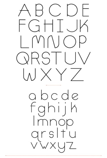
This may not be the 'expert' way to go about designing a typeface, but its a good way if you don't like drawing directly in FontLab. Be sure to read part 2 to learn how to design the rest of the characters for your typeface. The final image is below.
 By
By


