
Today's tutorial will focus on creating a brand for a fictitious skate company and also applying graphics to a skate deck and T-shirt. We'll demonstrate how to achieve professional results every time – both items were actually printed using the tutorial techniques.
For screen-print fanatics, there's an extra bonus; you'll discover how the Apply Image command enables you to create knockouts and error-free spot colors without the need for expensive RIP software.
I would especially like to thank Steve over at Advertees for printing the shirts and providing invaluable technical advice.
Tutorial Assets
You'll find some files in the "source" folder. You'll also need the following public domain images, a Photoshop plug-in and free font to complete this tutorial.
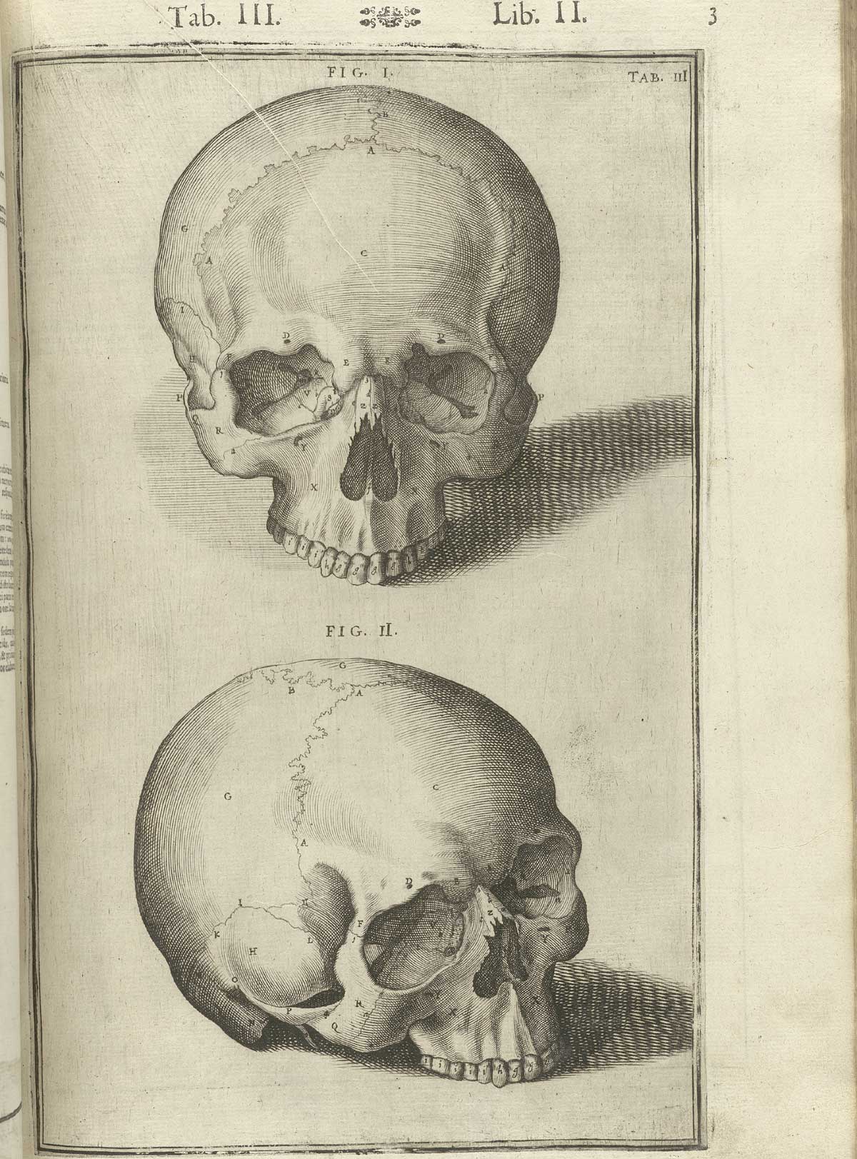
- Skull
- Skeleton
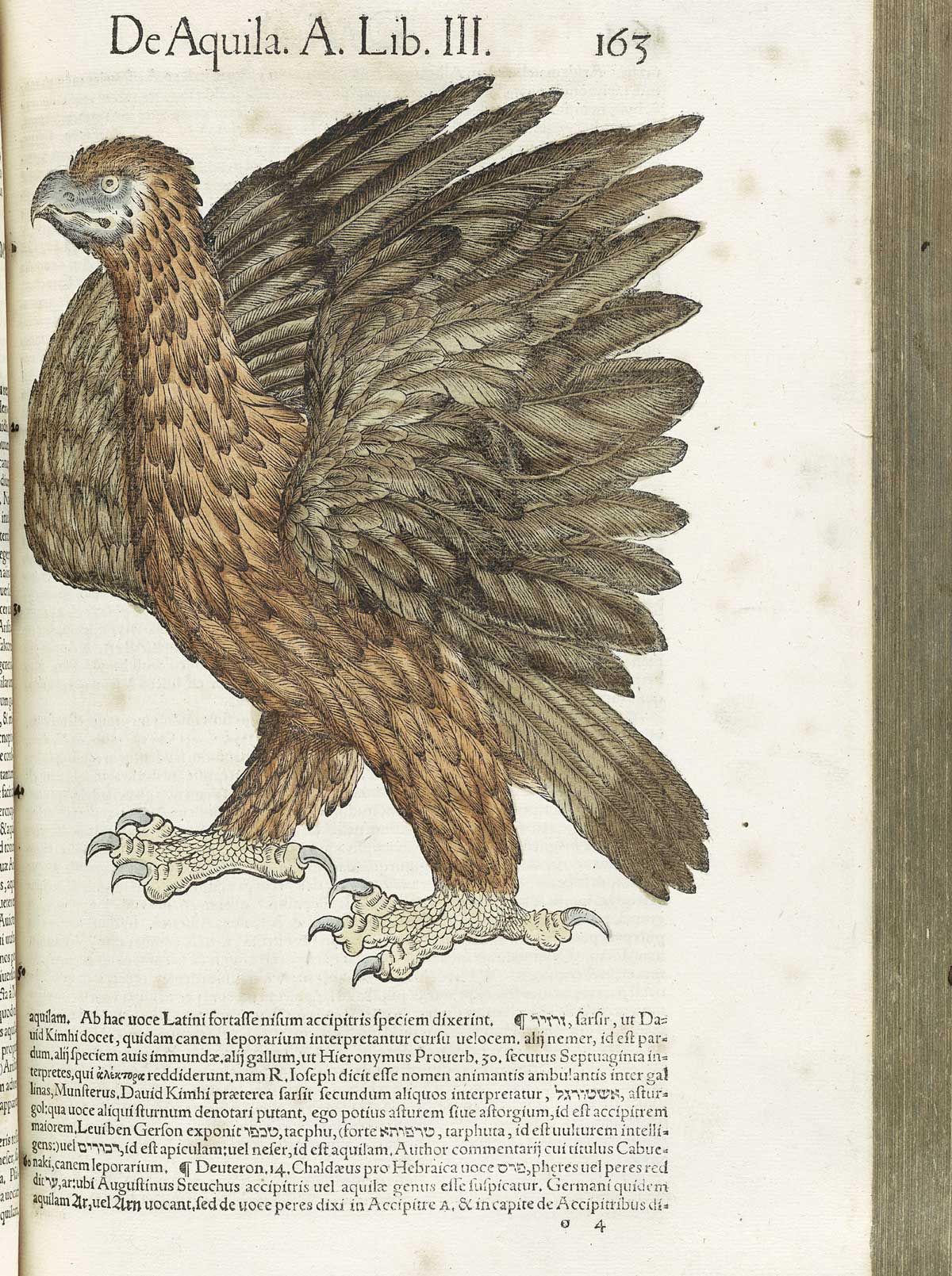
- Eagle wing
- Floral crown
- Royal crest
- Vintage frame
- "4.jpg" from these grunge textures
- Bad Boys font
- A demo, or full version of the Engraver II plug-in
Stage 1 – Initial Design Concepts
A logo is the single most important marketing device for any company. A logo will appear in both web and print applications; it must also be designed in such a way so it can be applied to a variety of promotional products such as a brochures or T-shirts and work in color and mono as well as being legible at different sizes – from a giant billboard to a fax header; but above all the design must be simple and effective.
It's good practice to always start off with some initial sketches no matter how rough to establish the basic design concept; some of my scribbles are shown below.


Here's a couple of early logo experiments. It was at this point I decided to keep the branding in black and white.


Next, I started to strip away excess detail, to leave a clean typographic solution.


From here I worked up some rough ideas for the T-shirts using public domain vintage engravings, as well as free vectors found on the web. I wanted these designs to reflect 13's core concept of superstition, phobia and fear – this also allowed room for additional designs based on the same theme.


I spent a lot of time on this rejected T-shirt design. The final choice was the Ace of spades design; which I had initially disregarded. On reflection, this was probably the strongest idea as it represented the brand perfectly.


Here's final rough layout showing the logo, skate deck and T-shirt. This standard of visual is perfect for submitting to your client.


Stage 2 – Creating the Logo Artwork
After the design stage and initial client feedback, it's time to create the logo. Illustrator is undoubtably the tool of choice for creating logos – mainly because the file remains resolution independent.
Create a portrait A4 Illustrator file with the Document Profile set to Print (CMYK), then add the numerals 13 at 270 pt in this font.


Next, we'll modify the first numeral so it's more recognizable; to achieve this we'll use a donor part from the same font. Hold down Opt + Shift and drag your text to the left to duplicate it, then replace with the character V. Double-click the Reflect Tool (0), in the next window check the Vertical Axis button and enter 90 degrees in the Angle field and hit OK.


Select All and press Shift + Command/Ctrl + O to convert the text to Outlines. We only require the top-left portion of this character, so grab the Pen Tool (P) and draw a closed shape to exclude the unwanted area as shown.


Select both paths and click the Minus Front button in the Pathfinder tab to chop away the excess.


Ungroup your original 13 numerals, then slice off the top of numeral 1 using the same technique as the previous step. Now drag your replacement section into place (as indicated in red), then use the Direct Selection Tool (A) to modify individual control points as required.


When you're happy, nudge your paths together so the bottom spurs slightly overlap. Select All and choose Make Compound Shape from the Pathfinder's fly-out menu (1), then hit the Expand button (2) to unite both paths.


Add a 310 pt circle (Fill: black/Stroke: 0) with the Ellipse Tool (E), then a smaller 278 pt circle (Fill: black/Stroke: 5 pt white). Set your numeral paths to Fill: black/Stroke: 0 and hit Shift + Command/Ctrl + ] Bring to Front. Select All and centre all your elements using the Horizontal and Vertical Align buttons in the Options bar.


Duplicate your numeral paths and nudge them up and to the left. Add a 4 pt black Stroke to the duplicate and ensure the Align Stroke is set to the Outside.


You can now Group both numeral paths and reposition by eye, leaving a slightly deeper space at the base of the circle. Next, add some smaller text below the main graphic in the same font.


Convert the text to Outlines and set the Fill to white/Stroke: 0. Now choose Object > Path > Offset Path and enter an Offset value of 5 pt/Joins: Mitre limit: 4. Set this Fill to black/Stroke: 0, then Send to Back (Shift + Command/Ctrl + [)


With your text paths selected press Opt + Shift + Command/Ctrl + W to access the Warp dialogue box and apply the following preset from the Style menu.


Now use the Pen Tool (P) to add some black shapes to fill any white holes around the lettering. These shapes should sit behind the text, so Send Backward.


OK, thats our basic logo designed, but to me it looks too to neat and tidy! We could Live Trace a texture image and use various Pathfinder commands to add wear and tear, but I opted for a hands-on, non-digital process, but I still wanted finished logo in vector format. Here's how it's done.
Group your logo, enlarge to cover the A4 Artboard, then print it out full-size onto plain paper.


For this step you'll need access to a black and white photocopier. Reduce your original to the lowest reduction size available, then use this copy to enlarge up to around 150%. Continue to use second and third generation copies to enlarge until the logo begins to degrade in quality.
Note: The number of copies required to produce the best result will vary depending on the quality of the photocopier. I found the older, lo-tech machines produce the best result.


When your happy, scan the logo into Photoshop at 600 dpi in Greyscale mode. If your scan is not square, drag the Ruler Tool (I) to a 90 degree edge and choose Image > Image Rotation > Arbitrary. The Angle value will determine the amount of rotation required to fix your scan. When you're done Save to a handy location as a .tiff file.


Jump over to Illustrator and open a new A4 portrait document set to Print (CMYK) Mode. Select Place from the File menu, then navigate to your .tiff file. We now need to convert the file back to vector format, so it can be scaled to any size without loss of quality. Go to Object > Live Trace > Tracing Options and click OK in the following warning window. Ensure the Default Black and White preset is selected, then click the Trace button. Now click the Expand button to convert the raster image into paths.


Next, Ungroup the object, then select the outer white area and hit Delete.


Select any black area, then go to Select > Same > Fill Color. Now choose Object > Compound Path > Make. This will unify the black shapes to a single path.


Printing a pure black ink (100% K) on our skate deck will look a little faded, or pale, so it's always best to use a rich, or four-color black. Fill the Compound path with: C: 70%, M: 50%, Y: 30% and C: 100%. Finally, use the same technique to make a Compound path from your white shapes.


Compound paths allow you to make swift color changes to your logo for different applications, such as using a spot-color for one-color printing, or reversed out of a dark background on a poster for example.
Select All and Copy your finished logo to the Clipboard for the next stage – creating the skate deck…


Stage 3 – Creating the Skateboard Artwork
For a one-off, or small quantities it's more economical to use a digital print process; there are many online companies who offer great rates, so it's this process we'll demonstrate here. For larger quantities, screen-printing is your best bet, so if your design takes off and you get orders for thousands, it's important to consider how your artwork will translate to two, or three-color screen-printing (covered in Stage 4).
Open the "Template.tif" from the "source" folder, then add add a bottom layer called "White base", fill with white, then snap a central guide to your canvas width.
Note: Different printers will require different amounts of bleed (areas that expand outside of the design), because of this factor, the supplied template has a generous amount added. Be sure to check your chosen printers print requirements before starting work and adjust your artwork accordingly.


Paste your Illustrator logo from the Clipboard and select Smart Object in the following window. By default the graphic will be placed dead center. Now hold Shift + Option to Transform from the centre and position just above the bottom truck guide. Rename this layer "Vector Smart Object/logo".
Note: Transforming Illustrator Smart Objects in large Photoshop files can prove tricky. As a workaround choose Layer > Rasterize Smart Object.


Open the skull image and use the Crop Tool (C) to trim away the excess canvas.


Go to Image > Mode > Greyscale, then click the Discard button in the next window to remove all color from the image. Next, hit Command/Ctrl + L to access the Levels dialogue box and set the three Input sliders as shown to increase the contrast.


Next, we'll remove the shadows around the skull; we'll do this on a duplicate layer – this way mistakes can easily be rectified. Drag the base layer over the Create a new layer icon at the foot of the palette to make a copy, then use a small, hard-edged white brush and begin to remove the unwanted areas.


When you're done, hit Command/Ctrl + E to Merge the upper layer. Your skull should now look something like this.


To make a true black and white image choose Image > Mode > Bitmap. In the following window keep the Output at 72 pixels/inch and set the Method to 50% Threshold.


Next, we need to select the black line work, but as the image is a Bitmap this is not possible. As a workaround, choose Greyscale as its mode again and keep the Size Ratio to 1 in the following dialogue box.
Set the Magic Wand Tool (W) to a Tolerance of 1 with the Contiguous option unchecked, then click on any black area to select the same pixel color.


Hit Command/Ctrl + J to copy the selection to a new layer, label it "Skull", then delete the base layer. Set your Foreground color to the same rich black as used in Illustrator earlier. Now Command/Ctrl-click the layer thumbnail to reselect and hit Option + Delete to fill with rich black.


Drag the "Skull" into your skate deck artwork below the "Template". Now enlarge and place as shown over the front truck guide.


To fix any blurring effects caused by the enlargement, go to Filter > Sharpen > Unsharp Mask and enter the values as shown.


At this point I felt the line work was a little to delicate – which could throw up some registration problems when printed. To fix this make a layer-based selection and go to Select > Modify > Expand by 1 px, then fill with rich black again.


Open the floral crown in Illustrator and fill all paths with the same rich black and Copy to the Clipboard.


Paste the selection as a Smart Object below the "Template"layer, then resize and position as shown. Rename this layer "Vector Smart Object/crown".


Next, open the royal crest via Illustrator and select the foreground path. Fill with rich black, then Copy to the Clipboard.


Paste as a new layer below the "Skull", then enlarge/position centrally over the tail of the deck and label it "Bottom flourish"


Open this vintage frame in Illustrator and delete everything apart from the main graphic. Fill the line work with rich black and also add a rich black 0.2 rule as shown.


Copy > Paste as a new layer below the "Bottom flourish" and reduce its Opacity to 60%. Transform/position behind the logo as shown, then name it "Swirl 1".


Add a layer mask, then use an assortment of "Grunge_brushes.abr" (from the "source" folder) to hide areas. For best results, use the brushes in a stamping fashion and also vary their angle to avoid repetition. My mask is shown to the right of the screengrab.


Add additional "Swirl" layers around your design and mask accordingly.


Now use the same technique to mask the top area of the "Bottom flourish"


Place "4.jpg" from these grunge textures as a new layer above the "White base", then enlarge/position over the bottom half as shown.


Duplicate this layer, then Rotate 180 degrees/Flip Horizontal. Shift-drag this duplicate to the top of your canvas, then use a large soft-edged Eraser (E) to blend the middle hard edge.


Merge both layers, then mask with the same brushes. Name this layer "Grunge texture".


Now add a new layer called "White areas" below the "Bottom flourish" and use an assortment of hard-edged and grunge brushes to loosely fill areas with white behind the skull and crown. If you feel you've gone to far, mask as required. My layer content is shown in black for clarity on the right of the screengrab.


That's it your deck design is complete. Save a flattened version and upload it to your printer after double-checking their size and resolution requirements.


After a few days your order should be delivered. If it looks too nice and shiny to ride, you can always hang it on a wall as art!


Stage 4 – Creating the Three-Color T-Shirt Artwork
Talk to your printer before embarking on the artwork stage – this will save major headaches later on. Questions he'll need to know are how many inks you intend using as well as what color garments are required. A visual mock-up can be used as a talking point and he may suggest ideas that you've not considered.
It's also vital to get a technical specification which should include file dimensions and resolution requirements. After showing Steve at Advertees a couple of designs we agreed on a three-colors (grey, white and black) on a charcoal grey (or possibly white T-shirts) using an environmentally friendly Discharge printing technique.
Before we start, bear in mind your client may need the same design as a poster or press ad in the future; so to keep things flexible, we'll create the design in CMYK, then add the special spot-color inks at the final stage – that way you'll have the CMYK and spot-color information within a single file.
Set your Background color to # 38333c, then create a new Photoshop canvas 16 inches wide x 20 inches high. Change the Resolution to 400 pixels per inch and the Color Mode to CMYK. Now set the Background Content to Background color and hit OK.


Double-click the default layer and rename it "Charcoal T", then add a new layer called "White T" to represent both shirt colors.


Now we'll perform the same workflow as we did on the skateboard graphics. First, convert the skeleton to Greyscale Mode and apply a Levels adjustment as below.


Zoom in and use a white, hard-edged brush to clean up the engraving on a duplicate layer.


Convert the image to Bitmap Mode, ensuring the Output remains at 72 pixels per inch and use the 50% Threshold setting under Method.


As before, we now need to convert back to Greyscale Mode (Keeping the Size Ratio as 1) in order to create a selection. Set the Magic Wand Tool (W) to a Tolerance of 1 with Contiguous unchecked, select the black and Copy to the Clipboard.


Add central guides, Paste the selection and Flip Horizontal. Now use the Rectangular Marquee Tool (M) to delete the area from the hips down. Resize and position as shown, then Command/Ctrl-click the layer thumbnail to load it as a selection and fill with rich black (C: 70%, M: 50%, Y: 30% and C: 100%). Name this layer "Skeleton black" and place it within a group folder called "TOP SKELETON".


Next, disable the visibility of the "White T" layer, add another layer below the "Skeleton black" and label it "Skeleton white" Zoom in and carefully infill the figure edges with a small white, hard-edged brush, then use a larger brush to fill the remaining gaps. Finally, remove any stray overlaps with a small hard-edged Eraser (E).


Repeat the Illustrator rich black coloring process on the floral crown and Copy > Paste into a new folder called "TOP CROWN" below the "TOP SKELETON" folder. Label this layer "Crown black", then resize/rotate to fit snugly over the skull. Repeat the white infill process on an underlying layer called "Crown white".


Use the same technique to isolate the wing from the eagle. Convert to Greyscale Mode, then apply the following Levels adjustment.


Next, choose Filter > Sharpen > Unsharp Mask and copy these settings to remove the slight blur.


Follow the same process to add a rich black wing layer ("Wing black") and a white infill layer ("Wing white") within a new folder called "TOP WING" below the previous ones.


Highlight all your folder thumbnails and drag them over the create new layer icon at the foot of the palette to duplicate them. Use the Transform function to rotate the duplicates 180 degrees. Now move them down and snap them to the vertical centre guide.


Now we'll move onto creating the grey artwork areas; drop "4.jpg" from these grunge textures into a new folder called "GREY PAINT" above the T-shirt color layers. Enlarge it to cover the majority of canvas and name it "Grunge".


To even out the tonal range, first use the Lasso Tool (L) to select some of the paler areas, then hit Command/Ctrl + J to Copy the selections to new layers. Next, add a mask and blend the hard edges with some of the grunge brushes. Label these layers as shown.


When you're done, add a folder mask and use the grunge brushes to blend the hard edges. My mask is shown in isolation to the right of this screengrab.


Next, we need to remove the tonal range from the grey areas. We could apply a Bitmap halftone effect, but the results would be fairly predictable and not be in keeping with the rest of the design. Instead we'll use the Engraver II filter, which with a little patience can produce some really cool vintage Bitmap effects.
For this to work, first duplicate the "GREY PAINT" folder, then switch off the visibility of the original folder. Next, press Command/Ctrl + E to Merge the duplicate group, then place a layer below the duplicate filled with white. Now target the duplicate layer and hit Command/Ctrl + E to Merge Down and also Apply the mask.
Now for the fun part! Choose Filter > AlphaPlugins > Engraver II and copy these settings. One really neat feature of this filter is the Noise and Randomness settings that really do produce an aged look.
Now click the Save button (to reapply the preset later) and hit OK. Remember, we're working at high resolution, so be patient while the filter does its work.


Access the Color Picker, then click the color libraries button in the next window. In the following window, choose PANTONE SOLID coated under the Book menu and select PANTONE Cool Grey 9C. This will give an accurate CMYK indication of the final spot color we'll be using.
Now grab the Magic Wand (W), zoom in and select all the black linework and fill with PANTONE Cool Grey 9C. Hit Shift + Command/Ctrl + I to Inverse the selection and hit delete to remove the white. Name this layer "Grey lines". You can now disable the visibility of the "GREY PAINT" folder, or delete it.


Copy > Paste the Illustrator spade shape (already filled with rich black) as a new layer below the "Grey lines", then resize and position top left. Make a duplicate and Rotate 180 degrees and position in the opposite corner. Merge these layers, then snap it to your centre guides.


Add a mask, then rough up the shapes using a selection of grunge brushes; be careful not to overdo this part, as the shapes still need to be recognizable – if you go to far, use a white brush to reinstate as required.


Add an underlying white fill layer, then Merge both layers into one and apply the mask at the same time.


Run the same Engraver filter on this layer and select/fill the linework with rich black. Inverse your selection, delete the white and name the layer "Spades".


Revisit the "elements.ai" file again and give the A character a Fill of white / Stroke: 0. (incidentally, the full font is available here). Paste as a new layer over the top spade and resize to fit. Duplicate, Rotate 180 degrees and position over the bottom spade, then Merge both layers.


Generate a layer-based selection from the merged layer, Inverse the selection, then disable its visibility. Target the "Spades" layer, then click on the Add layer mask icon at the foot of the palette.


Target your white A layer and switch it's visibility back on. Now press Command/Ctrl + I to Invert the layer to a negative. Merge this layer to an underlying white fill layer and run the same Engraver filter as previous.


Use the same technique as described earlier to select the black and fill with white, Inverse and delete the background. Name this layer "White letters", then trash your original solid A layer.


Copy > Paste your rich black and white illustrator logo as an uppermost layer and resize as shown. OK, that's the CMYK artwork completed; next, we'll move onto creating the spot color separations for screen-printing.


Spot colors are always stored as additional Alpha Channels. Switch to your Channels tab, first well add a channel to represent the T-shirt color. This channel will not print, so it's irrelevant being labeled a spot color.
Select New Spot Channel from the top right fly-out menu. In the next window name it "Charcoal T", leave its Solidity at 100%, then click the color chip. This will open the Color Picker, enter # 38333c and hit OK. You'll now see an additional channel appear at the bottom of the stack. By default it will appear with a white fill, to press Command/Ctrl + I to Invert it.


Now well add the actual spot color channels in the order they will be printed. Add another channel, but this time click the Color Libraries button after clicking the color chip. In the next window select PANTONE solid coated from the Book menu, then choose PANTONE Cool Grey 9 C. Your grey channel will now appear below your T-shirt channel.
Target (highlight) the top CMYK composite channel and switch to the Layers tab. Command/Ctrl-click your "Grey lines" layer thumbnail to load it as a selection and return to the Channels tab. Target the "PANTONE Cool Grey 9 C" and fill with black.


Now we'll create the white ink channel. As there is no Pantone equivalent of white, add a new Spot Channel as you did for the T-shirt color, but choose # ffffff and name it "White".
Follow the same technique to fill layer-based selections from the duplicate "Skeleton white", "Crown white" and "Wing white" with black on this channel.


Repeat this process with the "White" channel, filling the opposing skeleton, crown and wings with black. Now fill a selection with black from your "White letters" layer.


The last ink to be printed will be the black. Create another Spot Color Channel as you did for the grey, but select "PANTONE Black C". Now fill a selection from your "Spades" layer with black on this channel.


Next, we need to knock out, or eliminate the black spades from overprinting the white ink. Command/Ctrl-click your "White" channel to load it as a selection. Ensure your "PANTONE Black C" is the target channel and hit Delete.
Note: I've disabled the visibility of the "White" channel in the screengrab for clarity.


Now we'll add the remaining black ink; first fill selections from both "Wing black" layers with black on the "PANTONE Black C" channel.


Before we complete the black artwork we need to remove the skeleton body areas. Load a selection from the duplicate "Skeleton white" and delete from the "PANTONE Black C" channel. Now repeat for the top skeleton.


Next, fill selections from both "Crown black" layers with black on the "PANTONE Black C" channel.


Now use selections from both "Skeleton white" layers to remove the crown overlapping the skull on the "PANTONE Black C" channel.


Next, fill selections from both "Skeleton black" layers with black on the "PANTONE Black C" channel.


Create a selection from your "Logo" layer and delete it from the "PANTONE Black C" channel. Now use the same selection to fill with black on the "White" channel.


Now use the Magic Wand (W) to select just the black areas from the "Logo" layer and fill this with black on the "PANTONE Black C" channel.
Note: To make this step easier, temporarily switch off the visibility of all the spot channels.


With our manual knoutouts complete, we'll now apply some advanced knockout techniques to ensure all our inks print with no overprinting errors. First, target the "White" channel and choose Image > Apply Image. In In the next window set the Layer to Merged and select "PANTONE Black C" from the Channel menu. Next, activate the Invert button and set the Blending to Add. This command has effectively knocked out the black areas from the white.
Note: I've disabled the visibility of all the other channels to see the result clearly.


Next, target the "PANTONE Cool Gray 9 C" and run the Apply Image command again, but set the Channel menu to White and the remaining settings as before. We've now knocked out the white from the grey, but there's one more step to go.


Keep the "PANTONE Cool Gray 9 C" highlighted and Apply Image a final time, but choose the "PANTONE Black C" from the Channel menu to knockout the black from the grey.


Switch on the visibility of the T-shirt color channel and view each channel in turn to check your artwork for any errors. That's it your design is ready to send to your printer!


The first stage is to print out all three spot color channels onto film. These are then checked and pre-registered on a lightbox.


The next job is to place each film between a photo sensitive emulsion. The screens are then placed on a vacuum light table and exposed with a 3000 watt metal halide light.


The print areas are then washed out with a pressure washer at around 1300 psi.
Once the screens are dry, they are double checked against the films for accuracy.


Here's a close-up of one of the screens showing the washed out emulsion areas.


Here's all three taped up screens shown in their printing order: grey, white and black.


Each screen is then pin-registered securely to the rotary press.


Next, the PANTONE Cool Gray 9 C was checked against the charcoal T-shirt. Remember, at this late stage Pantone colors can always be subsisted.


Now it's time to get messy! All three inks are poured into the relevant screens ready for printing.


A test run is then performed onto a piece of material to ensure accurate registration of the inks.


When everything is OK, the shirts are placed into position and printed. The garments are flash dried between each color application to maintain ink density.


To complete the process, the shirts are passed through a heated dryer to ensure the inks are thoroughly dry.


Here's the final product.


A close-up reveals the high level of detail screen-printing is capable of.


Here's the same design printed in two colors (grey and black) onto a white shirt.


Conclusion and Scope
Once you've worked through this tutorial, look for old engravings of snakes, spiders or even black cats to create additional designs in keeping with 13's theme of superstition, phobia and fear. Have fun and skate safe!


 By
By


