
Illustrator and Photoshop work extremely well together. In this tutorial we will use both apps to produce elegant leafy lettering that can be used for a variety of projects. Let's get started!
Step 1
The first thing we need to do is sketch the layout. When it comes to sketching out my ideas, I used pencil and paper as an extremely basic guide for my layout and composition. Most of the sketching that makes it into the final design is done in Photoshop. I do this because I like to be able to create each letter on a separate layer. That way, I may move around the contents until the composition is just right. So in this first step, you need to draw a very basic layout for your composition. In this case, the letters are the foundation for, so we draw them first. I've left some inactive space on purpose, even thought the design may look a bit unbalanced right now. This is because we'll fill that space up later with leaves.


Step 2
As soon as I'm done sketching, I drag the sketch into illustrator. I prefer to clean up my sketch in illustrator, by using the pen tool and tracing over the sketch. In this case, I've created a simple single stroke. This is done in Illustrator because using the pen tool and path system here enables you to easily correct any composition errors you may have made.


Step 3
Copy the path and paste it back into Photoshop. It's time to use a pen tablet with pressure sensitivity enabled. Draw along the stroke and add thickness to it as seen below. Alternatively, you can remain in Illustrator and do this here. It's all up to preference. I like to alternate from program to program and use the best of each.


Step 4
Copy a merged version of the canvas in Photoshop (Command/Ctrl + Option + C) and paste it yet again into illustrator. In this screenshot, I've hidden the screenshot and replaced it the strokes we created in step 2. What you are doing though, is creating new shapes that follow the varying width done in Step 3.


Step 5
Continue this process and create about 3-5 blades of grass per letter. Make sure to not cross the same path over itself, as it will cause problems later. Instead of doing that, fade the path into another one by making it look like it's twisting around and over the previous.


Step 6
Repeat this process for the remaining letters. It's also a good idea to add a 0.5 white stroke to the blades, in order to see how they wrap around and under each other. This is important for later.


Step 7
This is the part where you step out of the original sketch and begin to add other, thinner blades. Make sure to make them at least 40% thinner, or they will make the letters confusing or impossible to read.


Step 8
We're now going to transform each thicker blade of grass (portions of the original letters) into a folded blade. First, trace a path (no fill color, just stroke) along the center of a blade.


Step 9
Select the stroke you've just made and the blade underneath that you want cut. Go to your pathfinder and hit the bottom-left icon. This will slice the blade in two, by using and eliminating the stroke on top.


Step 10
Repeat the process for the rest of the letters.


Step 11
It's now time to add the leaves. Make sure to draw each one separately and to fill in the composition to a rectangular layout.


Step 12
Make sure to draw each one separately and to fill in the composition to a rectangular layout.


Step 13
In your swatches panel, select the gray radial gradient and apply it to all the shapes.


Step 14
Bring up your Gradient menu and change the colors to a light green (#DEFA57), medium green (#6CBE45) and dark blue (#002945).


Step 15
Grab the gradient tool (G) and drag a new position for each of the leaves. Try to maintain a light source that is common to all the leaves.


Step 16
In order to keep the colors less predictable, I added a shade of red to certain leaves. You can do this simply by selecting a few leaves and changing the light green to red (#FF3600).


Step 17
Repeat this process and change colors here and there, just enough to make it more interesting.


Step 18
Copy all the objects and paste them in a different location on the canvas. Press 'D' to reset the colors, then change the stroke width to 0.5 pt. Copy it all.


Step 19
Go back into Photoshop. Create an A2 poster (or whatever size you're aiming for) at 300 dpi and paste the paths as raster image. Blur them by 0.7 px by going to Filter > Blur > Gaussian Blur.


Step 20
Duplicate the layer, then change the layer's blending mode to Multiply. Go to Layer > New Adjustment Layer > Gradient Map. Change the gradient to Black-White and drag the white pin's location to 50%. Group this layer and duplicate it. Hide the previous one.


Step 21
In the newly duplicated group, we're making a second version of the same process. Hide the Gradient Map layer. Blur the second image layer by about 4 px and duplicate the layer until the stroke that's visible becomes thick. Blur the top layer even more until you get a similar result.


Step 22
Reactivate the Gradient Map layer and change the white to 50% gray (#898989).


Step 23
Merge each group separately (Command/Ctrl + E). Change the grey stroke layer to 'Overlay' and change the layer Opacity to 50%. Mask it inside the leaves layer you pasted from Illustrator.


Step 24
Activate the first white stroke layer you created, and change the layer style to Color Burn.


Step 25
It's now time to add shadows. All these should masked and only visible inside the leaves layer. Make a polygonal selection of the area that would have a shadow cast, and paint in that area using a very large, soft brush with black. Make sure you change the Opacity of the layer to about 70% after that, as it can be a bit too contrasting.


Step 26
Repeat the process throughout the composition. This may take a while.


Step 27
Create a new layer and fill it with 50% gray (#878787). Go to Filter > Noise > Add Noise and add a generous amount of noise.


Step 28
Change the layer style to Overlay and Opacity to 30%.


Step 29
We're now going to add a few Adjustment Layers to alter the contrast and color of the composition. Keep these masked and only visible inside the leaves as well. Fill the background layer with a very light green (#e5f1d4). For the first change, add a Gradient Map Adjustment Layer. Drag the white pin's location to 90%. Add another pin at 70% and change the color to a medium gray (#bbbbbb). Change this layer's blending mode to Luminosity.


Step 30
We're now going to add a bit of variance to the colors of the leaves by adding another Gradient Map Adjustment Layer. This time, use these colors: violet (#6f156c), blue (#001d60) and dark yellow (#847921).


Step 31
With the new colors in, I wanted to brighten it up a bit more. This time I used a Curves Adjustment Layer.


Step 32
Time to change the shadows and make them a bit more dynamic. Shadows are never simply black, the take on the shade of the base color. Add a Selective Color Adjustment Layer and find the shadows tab in the drop-down menu. Change the settings as seen below.


Step 33
And finally, change the greens to this slightly more dark version.


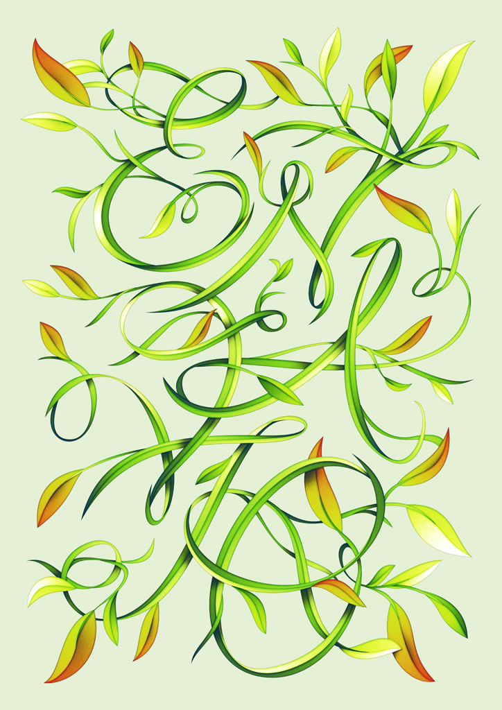
Final Image
And we are finally finished. The technique is something you can apply to all sorts of lettering. It doesn't have to be as formal as this one. Show me what you do with it by dropping me a line via Twitter.
 By
By


