


In the fifth part of the Achieving 3D Realism: Reception Area Render With 3D Studio Max & V-Ray Premium series, Jamie will cover post-production, one of the most important aspects of achieving a great looking final image. While getting the best possible render out of your 3d package is always the ultimate goal, in most cases renders will benefit greatly from further refinement and retouching in Photoshop.
Also available in this series:
- Achieving 3D Realism: Reception Area Render With 3D Studio Max & V-Ray, Part 1
- Achieving 3D Realism: Reception Area Render With 3D Studio Max & V-Ray, Part 2
- Achieving 3D Realism: Reception Area Render With 3D Studio Max & V-Ray, Part 3 Lighting And Rendering
- Achieving 3D Realism: Reception Area Render With 3D Studio Max & V-Ray, Part 4 Lighting And Rendering
- Achieving 3D Realism: Reception Area Render With 3D Studio Max & V-Ray: Post Production
- Achieving 3D Realism: Reception Area Render With 3D Studio Max & V-Ray: Final Post Production
Project Overview
The following tutorial is based on a real project. This unique tutorial will take users through the real process of creating shaders with bespoke physical properties and applying textures based on real photo references. The subsequent stage will introduce users to the fascinating process of creating and matching the overall lighting closely to the original photo reference supplied by the client while using state-of-the- art techniques to achieve fast and convincing results.
The final step will navigate users through the intricacies of using the best post-production approaches to help enhance and finalize the 3d shot at the highest level. Most post-production effects implemented in this tutorial are kept in layers with their respective masks to achieve the ultimate control over the final results.
Post Production
Photoshop is very powerful and useful when addressing quick changes and/or effects that would otherwise be time consuming to address in 3Ds Max alone.
Having said that is equally important to have relatively decent renders from Max, at one’s disposal for Post-Production. This work process will ultimately prove very fruitful for one’s final piece.
In this final part of the tutorial, we will bring in the main rendered image, along with its pre-rendered element.
Continued From Part 4...
78. In Photoshop, open (Ctrl+O) the file under the name of “office up_final.tga). See fig.78.0

Click To Enlarge
79. Let’s start by renaming the “background” layer. To do so, right click and choose the “layer from background” option from the list. In the “new layer” dialog, name the layer as “raw render” and “ok” to close it. See fig.79.0 and 79.1

Click To Enlarge


80. Next, we are going to duplicate the layer to safeguard the original layer. To do so, simply right click on the original layer (i.e. raw render) and choose the “duplicate layer” option from the list. See fig. 80.0 and 80.1


81. Prior to begin tweaking with the “raw render” layer, open the photo reference and the render element (vraywirecolor render).
The photo reference will be used to help match the current render more closely, and the “vraywirecolor” render element will be used to select and save specific selections. See fig.81.0

Click To Enlarge
82. Select the “vraywirecolor” document and duplicate it as previously done. In the “duplicate” layer dialog, choose the destination document to be the “office close_final.tga” and change this new layer name to “wire color”. See fig. 82.0, 82.1 and 82.2


Click To Enlarge
83. The first step is to try to match the TV screen glow intensity with the photo reference.
A- Select the “wirecolor” layer.
B- Enable the “magic wand” tool (w) and set its tolerance to about 5.
C- Select the TV color (red) by clicking this tool in the relevant area. See fig. 83.0

Click To Enlarge
84. Turn off the “wirecolor” layer visibility and select the “raw render copy” layer. See fig. 84.0

Click To Enlarge
85. Next, copy and paste this layer selection (ctrl+C and ctrl+v). Name it “tv screen”.
Also, change its colour to green, to differentiate it from the other layers. See fig. 85.0

Click To Enlarge
86. To match the TV glow intensity closer to the photo reference we are going to change its current layer blending mode to “overlay”. This layer blending mode worked well. However you may try different ones, if desired. See fig.86.0 and 86.1


Click To Enlarge
87. The next material to match is the “curved wooden wall”.
A- Select and turn on the “wirecolor” layer visibility.
B- Enable the magic wand tool (w) and select the “curved wooden wall” color. See fig. 87.0

Click To Enlarge
88. While the selection is still on, turn off the visibility of the “wirecolor” layer and select the “tv screen “layer.
Next, add an “adjustment layer” by clicking on its icon. Choose the “levels” adjustment from the pop up list. See fig.88.0 and 88.1

Click To Enlarge

Click To Enlarge
89. Tweak slightly with the “rgb” and the “red” channels to match the colors more closely. Also, darken slightly the “output levels” value and name this adjustment layer as “wooden rightlevels”. See fig.89.0, 89.1, 89.2 and 89.3


Click To Enlarge
90. Next we are going to brighten up the scene slightly with “curves” adjustment layer.
A- This adjustment layer needs to be on top of the previous one. Add the “curves” by using the steps described earlier.
B- In its “rgb” channel, add the first point on the curve with the cursor target.
C- Move it slightly up and towards the right. The image has become slightly brighter now.
D- Add the second point and move it downwards towards the left to balance the brightness a bit.
E- Open the “red” channel and add a point to its curve. Move it slightly downwards to add a bit of red to the image and match the photo more closely.
F- Open the “blue” channel and add a point to its curve.
Slightly move it downwards to bring up blue tones to the image. The overall brightness and colors are now closer to the photo reference. See fig.90.0, 90.1, 90.2 and 90.3


91. However, the TV screen and the light pattern on the wall have become bleached as result.
To correct this we are going to use the “layer mask thumbnail” and the brush tool to omit the brightness on undesired areas.
A- Select a brush tool (b) from the side tool bar.
B- On the main tool bar, click on the “brush picker” to select a smooth and feathered brush. Once selected, one can increase or decrease its diameter/size by pressing the key “]” or “[“.
When omitting areas with the brush, the “set foreground color” swatch has to be black. To add omitted areas in the document, one should switch the “set foreground color” to white. To switch between the two colors simply press the “x” key. See fig.91.0, 91.1 and 91.2


92. Enable the “brush” tool (b) and select the “layer mask thumbnail” to begin brushing around the relevant areas of the document (i.e. TV screen and wall pattern). One may also play with the brush opacity values for specific effects. To edit any of the previous adjustment layers simply click on its icon. See fig. 92.0 and 92.1


Click To Enlarge
93. To edit any of the previous adjustment layers simply click on its icon. See fig. 93.0

Click To Enlarge
94. Next, we are going to adjust the blue glass door.
A- Select the blue glass door area using the techniques highlighted earlier.
B- While the selection is still on, add the “levels” adjustment layer to match its color and appearance closer to the photo reference.
C- Start by moving its “rgb” channel points to the right, to darken it slightly.
D- Also, change its channel to “blue” and move its input mid-level point to the left. This should intensify the blue tone. “Ok” to close the dialog. See fig.94.0 and 94.1

Click To Enlarge


95. Name this new “levels” adjustment layer as “blue glass_levels” and change its property “color” to blue and ensure that its position is under the “curves 1” layer. This is to prevent the blue glass from becoming overly bright.
Note how the how blue tones of the rendered glass doors are almost identical to the photo reference. See fig. 95.0 and 95.1


Click To Enlarge
96. Next, we are going to save the blue glass door selection.
A- While the “blue glass_levels” adjustment layer is still selected, hold down the “ctrl” key and left click on its “mask thumbnail” to enable its selection.
B- The selection should appear on the document. To save it, click on the “select” tool from the main tool bar and choose the “save selection” option from the dropdown list.
Name this selection as “blue door”. This selection is now saved in the channels’ tab.
It’s common practice save selections/channels in this manner. See fig.96.0, 96.1 and 96.2


Click To Enlarge


97. Next, we are going to add an extra tone of blue to the blue glass door.
A- To load up its selection/channel, simply go to the “channels” tab, select the relevant layer, hold down the “ctrl” key and left click on its “mask thumbnail”. Select on the “rgb” channel and go back to the “layers” tab.
Alternatively, simply click on the “select” tool and choose the “load selection” option from the dropdown list.
B- Choose the pre-saved “blue door” channel from the “load selection” dialog. This unique tool allows users to load channels from different documents. Furthermore, if a selection was already “on” prior to choosing this tool, the dialog would have also given you the choice to “add selection”, “subtract, from selection” or “intersect with selection”. See fig.97.0 and 97.1


98. While the selection is still on in the document, add the “color balance” adjustment layer and play around with its value to achieve a more accentuated blue tone.
Once satisfied, name this new adjustment layer as “blue glass_color balance 1” and change its “color” to blue.
Also, ensure that this layer is beneath the “curves 1” adjustment layer. See fig.98.0, 98.1 and 98.2

Click To Enlarge

Click To Enlarge

Click To Enlarge
99. Next, we are going to darken the color of the metal pieces of the blue door to match it closer to the photo reference.
Select the relevant areas of the document using the techniques covered earlier and add the “levels” adjustment layer to darken the metal slightly. Use some of the approaches discussed earlier to achieve the correct tone.
This new adjustment layer should also be beneath the “curves 1” adjustment layer. See fig.99.0

Click To Enlarge
100. At times, professionals add real photos of objects to the rendered document in order to make the 3d image more believable.
For this scene, it was decided that a real photo of a sunflower would help improve the rendered image.
A- Select the “photo reference” document.
B- Enable the “polygonal lasso tool” (L) and begin drawing around the sunflower edges.
C- Once finished drawing and the selected area is on, copy the selected area (ctrl+c).
D- Select the “office close up_final” document and past it (ctrl+v).
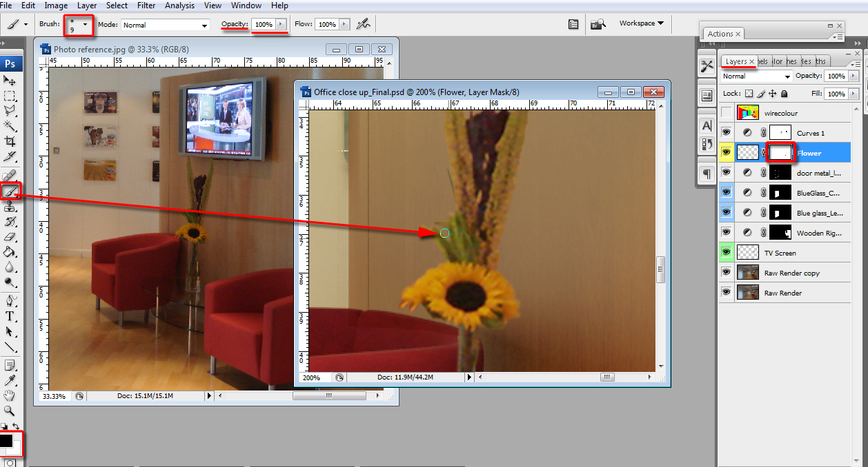
E- Once this new layer is created, move it beneath the “curves 1” adjustment layer. Name it “flower” and change its color to yellow.
F- Scale and adjust the “flower” layer to fit nicely between the jar and the TV screen. Use the transform tool (ctrl+t) and “distort” (right click) to scale and adjust the layer disproportionally.
To scale proportionally the transform marquee, simply hold down the “shift” key and start pulling its corner handles. See fig.100.0 and 100.1


101. In order to make the “flower” layer fit more naturally in the document, we are going to omit and feather certain parts of the document.
A- While the “flower” layer is still selected, create a layer mask thumbnail by clicking on its icon.
B- Enable the brush tool (b).
C- Ensure to have the “set foreground color” as black (to omit) and white (to add). To switch between the colors simply press the “x” key.
D- Next, begin brushing around the desired areas of the “sunflower” layer using “[“to reduce the brush size, and “]” to increase the brush size”.
Also, it’s worth using different brush opacity values to achieve the desired results. See fig.101.0 and 101.1


Click To Enlarge
102. The flower is now looking part of the rendered image. The following step is to adjust the overall hue and saturation of the rendered image to match closer to photo reference.
A- Add a new “hue/saturation” adjustment layer above the “curves 1” layer to affect the entire image.
B- To tone down the overall color to match the photo reference, we are going to reduce the “master” saturation value to about -22. The image is now looking much better.
C- However, the red and blue tones seem to have been lost slightly.
To boost these colors, we are going to first edit the “reds” and increase its saturation value to about +17. The image is looking much better now. You may try different values if desired.
D- Next, increase the “blues” saturation value to about +53 and close the dialog. See fig.102.0, 102.1, 102.2 and 102.3


Click To Enlarge
Stay tuned for the final part!
 By
By


