
What are the hot trends in icons? Let's check out these modern icon trends. 2024 will be full of trending symbols and app icon design trends that are both fresh and familiar.
1. Clean Line-Based Icons
Icons that feature simple line work were one of the key icon trends of 2023, and they're not going anywhere in 2024. You'll see this across all kinds of icon design, from UI to app icon trends. Take a moment to think about why this is a trend that lasts. Lines can communicate simply, easily, and elegantly. Icons are not usually the time or place for complexity. They need to be usable and readable at a variety of sizes.
Take a look at these beautifully designed icons—they entirely rely on simple but intentional line work. Notice how it doesn't take a lot of line to visually say a lot. This can be an excellent approach for your website, UI, and even app icon design.
One of the benefits of sticking strictly to line with icon design is flexibility when it comes to color and value too. Notice how these could work in such a wide variety of colors, on a wide variety of backgrounds. Line-based icons, like the ones in these examples, tend to have clean silhouettes where the details have been simplified. This can be crucial when space is limited.
2. Circles as a Supplement in Icon Design
When you're designing a set of icons, a unifying element can provide a sense of harmony across the entire set. Circles are a popular choice for their simplicity, and when it comes to trending symbols, their presence is clear.
Take a look at this stylish example. The circles provide a consistency that makes the icons look cohesive and organized in their appearance. Using them together in a single project would make it feel as if they are members of the same visual family.
Circles are also a versatile and neutral choice, which may be one of the reasons why they continue to have a presence in icon trends for 2024. As a foundational shape to contain more complex design elements, it's a supplemental anchor.
This works nicely across different aesthetics too. Take a look at these stylish examples. Prefer icons that are line-specific, like our previous icon trend? They can work great with this circular visual direction too. Want to do something more colorful or even mix the two? A basic shape can be the perfect neutral supplement.
3. Hand-Drawn Icon Design
There's something special about hand drawing, isn't there? It's the imperfections and the nuance of handwriting. It feels human in its distinct imperfections. This aesthetic can create a more personal aesthetic—which is a very different way to connect with your audience. Hand-drawn icons can stand out against the typical clean, sleek designs we see in trending symbols and other app icon design trends. That authentic and individualistic character can make them a memorable choice.
However, it's important to remember how they visually communicate. Check out these stylish hand-drawn icons. They lend themselves to creative ideas and problem-solving, but might not be the best choice for something like a medical or legal project. They are a popular visual style, but they have their niche.
For example, check out these stylish icon designs. They could be a fun choice for academic projects or communication-based projects. Maybe you're building an app that focuses on art or design. A personal touch lends itself well to the idea of speaking and creating.
4. Isometric Icon Design
Isometric icons have gained popularity in design, and this trend shows no signs of stopping. This visual style provides a sense of depth, even though it's a two-dimensional representation. This three-dimensional look can add interest and make an icon stand out from the rest. When looking at app icon trends, this is a fun option to explore. If you're designing an icon set, the isometric grid maintains a consistency. This provides a balanced appearance across your icon set—like other design choices, that cohesive nature can help establish a system in your icons.
Isometric icons often lean into clean lines and use of geometry, which makes for a very modern look and feel. This approach can be a strong choice when used with infographics or presentation design, as well.
There are so many ways to push this trend too. Notice how you can keep it simple or take it much further, with more detailed and even illustrative work. Keep in mind your goals for your icon designs when you're assessing this trend and how it might apply to your work. If you need something that scales well, keep the details to a minimum.
5. Lineless Flat Colors
This icon trend rejects lines completely in favor of flat colors. You can push this perspective in so many different ways too. For example, check out this stylish set of icons. We have a hand-drawn aesthetic going on here, as we see in the slight inconsistencies in the shapes. With a limited color palette and informal shapes, it makes for a friendly, personal aesthetic.
In some regards, this trend is a lot like line-based icons—only the complete opposite! Again, it's about keeping things simple and clean. That's a huge aspect of the icon trends for 2024.
However, there are so many ways this design trend could be pushed. Check out these examples. They're far more geometric, and you can get even more colorful too. The core of this design trend is the lack of line and the emphasis on color. Whether you're designing an app icon or an icon set, this can be a stylish and trendy approach.
6. Cute, Whimsical Icons
You're likely to notice cute, whimsical icons in the icon trends for 2024 too. Why? Think about it—there's something so nice about being treated to a cheerful aesthetic. Cute icons can convey a sense of approachability, whimsy, and fun. They could even make the viewer feel more comfortable. Sometimes, technology can feel very much the opposite, so cute, fun, illustrative elements could communicate a very different vibe.
Of course, like all design decisions, you'll want to make sure that this approach aligns with your branding. If the tone needs to be serious, you'll want to stay away from things that make light of the content. However, if you're looking for a touch of fun and energy, this could be the perfect trend for you to follow.
Aren't these examples cute? Somehow, adding a cute little face to things can make things ten times cuter, right? Character art can also make icons fun and memorable. Imagine an app icon with a smiling face—or with two characters talking to each other. It's very visually communicative, while also sharing a bubbly, welcoming feeling.
7. Dual Color Palettes
So what are the hot trends in icons for business? If that's your focus, you'll want to check out this one. Dual color palettes, or fixed color palettes, can be an amazing choice that can key right into your brand colors. Icons with a fixed palette can be such a simple yet effective way to further incorporate your branding and establish that essential recognition. Consistent use of color can reinforce your visual identity.
Using color in this way can help push the communicative qualities of your icons too. For example, check out this beautifully designed icon set. If we have a pie chart but one aspect is a different key color, it stands out more than it would have otherwise. See how color is used here to emphasize specific parts of the icons?
You can mix and match this design trend with the other icon trends in 2024. Prefer lines? Solid colors? A fixed color palette can be an awesome approach in both. Use color to create emphasis and key into your branding. It's a fun and simple way to make this effective connection.
8. Playful 3D Icons
3D has a pretty big presence in illustration trends for 2024 too—so it's no surprise its presence is here in the icon trends for 2024. There's something so fun about 3D icons too, isn't there? They feel tangible in a space where things can feel not so tangible. The clay look and feel in this trendy example has continually made itself known in design trends. While it's fun and stylish, it can also be quite niche. It would be fun as icons within an app, but may not scale well at smaller sizes.
In interactive design, 3D icons can respond to user interactions, providing dynamic and engaging experiences. This level of interactivity contributes to a more immersive and enjoyable user journey.
3D icons can feel new, unusual, or even cutting-edge. Look how fun they look, popping out of a mobile device or springing out of a background. Viewers and users attracted to this aesthetic may enjoy trending symbols that are unexpected. However, again, this can be a rather whimsical look, so make sure that it aligns well with your brand's mission.
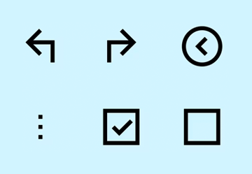
9. Single Solid Colors
Let's turn back to more clean and sleek web and app icon design trends. There's an absence of detail here, and it's a part of what makes them successful. They're a versatile choice too—since the line and shape here are a single color, you could use them in any color that best suits your project or situation. Need a version for a black and white scenario? Simple. Need an alternate color? Simple.
This is a great example of this design trend in use, and it's so communicative too. These icons visually illustrate the different moon phases and some weather conditions too. Notice how it doesn't take much to communicate quite a lot. Shape and line have been used together very effectively here.
This approach can work in so many ways. Have fun with it, as we see in these cut-out cupcake icons. Or use them to communicate complex ideas, as we see in this collection of UI essentials. The key to this icon trend for 2024 is the focus on shape as the primary visual and communicative element.
10. Playful Sticker-Themed Icons
Stickers can have such a fun feel to them, and that's why we see them as one of the icon trends for 2024. They're particularly great as reactions, emotes, and even app icons. Sticker-themed icons could evoke a feeling of nostalgia—remember collecting stickers? They can also have a tangible feel or a silly feel. This is another trend that's quite whimsical, so treat them accordingly.
Think about instances where someone might use stickers. They tend to be used to personalize objects, and that's why they show up in icon design, particularly in areas that involve communication and feedback. You can say "I like this" with a fun sticker instead of with plain old text. But that's not to say that icons like this can't serve other purposes. They could be a fun way to guide your user through an experience or connect with your app users.
11. Blocky Icons With Shadows
Just as circles can be effective as anchor shapes, squares are a great choice too. However, when looking at icon trends for 2024, you're going to see some familiar shadows. Take a look at this stylish example. Notice how the squares act as a solid anchor, and every item here has a uniform shadow. These two components help establish that this is a related series of icons.
However, this also has a presence in app icon design trends. It's a clean look, and it gives us a touch of depth without necessarily being ornate.
This is one of those trends you can push in many directions too. Love clean, elegant simplicity? Check out the example on the left. These tech items are presented with a delicate shadow. In contrast, we have these eccentric holiday icons, each of them very different. However, they easily become a series with that shape and shadow anchor. This could be a really fun design choice if you have more than one related app too.
Find Your Next Favorite Icons on Elements
Which icon trends for 2024 were your favorites? Looking for some trending symbols and icons for your next design project? Whether you're designing an app or a website, you're going to want to check out Envato Elements.
One low monthly price gets you unlimited access to thousands of icon sets—including every example in this inspiring list!
In addition, you get unlimited access to stock photos, illustrations, fonts, design templates, and much more. It's all included for one low price, and it's an amazing addition to any designer's tool kit. Make sure to check out Envato Elements today.
Learn How to Make Icons of Your Own
Love icon design and want to learn how to make icons of your own? Check out these free tutorials, right here on Envato Tuts+.

 How to Create a Set of Flat Animal Icons in Adobe Illustrator


 How to Create an Affinity Designer Icon


 19 Spooky Graphics and Icons for Fun Halloween Designs


 How to Create Animated Vector Icons in Adobe Illustrator and Photoshop


 Create the Captain America Shield Icon in Adobe Illustrator


 7 Basic Rules for Using Icons in UI Design


